分情况讨论path:
- 矩形分割
<div class="card"></div>
.container .card{
position: relative;
width: 320px;
height: 450px;
background: #b7a1a1;
border-radius: 20px;
overflow: hidden;
}
.container .card::before{
content: '';
position: absolute;
top:0;
left: 0;
width: 100%;
height: 100%;
background: #9bdc28;
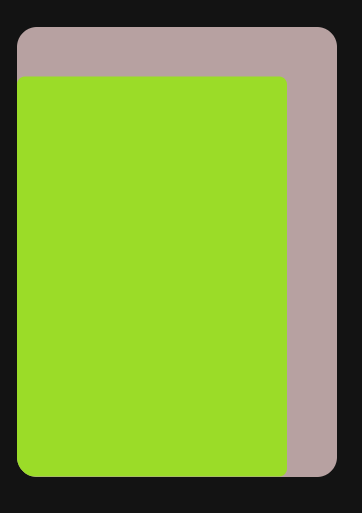
clip-path: inset(50px 50px 0 0 round 8px);
transition: 0.5s ease-in-out;
}
.container .card::before{
content: '';
position: absolute;
top:0;
left: 0;
width: 100%;
height: 100%;
background: #9bdc28;
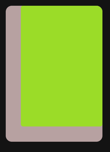
clip-path: inset(0 0 50px 50px round 8px);
transition: 0.5s ease-in-out;
}
- 圆形分割
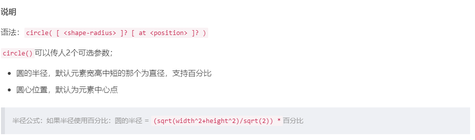
当长宽相当,50%可以铺满屏幕
圆心位置默认50%,50%,相对于上级容器位置
clip-path: circle(50% at 50% 50%); or
clip-path: circle(50%);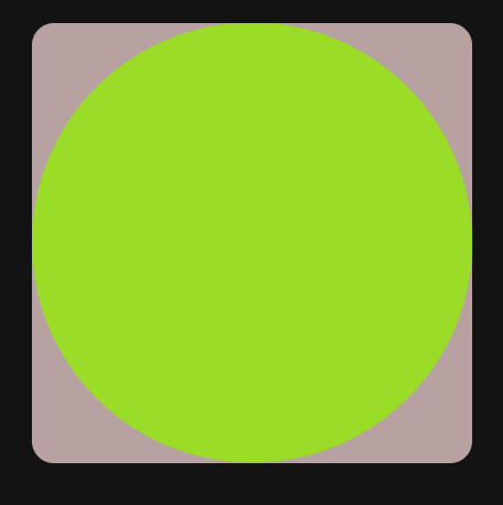
clip-path: circle(50% at 0 0);
- 椭圆分割
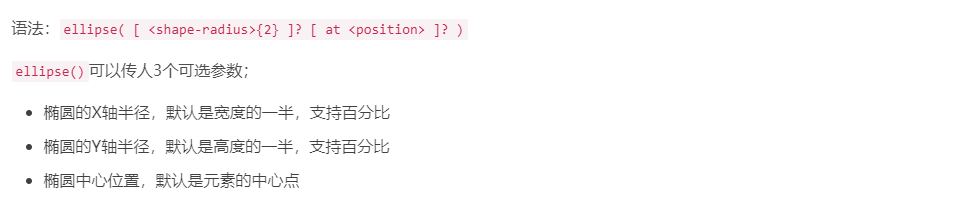
横轴纵轴相等时,即为圆
clip-path: ellipse(45% 30% at 50% 50%);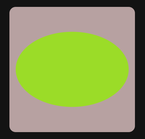
- 多边形分割
clip-path: polygon(50% 0, 100% 50%, 0 100%);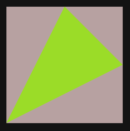
注意各个点的位置和代码位置
三角形对应了三个点,和代码位置相对应

若有收获,就点个赞吧
0 人点赞
