本文记录一些最近新学到的可以省去很多繁琐的css特性,它们不一定是新特性,但是可以为让前端代码写起来更方便。
1. 参数设置
<div class="wavy"><div style="--i: 1;">内</div><div style="--i: 2;">容</div><div style="--i: 3;">加</div><div style="--i: 4;">载</div><div style="--i: 5;">中</div><div style="--i: 6;">.</div><div style="--i: 7;">.</div><div style="--i: 8;">.</div></div>
.wavy {
  position: relative;
  -webkit-box-reflect: below -12px linear-gradient(transparent, rgba(0, 0, 0, 0.2));

  display: flex;
}

.wavy div {
  position: relative;
  color: #fff;
  font-size: 2em;
  animation: animate 1s ease-in-out infinite;
  animation-delay: calc(0.1s * var(--i));
  flex: none;
}

@keyframes animate {
  0% {
    transform: translateY(0px);
  }
  20% {
    transform: translateY(-24px);
  }
  40%,
  100% {
    transform: translateY(0px);
  }
}
使用场景:对于某些特殊的情况,如卡片的absolute排布,可以借用style里的参数进行设置,如top: t, left: l此类,这样可以省去很多css(和style很像,但是代码格式更完备)
<li data-text="Home"><a href="#">首页</a></li>
ul li::before{
  content: attr(data-text);
  position: absolute;
  top: 50%;
  left: 50%;
  transform: translate(-50%, -50%);
  color: #fff;
  font-size: 6em;
  font-weight: 700;
  pointer-events: none;
  letter-spacing: 20px;
  opacity: 0;
  transition: 0.5s;
  white-space: nowrap;
}
如果在css中,存在需要使用的标签属性,可以通过attr进行获取。比如这里的content,它可能是写在object中,使用v-for来调用的标签,这里使用attr来获取,显得很合理
2. theme设置
在组件等设置中,有时不同组件仅是颜色的不同,除了加载不同css之外,我们可以使用less,本质上是一套代码生成多套theme,但是看起来很舒服:
<view :class="'theme-' + (theme==='blue'?'blue':'white')">
     内部代码此处省略
</view>
// lang="less"
.theme(@font-color, @background-color, @card-height) {
  color: @font-color;
  background: @background-color;
  height: @card-height;

  .loading4 {
    height: 136rpx;
    width: 654rpx;
    margin: 0 auto;
    text-align: center;
    padding-top: 150rpx;
    background-color: transparent;
  }

  .card-wrapper {
    height: @card-height;
    display: flex;
    justify-content: center;
    align-items: center;
    flex-direction: column;
  }
}

.theme-white {
  @font-color: black;
  @background-color: white;
  @card-height: 336rpx;

  .theme(@font-color, @background-color, @card-height);
}
.theme-blue {
  @font-color: black;
  @background-color: url('https://douyin-static.yangtianbao.com/images/home_background.svg') no-repeat;
  @card-height: 336rpx;

  .theme(@font-color, @background-color, @card-height);
}
步骤为:
- 找到需要改变颜色的css,为其写一个函数,用来生成,同时函数的参数即为会变的颜色变量;
- 写出两种theme,并调用函数
3. grid写网格页面
首先明确的一点是,grid并不是一定比flex好用,但是在有些情况下,grid是个很好用的工具:
- 多维布局,因为flex一般只能考虑一个维度,涉及多维会很麻烦;
- 动态网格布局,如功能页的数据展示,它天生就是个网格。
这里作为例子,展示的是一个最近刚写过的网格布局,需求是首先一行有4列,其次不知道有多少个,如果6个就2行,2个就1行。同时默认靠左排布,这个例子中,网格间没有间隔,所以不够完美。
<view class="analysis" v-if="showApplicationList.length!==0">
      <view class="title" style="margin-top: 24rpx">
        <view class="c-label">
          <view class="c-label__bar"></view>我的应用
        </view>
      </view>

      <click-item
        v-for="(item, index) in showApplicationList"
        :key="index"
        class="item"
        :imgSrc="item.icon"
        :title="item.title"
        :url="item.url"
      />
  </view>
.analysis {
  width: 654rpx;
  background-color: #fff;
  margin: 48rpx 0 0 0;
  border-radius: 32rpx;

  display: grid;
  // 一行4个一样宽的
  grid-template-columns: repeat(4, 1fr);
  // 后面来的自动占一格
  grid-auto-columns: 1fr;
}

.title {
  // title独占一行
  grid-column-start: span 4;
}

// 主要是上面
.items .title {
  font-size: 28rpx;
}

// 元素的css 不关键
.item {
  display: flex;
  justify-content: center;
  align-items: center;
  flex-direction: column;
  flex-wrap: wrap;
  margin-top: 20rpx;
}
4. 各种图形
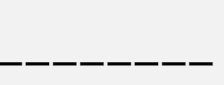
虚线
text-decoration 有限长 由content限制长度
.rect {
}
.rect::after {
content: "________";
color: transparent;
font-size: 5em;
text-decoration: line-through #000;
text-decoration-style: dashed;
letter-spacing: 2px;
}
文字强调 有限长 由content限制长度 ```less .rect { } .rect::after { content: “__“; font-size: 5em;
text-emphasis: ‘_’; letter-spacing: 5px; }
- 渐变 控制30%间隔
```less
.rect {
width: 200px;
height: 100px;
background: linear-gradient(to left, #000 70%, transparent 0);
background-repeat: repeat-x;
background-size: 30px 10px;
}
月牙
利用box-shadow产生的内阴影
.rect {
  width: 200px;
  height: 200px;

  background-color: transparent;

  border-radius: 50%;
  box-shadow: inset 1em -1em #333;
}
迷宫
利用5x5 grid 与 随机的斜线(方向随机)进行填充


若有收获,就点个赞吧
0 人点赞
