logo
<style>/* 如果css加载不出来,可能因为网速慢,css加载不出来如果css加载不出来,也可以让网页进行操作,有良好的体验,有一定的体验 */h1{margin: 0;}.logo {width: 142px;height: 58px;/*border: 1px solid #000;*/}.logo h1 .logo-hd{display: block;width: 142px;/* height: 58px; */height: 0;padding-top: 58px;background: url(./taobao.png) no-repeat 0 0/142px 58px;/* 图片如果链接找不到,可以直接截图,然后保存到本地 */overflow: hidden;}</style><div class="logo"><h1><a href="" class="logo-hd">淘宝网</a></h1></div>
前端水很深,学不完,这些都是经验
<style>h1{margin: 0;}.logo{width: 142px;height: 58px;border: 1px solid #000;}.logo h1 .logo-hd{display: block;width: 142px;height: 58px;background: url(https://www.baidu.com/img/PCtm_d9c8750bed0b3c7d089fa7d55720d6cf.png)no-repeat 0 0/142px 58px;}.box{width: 142px;padding-top: 58px;/* padding: 58px; */border: 1px solid #000;}.box2{width: 142px;padding: 58px;border: 1px solid #000;}</style><div class="logo"><h1><a href="" class="logo-hd">淘宝网</a></h1></div><div class="box"></div><div class="box2"></div>
<style>h1{margin: 0;}.logo{width: 142px;height: 58px;}.logo h1 .logo-hd{display: block;width: 142px;/* height: 58px; */height: 0;background: url(https://www.baidu.com/img/PCtm_d9c8750bed0b3c7d089fa7d55720d6cf.png)no-repeat 0 0/142px 58px;border: 1px solid #000;padding-top: 58px;overflow: hidden;}</style><div class="logo"><h1><a href="" class="logo-hd">淘宝网</a></h1></div>
因为a logo-hd上有背景图片,a也有文本,图片在文本上面
没有div,h1,也可以实现效果,但最好有规范,h1利于seo
首先在a里面设置大小需要把a变成,block,之后照常设置,之后height设置为0
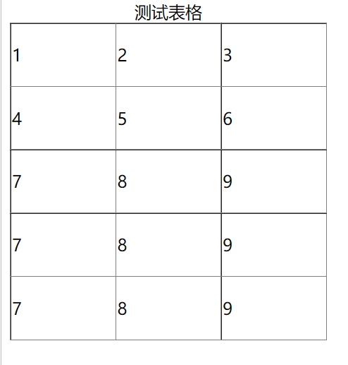
table
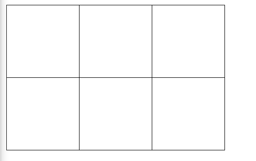
<style>table {width: 300px;height: 300px;/* caption-side: bottom; *//* caption-side: top|bottom; *//* border-collapse: separation|collapse; *//* border-collapse: separation; */border-collapse: collapse;}</style><table border="1"><caption>测试表格</caption><tr><td>1</td><td>2</td><td>3</td></tr><tr><td>4</td><td>5</td><td>6</td></tr><tr><td>7</td><td>8</td><td>9</td></tr><tr><td>7</td><td>8</td><td>9</td></tr><tr><td>7</td><td>8</td><td>9</td></tr></table>
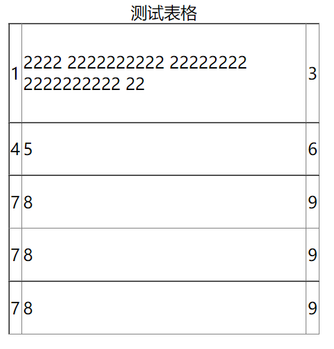
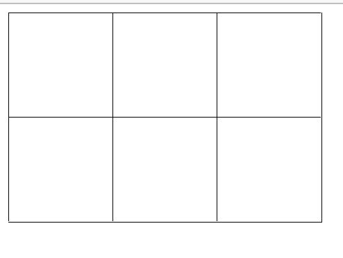
<style>table {width: 300px;height: 300px;/* caption-side: bottom; *//* caption-side: top|bottom; *//* border-collapse: separation|collapse; *//* border-collapse: separation; */border-collapse: collapse;/* table-layout: fixed; *//* table-layout: fixed| automatic; *//*无论字数有多少,可以让单元格大小一致,宽度一致,高度不一致*/}</style><table border="1"><caption>测试表格</caption><tr><td>1</td><td>2222 2222222222 22222222 222222222222</td><td>3</td></tr><tr><td>4</td><td>5</td><td>6</td></tr><tr><td>7</td><td>8</td><td>9</td></tr><tr><td>7</td><td>8</td><td>9</td></tr><tr><td>7</td><td>8</td><td>9</td></tr></table>
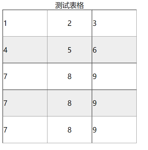
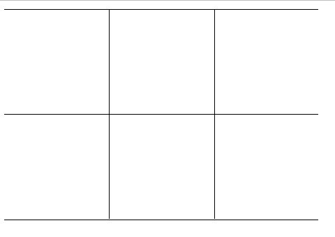
<style>table {width: 300px;height: 300px;/* caption-side: bottom; *//* caption-side: top|bottom; *//* border-collapse: separation|collapse; *//* border-collapse: separation; */border-collapse: collapse;/* table-layout: fixed; *//* table-layout: fixed| automatic; *//*无论字数有多少,可以让单元格大小一致,宽度一致,高度不一致*/}table tr td:nth-child(2){text-align: center;}table tr:nth-child(even){background-color: #eee;}table tr:hover{background-color: #ddd;}</style><table border="1"><caption>测试表格</caption><tr><td>1</td><td>2</td><td>3</td></tr><tr><td>4</td><td>5</td><td>6</td></tr><tr><td>7</td><td>8</td><td>9</td></tr><tr><td>7</td><td>8</td><td>9</td></tr><tr><td>7</td><td>8</td><td>9</td></tr></table>
ul模拟表格
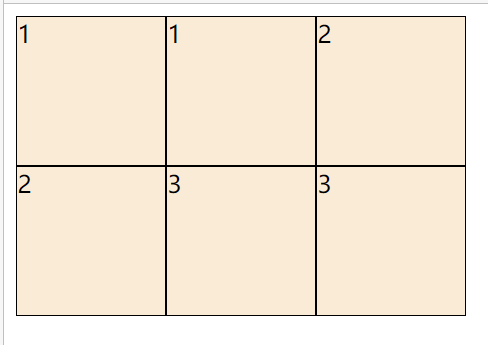
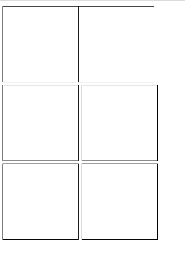
<style>ul{padding: 0;margin: 0;list-style: none;}.table{width: 300px;}.table li{float: left;width: 100px;height: 100px;background-color: antiquewhite;border: 1px solid #000;box-sizing: border-box;}</style><ul class="table clearfix"><li>1</li><li>1</li><li>2</li><li>2</li><li>3</li><li>3</li></ul>
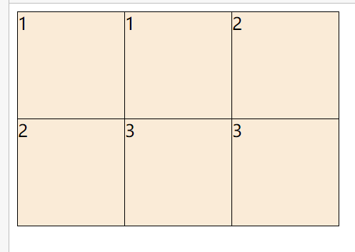
<style>ul{padding: 0;margin: 0;list-style: none;}.table{width: 300px;}.table li{float: left;width: 101px;height: 101px;background-color: antiquewhite;margin: -1px 0 0 -1px;border: 1px solid #000;box-sizing: border-box;}</style><ul class="table clearfix"><li>1</li><li>1</li><li>2</li><li>2</li><li>3</li><li>3</li></ul>
多尝试代码,不用非要记住正确的直接怎么写,要知道思路,可以自己顺道思考着写出来
记住思路,之后可以自己写出来,而不是记住答案
1 ul去掉
2 li float变成内联块元素 可以设置width、height了,设置width、height、背景颜色边框查看效果,之后table类设置300px,查看效果。之后根据效果分析原因,再进行调整,再分析,再调整,以此类推
先把会的,可以直接看到效果的写上,之后再在此基础上调整,先有一个磨具,用磨具制造出模型,再在此基础上微调->调整->大调,依次进行
<style>ul{padding: 0;margin: 0;list-style: none;}.clearfix::after{content: "";display: table;clear: both;}.table{width: 300px;}.table li{/* 因为边框默认不会重合,会叠加,所以叠加了的边框就显得粗了,处理方法让其重合,而不是叠加 */float: left;/* width: 100px;height: 100px; */width: 101px;height: 101px;/* margin-top: -1px;margin-left: -1px; */margin: -1px 0 0 -1px;border: 1px solid #000;box-sizing: border-box;}</style><ul class="table clearfix"><li></li><li></li><li></li><li></li><li></li><li></li></ul>
<style>ul {padding: 0;margin: 0;list-style: none;}.clearfix::after {content: "";display: table;clear: both;}.table {width: 300px;}.table li {/* 因为边框默认不会重合,会叠加,所以叠加了的边框就显得粗了,处理方法让其重合,而不是叠加 *//* float: left; */display: inline-block;/* width: 100px;height: 100px; */width: 101px;height: 101px;/* margin-top: -1px;margin-left: -1px; *//*虽然margin为0,但浏览器把li的换行解释成空格,所以还会空有间距,float可以消除空格的间距*//* margin: 0px; */margin: -1px 0 0 -1px;border: 1px solid #000;box-sizing: border-box;}</style><ul class="table clearfix"><li></li><li></li><li></li><li></li><li></li><li></li></ul>
方法2
video25min
<style>ul{padding: 0;margin: 0;list-style: none;}/*不写 float塌陷,父级元素感受不到float子元素的大小,导致父元素不会被子元素撑开*/.clearfix::after{content: "";display: table;clear: both;}.table{width: 300px;border-right: 1px solid #000;border-bottom: 1px solid #000;}.table li{float: left;width: 100px;height: 100px;border-top: 1px solid #000;border-left: 1px solid #000;box-sizing: border-box;}</style><ul class="table clearfix"><li></li><li></li><li></li><li></li><li></li><li></li></ul>
子元素 border-box
父元素content这样好计算
video25.05
<style>ul {padding: 0;margin: 0;list-style: none;}.clearfix::after {content: "";display: table;clear: both;}.box {width: 300px;overflow: hidden;}.table {/* width: 300px; */width: 303px;margin-left: -1px;border-right: 1px solid #000;border-bottom: 1px solid #000;}.table li {float: left;/* width: 100px; */width: 33.33%;height: 100px;border-top: 1px solid #000;border-left: 1px solid #000;box-sizing: border-box;}</style><div class="box"><ul class="table clearfix"><li></li><li></li><li></li><li></li><li></li><li></li></ul></div>
hidden的用法
先table width:302px
table li width 33.3%
margin-left:-1
BFC块级格式化上下文
普通流 normal flow浮动流 float 脱离普通流绝对定位布局 absolute positioning 脱离了整个文档流css2.1 常常在我们写布局样式时会产生问题,让人感觉匪夷所思,css2.1总结了这些问题,给出了比较正规的解决方案,这叫BFCbfc是一个容器,属于普通流设置以下属性的元素,具有BFC特性,是BFC元素BODYfloat: left right;position:absolute fixed;display:inline-block table-cell;overflow: hidden auto scroll;
<!-- 普通流 normal flow浮动流 float 脱离普通流绝对定位布局 absolute positioning 脱离了整个文档流css2.1 常常在我们写布局样式时会产生问题,让人感觉匪夷所思,css2.1总结了这些问题,给出了比较正规的解决方案,这叫BFCbfc是一个容器,属于普通流设置以下属性的元素,具有BFC特性,是BFC元素BODYfloat: left right;position:absolute fixed;display:inline-block table-cell;overflow: hidden auto scroll; -->
普通流 normal flow<br /> 浮动流 float 脱离普通流<br /> 绝对定位布局 absolute positioning 脱离了整个文档流css2.1 常常在我们写布局样式时会产生问题,让人感觉匪夷所思,css2.1总结了这些问题,<br /> 给出了比较正规的解决方案,这叫BFC<br /> bfc是一个容器,属于普通流<br /> 设置以下属性的元素,具有BFC特性,是BFC元素<br /> BODY<br /> float: left right;<br /> position:absolute fixed;<br /> display:inline-block table-cell;<br /> overflow: hidden auto scroll;
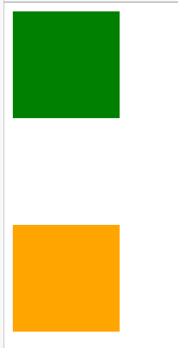
margin合并
margin合并 100px
<style>.box{width: 100px;height: 100px;}.box.box1{background-color: green;margin-bottom: 100px;}.box.box2{background-color: orange;margin-top: 100px}</style><div class="box box1"></div><div class="box box2"></div>
<style>.container {overflow: hidden;}.box{width: 100px;height: 100px;}.box.box1{background-color: green;margin-bottom: 100px;}.box.box2{background-color: orange;margin-top: 100px}</style><div class="container"><div class="box box1"></div></div><div class="container"><div class="box box2"></div></div>
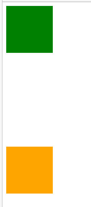
200px了,塌陷解决了,margin合并解决了
最好的方式是不解决
<style>.container {overflow: hidden;}.box {width: 100px;height: 100px;}.box.box1 {background-color: green;/* margin-bottom: 100px; */}.box.box2 {background-color: orange;/* margin-top: 100px */margin-top: 200px;}</style><div class="box box1"></div><div class="box box2"></div><!-- <div class="container"><div class="box box1"></div></div><div class="container"><div class="box box2"></div></div> -->
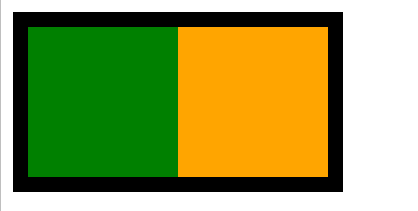
<style>.box{width: 200px;border: 10px solid #000;float: left;/*把父元素变成BFC就行了,但这样解决不好*//* float: left;overflow: auto;position: absolute;position: fixed;display: inline-block;display: table-cell; */}.box1{float: left;width: 100px;height: 100px;background-color: green;}.box2{float: left;width: 100px;height: 100px;background-color: orange;}</style><div class="box"><div class="box1"></div><div class="box2"></div></div>
margin塌陷
子元素带着父元素一块移动
<style>.box1{width: 300px;height: 300px;background-color: #000;}.box2{width: 50px;height: 50px;margin: 0 auto;margin-top: 100px;background-color: orange;}</style><div class="box1"><div class="box2"></div></div>
<style>.box1 {border-top: 1px solid transparent;width: 300px;height: 300px;background-color: #000;/* overflow: hidden;display: table-cell;float: left; */}.box2 {width: 50px;height: 50px;margin: 0 auto;margin-top: 100px;background-color: orange;}</style><div class="box1"><div class="box2"></div></div>
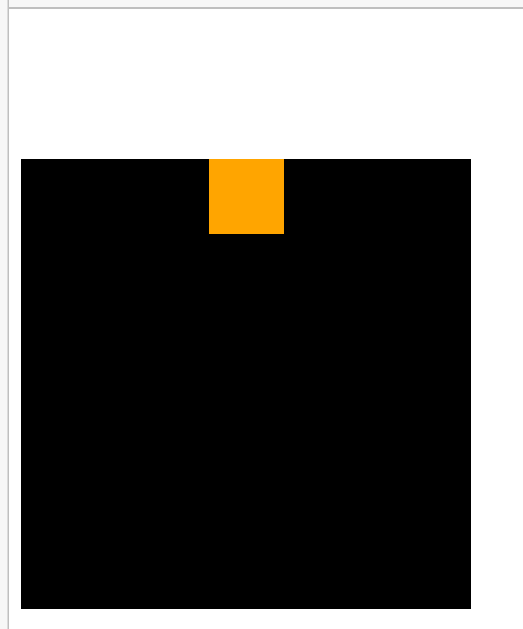
<style>.box1{float: left;width: 100px;height: 100px;background-color: #000;}.box2{width: 200px;height: 200px;background-color: orange;}</style><div class="box1">我是FLOAT</div><div class="box2">我是可怜的元素我是可怜的元素我是可怜的元素我是可怜的元我是可怜的元素我是可怜的元素我是可怜的元素我是可怜的元素我是可怜的元素</div>
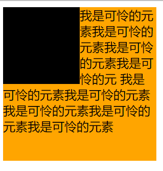
与图片环绕一样
加了float属性,就变成了内联块级元素了
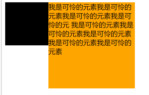
<style>.box1{float: left;width: 100px;height: 100px;background-color: #000;}.box2{display: table-cell;width: 200px;height: 200px;background-color: orange;}</style><div class="box1">我是FLOAT</div><div class="box2">我是可怜的元素我是可怜的元素我是可怜的元素我是可怜的元我是可怜的元素我是可怜的元素我是可怜的元素我是可怜的元素我是可怜的元素</div>
总结
BFC能解决什么问题
1 margin合并问题
2 浮动流造成父级元素坍塌的问题
3 margin塌陷问题
4 浮动元素覆盖的问题
css书写顺序
css书写顺序<br /> 显示属性:display,position,float,clear<br /> 自身属性: width,height,margin,padding,border,background<br /> 文本属性:color,font,text-align,vertical-align,whitespace<br /> 其他<br /> <br /> 不用严格要求按照这样的顺序,但最基本的顺序要遵守
font简写
font-style font-weight font-size line-height font-family<br /> font:italic bold 12px/20px "微软雅黑"
<!-- font-style font-weight font-size line-height font-familyfont:italic bold 12px/20px "微软雅黑" --><style>p{font: italic bold 12px/20px "微软雅黑";}</style><p> font-style font-weight font-size line-height font-familyfont:italic bold 12px/20px "微软雅黑"</p>

其它
<style>div{/* 不写0.9,写.9 */opacity: 0.9;opacity: .9;/* 写复合值 */margin: 1px 2px 3px 4px;/* rgb 00-ff 简写ff00ff f0fff4400 f40*/}</style>
选择器最基本的命名方法
选择器复合单词 中横线JS钩子ID 复合单词 符合单词 下划线选择器 小写尽可能英文header hd nav sidebarbtn button尽量不要用 bottom top left right 直观命名法 这是直观命名法应该结构化命名结构化标签:header hd nav sidebarbtn button英文结构化标签浏览器支持不是特别好,用的不安全,所以div命名div header hd nav sidebar
选择器复合单词 中横线JS钩子ID 复合单词 符合单词 下划线<br /> 选择器 小写<br /> 尽可能英文<br /> header hd nav sidebar<br /> btn button<br /> 尽量不要用 bottom top left right 直观命名法 这是直观命名法<br /> 应该结构化命名<br /> 结构化标签:<br /> header hd nav sidebar<br /> btn button<br /> 英文结构化标签浏览器支持不是特别好,用的不安全,所以div命名<br /> div header hd nav sidebar

若有收获,就点个赞吧
0 人点赞
