继承
<style>div {color: pink;font-size: 14px;}</style><div><p>龙生龙,凤生凤</p></div>
子元素继承父元素的属性
子标签会继承父标签的某些样式,如文本颜色和字号,不是所有样式都继承
texr-、font-、line-这些元素开头的可以继承,以及color属性
基本上都是与文字相关的可以继承,背景图片、hover等不能继承
<style>/*给body设置,body中所以子元素都继承*/body {color: pink;/* font: 12px/24px 'Microsoft YaHei'; */font: 12px/1.5 'Microsoft YaHei';}div {/* 子元素继承了父元素 body 的行高 1.5 *//* 这个1.5 就是当前元素文字大小 font-size 的1.5倍 所以当前div 的行高就是21像素 */font-size: 14px;}p {/* 1.5 * 16 = 24 当前的行高 */font-size: 16px;}/* li 么有手动指定文字大小 则会继承父亲的 文字大小 body 12px 所以 li 的文字大小为 12px当前li 的行高就是 12 * 1.5 = 18*/</style><div>粉红色的回忆</div><p>粉红色的回忆</p><ul><li>我没有指定文字大小</li></ul>
height100%
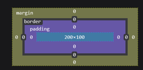
<style>.bigbox{width: 200px;height: 200px;padding: 10px;box-sizing: border-box;border: 1px solid #000000;}.box{width: 100%;height: 100%;box-sizing: border-box;border: 1px solid red;}</style><div class="bigbox"><div class="box"></div><div class="box"></div></div>
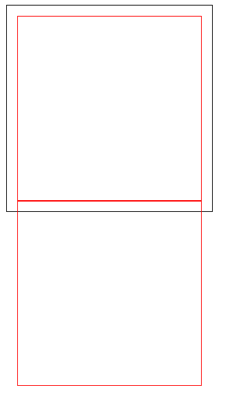
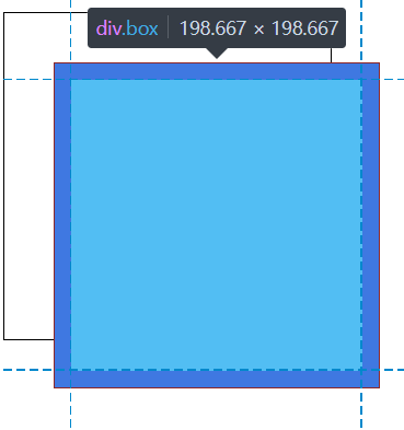
width、height 100%计算父元素的padding,设置父元素固定的width,固定的padding,子元素width100%好计算,如果子元素需要写固定的width …px,就得写178.667px,并且随着父元素width与padding变化也得变化,改一个得改所有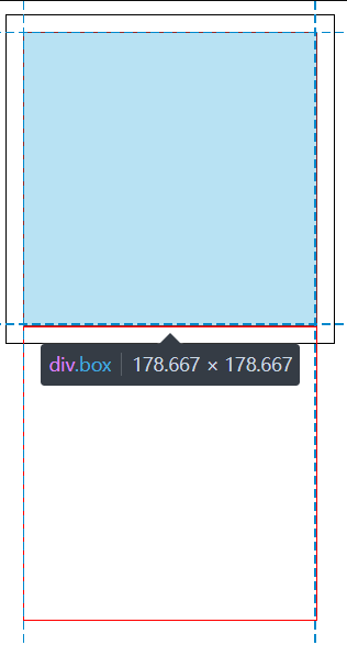
width的“继承”
<style>.father{width: 200px;height: 200px;background-color: green;}.son{height: 100px;background-color: red;}</style><div class="father"><div class="son"></div></div>
div是块级元素,默认占满一行,在html里占满整行,占满父元素的宽度,受padding影响,不会加入padding的尺寸,就相当于block块级元素,默认有个width100%,之后块级元素可以不写width,只写height,在设置好width、height的父元素中
这不是继承父元素的宽度,与继承父元素宽度不一样
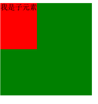
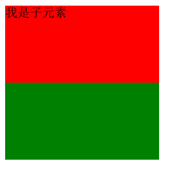
float、定位元素的影响
<style>.father{width: 200px;height: 200px;background-color: green;}.son{/*有影响,变成了类似行内块元素,被内容撑大,没有内容width为0*//*float: left;*/position: absolute;/*与上图一致无影响,width100%*//*position: relative;*/height: 100px;background-color: red;}</style><div class="father"><div class="son">我是子元素</div></div>
<style>.father{width: 200px;height: 200px;background-color: green;}.son{/*有影响,变成了类似行内块元素,被内容撑大,没有内容width为0*/float: left;/*position: absolute;*//*与上图一致无影响,width100%*//*position: relative;*/height: 100px;width: 100%;background-color: red;}</style><div class="father"><div class="son">我是子元素</div></div>
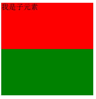
float时,width100%可以
<style>.father{position: relative;width: 200px;height: 200px;background-color: green;}.son{/*有影响,变成了类似行内块元素,被内容撑大,没有内容width为0*//*float: left;*/position: absolute;/*与上图一致无影响,width100%*//*position: relative;*/height: 100px;width: 100%;background-color: red;}</style><div class="father"><div class="son">我是子元素</div></div>
绝对定位时,width100%会和第一个父级定位元素一致,会参照第一个父级定位元素,如果这里father不设置定位,son的width100%会占满整个界面,和body宽度一样
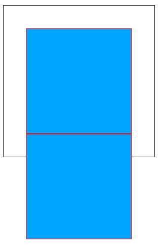
son设置为fixed,效果如下图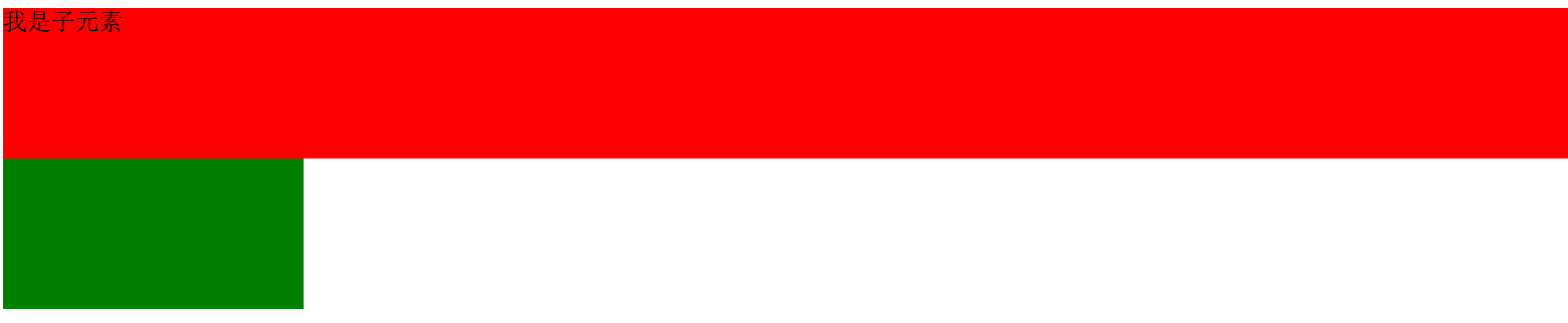
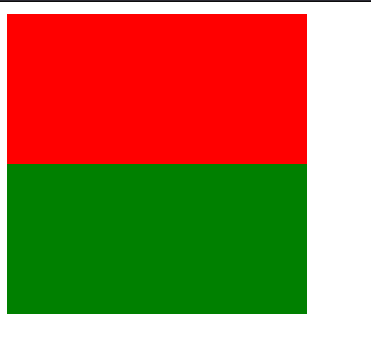
background-color覆盖
padding、width都会覆盖,不包括border、margin的其它
绝对定位 padding width100%
<style>.bigbox {/*overflow: hidden;*/position: relative;width: 200px;height: 200px;padding: 30px;box-sizing: border-box;border: 1px solid #000000;/*background-color: #00a4ff;*/}.box {/*overflow: hidden;*//*float: left;*/position: absolute;width: 100%;height: 100%;box-sizing: border-box;border: 1px solid red;padding: 10px;background-color: #00a4ff;}.other {width: 100%;height: 100%;}</style><div class="bigbox"><div class="box"></div><!-- <div class="box"></div>--></div>
absolute会近乎等于父元素的整个width,与预想的下图并不一致,float则不会产生这种影响
<style>.bigbox {/*overflow: hidden;*/position: relative;width: 200px;height: 200px;padding: 30px;box-sizing: border-box;border: 1px solid #000000;/*background-color: #00a4ff;*/}.box {/*overflow: hidden;*/float: left;/*position: absolute;*/width: 100%;height: 100%;box-sizing: border-box;border: 1px solid red;padding: 10px;background-color: #00a4ff;}.other {width: 100%;height: 100%;}</style><div class="bigbox"><div class="box"></div><div class="box"></div></div>
float会计算父元素的宽度,在父·
元素的宽度的基础上横向排列,如果父元素宽度不够了则纵向排列

若有收获,就点个赞吧
0 人点赞
