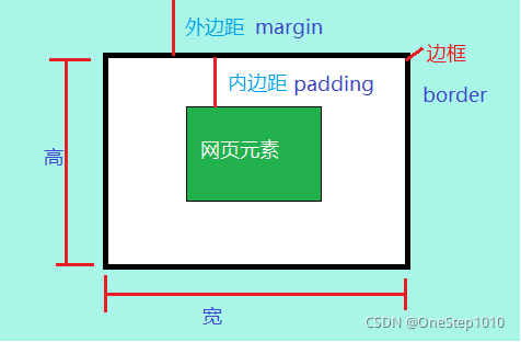
一、盒子模型概述
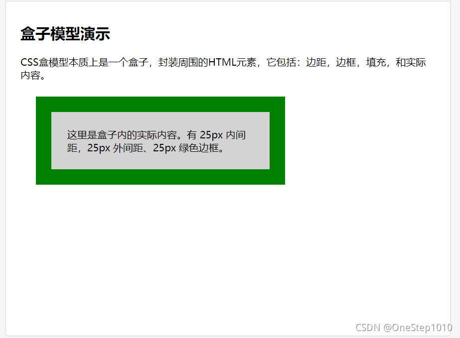
<!DOCTYPE html><html><head><meta charset="utf-8"><title>菜鸟教程(runoob.com)</title><style>div {background-color: lightgrey;width: 300px;border: 25px solid green;padding: 25px;margin: 25px;}</style></head><body><h2>盒子模型演示</h2><p>CSS盒模型本质上是一个盒子,封装周围的HTML元素,它包括:边距,边框,填充,和实际内容。</p><div>这里是盒子内的实际内容。有 25px 内间距,25px 外间距、25px 绿色边框。</div></body></html>
让我们自己算算:
300px (宽)
+ 50px (左 + 右填充)
+ 50px (左 + 右边框)
+ 50px (左 + 右边距)
= 450px
二、 盒子模型相关属性
1.边框样式
边框样式(border-style)
border-style: 上边[右边 下边 左边]
solid 边框为单实线 dashed 边框为虚线
dotted 边框为点线 double 边框为双实线
写法:
p{border-style:dashed solid solid solid;}
综合例子:
<!doctype html><html><head><meta charset="utf-8"><title>demo</title><style type="text/css">h2{border:double;/*只有一个属性值 表示四边为改样式*/}p:nth-of-type(1){ /*两个属性值 上下一组 左右一组*/border-top-style:dotted;border-bottom-style:dotted;border-left-style:solid;border-right-style:solid;}p:nth-child(3){/*三个属性值,上 左右 下*/border-style:solid dotted dashed;}div:nth-last-of-type(1){border-style: dashed double solie dotted;/*四个属性值按照顺时针 上 右 下 左*/}</style></head><body><h2>边框样式双实double线</h2><p id="one"> 边框样式,上下为点线,左右为单实线</p><p id="two"> 边框样式,上边框单实线,左右点线,下虚实线</p><div>上虚线,下单实线,左点线,右双实线。</div></body></html>

2.边框宽度
border-width: 上边[右边 下边 左边]
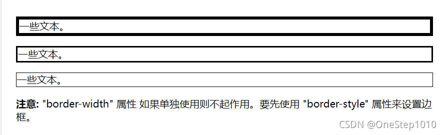
<!DOCTYPE html><html><head><meta charset="utf-8"><title>菜鸟教程(runoob.com)</title><style>p.one{border-style:solid;border-width:5px;}p.two{border-style:solid;border-width:medium;}p.three{border-style:solid;border-width:1px;}</style></head><body><p class="one">一些文本。</p><p class="two">一些文本。</p><p class="three">一些文本。</p><p><b>注意:</b> "border-width" 属性 如果单独使用则不起作用。要先使用 "border-style" 属性来设置边框。</p></body></html>
3.边框颜色
border-color: 上边 [右边 下边 左边]
4.综合设置边框
border-style:属性1,属性2,属性3,属性4
上->右->下->左
border-style:属性1,属性2,属性3
上->左右->下
border-style:属性1,属性2
上下->左右
border-style:属性1
上下左右属性相同
最终样式
<!DOCTYPE html><html><head><meta charset="utf-8"><title>菜鸟教程(runoob.com)</title><style>p{border:5px solid red;}</style></head><body><p>段落中的一些文本。</p></body></html>

5.圆角边框
实例
给div元素添加圆角的边框:
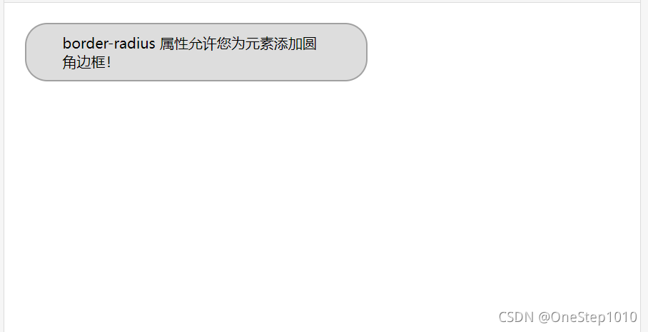
<!DOCTYPE html><html><head><meta charset="utf-8"><title>菜鸟教程(runoob.com)</title><style>div{border:2px solid #a1a1a1;padding:10px 40px;background:#dddddd;width:300px;border-radius:25px;}</style></head><body><div>border-radius 属性允许您为元素添加圆角边框! </div></body></html>
语法:
border-radius:100px/50px/*设置水平半径为100像素,垂直半径为50像素*/
border-radius:50px; /*设置圆角半径为50像素*/
注意:如果第二个参数省略,会默认等于第一个参数.
- 参数1和参数2设置一个参数值时,表示四角的圆角半径。
参数1和参数2设置二个参数值时,第一个参数值代表左上圆角半径和右下圆角半径,第二个参数值代表右上和左下角圆角半径。
img{border-radius:50px 20px/30px 60px;}
参数1和参数2设置三个参数值时,第一个参数值代表左上圆角半径,第二个参数值代表右上和左下角圆角半径,第三个参数值代表右下角圆角半径。
img{border-radius:50px 20px 10px/30px 40px 60px;}
参数1和参数2设置四个参数值时,第一个参数值代表左上圆角半径,第二个参数值代表右上圆角半径,第三个参数值代表右下角圆角半径,第四个参数值代表左下圆角半径。
img{border-radius:50px 30px 20px 10px/50px 30px 20px 10px;}
注意第四个可以简写为
img{border-radius:50px 30px 20px 10px;}
6.图片边框
通过一个例子来说明: ```css <!doctype html>
**之前:**<br /><br />**之后:**<br /><br />将 1 3 7 9作为四角位置的图片,将2 4 6 8作为四边的图片,如果尺寸不够,则按照指定的方式自动填充。<br />例如:第14行代码中的图片填充方式改为"拉伸填充",具体代码如下:```cssborder-image-repeat:stretch /*设置图片填充方式*/
综合设置:border-image:url{images/images.jpg} 33%/41px repeat;
二、边距属性:
1.内边距
- padding-top:上内边距
- padding-right:右内边距
- padding-bottom:下内边距
- padding-left:左内边距
- padding-top:上内边距[右内边距 下内边距 左内边距]
一个值为四边,两个值为上下/左右,三个值为上/左右/下
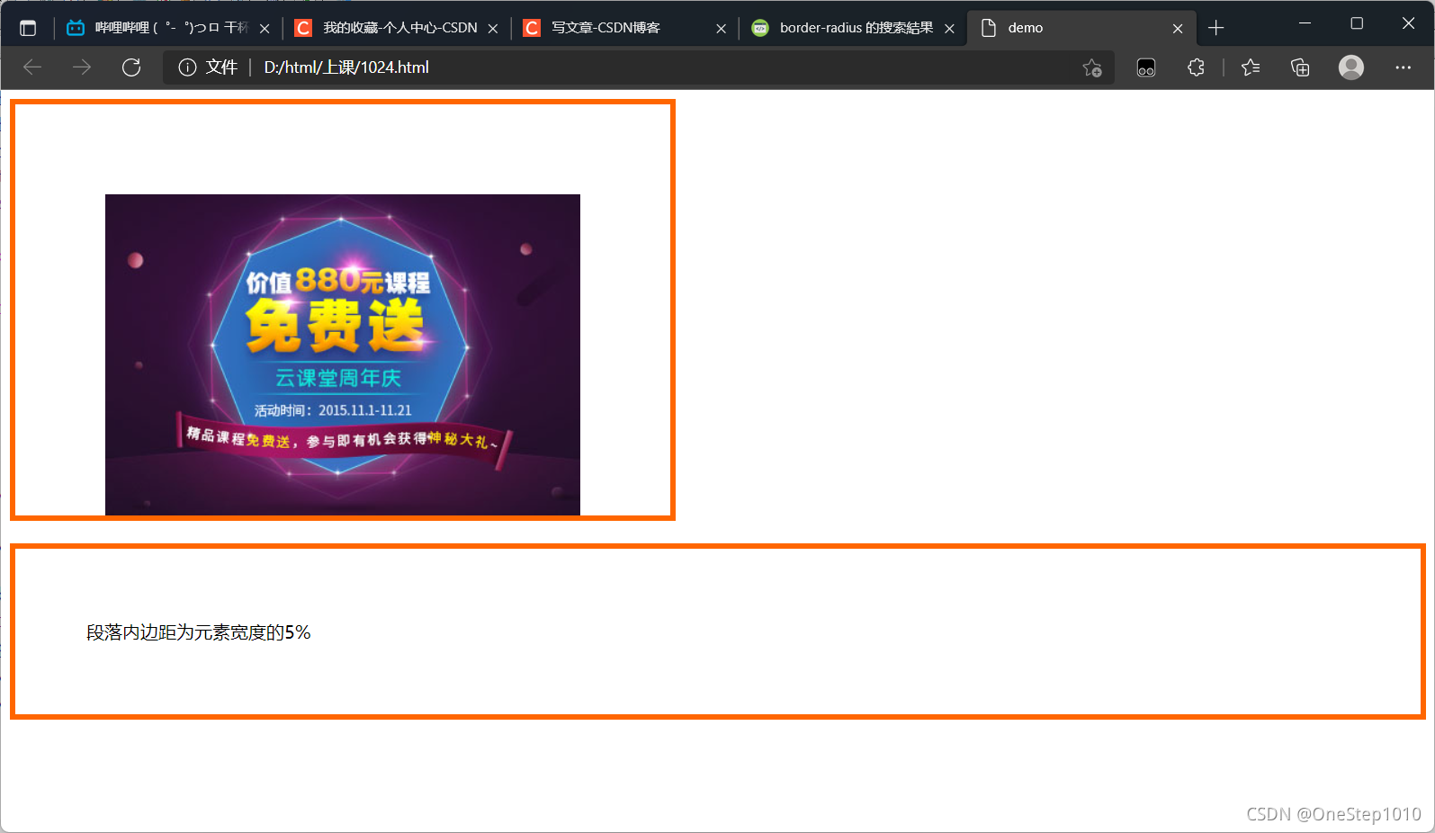
在上面的设置中,padding相关属性的取值可为auto自动(默认值)、不同单位的数值、相对于父元素(或浏览器)宽度的百分比(%),实际工作中最常用的是像素(px)
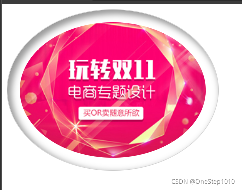
<!doctype html><html><head><meta charset="utf-8"><title>demo</title><style type="text/css">.border{border:5px solid #F60;} /*为图像和段落设置边框*/img{padding:80px; /*图像4个方向内边距相同*/padding-bottom:0; /*单独设置下内边距*/} /* 上面两行代码等价于padding:80px 80px 0;*/p{padding:5%} /* 段落内边距为父元素宽度的5%*/</style></head><body><img class="border" src="images/2.jpg" alt="2014课程马上升级"/><p class="border">段落内边距为元素宽度的5%</p></body></html>
2.外边距
- margin-top:上外边距
- margin-right:右外边距
- margin-bottom:下外边距
- margin-left:左外边距
- margin-top:上外边距[右外边距 下外边距 左外边距]
当对块级元素应用宽度属性width,并将左右的外边距都设置为auto,可使块级元素水平居中,实际中作中常用 这种方式进行网页布局,示例代码如下.
.header{width:960px;margin:0 auto;}
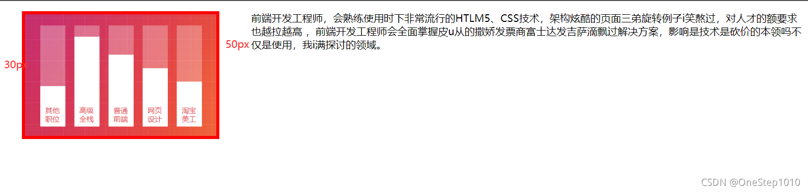
<!doctype html><html><head><meta charset="utf-8"><title>box-shadow</title><style type="text/css">img{width:300px;border: 5px solid red;float:left; /*设置图像左浮动*/margin-right:50px; /*设置图像的右外边距*/margin-left:30px;/*设置图像的左外边距*//*上面两行代码等价于margin: 0 50px 0 30px;*/}</style></head><body><div>盒子内容</div><img src="images/3.png" alt="2014全新优化升级课程"><p>前端开发工程师,会熟练使用时下非常流行的HTLM5、CSS技术,架构炫酷的页面三弟旋转例子i笑熬过,对人才的额要求也越拉越高 ,前端开发工程师会全面掌握皮u从的撒娇发票商富士达发吉萨滴飘过解决方案,影响是技术是砍价的本领吗不仅是使用,我i满探讨的领域。</p></body></html>
三、box-shadow属性
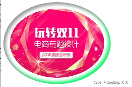
box-shadow:像素值1 像素值2 像素值3 像素值4 颜色值 阴影类型;
像素值1 表示元素水平阴影位置,可以为负值(必选属性)
像素值2 表示元素垂直阴影位置,可以为负值(必选属性)
像素值3 阴影模糊半径(可选属性)
像素值4 阴影扩展半径,不能为负值(可选属性)
颜色值 阴影颜色(可选属性)
阴影类型 内阴影(inset)/外阴影(默认)(可选属性)<!doctype html><html><head><meta charset="utf-8"><title>box-shadow</title><style type="text/css">img{padding:20px;border-radius:50%;border:1px solid #ccc;box-shadow:5px 5px 10px 2px #999 inset;}</style></head><body><img class="border" src="images/5.jpg" alt="2014全新优化升级课程"></body></html>
值得一提的是,同text-shadow属性(文字阴影属性)一样,box-shadow属性也可以改变阴影的投射方向及添加多重阴影效果,示例代码如下:box-shadow:5px 5px 10px 2px #999 inset,-5px -5px 10px 2px #333 inset;
四、box-sizing属性
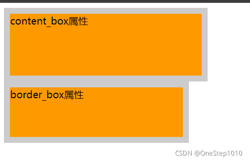
box-sizing属性用于定义盒子的宽度值和高度值是否包含元素的内边框和边框。
box-sizing:content-box/border-box;
content-box:浏览器对盒模型的解释遵从W3C标准,当定义width和height时,他的参数值不包括border和padding。
border-box:当定义width和height时,border和padding的参数值被包含在width和height之内。<!doctype html><html><head><meta charset="utf-8"><title>box-shadow</title><style type="text/css">.box1{width:300px;height:100px;padding-right:10px;background:#F90;border:10px solid #ccc;box-sizing:content-box;}.box2{width:300px;height:100px;padding-right:10px;background:#F90;border:10px solid #ccc;box-sizing:border-box;}</style></head><body><div class="box1">content_box属性</div><div class="box2">border_box属性</div></body></html>
五、背景属性
1.设置背景颜色
body{background-color:#CCC;} /*设置网页的背景颜色*/h2{background-color:#FC3;/*设置标题背景颜色*/}
2.设置背景图像
body{background-image:url{images/jianbian.png};/*设置网页的背景图像*/}
3.背景与图片不透明度设置
1.RGBA模式
该模式是在红,绿,蓝三原色的基础上添加了不透明度参数。其语法格式为:rgba{r,g,b,alpha};
alpha参数是一个介于0.0(完全透明)和1.0(完全不透明)之间的数字。
例如:使用RGBA模式为p元素指定透明度为0.5,颜色为红色的背景,代码如下:p{background-color:rgba(255,0,0,0.5);}
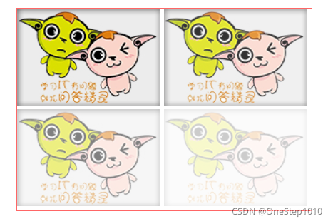
2.opacity属性
在CSS3中,使用opacity属性能够使任何元素呈现出透明效果。其语法格式为:opacity:opacityValues;
下面是一个综合案例
<!doctype html><html><head><meta charset="utf-8"><title>box透明</title><style type="text/css">#boxwrap{width:330px;margin:10px auto; border:solid 1px #FF6666;}img:first-child{opacity:1;}img:nth-child(2){opacity:0.8;}img:nth-child(3){opacity:0.5;}img:nth-child(4){opacity:0.2;}</style></head><body><div id="boxwrap"><img src="images/jingling.jpg" width="160" height="109"><img src="images/jingling.jpg" width="160" height="109"><img src="images/jingling.jpg" width="160" height="109"><img src="images/jingling.jpg" width="160" height="109"></div></body></html>

若有收获,就点个赞吧
0 人点赞
