The dash_core_components library includes a component called Graph.
主要是讲各种图形
1.概述
**dash_core_components**库包含一个叫Graph的组件;**Graph**组件使用开源的**plotly.js**(JavaScript图形库) 渲染交互式数据的可视化;**Plotly.js**支持超过35种数据图,可以生成高清的SVG矢量图和高性能的WebGL图;**dcc.Graph**组件的figure与**Plotly.py**的figure使用一样的参数。详情可参阅plotly.py文档与图库;**Dash**组件由一组属性以声明方式进行描述,所有这些属性都可以通过回调函数进行更新。有些属性还可以通过用户交互进行更新,比如,点选下拉按钮**dcc.Dropdown**组件的选项,该组件的属性**value**值就会改变;**dcc.Graph**组件有四个属性,可以通过用户交互进行更新:鼠标悬停(**hoverData**)、单击(**clickData**)、选择区域数据(**selectedData**)、更改布局(**relayoutData**)。
```python import json import dash import dash_core_components as dcc import dash_html_components as html from dash.dependencies import Input, Output import plotly.express as px import pandas as pd
app = dash.Dash(name)
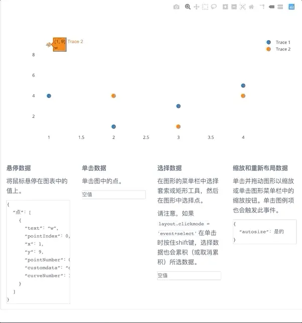
styles = dict(pre = dict(border = ‘thin lightgrey solid’, overflowX = ‘scroll’)) app.layout = html.Div([ dcc.Graph( id = ‘basic-interactions’, figure = dict(data = [dict(x = [1, 2, 3, 4], y = [4, 1, 3, 5], text = [‘a’, ‘b’, ‘c’, ‘d’], customdata = [‘c.a’, ‘c.b’, ‘c.c’, ‘c.d’], name = ‘trace01’, mode = ‘markers’, marker = dict(size = 12)), dict(x = [1, 2, 3, 4], y = [9, 4, 1, 4], text = [‘w’, ‘x’, ‘y’, ‘z’], customdata = [‘c.w’, ‘c.x’, ‘c.y’, ‘c.z’], name = ‘trace02’, mode = ‘markers’, marker = dict(size = 12))], layout = dict(clickmode = ‘event+select’))), html.Div(className = ‘row’, children = [ html.Div(className = ‘three columns’, children = [ dcc.Markdown(d(“”” 一、悬停数据
将鼠标悬停在图中的值上。""")),html.Pre(id = 'hover-data', style = styles['pre'])]),html.Div(className = 'three columns',children = [dcc.Markdown(d("""**二、点击数据**用鼠标点击图上的点。""")),html.Pre(id = 'click-data', style = styles['pre'])]),html.Div(className = 'three columns',children = [dcc.Markdown(d("""**三、选择数据**使用菜单的套索或方框工具,选择图上的点。请注意:如果layout.clickmode ='event + select',若单击的同时按住shift键,则选择数据的同时,也会累计或取消累计所选的数据。""")),html.Pre(id = 'selected-data', style = styles['pre'])]),html.Div(className = 'three columns',children = [dcc.Markdown(d("""**四、缩放与改变数据布局**在图形上点击并拖拽,或点击图形菜单的缩放按钮实现缩放。点击图例也可以激活此事件。""")),html.Pre(id = 'relayout-data', style = styles['pre'])])])
])
@app.callback(Output(‘hover-data’, ‘children’), [Input(‘basic-interactions’, ‘hoverData’)]) def display_hover_data(hoverData): return json.dumps(hoverData, indent = 2)
@app.callback(Output(‘click-data’, ‘children’), [Input(‘basic-interactions’, ‘clickData’)]) def display_click_data(clickData): return json.dumps(clickData, indent = 2)
@app.callback(Output(‘selected-data’, ‘children’), [Input(‘basic-interactions’, ‘selectedData’)]) def display_selected_data(selectedData): return json.dumps(selectedData, indent = 2)
@app.callback(Output(‘relayout-data’, ‘children’), [Input(‘basic-interactions’, ‘relayoutData’)]) def display_repayout_data(relayoutData): return json.dumps(relayoutData, indent = 2)
if name == ‘main‘: app.run_server(debug=True)
> ><a name="AJQLI"></a># 2.悬停时更新图表```pythonimport arrow as arimport numpy as npimport pandas as pdimport jsonfrom textwrap import dedent as dimport plotly.graph_objs as goimport dashimport dash_core_components as dcc # 交互式组件import dash_html_components as html # 代码转htmlfrom dash.dependencies import Input, Output, State # 回调from jupyter_plotly_dash import JupyterDash # Jupyter中的Dashimport ipywidgets as widgets # Jupyter的滑动条插件df = pd.read_csv('https://gist.githubusercontent.com/chriddyp/''cb5392c35661370d95f300086accea51/raw/''8e0768211f6b747c0db42a9ce9a0937dafcbd8b2/''indicators.csv')app = JupyterDash('update_graph_id', width = 1000, height = 960)app.layout = html.Div([# 设置2个下拉按钮、4个单选按钮html.Div([html.Div([dcc.Dropdown(id = 'crossfilter-xaxis-column',options = [{'label': i, 'value': i} for i in df['Indicator Name'].unique()],value = 'Fertility rate, total (births per woman)'),dcc.RadioItems(id = 'crossfilter-xaxis-type',options = [{'label': i, 'value': i} for i in ['线性', '日志']],value = '线性',labelStyle = dict(display = 'inline-block'))],style = dict(width = '49%', display = 'inline-block')),html.Div([dcc.Dropdown(id = 'crossfilter-yaxis-column',options = [{'label': i, 'value': i} for i in df['Indicator Name'].unique()],value = 'Life expectancy at birth, total (years)'),dcc.RadioItems(id = 'crossfilter-yaxis-type',options = [{'label': i, 'value': i} for i in ['线性', '日志']],value = '线性',labelStyle = dict(display = 'inline-block'))],style = dict(width = '49%', display = 'inline-block', float = 'right'))],style = dict(borderBottom = 'thin lightgrey solid',backgroundColor = 'rgb(250, 250, 250)', padding = '10px 5px')),# 设置交互数据对象及默认值html.Div([dcc.Graph(id = 'crossfilter-indicator-scatter',hoverData = dict(points = [{'customdata': 'Japan'}]))],style = dict(width = '49%', display = 'inline-block', padding = '0 20')),# 设置交互的子图表html.Div([dcc.Graph(id = 'x-time-series'),dcc.Graph(id = 'y-time-series')],style = dict(width = '49%', display = 'inline-block')),# 设置日期滑动条html.Div(dcc.Slider(id = 'crossfilter-year--slider',min = df['Year'].min(),max = df['Year'].max(),value = df['Year'].max(),marks = {str(y): str(y) for y in df['Year'].unique()}),style = dict(widht = '49%', padding = '0px 20px 20px 20px'))])# 回调2个下拉按钮 + 4个单选按钮@app.callback(Output('crossfilter-indicator-scatter', 'figure'),[Input('crossfilter-xaxis-column', 'value'),Input('crossfilter-yaxis-column', 'value'),Input('crossfilter-xaxis-type', 'value'),Input('crossfilter-yaxis-type', 'value'),Input('crossfilter-year--slider', 'value')])def update_graph(xaxis_column_name, yaxis_column_name, xaxis_type, yaxis_type, year_value):dff = df[df['Year'] == year_value]return dict(data = [go.Scatter(x = dff[dff['Indicator Name'] == xaxis_column_name]['Value'],y = dff[dff['Indicator Name'] == yaxis_column_name]['Value'],text = dff[dff['Indicator Name'] == yaxis_column_name]['Country Name'],customdata = dff[dff['Indicator Name'] == yaxis_column_name]['Country Name'],mode = 'markers',marker = dict(size = 15, opacity = 0.5, line = dict(width = 0.5, color = 'white')))],layout = dict(xaxis = dict(title = xaxis_column_name, type = 'linear' if xaxis_type == '线性' else '日志'),yaxis = dict(title = yaxis_column_name, type = 'linear' if yaxis_type == '线性' else '日志'),margin = {'l': 40, 'b': 30, 't': 10, 'r': 0}, height=720, hovermode = 'closest'))# 设置子图表def create_time_series(df, axis_type, title):return dict(data = [go.Scatter(x = df['Year'],y = df['Value'],mode = 'lines+markers')],layout = dict(height = 360, margin = {'l': 20, 'b': 30, 't': 10, 'r': 10},xaxis = dict(showgrid = False),yaxis = dict(type = 'linear' if axis_type == '线性' else '日志'),annotations = [dict(x = 0, y = 0.85, text = title,showarrow = False, align = 'left',bgcolor = 'rgba(255, 255, 255, 0.5)',xref = 'paper', yref = 'paper',xanchor = 'left', yanchor = 'bottom')]))# 回调--设置上子图表的交互@app.callback(Output('x-time-series', 'figure'),[Input('crossfilter-indicator-scatter', 'hoverData'),Input('crossfilter-xaxis-column', 'value'),Input('crossfilter-xaxis-type', 'value')])def update_y_timeseries(hoverData, xaxis_column_name, axis_type):country_name = hoverData['points'][0]['customdata']dff = df[df['Country Name'] == country_name]dff = dff[dff['Indicator Name'] == xaxis_column_name]title = f"<b>{country_name}</b><br>{xaxis_column_name}"return create_time_series(dff, axis_type, title)# 回调--设置下子图表的交互@app.callback(Output('y-time-series', 'figure'),[Input('crossfilter-indicator-scatter', 'hoverData'),Input('crossfilter-yaxis-column', 'value'),Input('crossfilter-yaxis-type', 'value')])def update_x_timeseries(hoverData, yaxis_column_name, axis_type):dff = df[df['Country Name'] == hoverData['points'][0]['customdata']]dff = dff[dff['Indicator Name'] == yaxis_column_name]return create_time_series(dff, axis_type, yaxis_column_name)app
![13819693-f74e21a4f95c25f0[1].gif](/uploads/projects/wangyaohui-0311@lv8g9a/4855b22d6e9de280b3fbf542541ad7b0.gif)
3.交叉过滤
# 数据源np.random.seed(0) # 使每次生成的随机数相同df = pd.DataFrame({f"Column {i}": np.random.rand(30) + i*10 for i in range(6)})app = JupyterDash('Cross_filter_id', width = 1000)app.layout = html.Div(className = 'row',children = [html.Div(dcc.Graph(id = 'g1', config = dict(displayModeBar = False)), className = 'four columns'),html.Div(dcc.Graph(id = 'g2', config = dict(displayModeBar = False)), className = 'four columns'),html.Div(dcc.Graph(id = 'g3', config = dict(displayModeBar = False)), className = 'four columns'),])# high_light为返回函数的函数def high_light(x, y):def callback(*selectedDatas):selectedpoints = df.index# 按选定的点,从Dataframe中过滤数据for i, selected_data in enumerate(selectedDatas):if selected_data is not None:selected_index = [p['customdata'] for p in selected_data['points']]if len(selected_index) > 0:selectedpoints = np.intersect1d(selectedpoints, selected_index)# 设置图表fig = dict(data = [dict(x = df[x], y = df[y], text = df.index, textposition = 'top', selectedpoints = selectedpoints,customdata = df.index, type = 'scatter', mode = 'markers+text',textfont = dict(color = 'rgba(30, 30, 30, 1)'),marker = dict(color = 'rgba(0, 116, 217, 0.7)', size = 12,line = dict(color = 'rgb(0, 116, 217)', width = 0.5)),unselected = dict(marker = dict(opacity = 0.3), textfont = dict(color = 'rgba(0, 0, 0, 0)')))], # 使未选择的透明layout = dict(clickmode = 'event+select', showlegend = False, hovermode = 'closest', height = 230,margin = {'l': 15, 'r': 0, 'b': 15, 't': 5}, dragmode = 'select'))# 将矩形显示到先前选定的区域shape = dict(type = 'rect', line = dict(width = 1, dash = 'dot', color = 'darkgrey'))if selectedDatas[0] and selectedDatas[0]['range']:fig['layout']['shapes'] = [dict({'x0': selectedDatas[0]['range']['x'][0],'x1': selectedDatas[0]['range']['x'][1],'y0': selectedDatas[0]['range']['y'][0],'y1': selectedDatas[0]['range']['y'][1]},**shape)]else:fig['layout']['shapes'] = [dict({'type': 'rect','x0': np.min(df[x]),'x1': np.max(df[x]),'y0': np.min(df[y]),'y1': np.max(df[y])},**shape)]return figreturn callback# app.callback是一个装饰器app.callback(Output('g1', 'figure'),[Input('g1', 'selectedData'),Input('g2', 'selectedData'),Input('g3', 'selectedData')])(high_light('Column 0', 'Column 1'))app.callback(Output('g2', 'figure'),[Input('g2', 'selectedData'),Input('g1', 'selectedData'),Input('g3', 'selectedData')])(high_light('Column 2', 'Column 3'))app.callback(Output('g3', 'figure'),[Input('g3', 'selectedData'),Input('g1', 'selectedData'),Input('g2', 'selectedData')])(high_light('Column 4', 'Column 5'))app
![13819693-f501e6a2bdc36229[1].gif](/uploads/projects/wangyaohui-0311@lv8g9a/731ca6c027155dcb5a1efa80705fa0e1.gif)
- 示例是对由6列数据集,两两组成的3个散点图表,进行交叉筛选的通用示例。对单个散点图进行选择数据区域(或单击),则另外2个散点图会仅显示筛选的数据;
- 对多维数据集进行筛选和可视化,最好选用平行坐标图的方式。
4.Dash交互局限性
- 点击图上的点不能累加:不能累加已经点击的图点数量,也不支持对某个图点进行反选;
- 目前还不能自定义悬停交互及选择框的样式。

若有收获,就点个赞吧
0 人点赞
