import numpy as npimport pandas as pdimport matplotlib.pyplot as pltplt.rcParams['font.sans-serif'] = ['SimHei']plt.rcParams['axes.unicode_minus'] = False
一、子图
1. 使用 plt.subplots 绘制均匀状态下的子图
- 返回元素分别是画布和子图构成的列表,第一个数字为行,第二个为列
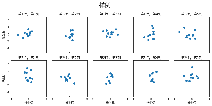
figsize参数可以指定整个画布的大小sharex和sharey分别表示是否共享横轴和纵轴刻度tight_layout函数可以调整子图的相对大小使字符不会重叠fig, axs = plt.subplots(2, 5, figsize=(10, 4), sharex=True, sharey=True) #画布样式fig.suptitle('样例1', size=20) #标题for i in range(2):for j in range(5):axs[i][j].scatter(np.random.randn(10), np.random.randn(10))axs[i][j].set_title('第%d行,第%d列'%(i+1,j+1))axs[i][j].set_xlim(-5,5)axs[i][j].set_ylim(-5,5)if i==1: axs[i][j].set_xlabel('横坐标')if j==0: axs[i][j].set_ylabel('纵坐标')fig.tight_layout()
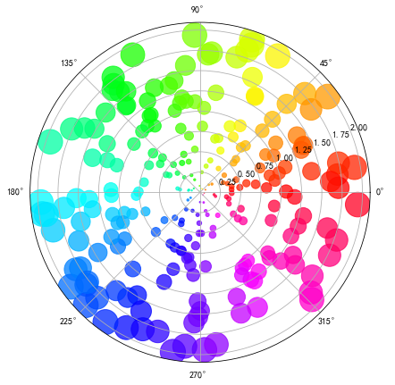
除了常规的直角坐标系,也可以通过projection方法创建极坐标系下的图表。(OS:这颜色也太好看了) ```python N = 250 r = 2 np.random.rand(N) theta = 2 np.pi np.random.rand(N) area = 200 r ** 2 colors = theta
plt.subplots(figsize=(7,7)) plt.subplot(projection=’polar’) plt.scatter(theta, r, c=colors, s=area, cmap=’hsv’, alpha=0.75)
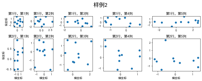
<a name="scGHP"></a>## 2. 使用 `GridSpec` 绘制非均匀子图所谓非均匀包含两层含义,第一是指图的比例大小不同但没有跨行或跨列,第二是指图为跨列或跨行状态<br />利用 `add_gridspec` 可以指定相对宽度比例 `width_ratios` 和相对高度比例参数 `height_ratios````pythonfig = plt.figure(figsize=(10, 4))spec = fig.add_gridspec(nrows=2, ncols=5, width_ratios=[1,2,3,4,5], height_ratios=[1,3])fig.suptitle('样例2', size=20)for i in range(2):for j in range(5):ax = fig.add_subplot(spec[i, j])ax.scatter(np.random.randn(10), np.random.randn(10))ax.set_title('第%d行,第%d列'%(i+1,j+1))if i==1: ax.set_xlabel('横坐标')if j==0: ax.set_ylabel('纵坐标')fig.tight_layout()
或者这样
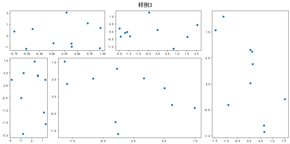
fig = plt.figure(figsize=(14, 7))spec = fig.add_gridspec(nrows=2, ncols=6, width_ratios=[2,2.5,3,1,1.5,2], height_ratios=[1,2])fig.suptitle('样例3', size=20)# sub1ax = fig.add_subplot(spec[0, :2])ax.scatter(np.random.randn(10), np.random.randn(10))# sub2ax = fig.add_subplot(spec[0, 2:4])ax.scatter(np.random.randn(10), np.random.randn(10))# sub3ax = fig.add_subplot(spec[:, 4:6])ax.scatter(np.random.randn(10), np.random.randn(10))# sub4ax = fig.add_subplot(spec[1, 0])ax.scatter(np.random.randn(10), np.random.randn(10))# sub5ax = fig.add_subplot(spec[1, 1:4])ax.scatter(np.random.randn(10), np.random.randn(10))fig.tight_layout()
二、子图上的方法
在 ax 对象上定义了和 plt 类似的图形绘制函数,常用的有: plot, hist, scatter, bar, barh, pie
fig, ax = plt.subplots(figsize=(4,3))
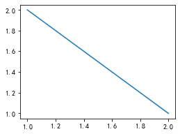
ax.plot([1,2],[2,1])
fig,ax = plt.subplots(figsize=(6,4))
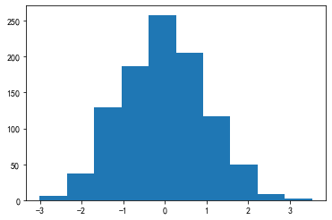
ax.hist(np.random.randn(1000))
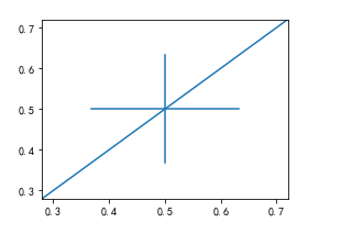
常用直线的画法为: axhline, axvline, axline (水平、垂直、任意方向)
fig, ax = plt.subplots(figsize=(4,3))
ax.axhline(0.5,0.2,0.8)
ax.axvline(0.5,0.2,0.8)
ax.axline([0.3,0.3],[0.7,0.7])   这个要3.3版本以上的,不然会报错。
使用 grid 可以加灰色网格
fig, ax = plt.subplots(figsize=(4,3))
ax.grid(True)
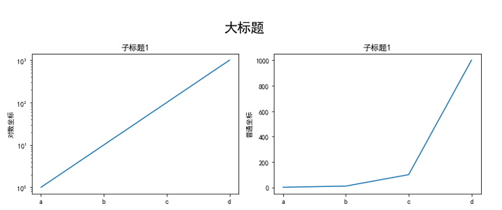
使用 set_xscale, set_title, set_xlabel 分别可以设置坐标轴的规度(指对数坐标等)、标题、轴名.
fig, axs = plt.subplots(1, 2, figsize=(10, 4))   #设置画布样式
fig.suptitle('大标题', size=20)
for j in range(2):
    axs[j].plot(list('abcd'), [10**i for i in range(4)])
    if j==0:
        axs[j].set_yscale('log')
        axs[j].set_title('子标题1')
        axs[j].set_ylabel('对数坐标')
    else:
        axs[j].set_title('子标题1')
        axs[j].set_ylabel('普通坐标')
fig.tight_layout()
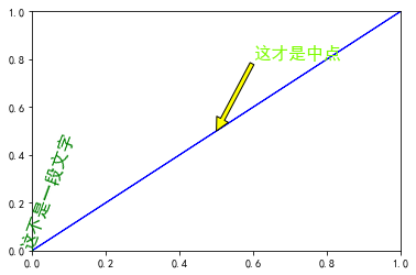
与一般的 plt 方法类似, legend, annotate, arrow, text 对象也可以进行相应的绘制
fig, ax = plt.subplots()
ax.arrow(0, 0, 1, 1, head_width=0.03, head_length=0.05, facecolor='LawnGreen', edgecolor='blue')
ax.text(x=0, y=0,s='这不是一段文字', fontsize=16, rotation=70, rotation_mode='anchor', color='green')
ax.annotate('这才是中点', xy=(0.5, 0.5), xytext=(0.6, 0.8), color='LawnGreen', arrowprops=dict(facecolor='yellow', edgecolor='black'), fontsize=16)
fig, ax = plt.subplots()
ax.plot([1,2],[2,1],label="line1")
ax.plot([1,1],[1,2],label="line2",color='g')
ax.legend(loc=1)
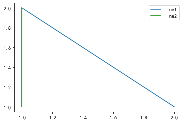
其中,图例的 loc 参数如下:
| string | code |
|---|---|
| best | 0 |
| upper right | 1 |
| upper left | 2 |
| lower left | 3 |
| lower right | 4 |
| right | 5 |
| center left | 6 |
| center right | 7 |
| lower center | 8 |
| upper center | 9 |
| center | 10 |
作业
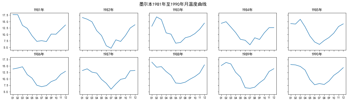
1. 墨尔本1981年至1990年的每月温度情况
import matplotlib.pyplot as plt
import numpy as np
import pandas as pd

data = pd.read_csv(r'C:\Users\Desktop\layout_ex1.csv')
data.loc[:,'year'] = data['Time'].str.split('-',expand=True)[0]
data.loc[:,'month'] = data['Time'].str.split('-',expand=True)[1]
year = data['year'].drop_duplicates().tolist()


fig,axs = plt.subplots(2,5,figsize=(20,5),sharex=True,sharey=True)
fig.suptitle('墨尔本1981年至1990年月温度曲线',size=15)
axs = axs.ravel()
index = 0
for i in year:
    data_ = data.loc[data['year'] == i]
    x = data_['month'].tolist()
    y = data_['Temperature'].tolist()
    axs[index].plot(x,y)
    axs[index].set_title('{i}年'.format(i=i))
    index += 1
fig.tight_layout()
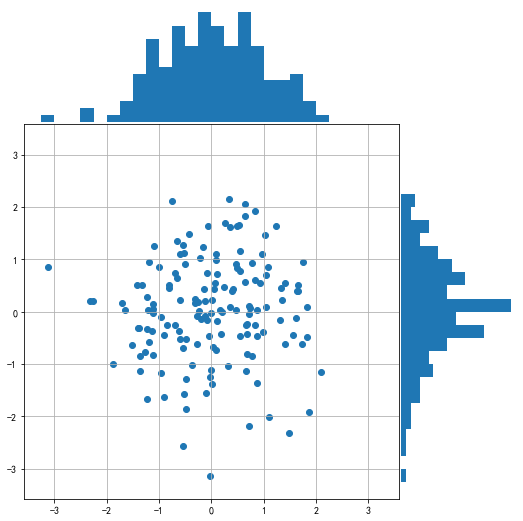
2. 画出数据的散点图和边际分布
- 用
np.random.randn(2, 150)生成一组二维数据,使用两种非均匀子图的分割方法,做出该数据对应的散点图和边际分布图 ```python import numpy as np import matplotlib.pyplot as plt
np.random.seed(19680801)
随机生成一组二位数据
x,y=np.random.randn(2,150)
def scatter_hist(x, y, ax, ax_histx, ax_histy):
# no labels
ax_histx.tick_params(axis="x", labelbottom=False)
ax_histy.tick_params(axis="y", labelleft=False)
ax.grid(True)
# the scatter plot:
ax.scatter(x, y)

# now determine nice limits by hand:
binwidth = 0.25
xymax = max(np.max(np.abs(x)), np.max(np.abs(y)))
lim = (int(xymax/binwidth) + 1) * binwidth

bins = np.arange(-lim, lim + binwidth, binwidth)
ax_histx.hist(x, bins=bins)
ax_histx.axis('off')
ax_histy.hist(y, bins=bins, orientation='horizontal')
ax_histy.axis('off')
definitions for the axes
left, width = 0.1, 0.65 bottom, height = 0.1, 0.65 spacing = 0.005
rect_scatter = [left, bottom, width, height] rect_histx = [left, bottom + height + spacing, width, 0.2] rect_histy = [left + width + spacing, bottom, 0.2, height]
start with a square Figure
fig = plt.figure(figsize=(8, 8))
ax = fig.add_axes(rect_scatter) ax_histx = fig.add_axes(rect_histx, sharex=ax) ax_histy = fig.add_axes(rect_histy, sharey=ax)
use the previously defined function
scatter_hist(x, y, ax, ax_histx, ax_histy) ```
拿轮子直接跑了

若有收获,就点个赞吧
0 人点赞
