引入
{"usingComponents": {"x-button": "waft-ui/assembly/button/button"}}
代码示例
<x-button text="按钮" click="clickButton"></x-button><x-button type="tip" text="按钮"></x-button><x-button type="primary" text="按钮"></x-button><x-button type="secondary" text="按钮"></x-button>
组件演示
axml
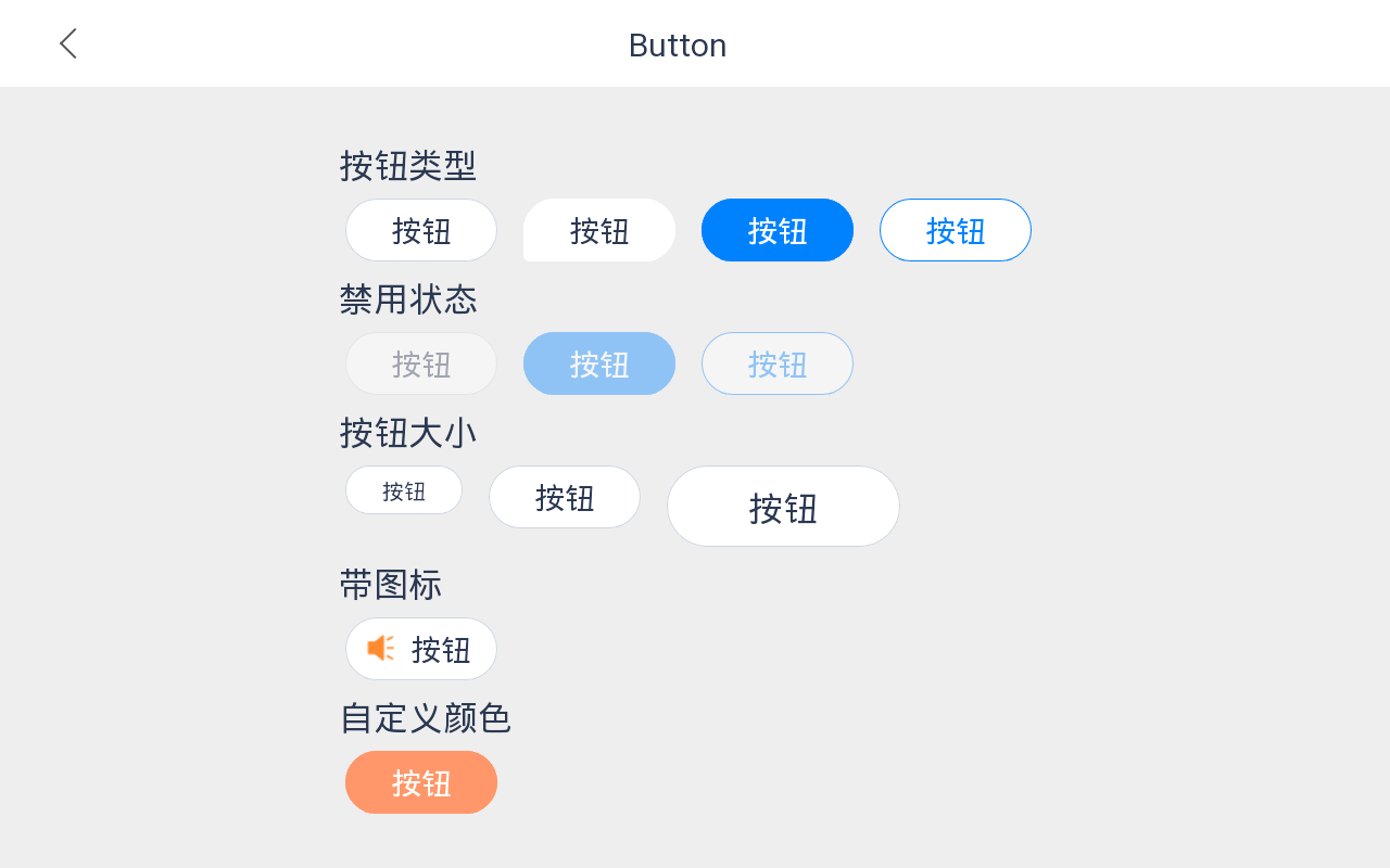
<view class="wrapper"><x-nav-bar showArrow="{{true}}" title="Button"></x-nav-bar><view style="flex: 1; padding-top: 30rpx; display: flex;flex-direction: column;"><view class="title">按钮类型</view><view class="flex"><x-button text="按钮"></x-button><view class="dot"></view><x-button type="tip" text="按钮"></x-button><view class="dot"></view><x-button type="primary" text="按钮"></x-button><view class="dot"></view><x-button type="secondary" text="按钮"></x-button><view class="dot"></view></view><view class="title">禁用状态</view><view class="flex"><x-button text="按钮" disabled="{{true}}"></x-button><view class="dot"></view><x-button type="primary" text="按钮" disabled="{{true}}"></x-button><view class="dot"></view><x-button type="secondary" text="按钮" disabled="{{true}}"></x-button><view class="dot"></view></view><view class="title">按钮大小</view><view class="flex"><x-button text="按钮" size="small"></x-button><view class="dot"></view><x-button text="按钮"></x-button><view class="dot"></view><x-button text="按钮" size="large"></x-button><view class="dot"></view></view><view class="title">带图标</view><view class="flex"><x-button text="按钮" iconURL="https://gw.alicdn.com/imgextra/i1/O1CN0192HvCz1vntR4jzNJ9_!!6000000006218-2-tps-20-20.png"></x-button><view class="dot"></view></view><view class="title">自定义颜色</view><view class="flex"><x-button text="按钮" bgColor="#ff976a" borderColor="#ff976a" textColor="#ffffff"></x-button><view class="dot"></view></view></view></view>
css
.wrapper {
    max-width: 100%;
    height: 100%;
    display: flex;
    flex-direction: column;
    justify-content: flex-start;
    align-items: center;
    background-color: #eeeeee;
}
.title {
    color: #2b3852;
    font-size: 26rpx;
    margin: 5rpx 0;
}
.flex {
    display: flex;
    flex-direction: row;
    justify-content: flex-start;
    align-content: flex-start;
    flex-wrap: wrap;
}
.dot {
    width: 10rpx;
}
API
props | 参数 | 说明 | 类型 | 默认值 | | —- | —- | —- | —- | | text | 按钮文字内容 | string | | | size | 按钮大小,可选值为medium(112x44),small(86x36),large(172x60) | string | medium | | type | 按钮类型,可选值为primary,secondary,normal,tip | string | normal | | width | 自定义按钮宽度 | string | | | height | 自定义按钮高度 | string | | | disabled | 是否禁用按钮 | boolean | false | | bgColor | 自定义按钮背景色 | string | #ffffff | | borderColor | 自定义边框颜色 | string | | | textColor | 按钮文字颜色 | string | |
Events | 事件名 | 说明 | 参数 | | —- | —- | —- | | click | 按钮点击事件,在按钮非禁用状态触发 | |

若有收获,就点个赞吧
0 人点赞
