引入
{"usingComponents": {"x-cell-group": "waft-ui/assembly/cell-group/cell-group","x-cell": "waft-ui/assembly/cell/cell"}}
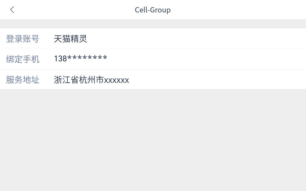
代码示例
<view class="wrapper"><x-nav-bar showArrow="{{true}}" title="Cell-Group"></x-nav-bar><view style="height: 30rpx"></view><x-cell-group><view><x-cell title="登录账号" value="天猫精灵" size="small" align="left" labelWidth="160" border="{{false}}" titleColor="#7282A3"></x-cell><x-cell title="绑定手机" value="138********" size="small" align="left" labelWidth="160" border="{{false}}" titleColor="#7282A3"></x-cell><x-cell title="服务地址" value="浙江省杭州市xxxxxx" size="small" align="left" labelWidth="160" border="{{false}}" titleColor="#7282A3"></x-cell></view></x-cell-group></view>
效果展示
API
- props
| 参数 | 说明 | 类型 | 默认值 |
| —- | —- | —- | —- |
| title | 分组标题 | string |
| | border | 是否显示外边框 | boolean | true | | labelWidth | label的宽度 | number |
| | size | 统一设置 size | string | normal | | align | 统一设置 align | string | right | | center | 统一设置 center | boolean | true | | titleFontSize | title 文字的大小 | number | 38 | | titleColor | title 文字的颜色 | string | |

若有收获,就点个赞吧
0 人点赞
