引入
{"usingComponents": {"x-slider":"waft-ui/assembly/slider/slider"}}
代码示例
<x-slider width="{{ 100 }}" value="{{ 30 }}"></x-slider>
效果展示
组件样式
axml
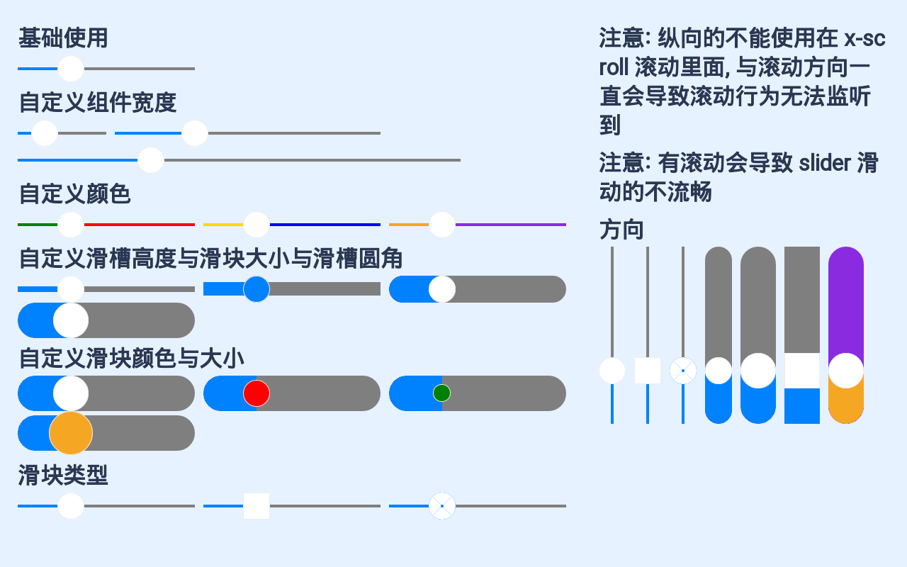
<view class="slider"><x-nav-bar showArrow="{{true}}" title="测试Slider"></x-nav-bar><view class="page"><view class="left"><x-scroll><view><view class="title">基础使用</view><x-slider value="{{ 30 }}"></x-slider><view class="title">自定义组件宽度</view><view class="flex"><x-slider width="{{ 100 }}" value="{{ 30 }}"></x-slider><view class="dot"></view><x-slider width="{{ 300 }}" value="{{ 30 }}"></x-slider><view class="dot"></view><x-slider width="{{ 500 }}" value="{{ 30 }}"></x-slider></view><view class="title">自定义颜色</view><view class="flex"><x-slider value="{{ 30 }}" activeColor="green" inactiveColor="red"></x-slider><view class="dot"></view><x-slider value="{{ 30 }}" activeColor="gold" inactiveColor="blue"></x-slider><view class="dot"></view><x-slider value="{{ 30 }}" activeColor="#F5A623" inactiveColor="blueviolet"></x-slider></view><view class="title">自定义滑槽高度与滑块大小与滑槽圆角</view><view class="flex"><x-slider value="{{ 30 }}" grooveWidth="{{ 6 }}"></x-slider><view class="dot"></view><x-slider value="{{ 30 }}" barColor="#0082ff" grooveWidth="{{ 15 }}"></x-slider><view class="dot"></view><x-slider value="{{ 30 }}" grooveWidth="{{ 30 }}" grooveRadius="{{ 15 }}"></x-slider><view class="dot"></view><x-slider value="{{ 30 }}" grooveWidth="{{ 40 }}" barRadius="{{ 20 }}" grooveRadius="{{ 20 }}"></x-slider><view class="dot"></view></view><view class="title">自定义滑块颜色与大小</view><view class="flex"><x-slider value="{{ 30 }}" grooveWidth="{{ 40 }}" barRadius="{{ 20 }}" grooveRadius="{{ 20 }}"></x-slider><view class="dot"></view><x-slider value="{{ 30 }}" barColor="red" grooveWidth="{{ 40 }}" barRadius="{{ 15 }}" grooveRadius="{{ 20 }}"></x-slider><view class="dot"></view><x-slider value="{{ 30 }}" barColor="green" grooveWidth="{{ 40 }}" barRadius="{{ 10 }}" grooveRadius="{{ 20 }}"></x-slider><view class="dot"></view><x-slider value="{{ 30 }}" barColor="#F5A623" grooveWidth="{{ 40 }}" barRadius="{{ 25 }}" grooveRadius="{{ 20 }}"></x-slider><view class="dot"></view></view><view class="title">滑块类型</view><view class="flex"><x-slider barType="circle" value="{{ 30 }}"></x-slider><view class="dot"></view><x-slider barType="block" value="{{ 30 }}"></x-slider><view class="dot"></view><x-slider barType="dount" value="{{ 30 }}"></x-slider></view></view></x-scroll></view><view class="right"><view class="title">注意: 纵向的不能使用在 x-scroll 滚动里面, 与滚动方向一直会导致滚动行为无法监听到</view><view class="title">注意: 有滚动会导致 slider 滑动的不流畅</view><view class="title">方向</view><view class="flex"><x-slider direction="column" barType="circle" value="{{ 30 }}"></x-slider><view class="dot"></view><x-slider direction="column" barType="block" value="{{ 30 }}"></x-slider><view class="dot"></view><x-slider direction="column" barType="dount" value="{{ 30 }}"></x-slider><view class="dot"></view><x-slider direction="column" value="{{ 30 }}" grooveWidth="{{ 30 }}" grooveRadius="{{ 15 }}"></x-slider><view class="dot"></view><x-slider direction="column" value="{{ 30 }}" grooveWidth="{{ 40 }}" barRadius="{{ 20 }}" grooveRadius="{{ 20 }}"></x-slider><view class="dot"></view><x-slider direction="column" barType="block" value="{{ 30 }}" grooveWidth="{{ 40 }}" barRadius="{{ 20 }}" grooveRadius="{{ 0 }}"></x-slider><view class="dot"></view><x-slider direction="column" value="{{ 30 }}" grooveWidth="{{ 40 }}" barRadius="{{ 20 }}" grooveRadius="{{ 20 }}" activeColor="#F5A623" inactiveColor="blueviolet"></x-slider><view class="dot"></view></view></view></view></view>
css
.slider{
    width: 100vw;
    height: 100vh;
    background-color: #E6F2FF;
}
.page {
    width: 100%;
    padding: 20rpx;
    display: flex;
    flex-direction: row;
    justify-content: flex-start;
    align-items: flex-start;
}
.left {
    flex: 2;
    height: 100%;
}
.right {
    flex: 1;
    height: 100%;
}
.title {
    color: #2b3852;
    font-size: 26rpx;
    font-weight: bold;
    margin: 5rpx 0;
}
.flex {
    display: flex;
    flex-direction: row;
    justify-content: flex-start;
    align-content: flex-start;
    flex-wrap: wrap;
}
.dot {
    width: 10rpx;
}
.radius {
    height: 40rpx;
    border-radius: 20rpx;
    overflow: hidden;
}
json
{
  "usingComponents": {
    "x-slider": "../assembly/slider/slider",
    "x-scroll": "../assembly/scroll/scroll"
  }
}
API
props | 参数 | 说明 | 类型 | 默认值 | | —- | —- | —- | —- | | step | 步进值 | number | 1 | | min | 最小值 | number | 0 | | max | 最大值 | number | 100 | | width | 组件的宽度 | number | 200 | | value | 组件的值 | number | 0 | | grooveWidth | slider 滑动槽的宽度 | number | 3 | | grooveRadius | slider 滑动槽的 border-radius | number | 0 | | barRadius | 按钮半径 | number | 15 | | barColor | 按钮颜色 | string | #FFF | | barBorderColor | 按钮 border 颜色 | string | #EEE | | barType | 按钮类型, circle[圆] | block[方块] | dount[同心圆环] | string | circle | | direction | slider 方向, row[横向] | column [纵向] | string | row | | activeColor | 选择部分的值的槽颜色 | string | #0082ff | | inactiveColor | 未选择部分的槽颜色 | string | #807F7F |
Events | 事件名 | 说明 | 参数 | | —- | —- | —- | | change | (value: number) => {} 值改变之后的回调 |
| | dragStart | (dataset: JSONObject) => {} 拖拽开始的回调 | | | dragEnd | (dataset: JSONObject) => {} 拖拽结束的回调 | |

若有收获,就点个赞吧
0 人点赞
