引入
{"usingComponents": {"x-nav-bar":"waft-ui/assembly/nav-bar/nav-bar"}}
代码示例
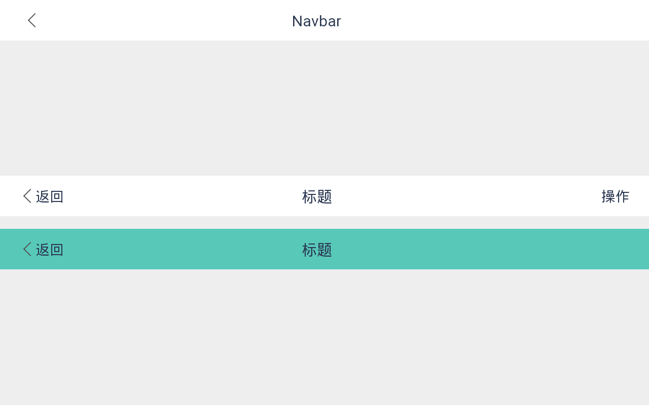
<view class="wrapper"><x-nav-bar showArrow="{{true}}" title="Navbar"></x-nav-bar><view style="height: 30rpx"></view><x-nav-bar showArrow="{{true}}" leftText="返回" rightText="操作" title="标题"></x-nav-bar><view style="height:20rpx"></view><x-nav-bar showArrow="{{true}}" leftText="返回" bgColor="#58C9B9" title="标题"></x-nav-bar></view>
组件样式
CSS
.wrapper {
    max-width: 100%;
    height: 100%;
    display: flex;
    flex-direction: column;
    justify-content: flex-start;
    align-items: center;
    background-color: #eeeeee;
}
效果展示
API
props | 参数 | 说明 | 类型 | 默认值 | | —- | —- | —- | —- | | title | 标题 | string |
| | showArrow | 是否显示左侧箭头 | boolean | false | | leftText | 左侧文字 | string |
| | rightText | 右侧文字 | string |
| | bgColor | 导航栏背景色 | string | #fff | | fixed | 是否固定在顶部(为true时自动占位) | boolean | false | | borderBottom | 是否显示下边框 | boolean | true |Events | 事件名 | 说明 | 参数 | | —- | —- | —- | | onTap | 左侧箭头/文字点击事件(
若无onTap事件,点击箭头返回上一页或退出应用) |
|slot | 名称 | 说明 | | —- | —- | | left | 左侧插槽 | | title | 题目插槽 | | right | 右侧插槽,leftText优先级高 |

若有收获,就点个赞吧
0 人点赞
