引入
{"usingComponents": {"x-time-picker": "waft-ui/assembly/time-picker/time-picker"}}
代码示例
<x-button text="显示时间选择器" onTap="clickTimeButton" type="secondary"></x-button><x-time-pickershow="{{ showTimePicker }}"onConfirm="onConfirm"onCancel="onCancel"onChange="handleChange"></x-time-picker>
{"state":{"showTimePicker": false,"timePickerData": [{"options": ["上午", "下午"],"index": 0},{"options": ["1", "2", "3", "4", "5", "6", "7", "8"],"index": 0},{"options": ["1", "2", "3", "4", "5", "6", "7", "8"],"index": 4}]}}
import { Event, Page, Props, console } from "waft";import { JSON, JSONObject } from "waft-json";export class TestPicker extends Page {constructor(props: Props) {super(props);}onConfirm(e: Event): void{console.log("===test-picker的onConfirm事件===");this.setState(JSON.parseObject(`{"showTimePicker":false}`));}onCancel(e: Event): void{console.log("===test-picker的onCancel事件===");this.setState(JSON.parseObject(`{"showTimePicker":false}`));}handleChange(e: Event): void{console.log("===test-picker的handleChange事件===");console.log(e.toString());}clickTimeButton(e: Event): void{this.setState(JSON.parseObject(`{"showTimePicker":true}`));}}
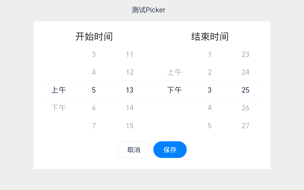
效果展示
API
props | 参数 | 说明 | 类型 | 默认值 | | —- | —- | —- | —- | | show | 是否显示选择器 | boolean | false | | minMinute | 最小可选分钟 | number | 1 | | maxMinute | 最大可选分钟 | number | 60 | | minHour | 最小可选小时 | number | 1 | | maxHour | 最大可选小时 | number | 12 |
Event | 事件名 | 说明 | 返回值 | | —- | —- | —- | | clickConfirm | 点击确定按钮触发 | 当前选中数据 | | clickCancel | 点击取消按钮触发 | 当前选中数据 | | change | 数据发生改变时触发 | 发生改变的列选中的数据 |

若有收获,就点个赞吧
0 人点赞
