基本使用
- rem(单位),等于html 标签的font-size大小
- 媒体查询动态计算html根标签font-size大小
媒体查询设置不同宽度下的字体大小
@media screen and (min-width:320px){html{font-size: 50px;}}@media screen and (min-width:620px){html{font-size: 100px;}}div{width:1rem;}
px->rem
1.less计算rem

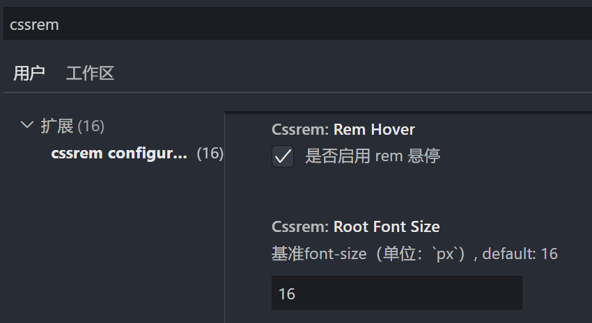
2.工具cssrem

该工具默认font-size:16px,需要根据设计稿修改,例如750px设计稿 修改为50,则1rem=50px
3.postcss-pxtorem - 自动转换
https://github.com/cuth/postcss-pxtoremnpm install postcss postcss-pxtorem --save-dev
webpack.config.js react修改如下 vue查看官网https://github.com/cuth/postcss-pxtorem 搜索 postcss-loader ,添加:
const loaders = [...,{// Options for PostCSS as we reference these options twice// Adds vendor prefixing based on your specified browser support in// package.jsonloader: require.resolve('postcss-loader'),options: {postcssOptions: {// Necessary for external CSS imports to work// https://github.com/facebook/create-react-app/issues/2677ident: 'postcss',config: false,plugins: !useTailwind? ['postcss-flexbugs-fixes',['postcss-preset-env',{autoprefixer: {flexbox: 'no-2009',},stage: 3,},]],/* -------添加下面这一段------- */['postcss-pxtorem',{rootValue: 112.5,selectorBlackList: [],propList: ['*'],exclude: /node_modules/i}],/* -------添加上面这一段------- */// Adds PostCSS Normalize as the reset css with default options,// so that it honors browserslist config in package.json// which in turn let's users customize the target behavior as per their needs.'postcss-normalize',]: ['tailwindcss','postcss-flexbugs-fixes',['postcss-preset-env',{autoprefixer: {flexbox: 'no-2009',},stage: 3,},],/* -------添加下面这一段------- */['postcss-pxtorem',{rootValue: 112.5,selectorBlackList: [],propList: ['*'],exclude: /node_modules/i}]/* -------添加上面这一段------- */],},sourceMap: isEnvProduction ? shouldUseSourceMap : isEnvDevelopment,},...]
这里的 rootValue: 112.5 的意思就是1rem = 112.5px 这个是根据1125px设计稿来的。
rem适配方案
1.媒体查询 + rem + less(用于计算rem)

html{font-size: 50px;}@media screen and (min-width:320px){html{font-size: 21.33px;}}@media screen and (min-width:750px){html{font-size: 50px;}}//最外层容器由于划分为15份所以width: 15rem;=750px刚好以设计稿为准.content{width: 15rem;height: 1rem;background-color: aquamarine;margin: 0 auto;}
2.flexible.js + rem + postcss-pxtorem(自动转换rem)

方式一: amfe-flexible
npm i -S amfe-flexible设置html的font-sizeimport 'amfe-flexible'// //最外层容器由于划分为10份所以width: 10rem;=750px刚好以设计稿为准 .content{ width: 10rem; height: 1rem; background-color: aquamarine; margin: 0 auto; }方式二: lib-flexible
npm i -S amfe-flexible设置html的font-size- main.js引入
import 'lib-flexible/flexible.js' flexible.js 默认最小是540,找到文件进行修改为自己的
function refreshRem() {
 var width = docEl.getBoundingClientRect().width;
 // if (width / dpr > 540) {
 //     width = 540 * dpr;
 // }
 // var rem = width / 10;
 //修改为最小值400 最大值2560
 if (width / dpr < 400) {
   width = 400 * dpr;
 } else if (width / dpr > 2560) {
   width = 2560 * dpr;
 }
 //设置成24分 1920px设计稿 1rem就是80px (1920/24=80) 这样好计算
 var rem = width / 24;

 docEl.style.fontSize = rem + 'px';
 flexible.rem = win.rem = rem;
}
ipad不兼容问题
如果lib-flexible不兼容ipad则index.html 中添加,解决ipad不兼容问题
<script>
  /(iPhone|iPad|iPhone OS|Phone|iPod|iOS)/i.test(navigator.userAgent)&&(head=document.getElementsByTagName('head'),viewport=document.createElement('meta'),viewport.name='viewport',viewport.content='target-densitydpi=device-dpi, width=480px, user-scalable=no',head.length>0&&head[head.length-1].appendChild(viewport));
</script>
并将视口标签改为
<meta name="viewport" content="minimum-scale=1, initial-scale=1, width=device-width" />
npm install postcss postcss-pxtorem --save-dev自动将px转换为rem配置在上边px->rem3.自定义一 font-size + rem + postcss-pxtorem
publuc/js/rem.js
function remSize(){
  //获取屏幕宽度 兼容ie
  var deviceWidth = document.documentElement.clientWidth || window.innerWidth;
  //限制宽度(如果设计稿是750px的 则限制宽度)
  //750是iphone尺寸
  if(deviceWidth>=750){
      deviceWidth = 750
  }
  if (deviceWidth <= 320){
      deviceWidth = 320
  }
  //设置html默认字体大小
  document.documentElement.style.fontSize = (deviceWidth / 7.5) + 'px'

  document.querySelector('body').style.fontSize = 0.3 +'rem'
  // 设计稿是750px.
  // 设置1半的宽度,那么就是375px
  // 1rem == 100px的设计稿宽度
  // 表达一半的宽度就是3.75rem
}

remSize()

window.onresize = function(){
  remSize()
}
index.html
<script src="<%= BASE_URL %>js/rem.js"></script>
4.自定义二 + rem + postcss-pxtorem
设置字体&颜色&像素比
利用rem+视口释放的方式来适配移动端注意点:
- 如果在HTML文件中用到了字符串模板, 字符串模板中用到了变量, 那么html-plugin是无法处理的, 所以会报错 如果想解决这个问题, 那么我们需要再借助一个loader, html-loader (https://www.npmjs.com/)) 由于是vue-cli创建的没有webpack.config,所以新建一个vue.config配置html-loader
- 借助postcss-pxtorem(npm i -D postcss-pxtorem)实现自动将px转换成rem,即可以按照设计师给的图片编写 同时新增配置: postcss.config.js
- 在移动端开发中, 一般情况下我们不需要让字体大小随着屏幕尺寸的变化而变化(具体看css中mixin.scss - font_dpr()) 由于我们是通过视口缩放来适配移动端的, 所以我们不能直接设置字体大小, 否则字体大小就会随着屏幕尺寸的变化而变化
index.html动态定义 视口标签
<head>
    <script>
        //window.devicePixelRatio告诉浏览器应使用多少屏幕实际像素来绘制单个CSS像素 返回1|2|3|?
        let scale = 1.0 / window.devicePixelRatio;
        //设置视口标签
        let text = `<meta name="viewport" content="width=device-width, initial-scale=${scale}, maximum-scale=${scale}, minimum-scale=${scale}, user-scalable=no">`;
        document.write(text);
        //设置html标签fontSize
        document.documentElement.style.fontSize = window.innerWidth / 7.5 + "px";
        //data-dpr自定义属性像素比
        document.documentElement.setAttribute('data-dpr', parseInt(window.devicePixelRatio) + '');
        //data-theme 用于改变主题颜色
        document.documentElement.setAttribute('data-theme', 'theme');
    </script>
</head>
点图切换颜色的函数
methods:{
  //点击heander切换颜色和图片
  changeThemes(){
    this.index++;
    if(this.index >= this.themes.length) this.index=0;
    //index中setAttribute='theme'
    document.documentElement.setAttribute('data-theme',this.themes[this.index])
  }
}
scss 根据data-dpr和data-theme设置字体和颜色
@mixin font_dpr($font-size){
  font-size: $font-size;
  // 根据像素比缩放字体大小 达到视口变化而字体不变
  [data-dpr="2"] & { font-size: $font-size * 2;}
  [data-dpr="3"] & { font-size: $font-size * 3;}
}

//改变tabbar字体颜色
@mixin font_color(){
  color: $font-color-theme;
  [data-theme=theme1] & {
    color: $font-color-theme1;
  }
  [data-theme=theme2] & {
    color: $font-color-theme2;
  }
}

若有收获,就点个赞吧
0 人点赞
