css in js 与 css 虽然很像,但是因为是基于 js 的原因,还是有一些区别。以下会从开发和使用两个方便来进行比较。
开发组件库
Token 的 获取 和 派生
原来获取 token 是使用 less 变量或者 css 变量来管理,less 的动态性主要是靠编译工具来实现。和 css 靠的是浏览器的能力,但是无法派生。两者都有相应的问题。导致动态切主题一直有各种问题。
css in js 依托于 js 的动态性和灵活性,可以实现一些用css 变量很难实现的东西。
import useStyle from './style';// 与configProvide 结合实现 组件级别的样式隔离const { getPrefixCls, autoInsertSpaceInButton, direction, iconPrefixCls } =React.useContext(ConfigContext);const prefixCls = getPrefixCls('btn', customizePrefixCls);// Styleconst [wrapSSR, hashId] = useStyle(prefixCls, iconPrefixCls);// 基于 token 的 派生属性const genSharedButtonStyle = (prefixCls: string,iconPrefixCls: string,token: DerivativeToken,): CSSObject// 更方便的 hover 写法'&:hover': {display: 'inline-block',},
这样写起来会有诸多不适应,尤其是选择器方面,会让人感觉很难受需要适应一下。
选择器
css 选择器是 css 的精华,但是在 css in js 中它用起来会有点难受。以 antd 的 Button 为例。传统写法是,.ant-btn 先按照 default 按钮样式写完(这样按钮的大框就完成了)。然后再通过 css selector 减去或者改造一部分。比如 Text 和 Link 类型就需要去除边框。于是就会变成:
.ant-btn {// ...&-text,&-link {border-color: transparent;backgounrd-color: transparent;}[disabled] {// ...// 也有提上到 `text` 和 `link` 的写法,看自己组织风格是什么样子的了&.ant-btn-text,&.ant-btn-link {border-color: transparent;backgounrd-color: transparent;}}}
我们会先定义一个基本样式,然后用选择器去覆盖掉它来实现不同的样式。如果样式差不多我们可以然选择器公用一段css。看起来非常精巧。
但是在 css 中这些应该都被派生出来。
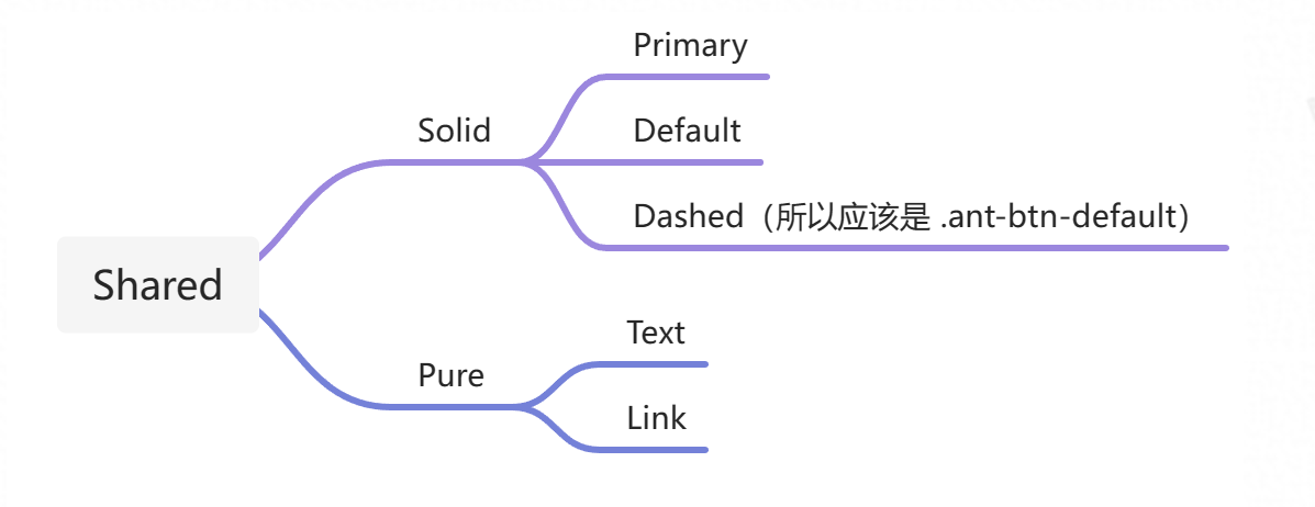
实现完看起来是这样的,我们在一个基础上面不断的添加样式,css 的熟练反而增加了,但是同一时间作用的选择器反而减少了。
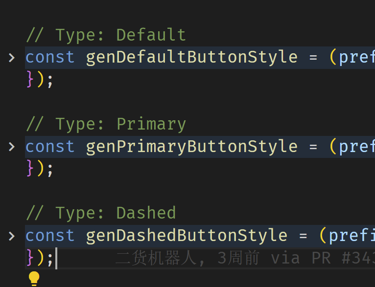
除了样式的派生还有一个子选择器的问题使用起来不同,在 css in js 中很少用到子选择器,尤其是根据不同的父样式来设置子样式。
.@{button-prefix-cls} {&-button {bgcolor:#eee}&-primariy {&-button {bgcolor:#1890FF}}}
但是在 css in js 中这个写起来其实比较麻烦,很多库对这方面都不重视的。这里我们需要换下思路,在css in js 中我们可以这么写。
const getButtonStyle=(primariy)=>{if(primariy) return { bgcolor:#1890FF}return { bgcolor:#eee }}
写多了发现这种方法更好,可以避免一些样式污染问题,同时逻辑化更清晰。
使用组件库
css in js 最大的好处就是动态能力和样式隔离,这个对于现在很难找到亮点的组件库来说让人开心,在使用的时候也会更加方便。
// 默认的修改方式<Button type="primary" style={{bgColor:"red"}}>主按钮</Button>// 新版本<ConfigProVide token={{ primaryColor:"red" }}><Button type="primary">主按钮</Button></ConfigProVide>
对于复杂的组件来说,token 会一直传递下去,我们要覆盖 tabs 的边框圆角,需要记住很多 css 的 className。一旦 antd 修改就会出问题,在css in js 中我们可以这么搞。
// 新版本<ConfigProVide token={{ borderRadius:"0" }}><Button type="primary">主按钮</Button><Tabs><Tabs.Panel tab="名字"/></Tabs</ConfigProVide>
比原来好多了,随着token越来越方便,我们可以不用写 css 了。只要写 token 或者 css in js 的变量就好了。
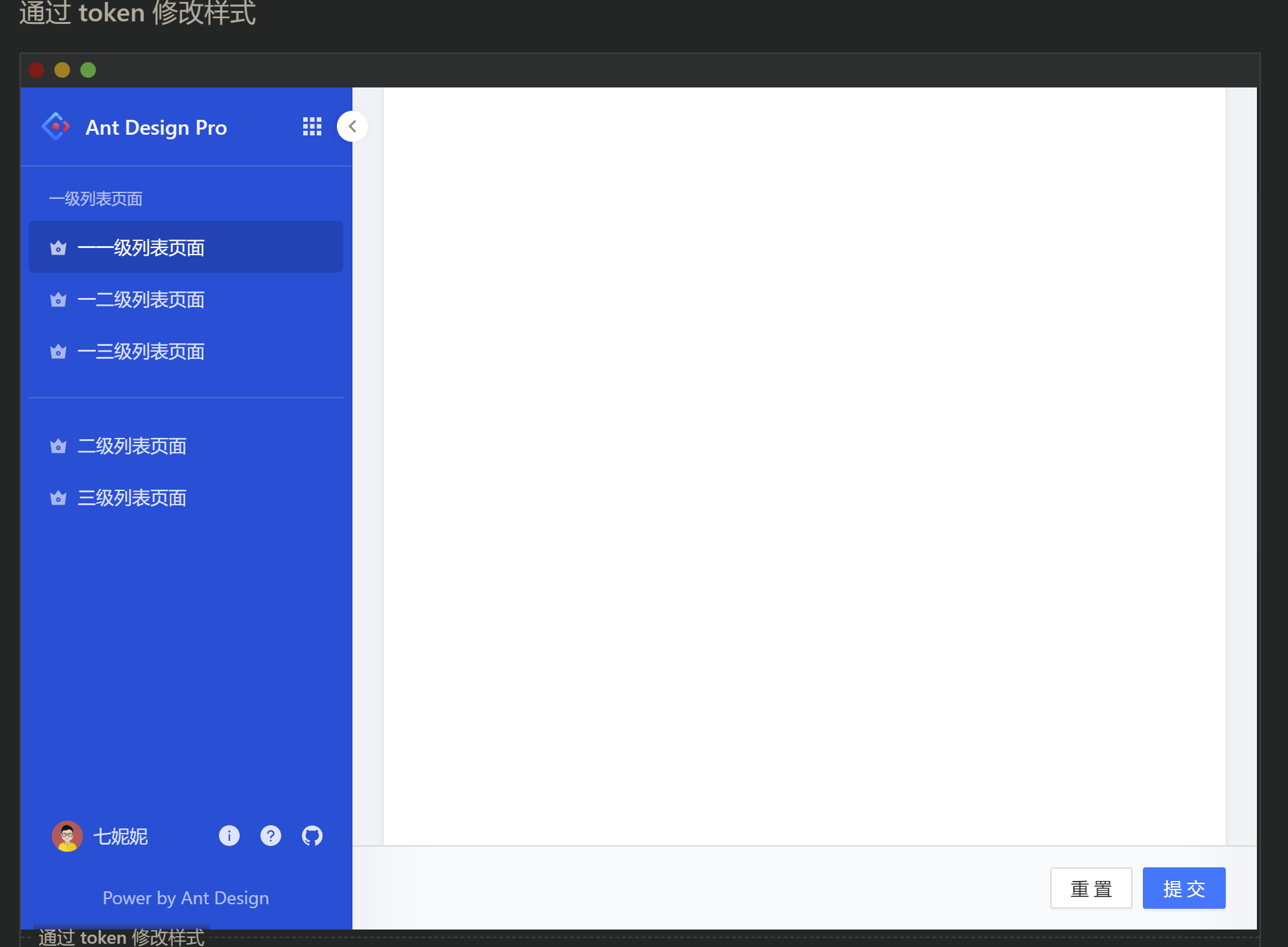
ProLayout 的示例。
token 的配置,无需考虑优先级。
token={{sider: {menuBackgroundColor: '#004FD9',menuTextColor: 'rgba(255,255,255,0.85)',menuTextColorSecondary: 'rgba(255,255,255,0.65)',menuSelectedTextColor: '#fff',menuTitleTextColor: 'rgba(255,255,255,0.95)',menuItemHoverBgColor: 'rgba(0,0,0,0.06)',menuItemCollapsedHoverBgColor: 'rgba(0,0,0,0.06)',menuItemSelectedBgColor: 'rgba(0,0,0,0.15)',menuItemCollapsedSelectedBgColor: 'rgba(0,0,0,0.15)',menuItemDividerColor: 'rgba(255,255,255,0.15)',collapsedButtonBgColor: '#fff',collapsedButtonTextColor: 'rgba(0,0,0,0.45)',collapsedButtonHoverTextColor: 'rgba(0,0,0,0.65)',menuSubArrowColor: 'rgba(255,255,255,0.15)',},appListIconTextColor: 'rgba(255,255,255,0.85)',appListIconHoverTextColor: 'rgba(255,255,255,0.95)',appListIconHoverBgColor: 'rgba(0,0,0,0.06)',}}

若有收获,就点个赞吧
0 人点赞
