有趣的css编程技巧
https://github.com/chokcoco/iCSS
css灵感:
https://chokcoco.github.io/CSS-Inspiration/#/
基础知识
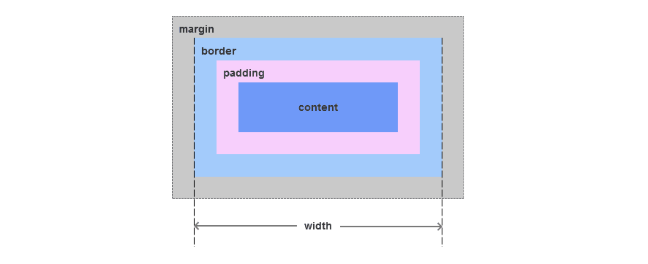
盒模型
margin border padding content
标准模型元素宽度width=content,高度计算相同
IE模型元素宽度width=content+padding,高度计算相同
通过css3新增的属性 box-sizing: content-box | border-box分别设置盒模型为标准模型(content-box)和IE模型(border-box)。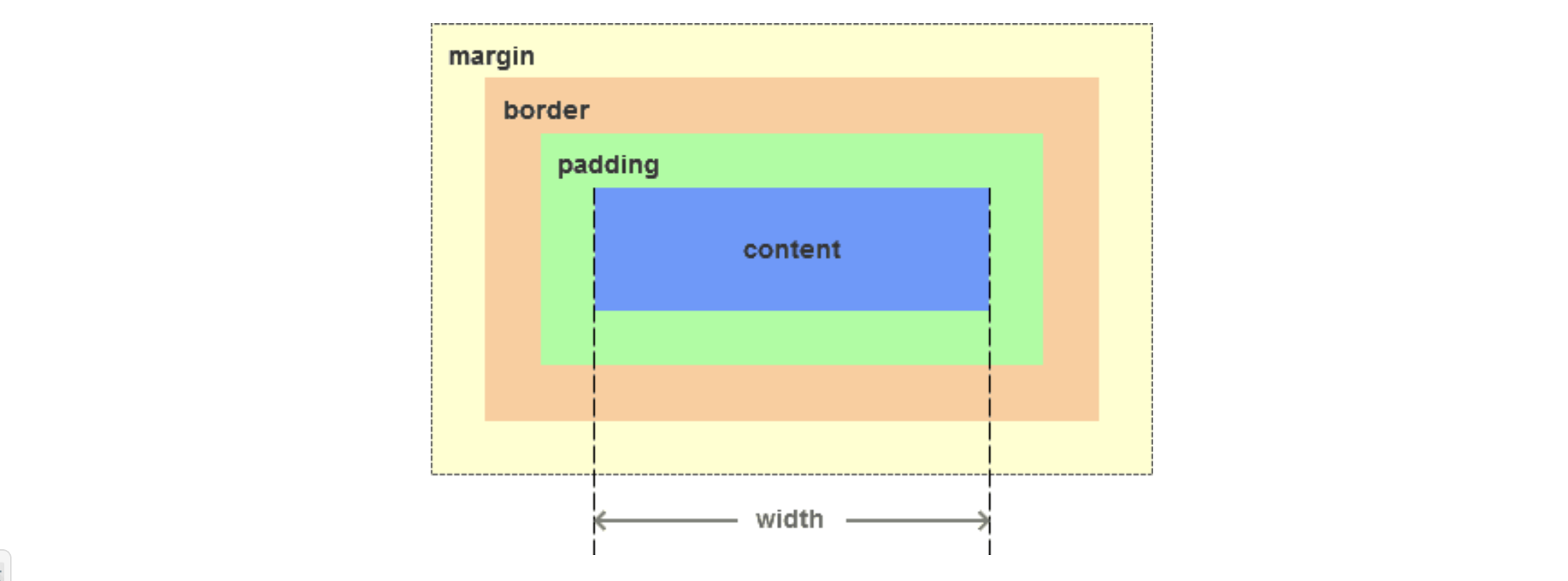
javascript如何设置获取盒模型对应的宽和高
dom.style.width/height只能取到行内样式的宽和高,style标签中和link外链的样式取不到。
dom.currentStyle.width/height取到的是最终渲染后的宽和高,只有IE支持此属性。window.getComputedStyle(dom).width/height同(2)但是多浏览器支持,IE9以上支持。dom.getBoundingClientRect().width/height也是得到渲染后的宽和高,大多浏览器支持。IE9以上支持,除此外还可以取到相对于视窗的上下左右的距离
块级内联元素
块级:
、
-
、、、、、、 、
内联:、、
、、、、
vw vh
vw、vh、vmin、vmax是一种视窗单位,也是相对单位。它相对的不是父节点或者页面的根节点。而是由视窗(Viewport)大小来决定的,单位 1,代表类似于 1%。 视窗(Viewport)是你的浏览器实际显示内容的区域—,换句话说是你的不包括工具栏和按钮的网页浏览器。
vw:视窗宽度的百分比(1vw 代表视窗的宽度为 1%)
vh:视窗高度的百分比
vmin:取当前Vw和Vh中较小的那一个值
vmax:取当前Vw和Vh中较大的那一个值
vw、vh 与 % 百分比的区别
(1)% 是相对于父元素的大小设定的比率,vw、vh 是视窗大小决定的。
(2)vw、vh 优势在于能够直接获取高度,而 % 在没有设置 body 高度的情况下,是无法正确获得可视区域的高度的
calc()
1.使用“+”、“-”、“” 和 “/”四则运算;
2.可以使用百分比、px、em、rem等单位;
3.可以混合使用各种单位进行计算;
4.表达式中有“+”和“-”时,其前后必须要有空格,如”width: calc(12%+5em)”这种没有空格的写法是错误的;
5.表达式中有“”和“/”时,其前后可以没有空格,但建议留有空格。
width: calc(100vw - (2 * 10)px);
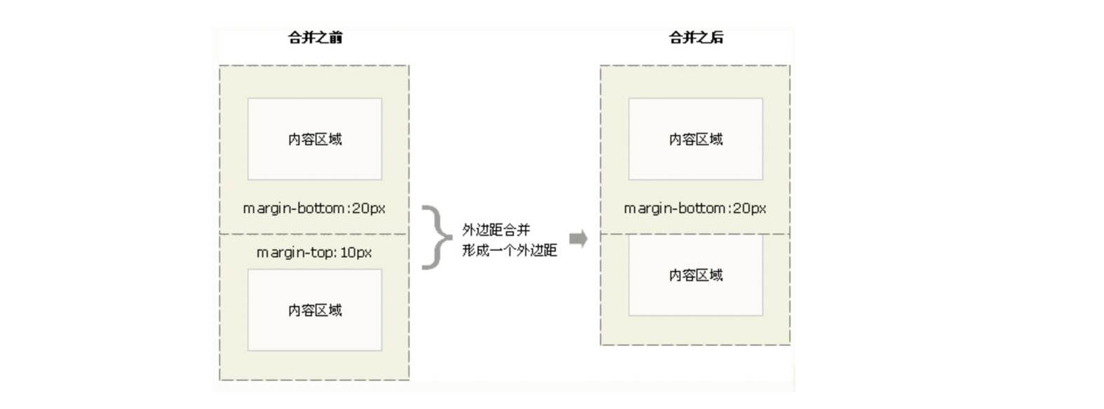
高度塌陷
当两个垂直外边距相遇时,他们将形成一个外边距,合并后的外边距高度等于两个发生合并的外边距的高度中的较大者。
注意:只有普通文档流中块框的垂直外边距才会发生外边距合并,行内框、浮动框或绝对定位之间的外边距不会合并。
垂直塌陷
嵌套塌陷 解决:父元素加border 父级元素触发BFC
BFC
BFC就是一个独立不干扰外界也不受外界干扰的盒子
满足下列条件之一就可触发BFC
【1】根元素,即HTML元素
【2】float的值不为none
【3】overflow的值不为visible
【4】display的值为inline-block、table-cell、table-caption
【5】position的值为absolute或fixed
1.自适应两栏布局。
2.可以阻止元素被浮动元素覆盖。元素添加overflow:hidden。
3.可以包含浮动元素——清除内部浮动。父级元素overflow:hidden
4.分属于不同的BFC时可以阻止margin重叠. 操作方法:给其中一个div外面包一个div,然后通过触发外面这个div的BFC,就可以阻止这两个div的margin重叠
定位
position: static| fixed |absolute | relative|sticky|
**
static: 默认的position值,无特殊定位,遵循标准文档流
relative:相对于自己原来的位置偏移,不会脱离文档流,其他元素定位不变
absolute:相对于父级(relative absolute) 脱离文档流 ,‘连根拔起’,其他元素定位变化
fixed:连根拔起 相对于视口固定
sticky: top:10px . 设定阈值10px,这个值表示当元素距离页面视口(Viewport,也就是fixed定位的参照)顶部距离大于 10px 时,元素以 relative 定位表现,而当元素距离页面视口小于 10px 时,元素表现为 fixed 定位,也就会固定在顶部。
css3新增属性
RGBA和透明度
动画系列
选择器
background-image background-origin(content-box/padding-box/border-box) background-size background-repeat
word-wrap(对长的不可分割单词换行)word-wrap:break-word
文字阴影:text-shadow: 5px 5px 5px #FF0000;(水平阴影,垂直阴影,模糊距离,阴影颜色)
font-face属性:定义自己的字体
圆角(边框半径):border-radius 属性用于创建圆角
边框图片:border-image: url(border.png) 30 30 round
盒阴影:box-shadow: 10px 10px 5px #888888
媒体查询:定义两套css,当浏览器的尺寸变化时会采用不同的属性
**
选择器
CSS3中新添加了很多选择器,解决了很多之前需要用javascript才能解决的布局问题。
element1~element2: 选择前面有element1元素的每个element2元素。
[attribute^=value]: 选择某元素attribute属性是以value开头的。
[attribute$=value]: 选择某元素attribute属性是以value结尾的。
[attribute*=value]: 选择某元素attribute属性包含value字符串的。
E:first-of-type: 选择属于其父元素的首个E元素的每个E元素。
E:last-of-type: 选择属于其父元素的最后E元素的每个E元素。
E:only-of-type: 选择属于其父元素唯一的E元素的每个E元素。
E:only-child: 选择属于其父元素的唯一子元素的每个E元素。
E:nth-child(n): 选择属于其父元素的第n个子元素的每个E元素。
E:nth-last-child(n): 选择属于其父元素的倒数第n个子元素的每个E元素。
E:nth-of-type(n): 选择属于其父元素第n个E元素的每个E元素。
E:nth-last-of-type(n): 选择属于其父元素倒数第n个E元素的每个E元素。
E:last-child: 选择属于其父元素最后一个子元素每个E元素。
:root: 选择文档的根元素。
E:empty: 选择没有子元素的每个E元素(包括文本节点)。
E:target: 选择当前活动的E元素。
E:enabled: 选择每个启用的E元素。
E:disabled: 选择每个禁用的E元素。
E:checked: 选择每个被选中的E元素。
E:not(selector): 选择非selector元素的每个元素。
E::selection: 选择被用户选取的元素部分。
动画
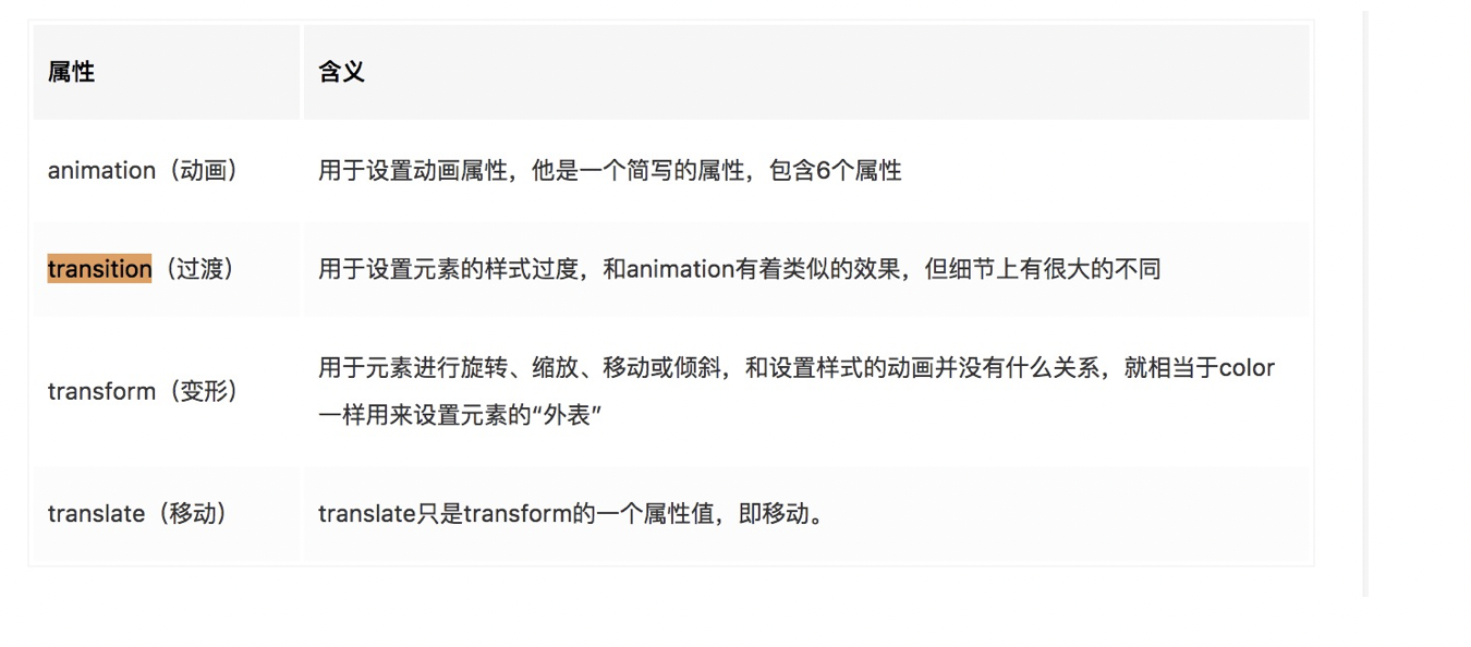
Animation,Transition,Transform和Translate
keyframes
@keyframes animationname {
keyframes-selector {css-styles;} 动画时长的百分比
}
在css3中,我们以百分比来规定改变发生的时间,或者通过关键词 “from” 和 “to”,等价于 0% 和 100%。其中,0% 是动画的开始时间,100% 动画的结束时间。
@-webkit-keyframes rotation {
from {
-webkit-transform: rotate(0deg);
}
to {
-webkit-transform: rotate(360deg);
}
}
._loading {
width: 100%;
height: 100%;
display: flex;
align-items: center;
justify-content: center;
._icon {
font-size: inherit;
color: $color_orange;
-webkit-transform: rotate(360deg);
animation: rotation 2s linear infinite;
-moz-animation: rotation 2s linear infinite;
-webkit-animation: rotation 2s linear infinite;
-o-animation: rotation 2s linear infinite;
}
}
Animation
animation: name duration timing-function delay iteration-count direction;
**注释:
- name: keyframes 的名称
- duration:完成动画所花费的时间,以秒或毫秒计。请始终规定 animation-duration 属性,否则时长为 0,就不会播放动画了。
- timing-function:动画的速度曲线。 ease ease-in ease-out linear ease-in-out
- delay:动画开始之前的延迟。
- iteration-count:动画应该播放的次数。
- direction:是否应该轮流反向播放动画。
无限旋转
@keyframes rotate{
0%{ transform: rotate(0); }
50%{ transform:rotate(200deg); }
100%{ transform: rotate(0); }
}
.rotate{
transition: 0.5s;
transform-origin: 30px 30px;
animation: rotate 10s linear infinite; /开始动画后无限循环,用来控制rotate/
}
实现loading
.loading {
width: 100px;
height: 100px;
background: #ffcc00;
border-radius: 100%;
border: 5px #851414 solid;
border-right-color: #87CEEB;
animation: loading 1s linear infinite;
}
@keyframes loading {
0% {
transform: rotate(0deg);
}
100% {
transform: rotate(360deg);
}
}
Transform:
二维
transform: matrix(1.0, 2.0, 3.0, 4.0, 5.0, 6.0);
transform: translate(12px, 50%);//设置元素在x,y轴的平移
transform: translateX(2em);
transform: translateY(3in);
transform: scale(2, 0.5);//设置元素在x y轴缩放
transform: scaleX(2);
transform: scaleY(0.5);
transform: rotate(0.5turn);//二维空间中,rotate即围绕屏幕法向量旋转,等同于 rotateZ
transform: skew(30deg, 20deg);//设置x y轴倾斜度
transform: skewX(30deg);
transform: skewY(1.07rad);
transform-origin:’top left’//默认值为(50%, 50%, 0),即默认的变换原点位于变换元素的 Z=0 的 XY 平面的中心点,取值为 (||left|center|right, ||top|center|bottom, ) 三个参数从左到右分别表示变换原点相盒模型左侧的偏移量、盒模型顶部的偏移量以及 Z轴偏移量
transform-origin是变形原点,也就是该元素围绕着那个点变形或旋转,该属性只有在设置了transform属性的时候起作用;
三维
perspective:150px;//透视点到XY 轴平面的距离
translateZ
rotateY/rotateX
Transition:可以在当元素从一种样式变换为另一种样式时为元素添加效果
Transition有如下属性:
- transition-property: 规定应用过渡的CSS属性的名称。
- transition-duration: 规定完成过渡效果需要多长时间。
- transition-delay: 规定过渡效果何时开始,默认是0。
- transition-timing-function: 规定过渡效果的时间曲线,默认是”ease”,还有linear、ease-in、ease-out、ease-in-out和cubic-bezier等过渡类型。
- transition: 简写属性,用于在一个属性中设置四个过渡属性。
伪类伪元素
https://mp.weixin.qq.com/s?__biz=MzI0MDYzOTEyOA==&mid=2247483704&idx=1&sn=ebba5365768889245ca4185b0f011ddc&chksm=e9168ccfde6105d92f9fce14ae201263758e5be70d9500fb89e9dd6c8c71b2c57cf7ae62923f&scene=38#wechat_redirect
伪元素
伪元素是对元素中的特定内容进行操作,选取诸如元素内容第一个字(母)、第一行,选取某些内容前面或后面这种普通的选择器无法完成的工作。它控制的内容实际上和元素是相同的,但是它本身只是基于元素的抽象,并不存在于文档中,所以叫伪元素
::before 在元素内容之前插入额外生成的内容
::after 在元素内容之后插入额外生成的内容
::first–letter 选取元素的首个字符
::first–line 选取元素的第一行
::selection 对用鼠标键盘等已选取的文字部分应用样式
::spelling-error
::grammar-error
::before 和 ::after
相比于其他伪元素大都是对文档中已有部分的选择,::before 和 ::after 则是向文档树中加入内容,这些内容并不存在于HTML源代码中,但确是可见的,并且可以当作元素的子对象对待(正常的样式继承等)
场景1:指示表单中的必填域
:required::after { content: ' (Required) '; color: #c00; font-size: .8em;}
场景2:清除浮动
.clearfix::after { content: " "; display: table; clear: both;}
场景3:添加装饰性样式
h3::after { display: inline-block; content: ""; position: absolute; left: 50%; top: -41px; width: 6px; height: 6px; background-color: #fb5211; border-radius: 50%; border: 2px solid #fff; box-shadow: 0 0 0 3px #fb5211; transform: translateX(-5px);}
场景4:链接tooltip
a[data-tooltip] { display: inline-block; position: relative; text-decoration: none;}a[data-tooltip]::after { content: attr(data-tooltip) "@_@"; position: absolute; bottom: 130%; left: 20%; background: #ffcb66; padding: 5px 15px; white-space: nowrap; opacity: 0; transition: all 0.5s ease;}a[data-tooltip]:hover::after{ opacity: 1;}
场景5:鼠标经过按钮时的闪光效果
.button { border-top: 1px solid #96d1f8; background: #65a9d7; background: -webkit-gradient(linear, left top, left bottom, from(#3e779d), to(#65a9d7)); padding: 5px 10px; border-radius: 8px; box-shadow: rgba(0,0,0,1) 0 1px 0; text-shadow: rgba(0,0,0,.4) 0 1px 0; color: white; font-size: 14px; text-decoration: none; vertical-align: middle; position: relative; overflow: hidden; display: inline-block;}.button::before { content: ""; width: 200%; height: 200%; position: absolute; top: -200%; left: -225%; background-image: -webkit-linear-gradient(135deg, rgba(255,255,255,0), rgba(255,255,255,0.6), rgba(255,255,255,0)); transition: all 0.5s ease-out;}.button:hover::before { top: 200%; left: 200%; }
伪类
由于元素状态是动态变化的,所以一个元素特定状态改变时,它可能得到或失去某个样式。因为功能和class有些类似,但它是基于文档之外的抽象,所以叫伪类
:target
:link
:hover
:active
:visited
:focus
:not
:lang
:enabled
:disabled
:required
:optional
:checked
:in-range
:out-of-range
:valid
:invalid
:first-child
:last-child
:only-child
:nth-child()
:nth-last-child()
:empty
:first-of-type
:last-of-type
:only-of-type
:nth-of-type()
-
flex
flex-basis:https://gedd.ski/post/the-difference-between-width-and-flex-basis/
容器属性
flex-direction:row | row-reverse | column | column-reverse; 项目排列方向
- flex-wrap:nowrap | wrap | wrap-reverse; 轴线排不开如何换行
- flex-flow:flex-direction属性和flex-wrap属性的简写形式
- justify-content:flex-start | flex-end | center | space-between | space-around;左|右|居中|两端|均分
- align-items:flex-start | flex-end | center | baseline | stretch;交叉轴如何对齐
baseline: 项目的第一行文字的基线对齐。
stretch(默认值):如果项目未设置高度或设为auto,将占满整个容器的高度。
- align-content:定义了多根轴线的对齐方式。如果项目只有一根轴线,该属性不起作用。
flex-start:与交叉轴的起点对齐。
flex-end:与交叉轴的终点对齐。
center:与交叉轴的中点对齐。
space-between``:与交叉轴两端对齐,轴线之间的间隔平均分布。
space-around``:每根轴线两侧的间隔都相等。所以,轴线之间的间隔比轴线与边框的间隔大一倍。
stretch(默认值):轴线占满整个交叉轴。
项目属性
order:定义项目的排列顺序。数值越小,排列越靠前,默认为0。flex-grow:项目的放大比例,默认为0,即如果存在剩余空间,也不放大flex-shrink:项目的缩小比例,默认为1,即如果空间不足,该项目将缩小。0不缩小,负值无效flex-basis:在分配多余空间之前,项目占据的主轴空间。默认值为auto,即项目的本来大小flex:flex-grow, flex-shrink 和 flex-basis的简写,默认值为0 1 auto。
auto (1 1 auto) 和 none (0 0 auto)
align-self:允许单个项目有与其他项目不一样的对齐方式,可覆盖align-items属性。默认值为auto,表示继承父元素的align-items属性,如果没有父元素,则等同于stretch
NOTE:
1.flex-basis
content —> width —> flex-basis (limted by max|min-width)
当项目同时定义了min(max)-width,flex-basis失效,当同时定义了flex-basis和width,依赖于flex-basis
如果容器宽度不够,item宽度会缩小以撑满容器
2.flex-grow flex-shink
flex-grow:当容器宽度足够有剩余的时候,项目按照放大比例撑满
<div class="as-flex"> <div class="item-1 pink"> <span>1 2 3 4 5 6 7 8 9</span> </div> <div class="item-1 lightblue"> <span>1 2 3 4 5 6 7 8 9</span> </div> <div class="item-1 lightgray"> <span>1 2 3 4 5 6 7 8 9</span> </div></div><style type="text/css"> *{ margin: 0; padding: 0; } .as-flex{ display: flex; } .item-1{ flex-grow: 1; } .pink{ background: pink; } .lightblue{ background: lightblue; } .lightgray{ background: lightgray }</style>页面内容其实就是三个span标签中的内容,flex-grow的逻辑是对剩余空间分成。当前的屏幕宽度为600px,三个span标签的长度分别为104px、104px、243.4px,那么页面剩余空间为(600-104-104-243.4)=148.6px,根据分成的比例1:1:1(flex-grow对应的值),可计算得到三个div标签的分得的剩余空间分别为49.533px(148.6/3)、49.533px、49.533px,加上标签本来的长度则对应的三个div的长度分别为153.533px(104+49.533)、153.533px、292.933px。页面选取对应的div,长度与计算完全吻合。同样的,如果flex-grow属性分别为1:1:2,剩余空间会按照1:1:2的比例来分成,再加上div的内容长度,就是其总长度
<div class="as-flex"> <div class="item-1 pink"> <span>1 2 3 4 5 6 7 8 9</span> </div> <div class="item-1 lightblue"> <span>1 2 3 4 5 6 7 8 9</span> </div> <div class="item-2 lightgray"> <span>1 2 3 4 5 6 7 8 9</span> </div></div><style type="text/css"> *{ margin: 0; padding: 0; } .as-flex{ display: flex; } .item-1{ flex-shrink: 1; } .item-2{ flex-shrink: 2; } .pink{ background: pink; } .lightblue{ background: lightblue; } .lightgray{ background: lightgray }</style>
三个div标签本来的宽度都为104px(span标签的宽度),as-flex对应的div的宽度为300px,很明显,空间不够了,需要大家挤一挤,怎么个挤发,就需要按照flex-shrink的约定来让出自己的部分空间。例如,三个div原来都需要占用104px的空间,总共要占用312px的空间,现在只有300px,缺少12px。按照flex-shrink的约定,三个div按照1:1:2来分配缺少的12px,三个div分别让出3px(12/(1+1+2))、3px、6px的空间,则最终三个div的实际长度分别为101px、101px、98px,这与浏览器中div的实际长度相等。
同样的,如果有一个div是固定宽度的话,三个div的宽度如何计算呢?看如下的例子:
<div class="as-flex"> <div class="item-1 pink"> <span>1 2 3 4 5 6 7 8 9</span> </div> <div class="item-2 lightblue"> <span>1 2 3 4 5 6 7 8 9</span> </div> <div class="width208 lightgray"> <span>1 2 3 4 5 6 7 8 9</span> </div></div><style type="text/css"> *{ margin: 0; padding: 0; } .as-flex{ display: flex; } .item-1{ flex-shrink: 1; } .item-2{ flex-shrink: 2; } .width208{ width: 208px; } .pink{ background: pink; } .lightblue{ background: lightblue; } .lightgray{ background: lightgray }</style>
<div class="outer"> <div class="div1"></div> <div class="div2"></div> <div class="div3"></div></div>.outer { width: 500px; display: flex; }.outer div { height: 80px; }.div1 { flex: 1 1 100px; background: red; } .div2 { flex: 1 2 200px; background: yellow; }.div3 { flex: 1 3 300px; background: green; }
500<600px(100+200+300)
先计算总权重TW = 100px 1(flex-shrink) + 200px 2(flex-shrink) + 300px *3(flex-shrink) = 1400px 也就是每个div的宽度乘以flex-shrink系数的总和。
每个div收缩的空间为:div的宽度 flex-shrink系数/ 总权重TW 需要收缩的总宽度(在我们的例子中是600px - 500px = 100px)
所以各div最后的宽度计算公式如下:
div1最后的宽度 = 100px - 1001/1400 100px = 92.86px
div2最后的宽度 = 200px - 2002/1400 100px = 171.42px
div3最后的宽度 = 300px - 3003/1400 100px = 235.72px
——————————————————————————
| | |
——————————————————————————
width:200px flex-basis:300px flex-grow:1
flex-grow:1
总宽 1000px
问:1. 每个item多宽?
200px 550px 250px
2.如果item3 flex-basis:300px,flex-shink分别是 1 2 3,总宽600px?
TW: 2001+3002+3003=1700
item1: 200-2001/1700*200
z-index
background/border < 负z-index < block块状盒子 <float < inline/inline-block <0 auto < 正z-index
元素层叠水平相当
当两个元素层叠水平相同的时候,这时候就要遵循下面两个准则:
- 后来居上原则
- 谁 z-index 大,谁在上的准则
层叠上下文
- 默认创建层叠上下文,只有 HTML 根元素,这里你可以理解为 body 标签。它属于根层叠上下文元素,不需要任何 CSS 属性来触发。
2.依赖 z-index 值创建层叠上下文的情况:
position 值为 relative/absolute/fixed(部分浏览器)
flex 项(父元素 display 为 flex|inline-flex),注意是子元素,不是父元素创建层叠上下文
这两种情况下,需要设置具体的 z-index 值,不能设置 z-index 为 auto,这也就是 z-index: auto 和 z-index: 0 的一点细微差别。
前面我们提到,设置 position: relative 的时候 z-index 的值为 auto 会生效,但是这时候并没有创建层叠上下文,当设置 z-index 不为 auto,哪怕设置 z-index: 0 也会触发元素创建层叠上下文。
3.不依赖
- 元素的透明度 opacity 小于1
- 元素的 mix-blend-mode 值不是 normal
- 元素的以下属性的值不是 none:
- transform
- filter
- perspective
- clip-path
- mask / mask-image / mask-border
- 元素的 isolution 属性值为 isolate
- 元素的 -webkit-overflow-scrolling 属性为 touch
- 元素的 will-change 属性具备会创建层叠上下文的值
比较两个 DOM 元素显示顺序
- 如果是在相同的层叠上下文,按照层叠水平的规则来显示元素
- 如果是在不同的层叠上下文中,先找到共同的祖先层叠上下文,然后比较共同层叠上下文下这个两个元素所在的局部层叠上下文的层叠水平。
页面中常见的 DOM 树大概是长这样:这里 Root、ParentX、ChildX 均为层叠上下文元素,并非一定是 ABCD 的父元素
- A 元素想跟 B 或者 ChildB 元素比较,很高兴,它们属于相同层叠上下文(ChildB)下,根据层叠水平去判断就可以了
- 如果 A 元素想跟 C 或者 ChildA 比较,那就去找它们共同的祖先层叠上下文(ParentB),找到之后,就根据祖先层叠上下文下两个元素所在的局部层叠上下文比较层叠水平(这里就是 ChildA 和 ChildB 去比较)
- 同理,如果 A 想跟 D 一决雌雄,那么就去找祖先层叠上下文(Root),然后去比较 ParentA 和 ParentB 的层叠水平即可
padding-bottom
https://juejin.im/post/5b0784566fb9a07abd0e14ae
何实现一个宽度自适应,高度为宽度的一半的矩形
**
<style> .scale { width: 100%; height: 0; padding-bottom: 50%; }</style>
这其中的关键点就是height: 0;和padding-bottom: 50%;。
我们将元素的高度由padding撑开,由于padding是根据父元素宽度计算的,所以高度也就变成了相对父元素宽度,同时要将height设置为 0,这是为了将元素高度完全交给padding负责。
最后padding-bottom的值设为width的值一半,就可以实现高度是宽度的一半且自适应啦。
.placeholder { width: 100%; border:3px solid red;}.placeholder:after { content: ''; display: block; margin-top: 50%; /* margin 百分比相对父元素宽度计算 */}
除inline-block元素间间距的N种方法
真正意义上的inline-block水平呈现的元素间,换行显示或标签空格分隔的情况下会有间距
.space a {
display: inline-block;
padding: .5em 1em;
background-color: #cad5eb;
}
letter-spacing为每个字符之间的空白距离,word-spacing为单词之间的空白距离,
.space a {
display: inline-block;
margin-right: -3px;
}
.space {
letter-spacing: -3px;
}
.space a {
letter-spacing: 0;
}
.space {
word-spacing: -6px;
}
.space a {
word-spacing: 0;
}
移动端适配
https://segmentfault.com/a/1190000008767416
viewport视口**
可见视口: 屏幕宽度 visual viewport
布局视口: DOM宽度 layout viewport
理想适口:使布局视口就是可见视口
设备宽度(visual viewport)与DOM宽度(layout viewport), scale的关系为:
(visual viewport)= (layout viewport)* scale
获取屏幕宽度(visual viewport)的尺寸:window. innerWidth/Height。
获取DOM宽度(layout viewport)的尺寸:document. documentElement. clientWidth/Height。
设置理想视口:把默认的layout viewport的宽度设为移动设备的屏幕宽度,得到理想视口(ideal viewport):
设备(物理)像素和css像素
**
物理像素又被称为设备像素,显示设备中一个最微小的物理部件。每个像素可以根据操作系统设置自己的颜色和亮度。所谓的一倍屏、二倍屏(Retina)、三倍屏,指的是设备以多少物理像素来显示一个CSS像素,也就是说,多倍屏以更多更精细的物理像素点来显示一个CSS像素点
一个CSS像素的大小是可变的,比如用后缩放页面的时候,实际上就是在缩小或放大CSS像素,而设备像素无论大小还是数量都是不变的。
设备像素比(DPR)
设备像素比(DPR) = 设备像素 / CSS像素个数(device-width)
在Retina屏的iphone上,devicePixelRatio的值为2,也就是说1个css像素相当于2个物理像素。通常所说的二倍屏(retina)的dpr是2, 三倍屏是3。
viewport中的scale和dpr是倒数关系。
获取当前设备的dpr:
- JavaScript: window.devicePixelRatio。
- CSS: -webkit-device-pixel-ratio, -webkit-min-device-pixel-ratio, -webkit-max-device-pixel-ratio。不同dpr的设备,可根据此做一些样式适配(这里只针对webkit内核的浏览器和webview)。
动态设置根font_size
根元素fontSize公式:width/fontSize = baseWidth/baseFontSize
其中,baseWidth, baseFontSize是选为基准的设备宽度及其根元素大小,width, fontSize为所求设备的宽度及其根元素大小
iPhone6为例,dpr为2,则DOM宽度为750,缩放后显示刚好为屏幕宽度375 设计稿给的也是750,点击设计稿视网膜@2x开发,
function dynamicSet() {
const width = window.innerWidth
|| document.documentElement.clientWidth
|| document.body.clientWidth || 0
let fontSize = (width * 20) / 375 设置根font-size:20px width/fontSize = baseWidth/baseFontSize
if (fontSize > 25) {
fontSize = 25
}
if (dynamicSet.cacheWidth === undefined || dynamicSet.cacheWidth !== width) {
dynamicSet.cacheWidth = width
document.documentElement.style.fontSize = ${fontSize}px
}
}
rem布局
如果根元素font-size = 20px; 1rem = 20px;
根据设备宽度动态设置根元素的font-size,以rem为单位布局
@function px2rem($size) {
$remSize: $size / 20;
@return #{$remSize}rem;
}
flex布局
媒体查询
@media all and (min-width: 321px) and (max-width: 400px){
.box{
background: red;
}
}
vm/vh:CSS单位
vw(view-width), vh(view-height) 这两个单位是CSS新增的单位,表示视区宽度/高度,视区总宽度为100vw, 总高度为100vh。
视区指浏览器内部的可视区域大小:window.innerWidth/Height
2倍图3倍图
@mixin bg-size-image($width, $height, $url) {
display: inline-block;
width: px2rem($width);
height: px2rem($height);
background: left top / 100% 100% no-repeat;
background-size: 100% 100%;
background-image: url($url + “@2x.png”);
@media (-webkit-min-device-pixel-ratio: 3), (min-device-pixel-ratio: 3) {<br /> background-image: url($url + "@3x.png")<br /> }<br />}
@mixin bg-image($url) {
background-image: url($url + “@2x.png”);
@media (-webkit-min-device-pixel-ratio: 3), (min-device-pixel-ratio: 3) {
background-image: url($url + “@3x.png”)
}
}
1px问题
real1px(color){
position: relative
&::before {
content: ‘’;
position: absolute;
border: 1px solid color;
transform-origin: 0 0;
box-sizing: border-box;
@media screen and (max-resolution: 2dppx) {
width: 200%;
height: 200%;
transform: scale(1 / 2, 1 / 2);
}
@media screen and (min-resolution: 3dppx) {
width: 300%;
height: 300%;
transform: scale(1 / 3, 1 / 3);
}
@media screen and (min-resolution: 4dppx) {
width: 400%;
height: 400%;
transform: scale(1 / 4, 1 / 4);
}
}
}
iponeX适配
移动端300ms点击延迟和点击穿透
移动端双击的设置,导致会有300ms系统判断的延时.
touch事件执行顺序 start ——move ——end
click时执行顺序 start —-end —- click
阻止默认行为在touchmove中
附:移动端常用css func
/ mixins /
@import “func.scss”;
@mixin line-1px($color) {
margin: 0;
padding: 0;
height: 1px;
width: 200%;
background-color: $color;
transform: scale(.5);
transform-origin: top left;
@media (-webkit-min-device-pixel-ratio: 2), (min-device-pixel-ratio: 2) {
width: 200%;
transform: scale(.5);
transform-origin: top left;
}
@media (-webkit-min-device-pixel-ratio: 3),
(min-device-pixel-ratio: 3) {
width: 300%;
transform: scale(.333);
transform-origin: top left;
}
}
@mixin border-top-1px($color-row-line) {
position: relative;
&:before,
&:after {
content: “”;
display: block;
position: absolute;
transform-origin: 0 0;
}
&:before {
border-top: 1px solid $color-row-line;
left: 0;
top: 0;
width: 200%;
transform: scale(.5);
transform-origin: top left;
@media (-webkit-min-device-pixel-ratio: 2), (min-device-pixel-ratio: 2) {
width: 200%;
transform: scale(.5);
transform-origin: top left;
}
@media (-webkit-min-device-pixel-ratio: 3),
(min-device-pixel-ratio: 3) {
width: 300%;
transform: scale(.333);
transform-origin: top left;
}
}
}
@mixin border-top-npx($px, $color-row-line) {
position: relative;
&:before,
&:after {
content: “”;
display: block;
position: absolute;
transform-origin: 0 0;
}
&:before {
border-top: $px solid $color-row-line;
left: 0;
top: 0;
width: 200%;
transform: scale(.5);
transform-origin: top left;
@media (-webkit-min-device-pixel-ratio: 2), (min-device-pixel-ratio: 2) {
width: 200%;
transform: scale(.5);
transform-origin: top left;
}
@media (-webkit-min-device-pixel-ratio: 3),
(min-device-pixel-ratio: 3) {
width: 300%;
transform: scale(.333);
transform-origin: top left;
}
}
}
@mixin border-bottom-1px($color-row-line) {
position: relative;
&:after {
content: “”;
display: block;
position: absolute;
transform-origin: 0 0;
}
&:after {
border-bottom: 1px solid $color-row-line;
left: 0;
bottom: 0;
width: 200%;
transform: scale(.5);
transform-origin: bottom left;
@media (-webkit-min-device-pixel-ratio: 2), (min-device-pixel-ratio: 2) {
width: 200%;
transform: scale(.5);
transform-origin: bottom left;
}
@media (-webkit-min-device-pixel-ratio: 3),
(min-device-pixel-ratio: 3) {
width: 300%;
transform: scale(.333);
transform-origin: bottom left;
}
}
}
@mixin border-right-1px($color-col-line) {
position: relative;
&:before,
&:after {
content: “”;
display: block;
position: absolute;
transform-origin: 0 0;
-webkit-transform-origin: 0 0;
}
&:after {
border-right: 1px solid $color-col-line;
top: 0;
right: 0;
transform-origin: right 0;
-webkit-transform-origin: right 0;
height: 200%;
transform: scale(.5);
@media (-webkit-min-device-pixel-ratio: 2), (min-device-pixel-ratio: 2) {
height: 200%;
transform: scale(.5);
}
@media (-webkit-min-device-pixel-ratio: 3),
(min-device-pixel-ratio: 3) {
height: 300%;
transform: scale(.3333333);
}
}
}
@mixin border-1px($color, $radius, $style) {
position: relative;
&:after {
content: “”;
pointer-events: none; // 解决iphone上的点击无效Bug
display: block;
position: absolute;
left: 0;
top: 0;
transform-origin: 0 0;
border: 1px $style $color;
border-radius: $radius;
box-sizing: border-box;
width: 100%;
height: 100%;
@media (-webkit-min-device-pixel-ratio: 2), (min-device-pixel-ratio: 2) {
width: 200%;
height: 200%;
line-height: 300%;
border-radius: $radius * 2;
transform: scale(.5);
transform-origin: top left;
}
@media (-webkit-min-device-pixel-ratio: 3),
(min-device-pixel-ratio: 3) {
width: 300%;
height: 300%;
line-height: 400%;
border-radius: $radius * 3;
transform: scale(.3333333);
transform-origin: top left;
}
}
}
@mixin rounded-corner($size) {
$size1: px2rem($size);
$size2: px2rem($size 2);
$size3: px2rem($size 3);
width: $size1;
height: $size1;
border-radius: 50%;
@media (-webkit-min-device-pixel-ratio: 2), (min-device-pixel-ratio: 2) {
width: $size2;
height: $size2;
transform: scale(.5);
transform-origin: top right;
}
@media (-webkit-min-device-pixel-ratio: 3),
(min-device-pixel-ratio: 3) {
width: $size3;
height: $size3;
transform: scale(.333333333);
transform-origin: top right;
}
}
@mixin placeholder {
&.placeholder {
@content;
}
&:-moz-placeholder {
@content;
}
&::-moz-placeholder {
@content;
}
&::-webkit-input-placeholder {
@content;
}
}
@mixin bg-size-image($width, $height, $url) {
display: inline-block;
width: px2rem($width);
height: px2rem($height);
background: left top / 100% 100% no-repeat;
background-size: 100% 100%;
background-image: url($url + “@2x.png”);
@media (-webkit-min-device-pixel-ratio: 3), (min-device-pixel-ratio: 3) {
background-image: url($url + “@3x.png”)
}
}
@mixin bg-image($url) {
background-image: url($url + “@2x.png”);
@media (-webkit-min-device-pixel-ratio: 3), (min-device-pixel-ratio: 3) {
background-image: url($url + “@3x.png”)
}
}
@mixin ico($width, $height, $url) {
display: inline-block;
width: px2rem($width);
height: px2rem($height);
background: left top / 100% 100% no-repeat;
background-size: 100% 100%;
@include bg-image($url)
}
常见布局
- icon后者图片和文字垂直居中: 父元素display:inline-flex;align-items:center
100vw = 100%
1vw = 1%
750px = 100%=100vm
100px = x
x = 13.3333
100px = 13.3333vm
将根元素 设置font-size:100px
1rem = 100px = 13.33333
3.单行文本省略
overflow: hidden;
text-overflow:ellipsis;
white-space: nowrap;
多行文本省略
display: -webkit-box; 将对象作为弹性伸缩盒子模型显示 。
-webkit-box-orient: vertical; 设置或检索伸缩盒对象的子元素的排列方式 。
-webkit-line-clamp: 3; 限制在一个块元素显示的文本的行数
overflow: hidden;
p {
position:relative;
line-height:1.5em;
/ 高度为需要显示的行数行高,比如这里我们显示两行,则为3 */
height:3em;
overflow:hidden;
}
p:after {
content:”…”;
position:absolute;
bottom:0;
right:0;
padding: 0 5px;
background-color: #fff;
}
1.圣杯布局:
https://segmentfault.com/a/1190000004524159
需求
圣杯布局左中右三列布局,渲染顺序中间列书写在前保证提前渲染,左右两列定宽,中间列自适应剩余宽度。
圣杯布局与双飞翼布局的不同之处,圣杯布局的的左中右三列容器没有多余子容器存在,通过控制父元素的 padding 空出左右两列的宽度。
关键点
- 圣杯布局的关键点是通过 margin-left 与 left 属性将左右两列放置到准确的位置
- 圣杯布局的关键点父元素需要设置 padding
- 圣杯布局的关键点 margin-left 取值为百分比时,是以其父元素的宽度为基准的
//保证先渲染中间部分
.header { width: 100%; height: 30px; background: red; }
.footer { width: 100%; height: 30px; background: red; }
.content { overflow: hidden; padding: 0 100px; } //留出左右两列的宽度
.middle { position:relative; width: 100%; float: left; height: 80px; background: green; }
.left { position:relative; width: 100px; float: left; left:-100px; height: 80px; margin-left: -100%; background: yellow; }
.right { position:relative; width: 100px; float: left; right:-100px; height: 80px; margin-left: -100px; background: pink }


flex实现:
.header {
width: 100%;
height: 30px;
background: red;
}
.footer {
width: 100%;
height: 30px;
background: red;
}
.content {
display: flex;
}
.middle {
/ width: 100%; /
flex: auto 1 0; flex-grow:1; //这个比较重要,作用是让第二个块的宽度撑满剩余的空间
height: 80px;
background: green;
order: 2;
}
.left {
/ width: 100px; /
flex: 200px 0 0;
height: 80px;
order: 1;
background: yellow;
}
.right {
/ width: 100px; /
flex: 200px 0 0;
height: 80px;
background: pink;
order: 3;
}
2.双飞翼布局
需求
双飞翼布局左中右三列布局,渲染顺序中间列书写在前保证提前渲染,左右两列定宽,中间列自适应剩余宽度。
双飞翼布局与圣杯布局的不同之处,圣杯布局的的左中右三列容器,中间middle多了一个子容器存在,通过控制 middle 的子容器的 margin 或者 padding 空出左右两列的宽度。
关键点
- 双飞翼布局的关键点是通过 margin-left 属性将左右两列放置到准确的位置,通过控制 middle 的子容器的 margin 或者 padding 空出左右两列的宽度
- 双飞翼布局的关键点父元素不需要设置 padding
- 双飞翼布局的关键点 margin-left 取值为百分比时,是以其父元素的宽度为基准的
.header { width: 100%; height: 30px; background: red; }
.content { overflow: hidden; }
.footer { width: 100%; height: 30px; background: red; }
.middle { width: 100%; float: left; }
.inner-middle{ width:100%; margin: 0 100px; height: 80px; background: green; }
.left { width: 100px; float: left; height: 80px; margin-left: -100%; background: yellow; }
.right { width: 100px; float: left; height: 80px; margin-left: -100px; background: pink }
3.多列等高
- padding + margin + overflow 实现多列等高效果,兼容性好
- border实现多列等高,左边框宽度为200px,左列浮动,伪元素清除浮动
- 父元素线性渐变背景色实现多列等高(同理各种颜色障眼法)
- display:flex实现多列等高
- display:grid实现多列等高
- display:table-cell 实现多列等高
padding + margin + overflow 实现多列等高效果,兼容性好
把列的padding-bottom设为一个足够大的值,再把列的margin-bottom设一个与前面的padding-bottom的正值相抵消的负值,父容器设置超出隐藏,
h2 {
text-align: center;
line-height: 60px;
font-size: 20px;
background: #00bcd4;
color: #fff;
}
.g-container {
width: 1000px;
margin: 0 auto;
line-height: 2;
color: #fff;
}
.g-container > div {
margin-bottom: 50px;
}
.g-padmar {
position: relative;
overflow: hidden;
}
.g-padmar .g-left {
float: left;
width: 200px;
background: #4caf50;
padding-bottom:9999px;
margin-bottom:-9999px;
}
.g-padmar .g-right {
float: left;
width: 800px;
background: #99afe0;
padding-bottom: 9999px;
margin-bottom: -9999px;
}
content
content
content
content
content
一家将客户利益置于首位的经纪商,
为客户提供专业的交易工具一家将客户利益置于首位的经纪商,
为客户提供专业的交易工具一家将客户利益置于首位的经纪商,
为客户提供专业的交易工具一家将客户利益置于首位的经纪商,为客户提供专业的交易工具
一家将客户利益置于首位的经纪商,为客户提供专业的交易工具
一家将客户利益置于首位的经纪商,为客户提供专业的交易工具
一家将客户利益置于首位的经纪商
flex实现
flex中的伸缩项目默认为拉伸为父元素的高度,同样可以实现等高效果。在pc端兼容性不是很好,在ie9以及ie9以下不支持。
Article {
display: flex;
}
.Article>li {
flex: 1;
border-left: solid 5px currentColor;
border-right: solid 5px currentColor;
color: #fff;
background: #4577dc;
}
.Article>li>p {
padding: 10px;
}
使用负margin-bottom和正padding-bottom相抵消
Article {
overflow: hidden;
}
.Article>li {
float: left;
margin: 0 10px -9999px 0;
padding-bottom: 9999px;
background: #4577dc;
width: 200px;
color: #fff;
}
.Article>li>p {
padding: 10px;
}
- 、
- name: keyframes 的名称
- duration:完成动画所花费的时间,以秒或毫秒计。请始终规定 animation-duration 属性,否则时长为 0,就不会播放动画了。
- timing-function:动画的速度曲线。 ease ease-in ease-out linear ease-in-out
- delay:动画开始之前的延迟。
- iteration-count:动画应该播放的次数。
- direction:是否应该轮流反向播放动画。
- transition-property: 规定应用过渡的CSS属性的名称。
- transition-duration: 规定完成过渡效果需要多长时间。
- transition-delay: 规定过渡效果何时开始,默认是0。
- transition-timing-function: 规定过渡效果的时间曲线,默认是”ease”,还有linear、ease-in、ease-out、ease-in-out和cubic-bezier等过渡类型。
- transition: 简写属性,用于在一个属性中设置四个过渡属性。
::before在元素内容之前插入额外生成的内容::after在元素内容之后插入额外生成的内容::first–letter选取元素的首个字符::first–line选取元素的第一行::selection对用鼠标键盘等已选取的文字部分应用样式::spelling-error::grammar-error:required::after {content: ' (Required) ';color: #c00;font-size: .8em;}.clearfix::after {content: " ";display: table;clear: both;}h3::after {display: inline-block;content: "";position: absolute;left: 50%;top: -41px;width: 6px;height: 6px;background-color: #fb5211;border-radius: 50%;border: 2px solid #fff;box-shadow: 0 0 0 3px #fb5211;transform: translateX(-5px);}a[data-tooltip] {display: inline-block;position: relative;text-decoration: none;}a[data-tooltip]::after {content: attr(data-tooltip) "@_@";position: absolute;bottom: 130%;left: 20%;background: #ffcb66;padding: 5px 15px;white-space: nowrap;opacity: 0;transition: all 0.5s ease;}a[data-tooltip]:hover::after{opacity: 1;}.button {border-top: 1px solid #96d1f8;background: #65a9d7;background: -webkit-gradient(linear, left top, left bottom, from(#3e779d), to(#65a9d7));padding: 5px 10px;border-radius: 8px;box-shadow: rgba(0,0,0,1) 0 1px 0;text-shadow: rgba(0,0,0,.4) 0 1px 0;color: white;font-size: 14px;text-decoration: none;vertical-align: middle;position: relative;overflow: hidden;display: inline-block;}.button::before {content: "";width: 200%;height: 200%;position: absolute;top: -200%;left: -225%;background-image: -webkit-linear-gradient(135deg, rgba(255,255,255,0), rgba(255,255,255,0.6), rgba(255,255,255,0));transition: all 0.5s ease-out;}.button:hover::before {top: 200%;left: 200%;}:target:link:hover:active:visited:focus:not:lang:enabled:disabled:required:optional:checked:in-range:out-of-range:valid:invalid:first-child:last-child:only-child:nth-child():nth-last-child():empty:first-of-type:last-of-type:only-of-type:nth-of-type()-
flex
flex-basis:https://gedd.ski/post/the-difference-between-width-and-flex-basis/
容器属性 flex-direction:row | row-reverse | column | column-reverse; 项目排列方向
- flex-wrap:nowrap | wrap | wrap-reverse; 轴线排不开如何换行
- flex-flow:flex-direction属性和flex-wrap属性的简写形式
- justify-content:flex-start | flex-end | center | space-between | space-around;左|右|居中|两端|均分
- align-items:flex-start | flex-end | center | baseline | stretch;交叉轴如何对齐
- align-content:定义了多根轴线的对齐方式。如果项目只有一根轴线,该属性不起作用。
order:定义项目的排列顺序。数值越小,排列越靠前,默认为0。flex-grow:项目的放大比例,默认为0,即如果存在剩余空间,也不放大flex-shrink:项目的缩小比例,默认为1,即如果空间不足,该项目将缩小。0不缩小,负值无效flex-basis:在分配多余空间之前,项目占据的主轴空间。默认值为auto,即项目的本来大小flex:flex-grow, flex-shrink 和 flex-basis的简写,默认值为0 1 auto。align-self:允许单个项目有与其他项目不一样的对齐方式,可覆盖align-items属性。默认值为auto,表示继承父元素的align-items属性,如果没有父元素,则等同于stretch<div class="as-flex"><div class="item-1 pink"><span>1 2 3 4 5 6 7 8 9</span></div><div class="item-1 lightblue"><span>1 2 3 4 5 6 7 8 9</span></div><div class="item-1 lightgray"><span>1 2 3 4 5 6 7 8 9</span></div></div><style type="text/css">*{margin: 0;padding: 0;}.as-flex{display: flex;}.item-1{flex-grow: 1;}.pink{background: pink;}.lightblue{background: lightblue;}.lightgray{background: lightgray}</style>页面内容其实就是三个span标签中的内容,flex-grow的逻辑是对剩余空间分成。当前的屏幕宽度为600px,三个span标签的长度分别为104px、104px、243.4px,那么页面剩余空间为(600-104-104-243.4)=148.6px,根据分成的比例1:1:1(flex-grow对应的值),可计算得到三个div标签的分得的剩余空间分别为49.533px(148.6/3)、49.533px、49.533px,加上标签本来的长度则对应的三个div的长度分别为153.533px(104+49.533)、153.533px、292.933px。页面选取对应的div,长度与计算完全吻合。同样的,如果flex-grow属性分别为1:1:2,剩余空间会按照1:1:2的比例来分成,再加上div的内容长度,就是其总长度<div class="as-flex"><div class="item-1 pink"><span>1 2 3 4 5 6 7 8 9</span></div><div class="item-1 lightblue"><span>1 2 3 4 5 6 7 8 9</span></div><div class="item-2 lightgray"><span>1 2 3 4 5 6 7 8 9</span></div></div><style type="text/css">*{margin: 0;padding: 0;}.as-flex{display: flex;}.item-1{flex-shrink: 1;}.item-2{flex-shrink: 2;}.pink{background: pink;}.lightblue{background: lightblue;}.lightgray{background: lightgray}</style><div class="as-flex"><div class="item-1 pink"><span>1 2 3 4 5 6 7 8 9</span></div><div class="item-2 lightblue"><span>1 2 3 4 5 6 7 8 9</span></div><div class="width208 lightgray"><span>1 2 3 4 5 6 7 8 9</span></div></div><style type="text/css">*{margin: 0;padding: 0;}.as-flex{display: flex;}.item-1{flex-shrink: 1;}.item-2{flex-shrink: 2;}.width208{width: 208px;}.pink{background: pink;}.lightblue{background: lightblue;}.lightgray{background: lightgray}</style><div class="outer"><div class="div1"></div><div class="div2"></div><div class="div3"></div></div>.outer { width: 500px; display: flex; }.outer div { height: 80px; }.div1 { flex: 1 1 100px; background: red; }.div2 { flex: 1 2 200px; background: yellow; }.div3 { flex: 1 3 300px; background: green; }- 后来居上原则
- 谁 z-index 大,谁在上的准则
- 默认创建层叠上下文,只有 HTML 根元素,这里你可以理解为 body 标签。它属于根层叠上下文元素,不需要任何 CSS 属性来触发。
- 元素的透明度 opacity 小于1
- 元素的 mix-blend-mode 值不是 normal
- 元素的以下属性的值不是 none:
- transform
- filter
- perspective
- clip-path
- mask / mask-image / mask-border
- 元素的 isolution 属性值为 isolate
- 元素的 -webkit-overflow-scrolling 属性为 touch
- 元素的 will-change 属性具备会创建层叠上下文的值
- 如果是在相同的层叠上下文,按照层叠水平的规则来显示元素
- 如果是在不同的层叠上下文中,先找到共同的祖先层叠上下文,然后比较共同层叠上下文下这个两个元素所在的局部层叠上下文的层叠水平。
- A 元素想跟 B 或者 ChildB 元素比较,很高兴,它们属于相同层叠上下文(ChildB)下,根据层叠水平去判断就可以了
- 如果 A 元素想跟 C 或者 ChildA 比较,那就去找它们共同的祖先层叠上下文(ParentB),找到之后,就根据祖先层叠上下文下两个元素所在的局部层叠上下文比较层叠水平(这里就是 ChildA 和 ChildB 去比较)
- 同理,如果 A 想跟 D 一决雌雄,那么就去找祖先层叠上下文(Root),然后去比较 ParentA 和 ParentB 的层叠水平即可
<style>.scale {width: 100%;height: 0;padding-bottom: 50%;}</style>.placeholder {width: 100%;border:3px solid red;}.placeholder:after {content: '';display: block;margin-top: 50%; /* margin 百分比相对父元素宽度计算 */}- JavaScript: window.devicePixelRatio。
- CSS: -webkit-device-pixel-ratio, -webkit-min-device-pixel-ratio, -webkit-max-device-pixel-ratio。不同dpr的设备,可根据此做一些样式适配(这里只针对webkit内核的浏览器和webview)。
@media (-webkit-min-device-pixel-ratio: 3), (min-device-pixel-ratio: 3) {<br /> background-image: url($url + "@3x.png")<br /> }<br />}- icon后者图片和文字垂直居中: 父元素display:inline-flex;align-items:center
- 圣杯布局的关键点是通过 margin-left 与 left 属性将左右两列放置到准确的位置
- 圣杯布局的关键点父元素需要设置 padding
- 圣杯布局的关键点 margin-left 取值为百分比时,是以其父元素的宽度为基准的
- 双飞翼布局的关键点是通过 margin-left 属性将左右两列放置到准确的位置,通过控制 middle 的子容器的 margin 或者 padding 空出左右两列的宽度
- 双飞翼布局的关键点父元素不需要设置 padding
- 双飞翼布局的关键点 margin-left 取值为百分比时,是以其父元素的宽度为基准的
- padding + margin + overflow 实现多列等高效果,兼容性好
- border实现多列等高,左边框宽度为200px,左列浮动,伪元素清除浮动
- 父元素线性渐变背景色实现多列等高(同理各种颜色障眼法)
- display:flex实现多列等高
- display:grid实现多列等高
- display:table-cell 实现多列等高
一家将客户利益置于首位的经纪商,
为客户提供专业的交易工具一家将客户利益置于首位的经纪商,
为客户提供专业的交易工具一家将客户利益置于首位的经纪商,
为客户提供专业的交易工具一家将客户利益置于首位的经纪商,为客户提供专业的交易工具一家将客户利益置于首位的经纪商,为客户提供专业的交易工具
一家将客户利益置于首位的经纪商,为客户提供专业的交易工具
一家将客户利益置于首位的经纪商
- 、、、
、
内联:、、
、、、、vw vh
vw、vh、vmin、vmax是一种视窗单位,也是相对单位。它相对的不是父节点或者页面的根节点。而是由视窗(Viewport)大小来决定的,单位 1,代表类似于 1%。 视窗(Viewport)是你的浏览器实际显示内容的区域—,换句话说是你的不包括工具栏和按钮的网页浏览器。
vw:视窗宽度的百分比(1vw 代表视窗的宽度为 1%)
vh:视窗高度的百分比
vmin:取当前Vw和Vh中较小的那一个值
vmax:取当前Vw和Vh中较大的那一个值
vw、vh 与 % 百分比的区别
(1)% 是相对于父元素的大小设定的比率,vw、vh 是视窗大小决定的。
(2)vw、vh 优势在于能够直接获取高度,而 % 在没有设置 body 高度的情况下,是无法正确获得可视区域的高度的calc()
1.使用“+”、“-”、“” 和 “/”四则运算;
2.可以使用百分比、px、em、rem等单位;
3.可以混合使用各种单位进行计算;
4.表达式中有“+”和“-”时,其前后必须要有空格,如”width: calc(12%+5em)”这种没有空格的写法是错误的;
5.表达式中有“”和“/”时,其前后可以没有空格,但建议留有空格。width: calc(100vw - (2 * 10)px);
高度塌陷
当两个垂直外边距相遇时,他们将形成一个外边距,合并后的外边距高度等于两个发生合并的外边距的高度中的较大者。
注意:只有普通文档流中块框的垂直外边距才会发生外边距合并,行内框、浮动框或绝对定位之间的外边距不会合并。垂直塌陷
嵌套塌陷 解决:父元素加border 父级元素触发BFCBFC
BFC就是一个独立不干扰外界也不受外界干扰的盒子
满足下列条件之一就可触发BFC
【1】根元素,即HTML元素
【2】float的值不为none
【3】overflow的值不为visible
【4】display的值为inline-block、table-cell、table-caption
【5】position的值为absolute或fixed1.自适应两栏布局。
2.可以阻止元素被浮动元素覆盖。元素添加overflow:hidden。
3.可以包含浮动元素——清除内部浮动。父级元素overflow:hidden
4.分属于不同的BFC时可以阻止margin重叠. 操作方法:给其中一个div外面包一个div,然后通过触发外面这个div的BFC,就可以阻止这两个div的margin重叠定位
position: static| fixed |absolute | relative|sticky|
**
static: 默认的position值,无特殊定位,遵循标准文档流
relative:相对于自己原来的位置偏移,不会脱离文档流,其他元素定位不变
absolute:相对于父级(relative absolute) 脱离文档流 ,‘连根拔起’,其他元素定位变化
fixed:连根拔起 相对于视口固定
sticky: top:10px . 设定阈值10px,这个值表示当元素距离页面视口(Viewport,也就是fixed定位的参照)顶部距离大于 10px 时,元素以 relative 定位表现,而当元素距离页面视口小于 10px 时,元素表现为 fixed 定位,也就会固定在顶部。css3新增属性
RGBA和透明度
动画系列
选择器
background-image background-origin(content-box/padding-box/border-box) background-size background-repeat
word-wrap(对长的不可分割单词换行)word-wrap:break-word
文字阴影:text-shadow: 5px 5px 5px #FF0000;(水平阴影,垂直阴影,模糊距离,阴影颜色)
font-face属性:定义自己的字体
圆角(边框半径):border-radius 属性用于创建圆角
边框图片:border-image: url(border.png) 30 30 round
盒阴影:box-shadow: 10px 10px 5px #888888
媒体查询:定义两套css,当浏览器的尺寸变化时会采用不同的属性
**选择器
CSS3中新添加了很多选择器,解决了很多之前需要用javascript才能解决的布局问题。
element1~element2: 选择前面有element1元素的每个element2元素。
[attribute^=value]: 选择某元素attribute属性是以value开头的。
[attribute$=value]: 选择某元素attribute属性是以value结尾的。
[attribute*=value]: 选择某元素attribute属性包含value字符串的。
E:first-of-type: 选择属于其父元素的首个E元素的每个E元素。
E:last-of-type: 选择属于其父元素的最后E元素的每个E元素。
E:only-of-type: 选择属于其父元素唯一的E元素的每个E元素。
E:only-child: 选择属于其父元素的唯一子元素的每个E元素。
E:nth-child(n): 选择属于其父元素的第n个子元素的每个E元素。
E:nth-last-child(n): 选择属于其父元素的倒数第n个子元素的每个E元素。
E:nth-of-type(n): 选择属于其父元素第n个E元素的每个E元素。
E:nth-last-of-type(n): 选择属于其父元素倒数第n个E元素的每个E元素。
E:last-child: 选择属于其父元素最后一个子元素每个E元素。
:root: 选择文档的根元素。
E:empty: 选择没有子元素的每个E元素(包括文本节点)。
E:target: 选择当前活动的E元素。
E:enabled: 选择每个启用的E元素。
E:disabled: 选择每个禁用的E元素。
E:checked: 选择每个被选中的E元素。
E:not(selector): 选择非selector元素的每个元素。
E::selection: 选择被用户选取的元素部分。动画
Animation,Transition,Transform和Translate
keyframes
@keyframes animationname {
keyframes-selector {css-styles;} 动画时长的百分比
}
在css3中,我们以百分比来规定改变发生的时间,或者通过关键词 “from” 和 “to”,等价于 0% 和 100%。其中,0% 是动画的开始时间,100% 动画的结束时间。@-webkit-keyframes rotation {
from {
-webkit-transform: rotate(0deg);
}
to {
-webkit-transform: rotate(360deg);
}
}._loading {
width: 100%;
height: 100%;
display: flex;
align-items: center;
justify-content: center;
._icon {
font-size: inherit;
color: $color_orange;
-webkit-transform: rotate(360deg);
animation: rotation 2s linear infinite;
-moz-animation: rotation 2s linear infinite;
-webkit-animation: rotation 2s linear infinite;
-o-animation: rotation 2s linear infinite;
}
}Animation
animation: name duration timing-function delay iteration-count direction;**注释:
无限旋转
@keyframes rotate{
0%{ transform: rotate(0); }
50%{ transform:rotate(200deg); }
100%{ transform: rotate(0); }
}
.rotate{
transition: 0.5s;
transform-origin: 30px 30px;
animation: rotate 10s linear infinite; /开始动画后无限循环,用来控制rotate/
}
实现loading
.loading {
width: 100px;
height: 100px;
background: #ffcc00;
border-radius: 100%;
border: 5px #851414 solid;
border-right-color: #87CEEB;
animation: loading 1s linear infinite;
}@keyframes loading {
0% {
transform: rotate(0deg);
}
100% {
transform: rotate(360deg);
}
}Transform:
二维
transform: matrix(1.0, 2.0, 3.0, 4.0, 5.0, 6.0);
transform: translate(12px, 50%);//设置元素在x,y轴的平移
transform: translateX(2em);
transform: translateY(3in);transform: scale(2, 0.5);//设置元素在x y轴缩放
transform: scaleX(2);
transform: scaleY(0.5);transform: rotate(0.5turn);//二维空间中,rotate即围绕屏幕法向量旋转,等同于 rotateZ
transform: skew(30deg, 20deg);//设置x y轴倾斜度
transform: skewX(30deg);
transform: skewY(1.07rad);transform-origin:’top left’//默认值为(50%, 50%, 0),即默认的变换原点位于变换元素的 Z=0 的 XY 平面的中心点,取值为 (
| |left|center|right, | |top|center|bottom, ) 三个参数从左到右分别表示变换原点相盒模型左侧的偏移量、盒模型顶部的偏移量以及 Z轴偏移量
transform-origin是变形原点,也就是该元素围绕着那个点变形或旋转,该属性只有在设置了transform属性的时候起作用;三维
perspective:150px;//透视点到XY 轴平面的距离
translateZ
rotateY/rotateXTransition:可以在当元素从一种样式变换为另一种样式时为元素添加效果
Transition有如下属性:
伪类伪元素
https://mp.weixin.qq.com/s?__biz=MzI0MDYzOTEyOA==&mid=2247483704&idx=1&sn=ebba5365768889245ca4185b0f011ddc&chksm=e9168ccfde6105d92f9fce14ae201263758e5be70d9500fb89e9dd6c8c71b2c57cf7ae62923f&scene=38#wechat_redirect
伪元素
伪元素是对元素中的特定内容进行操作,选取诸如元素内容第一个字(母)、第一行,选取某些内容前面或后面这种普通的选择器无法完成的工作。它控制的内容实际上和元素是相同的,但是它本身只是基于元素的抽象,并不存在于文档中,所以叫伪元素
::before 和 ::after相比于其他伪元素大都是对文档中已有部分的选择,::before 和 ::after 则是向文档树中加入内容,这些内容并不存在于HTML源代码中,但确是可见的,并且可以当作元素的子对象对待(正常的样式继承等)
场景1:指示表单中的必填域
场景2:清除浮动
场景3:添加装饰性样式
场景4:链接tooltip
场景5:鼠标经过按钮时的闪光效果
伪类
由于元素状态是动态变化的,所以一个元素特定状态改变时,它可能得到或失去某个样式。因为功能和class有些类似,但它是基于文档之外的抽象,所以叫伪类
baseline: 项目的第一行文字的基线对齐。stretch(默认值):如果项目未设置高度或设为auto,将占满整个容器的高度。
flex-start:与交叉轴的起点对齐。flex-end:与交叉轴的终点对齐。center:与交叉轴的中点对齐。space-between``:与交叉轴两端对齐,轴线之间的间隔平均分布。space-around``:每根轴线两侧的间隔都相等。所以,轴线之间的间隔比轴线与边框的间隔大一倍。stretch(默认值):轴线占满整个交叉轴。项目属性
auto (1 1 auto) 和 none (0 0 auto)
NOTE:
1.flex-basis
content —> width —> flex-basis (limted by max|min-width)
当项目同时定义了min(max)-width,flex-basis失效,当同时定义了flex-basis和width,依赖于flex-basis
如果容器宽度不够,item宽度会缩小以撑满容器2.flex-grow flex-shink
flex-grow:当容器宽度足够有剩余的时候,项目按照放大比例撑满
三个
div标签本来的宽度都为104px(span标签的宽度),as-flex对应的div的宽度为300px,很明显,空间不够了,需要大家挤一挤,怎么个挤发,就需要按照flex-shrink的约定来让出自己的部分空间。例如,三个div原来都需要占用104px的空间,总共要占用312px的空间,现在只有300px,缺少12px。按照flex-shrink的约定,三个div按照1:1:2来分配缺少的12px,三个div分别让出3px(12/(1+1+2))、3px、6px的空间,则最终三个div的实际长度分别为101px、101px、98px,这与浏览器中div的实际长度相等。同样的,如果有一个
div是固定宽度的话,三个div的宽度如何计算呢?看如下的例子:
500<600px(100+200+300)
先计算总权重TW = 100px 1(flex-shrink) + 200px 2(flex-shrink) + 300px *3(flex-shrink) = 1400px 也就是每个div的宽度乘以flex-shrink系数的总和。每个div收缩的空间为:div的宽度 flex-shrink系数/ 总权重TW 需要收缩的总宽度(在我们的例子中是600px - 500px = 100px)
所以各div最后的宽度计算公式如下:div1最后的宽度 = 100px - 1001/1400 100px = 92.86px
div2最后的宽度 = 200px - 2002/1400 100px = 171.42px
div3最后的宽度 = 300px - 3003/1400 100px = 235.72px——————————————————————————
| | |
——————————————————————————
width:200px flex-basis:300px flex-grow:1
flex-grow:1总宽 1000px
问:1. 每个item多宽?
200px 550px 250px
2.如果item3 flex-basis:300px,flex-shink分别是 1 2 3,总宽600px?TW: 2001+3002+3003=1700
item1: 200-2001/1700*200
z-index
background/border < 负z-index < block块状盒子 <float < inline/inline-block <0 auto < 正z-index
元素层叠水平相当
当两个元素层叠水平相同的时候,这时候就要遵循下面两个准则:
层叠上下文
2.依赖 z-index 值创建层叠上下文的情况:
position 值为 relative/absolute/fixed(部分浏览器)
flex 项(父元素 display 为 flex|inline-flex),注意是子元素,不是父元素创建层叠上下文
这两种情况下,需要设置具体的 z-index 值,不能设置 z-index 为 auto,这也就是 z-index: auto 和 z-index: 0 的一点细微差别。
前面我们提到,设置 position: relative 的时候 z-index 的值为 auto 会生效,但是这时候并没有创建层叠上下文,当设置 z-index 不为 auto,哪怕设置 z-index: 0 也会触发元素创建层叠上下文。3.不依赖
比较两个 DOM 元素显示顺序
页面中常见的 DOM 树大概是长这样:这里 Root、ParentX、ChildX 均为层叠上下文元素,并非一定是 ABCD 的父元素
padding-bottom
https://juejin.im/post/5b0784566fb9a07abd0e14ae
何实现一个宽度自适应,高度为宽度的一半的矩形
**
这其中的关键点就是
height: 0;和padding-bottom: 50%;。
我们将元素的高度由padding撑开,由于padding是根据父元素宽度计算的,所以高度也就变成了相对父元素宽度,同时要将height设置为 0,这是为了将元素高度完全交给padding负责。
最后padding-bottom的值设为width的值一半,就可以实现高度是宽度的一半且自适应啦。
除inline-block元素间间距的N种方法
真正意义上的inline-block水平呈现的元素间,换行显示或标签空格分隔的情况下会有间距
.space a {
display: inline-block;
padding: .5em 1em;
background-color: #cad5eb;
}letter-spacing为每个字符之间的空白距离,word-spacing为单词之间的空白距离,
.space a {
display: inline-block;
margin-right: -3px;
}.space {
letter-spacing: -3px;
}
.space a {
letter-spacing: 0;
}.space {
word-spacing: -6px;
}
.space a {
word-spacing: 0;
}移动端适配
https://segmentfault.com/a/1190000008767416
viewport视口**
可见视口: 屏幕宽度 visual viewport
布局视口: DOM宽度 layout viewport
理想适口:使布局视口就是可见视口设备宽度(visual viewport)与DOM宽度(layout viewport), scale的关系为:
(visual viewport)= (layout viewport)* scale
获取屏幕宽度(visual viewport)的尺寸:window. innerWidth/Height。
获取DOM宽度(layout viewport)的尺寸:document. documentElement. clientWidth/Height。设置理想视口:把默认的layout viewport的宽度设为移动设备的屏幕宽度,得到理想视口(ideal viewport):
设备(物理)像素和css像素
**
物理像素又被称为设备像素,显示设备中一个最微小的物理部件。每个像素可以根据操作系统设置自己的颜色和亮度。所谓的一倍屏、二倍屏(Retina)、三倍屏,指的是设备以多少物理像素来显示一个CSS像素,也就是说,多倍屏以更多更精细的物理像素点来显示一个CSS像素点一个CSS像素的大小是可变的,比如用后缩放页面的时候,实际上就是在缩小或放大CSS像素,而设备像素无论大小还是数量都是不变的。
设备像素比(DPR)
设备像素比(DPR) = 设备像素 / CSS像素个数(device-width)
在Retina屏的iphone上,devicePixelRatio的值为2,也就是说1个css像素相当于2个物理像素。通常所说的二倍屏(retina)的dpr是2, 三倍屏是3。
viewport中的scale和dpr是倒数关系。
获取当前设备的dpr:
动态设置根font_size
根元素fontSize公式:width/fontSize = baseWidth/baseFontSize
其中,baseWidth, baseFontSize是选为基准的设备宽度及其根元素大小,width, fontSize为所求设备的宽度及其根元素大小
iPhone6为例,dpr为2,则DOM宽度为750,缩放后显示刚好为屏幕宽度375 设计稿给的也是750,点击设计稿视网膜@2x开发,function dynamicSet() {
const width = window.innerWidth
|| document.documentElement.clientWidth
|| document.body.clientWidth || 0let fontSize = (width * 20) / 375 设置根font-size:20px width/fontSize = baseWidth/baseFontSize
if (fontSize > 25) {
fontSize = 25
}if (dynamicSet.cacheWidth === undefined || dynamicSet.cacheWidth !== width) {
dynamicSet.cacheWidth = width
document.documentElement.style.fontSize =${fontSize}px
}
}rem布局
如果根元素font-size = 20px; 1rem = 20px;
根据设备宽度动态设置根元素的font-size,以rem为单位布局@function px2rem($size) {
$remSize: $size / 20;
@return #{$remSize}rem;
}flex布局
媒体查询
@media all and (min-width: 321px) and (max-width: 400px){ .box{ background: red; } }
vm/vh:CSS单位
vw(view-width), vh(view-height) 这两个单位是CSS新增的单位,表示视区宽度/高度,视区总宽度为100vw, 总高度为100vh。视区指浏览器内部的可视区域大小:window.innerWidth/Height
2倍图3倍图
@mixin bg-size-image($width, $height, $url) {
display: inline-block;
width: px2rem($width);
height: px2rem($height);
background: left top / 100% 100% no-repeat;
background-size: 100% 100%;
background-image: url($url + “@2x.png”);
@mixin bg-image($url) {
background-image: url($url + “@2x.png”);@media (-webkit-min-device-pixel-ratio: 3), (min-device-pixel-ratio: 3) {
background-image: url($url + “@3x.png”)
}
}1px问题
real1px(color){
position: relative
&::before {
content: ‘’;
position: absolute;
border: 1px solid color;
transform-origin: 0 0;
box-sizing: border-box;@media screen and (max-resolution: 2dppx) {
width: 200%;
height: 200%;
transform: scale(1 / 2, 1 / 2);
}@media screen and (min-resolution: 3dppx) {
width: 300%;
height: 300%;
transform: scale(1 / 3, 1 / 3);
}@media screen and (min-resolution: 4dppx) {
width: 400%;
height: 400%;
transform: scale(1 / 4, 1 / 4);
}}
}iponeX适配
移动端300ms点击延迟和点击穿透
移动端双击的设置,导致会有300ms系统判断的延时.
touch事件执行顺序 start ——move ——end
click时执行顺序 start —-end —- click
阻止默认行为在touchmove中附:移动端常用css func
/ mixins /
@import “func.scss”;
@mixin line-1px($color) {
margin: 0;
padding: 0;
height: 1px;
width: 200%;
background-color: $color;
transform: scale(.5);
transform-origin: top left;@media (-webkit-min-device-pixel-ratio: 2), (min-device-pixel-ratio: 2) {
width: 200%;
transform: scale(.5);
transform-origin: top left;
}@media (-webkit-min-device-pixel-ratio: 3),
(min-device-pixel-ratio: 3) {
width: 300%;
transform: scale(.333);
transform-origin: top left;
}
}@mixin border-top-1px($color-row-line) {
position: relative;&:before,
&:after {
content: “”;
display: block;
position: absolute;
transform-origin: 0 0;
}&:before {
border-top: 1px solid $color-row-line;
left: 0;
top: 0;
width: 200%;
transform: scale(.5);
transform-origin: top left;@media (-webkit-min-device-pixel-ratio: 2), (min-device-pixel-ratio: 2) {
width: 200%;
transform: scale(.5);
transform-origin: top left;
}@media (-webkit-min-device-pixel-ratio: 3),
(min-device-pixel-ratio: 3) {
width: 300%;
transform: scale(.333);
transform-origin: top left;
}
}
}@mixin border-top-npx($px, $color-row-line) {
position: relative;&:before,
&:after {
content: “”;
display: block;
position: absolute;
transform-origin: 0 0;
}&:before {
border-top: $px solid $color-row-line;
left: 0;
top: 0;
width: 200%;
transform: scale(.5);
transform-origin: top left;@media (-webkit-min-device-pixel-ratio: 2), (min-device-pixel-ratio: 2) {
width: 200%;
transform: scale(.5);
transform-origin: top left;
}@media (-webkit-min-device-pixel-ratio: 3),
(min-device-pixel-ratio: 3) {
width: 300%;
transform: scale(.333);
transform-origin: top left;
}
}
}@mixin border-bottom-1px($color-row-line) {
position: relative;&:after {
content: “”;
display: block;
position: absolute;
transform-origin: 0 0;
}&:after {
border-bottom: 1px solid $color-row-line;
left: 0;
bottom: 0;
width: 200%;
transform: scale(.5);
transform-origin: bottom left;@media (-webkit-min-device-pixel-ratio: 2), (min-device-pixel-ratio: 2) {
width: 200%;
transform: scale(.5);
transform-origin: bottom left;
}@media (-webkit-min-device-pixel-ratio: 3),
(min-device-pixel-ratio: 3) {
width: 300%;
transform: scale(.333);
transform-origin: bottom left;
}
}
}@mixin border-right-1px($color-col-line) {
position: relative;&:before,
&:after {
content: “”;
display: block;
position: absolute;
transform-origin: 0 0;
-webkit-transform-origin: 0 0;
}&:after {
border-right: 1px solid $color-col-line;
top: 0;
right: 0;
transform-origin: right 0;
-webkit-transform-origin: right 0;
height: 200%;
transform: scale(.5);@media (-webkit-min-device-pixel-ratio: 2), (min-device-pixel-ratio: 2) {
height: 200%;
transform: scale(.5);
}@media (-webkit-min-device-pixel-ratio: 3),
(min-device-pixel-ratio: 3) {
height: 300%;
transform: scale(.3333333);
}
}
}@mixin border-1px($color, $radius, $style) {
position: relative;&:after {
content: “”;
pointer-events: none; // 解决iphone上的点击无效Bug
display: block;
position: absolute;
left: 0;
top: 0;
transform-origin: 0 0;
border: 1px $style $color;
border-radius: $radius;
box-sizing: border-box;
width: 100%;
height: 100%;@media (-webkit-min-device-pixel-ratio: 2), (min-device-pixel-ratio: 2) {
width: 200%;
height: 200%;
line-height: 300%;
border-radius: $radius * 2;
transform: scale(.5);
transform-origin: top left;
}@media (-webkit-min-device-pixel-ratio: 3),
(min-device-pixel-ratio: 3) {
width: 300%;
height: 300%;
line-height: 400%;
border-radius: $radius * 3;
transform: scale(.3333333);
transform-origin: top left;
}
}
}@mixin rounded-corner($size) {
$size1: px2rem($size);
$size2: px2rem($size 2);
$size3: px2rem($size 3);
width: $size1;
height: $size1;
border-radius: 50%;@media (-webkit-min-device-pixel-ratio: 2), (min-device-pixel-ratio: 2) {
width: $size2;
height: $size2;
transform: scale(.5);
transform-origin: top right;
}@media (-webkit-min-device-pixel-ratio: 3),
(min-device-pixel-ratio: 3) {
width: $size3;
height: $size3;
transform: scale(.333333333);
transform-origin: top right;
}
}@mixin placeholder {
&.placeholder {
@content;
}&:-moz-placeholder {
@content;
}&::-moz-placeholder {
@content;
}&::-webkit-input-placeholder {
@content;
}
}@mixin bg-size-image($width, $height, $url) {
display: inline-block;
width: px2rem($width);
height: px2rem($height);
background: left top / 100% 100% no-repeat;
background-size: 100% 100%;
background-image: url($url + “@2x.png”);@media (-webkit-min-device-pixel-ratio: 3), (min-device-pixel-ratio: 3) {
background-image: url($url + “@3x.png”)
}
}@mixin bg-image($url) {
background-image: url($url + “@2x.png”);@media (-webkit-min-device-pixel-ratio: 3), (min-device-pixel-ratio: 3) {
background-image: url($url + “@3x.png”)
}
}@mixin ico($width, $height, $url) {
display: inline-block;
width: px2rem($width);
height: px2rem($height);
background: left top / 100% 100% no-repeat;
background-size: 100% 100%;
@include bg-image($url)
}
常见布局
100vw = 100%
1vw = 1%750px = 100%=100vm
100px = xx = 13.3333
100px = 13.3333vm将根元素 设置font-size:100px
1rem = 100px = 13.333333.单行文本省略
overflow: hidden;
text-overflow:ellipsis;
white-space: nowrap;多行文本省略
display: -webkit-box; 将对象作为弹性伸缩盒子模型显示 。
-webkit-box-orient: vertical; 设置或检索伸缩盒对象的子元素的排列方式 。
-webkit-line-clamp: 3; 限制在一个块元素显示的文本的行数
overflow: hidden;p {
position:relative;
line-height:1.5em; / 高度为需要显示的行数行高,比如这里我们显示两行,则为3 */
height:3em;
overflow:hidden;
}
p:after {
content:”…”;
position:absolute;
bottom:0;
right:0;
padding: 0 5px;
background-color: #fff;
}1.圣杯布局:
https://segmentfault.com/a/1190000004524159
需求
圣杯布局左中右三列布局,渲染顺序中间列书写在前保证提前渲染,左右两列定宽,中间列自适应剩余宽度。
圣杯布局与双飞翼布局的不同之处,圣杯布局的的左中右三列容器没有多余子容器存在,通过控制父元素的 padding 空出左右两列的宽度。
关键点
//保证先渲染中间部分
.header { width: 100%; height: 30px; background: red; }
.footer { width: 100%; height: 30px; background: red; }
.content { overflow: hidden; padding: 0 100px; } //留出左右两列的宽度
.middle { position:relative; width: 100%; float: left; height: 80px; background: green; }
.left { position:relative; width: 100px; float: left; left:-100px; height: 80px; margin-left: -100%; background: yellow; }
.right { position:relative; width: 100px; float: left; right:-100px; height: 80px; margin-left: -100px; background: pink }
flex实现:
.header {
width: 100%;
height: 30px;
background: red;
}.footer {
width: 100%;
height: 30px;
background: red;
}.content {
display: flex;
}.middle {
/ width: 100%; /
flex: auto 1 0; flex-grow:1; //这个比较重要,作用是让第二个块的宽度撑满剩余的空间
height: 80px;
background: green;
order: 2;
}.left {
/ width: 100px; /
flex: 200px 0 0;
height: 80px;
order: 1;
background: yellow;
}.right {
/ width: 100px; /
flex: 200px 0 0;
height: 80px;
background: pink;
order: 3;
}2.双飞翼布局
需求
双飞翼布局左中右三列布局,渲染顺序中间列书写在前保证提前渲染,左右两列定宽,中间列自适应剩余宽度。
双飞翼布局与圣杯布局的不同之处,圣杯布局的的左中右三列容器,中间middle多了一个子容器存在,通过控制 middle 的子容器的 margin 或者 padding 空出左右两列的宽度。
关键点
.header { width: 100%; height: 30px; background: red; }
.content { overflow: hidden; }
.footer { width: 100%; height: 30px; background: red; }
.middle { width: 100%; float: left; }
.inner-middle{ width:100%; margin: 0 100px; height: 80px; background: green; }
.left { width: 100px; float: left; height: 80px; margin-left: -100%; background: yellow; }
.right { width: 100px; float: left; height: 80px; margin-left: -100px; background: pink }3.多列等高
padding + margin + overflow 实现多列等高效果,兼容性好
把列的padding-bottom设为一个足够大的值,再把列的margin-bottom设一个与前面的padding-bottom的正值相抵消的负值,父容器设置超出隐藏,h2 {
text-align: center;
line-height: 60px;
font-size: 20px;
background: #00bcd4;
color: #fff;
}
.g-container {
width: 1000px;
margin: 0 auto;
line-height: 2;
color: #fff;
}
.g-container > div {
margin-bottom: 50px;
}
.g-padmar {
position: relative;
overflow: hidden;
}
.g-padmar .g-left {
float: left;
width: 200px;
background: #4caf50;
padding-bottom:9999px;
margin-bottom:-9999px;
}
.g-padmar .g-right {
float: left;
width: 800px;
background: #99afe0;
padding-bottom: 9999px;
margin-bottom: -9999px;
}
content
content
content
content
content
flex实现
flex中的伸缩项目默认为拉伸为父元素的高度,同样可以实现等高效果。在pc端兼容性不是很好,在ie9以及ie9以下不支持。Article {
display: flex;
}.Article>li {
flex: 1;
border-left: solid 5px currentColor;
border-right: solid 5px currentColor;
color: #fff;
background: #4577dc;
}.Article>li>p {
padding: 10px;
}使用负margin-bottom和正padding-bottom相抵消
Article {
overflow: hidden;
}.Article>li {
float: left;
margin: 0 10px -9999px 0;
padding-bottom: 9999px;
background: #4577dc;
width: 200px;
color: #fff;
}.Article>li>p {
padding: 10px;
}

若有收获,就点个赞吧
0 人点赞
