transform/translate - 变形
CSStransform属性允许你旋转,缩放,倾斜或平移给定元素。
/* Keyword values */transform: none;/* Function values */transform: matrix(1.0, 2.0, 3.0, 4.0, 5.0, 6.0);transform: translate(12px, 50%);transform: translateX(2em);transform: translateY(3in);transform: scale(2, 0.5);transform: scaleX(2);transform: scaleY(0.5);transform: rotate(0.5turn);transform: skew(30deg, 20deg);transform: skewX(30deg);transform: skewY(1.07rad);transform: matrix3d(1.0, 2.0, 3.0, 4.0, 5.0, 6.0, 7.0, 8.0, 9.0, 10.0, 11.0, 12.0, 13.0, 14.0, 15.0, 16.0);transform: translate3d(12px, 50%, 3em);transform: translateZ(2px);transform: scale3d(2.5, 1.2, 0.3);transform: scaleZ(0.3);transform: rotate3d(1, 2.0, 3.0, 10deg);transform: rotateX(10deg);transform: rotateY(10deg);transform: rotateZ(10deg);transform: perspective(17px);/* Multiple function values */transform: translateX(10px) rotate(10deg) translateY(5px);/* Global values */transform: inherit;transform: initial;transform: unset;
旋转 - rotate
**
顺时针旋转,逆时针(负值)旋转
3D旋转,3D旋转可以分别绕X轴,Y轴,Z轴旋转。
transform: rotate3d(1, 2.0, 3.0, 10deg);transform: rotateX(10deg);transform: rotateY(10deg);transform: rotateZ(10deg);
效果参照:
https://developer.mozilla.org/zh-CN/docs/Web/CSS/transform-function/rotate3d())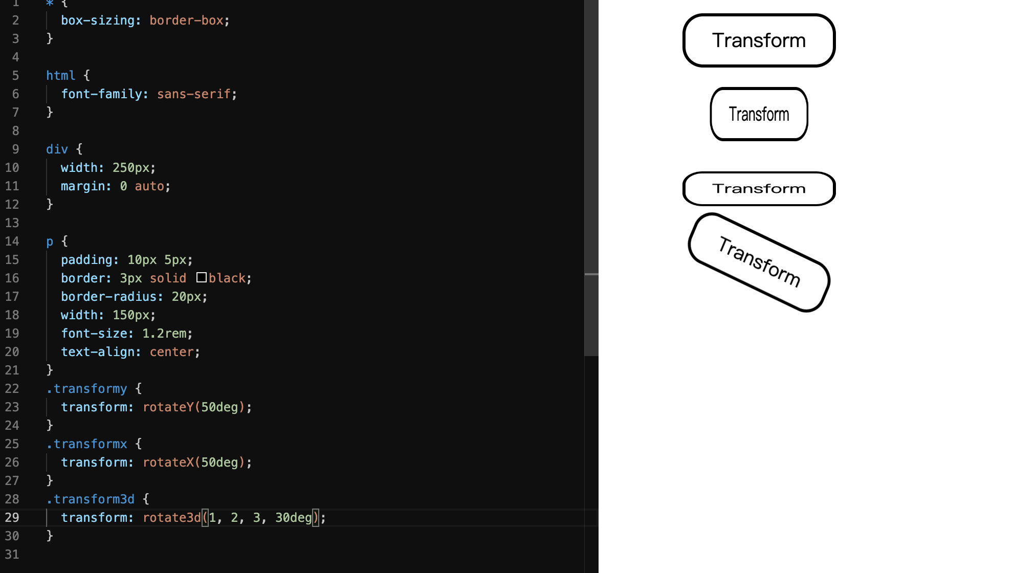
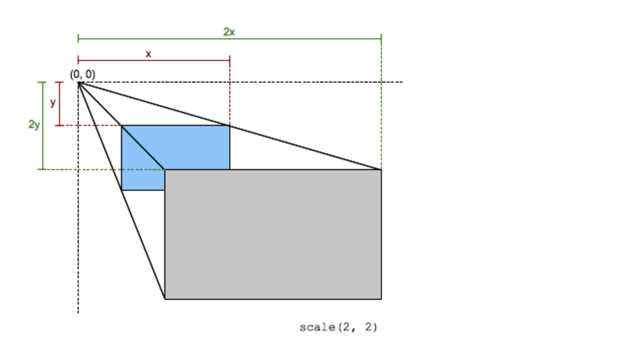
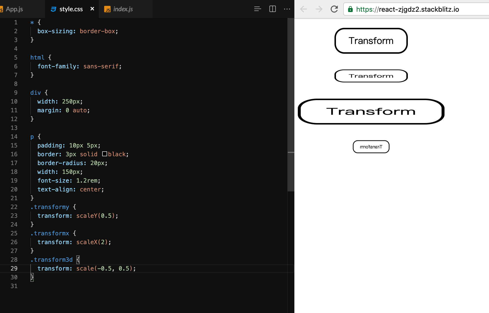
缩放 - scale
CSS 函数 scale() 用于修改元素的大小。可以通过向量形式定义的缩放值来放大或缩小元素,同时可以在不同的方向设置不同的缩放值。
负数旋转
transform: scale(2, 0.5);transform: scaleX(2);transform: scaleY(0.5);
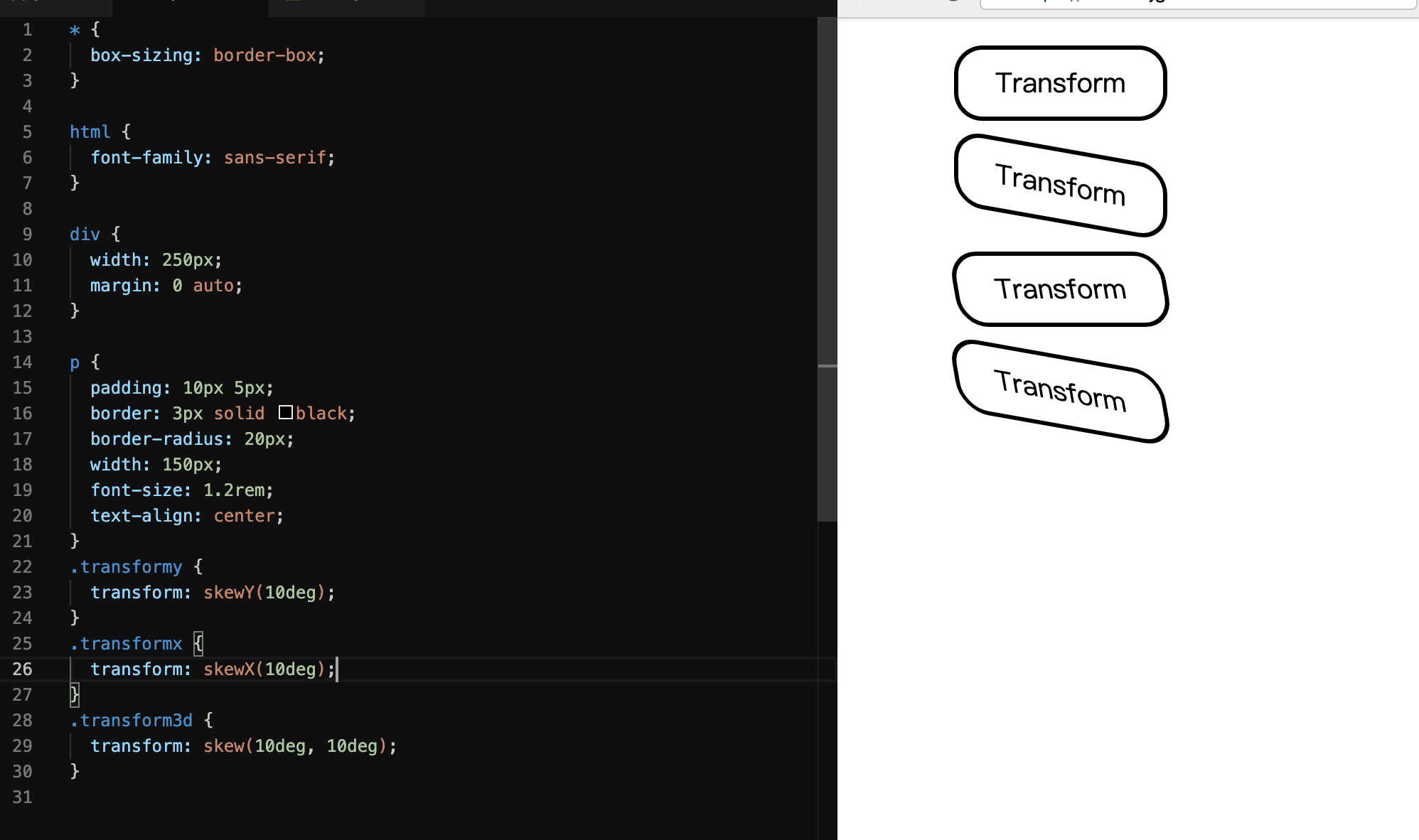
倾斜 - skew
函数定义了一个元素在二维平面上的倾斜转换。
transform: skew(30deg, 20deg);transform: skewX(30deg);transform: skewY(1.07rad);
平移 - translate
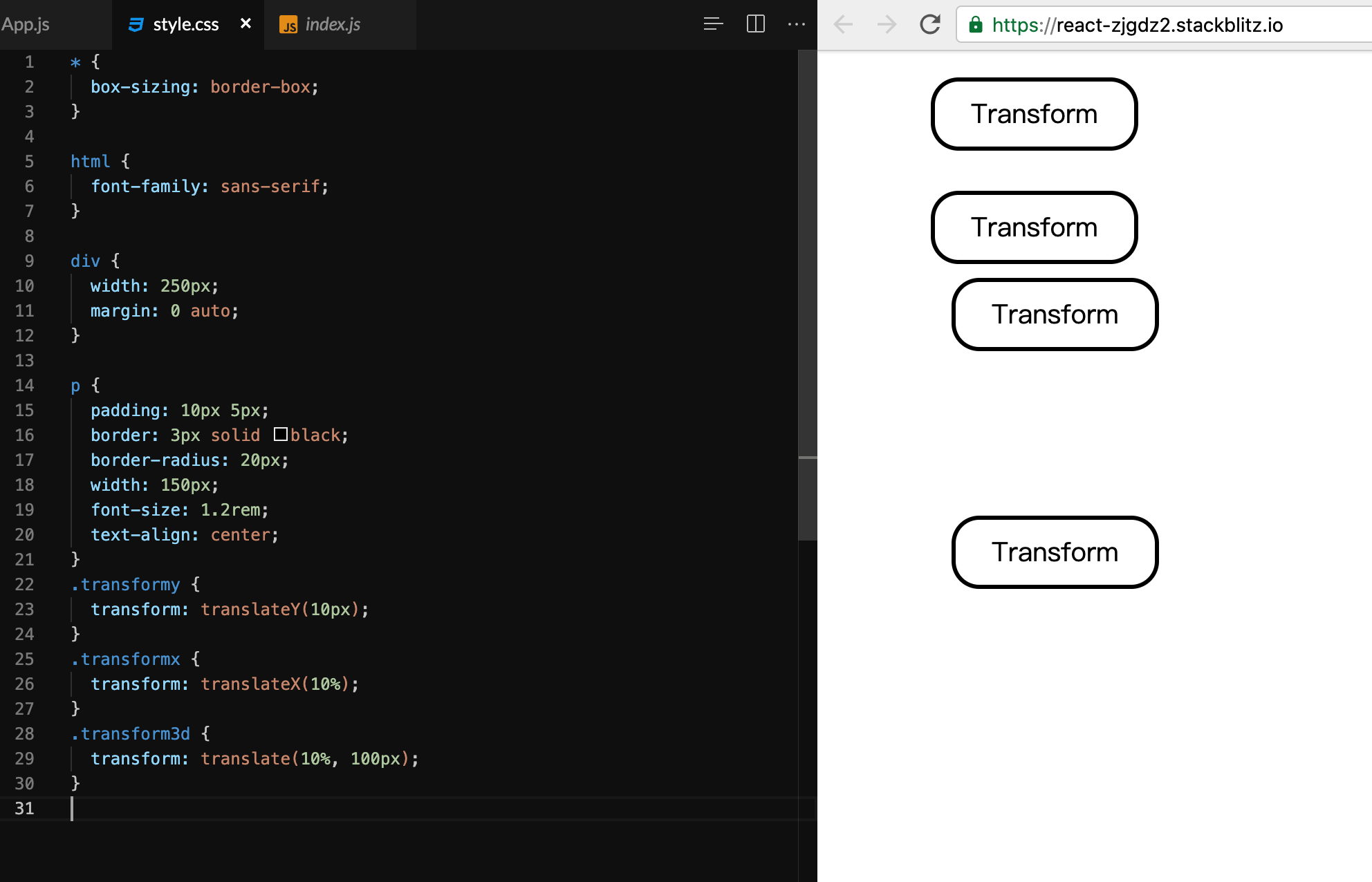
transform: translate(12px, 50%);transform: translateX(2em);transform: translateY(3in);
transform-origin
更改一个元素变形的原点 https://developer.mozilla.org/zh-CN/docs/Web/CSS/transform-origin
转换起点是应用转换的点。例如,rotate()函数的转换原点是旋转中心。(这个属性的应用原理是先用这个属性的赋值转换该元素,进行变形,然后再用这个属性的值把元素转换回去)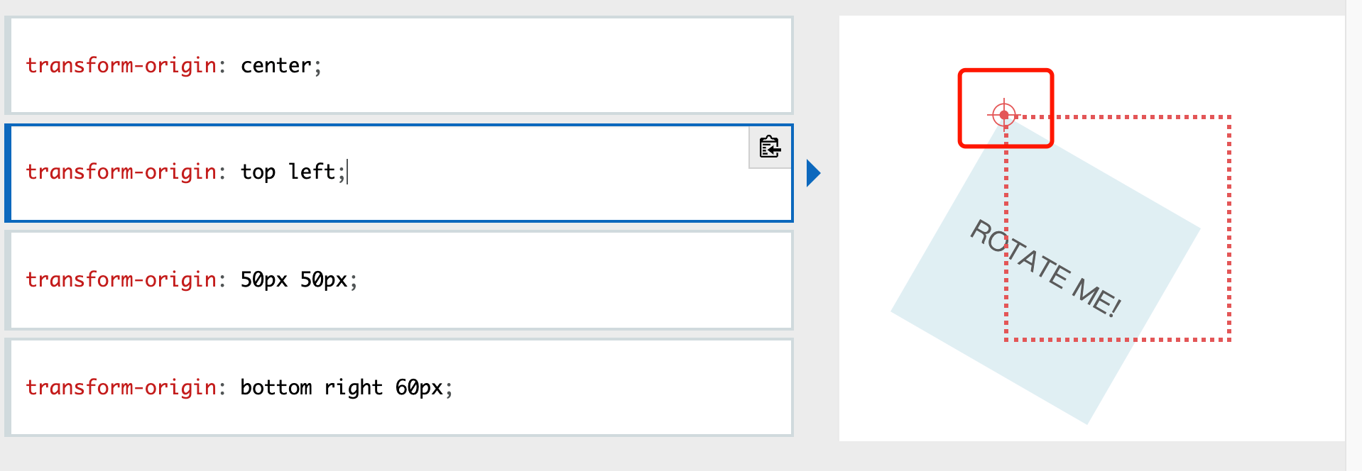
/* One-value syntax */transform-origin: 2px;transform-origin: bottom;/* x-offset | y-offset */transform-origin: 3cm 2px;/* x-offset-keyword | y-offset */transform-origin: left 2px;/* x-offset-keyword | y-offset-keyword */transform-origin: right top;/* y-offset-keyword | x-offset-keyword */transform-origin: top right;/* x-offset | y-offset | z-offset */transform-origin: 2px 30% 10px;/* x-offset-keyword | y-offset | z-offset */transform-origin: left 5px -3px;/* x-offset-keyword | y-offset-keyword | z-offset */transform-origin: right bottom 2cm;/* y-offset-keyword | x-offset-keyword | z-offset */transform-origin: bottom right 2cm;/* Global values */transform-origin: inherit;transform-origin: initial;transform-origin: unset;
transition - 过渡
SS 提供了四个属性来描述一个过渡:
transition-propertytransition-durationtransition-timing-functiontransition-delay``` .ball { width: 60px; height: 60px; border-radius: 100%; background: blue; transition: 1s; // ** }
.ball:hover { width: 120px; height: 120px; color: red; }
**<br />不设置transition,小球的变化的突兀的瞬间的,不平滑<br />指定transition适用的属性,比如只适用于height,只有height的变化需要1秒实现,其他变化(主要是width)依然瞬间实现
transition: 1s height, 2s width; //也可以设置多个属性
transition: 1s 1s height, 2s width; //transition-delay延迟多久开始
transition: 1s 1s height linear; // transition-timing-function 渐变函数 linear匀速|ease-in加速|ease-out减速|cubic-bezier函数自定义速度模式
transition的优点在于简单易用,但是它有几个很大的局限。<br />(1)**transition需要事件触发**,所以没法在网页加载时自动发生。<br />(2)**transition是一次性的**,不能重复发生,除非一再触发。<br />(3)**transition只能定义开始状态和结束状态**,不能定义中间状态,也就是说只有两个状态。<br />(4)**一条transition规则**,只能定义一个属性的变化,不能涉及多个属性。**CSS Animation就是为了解决这些问题而提出的。**<a name="Nwq8n"></a>#<a name="kVtDs"></a># animation - 动画`animation` 属性用来指定一组或多组动画,每组之间用逗号相隔。- name: none keyframes 的名称- duration:0s 完成动画所花费的时间,以秒或毫秒计。请始终规定 animation-duration 属性,否则时长为 0,就不会播放动画了。- timing-function:ease 动画的速度曲线。 ease ease-in ease-out linear ease-in-out- delay:0s 动画开始之前的延迟。- iteration-count:1 动画应该播放的次数。- direction:normal 是否应该轮流反向播放动画。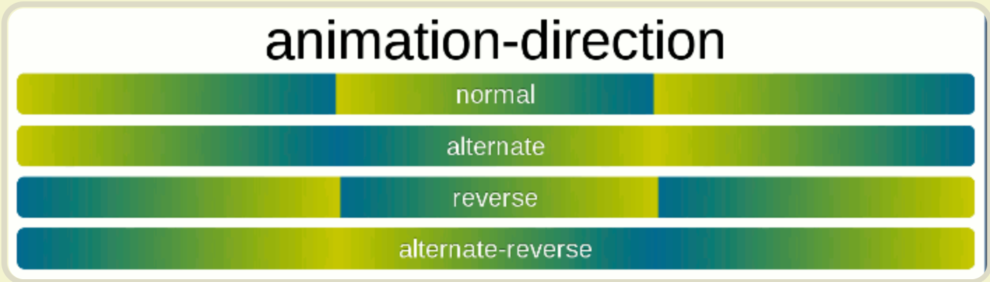- [**animation-fill-mode**](https://developer.mozilla.org/zh-CN/docs/Web/CSS/animation-fill-mode)**: **none. 动画结束以后,会立即从结束状态跳回到起始状态。如果想让动画保持在结束状态,需要使用animation-fill-mode属性。**none**:默认值,回到动画没开始时的状态<br />**forwards** 表示让动画停留在结束状态<br />**backwards**:让动画回到第一帧的状态。<br />**both**: 根据animation-direction轮流应用forwards和backwards规则。- [**animation-play-state**](https://developer.mozilla.org/zh-CN/docs/Web/CSS/animation-play-state)**:** running 动画播放过程中,会突然停止。这时,默认行为是跳回到动画的开始状态。如果想让动画保持突然终止时的状态,就要使用animation-play-state属性 paused
/ @keyframes duration | timing-function | delay | iteration-count | direction | fill-mode | play-state | name / animation: 3s ease-in 1s 2 reverse both paused slidein;
/ @keyframes duration | timing-function | delay | name / animation: 3s linear 1s slidein;
/ @keyframes duration | name / animation: 3s slidein;
div:hover { animation: 1s 1s rainbow linear 3 forwards normal; }
div:hover { animation-name: rainbow; animation-duration: 1s; animation-timing-function: linear; animation-delay: 1s; animation-fill-mode:forwards; animation-direction: normal; animation-iteration-count: 3; }
keyframes关键字用来定义动画的各个状态,它的写法相当自由。<br />0%可以用from代表,100%可以用to代表
@keyframes rainbow { 0% { background: #c00; } 50% { background: orange; } 100% { background: yellowgreen; } }
<a name="icWba"></a># 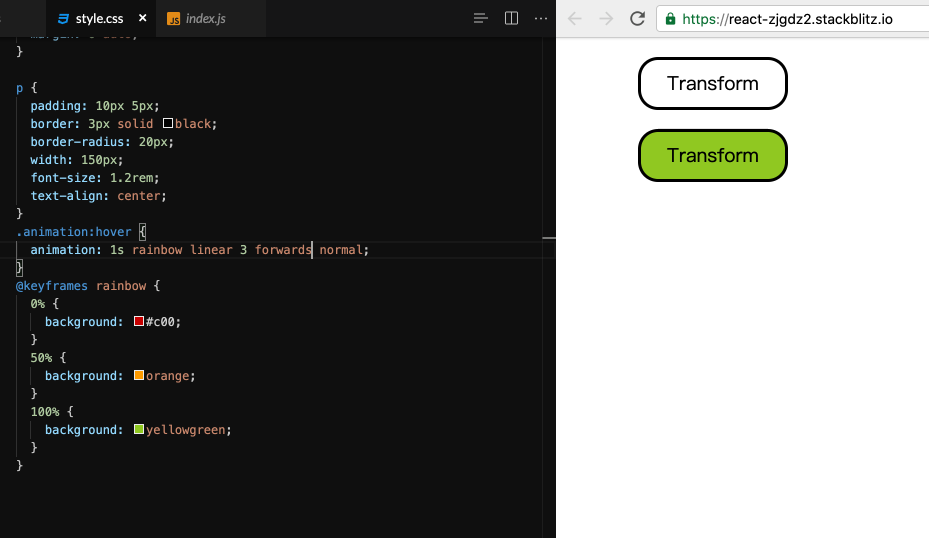<a name="15MRr"></a>## 实现loading
```loading {width: 100px;height: 100px;background: #ffcc00;border-radius: 100%; // ***border: 5px #851414 solid; // ***border-right-color: #87ceeb; // ***animation: loading 1s linear infinite;}@keyframes loading {0% {transform: rotate(0deg);}100% {transform: rotate(360deg);}}
实现摆钟
<div class="container"><div class="line"><div class="ball" /></div></div>
.container {width: 100%;}.line {width: 20px;height: 400px;background: red;margin: 50px auto;transform-origin: center top;animation: swing 5s;animation-iteration-count: infinite;animation-timing-function: linear;position: relative;}.ball {width: 60px;height: 60px;border-radius: 100%;background: blue;position: absolute;bottom: -60px;left: -20px;}@keyframes swing {0% {transform: rotate(45deg);}25% {transform: rotate(0deg);}50% {transform: rotate(-45deg);}75% {transform: rotate(0deg);}100% {transform: rotate(45deg);}}

若有收获,就点个赞吧
0 人点赞
