WPF入门系列二——Application介绍
三种方式启动应用程序
都是在App.cs文件中编写以下代码。
第一种
using System;using System.Collections.Generic;using System.Linq;using System.Text;using System.Threading.Tasks;using System.Windows;namespace WpfApp1{class App{[STAThread]static void Main(){// 定义Application对象作为整个应用程序入口Application app = new Application();// 方法一:调用Run方法 ,这种方式跟winform的调用一样WindowGrid win = new WindowGrid();app.Run(win);}}}
第二种
using System;using System.Collections.Generic;using System.Linq;using System.Text;using System.Threading.Tasks;using System.Windows;namespace WpfApp1{class App{[STAThread]static void Main(){// 定义Application对象作为整个应用程序入口Application app = new Application();//指定Application对象的MainWindow属性为启动窗体,然后调用无参数的Run方法WindowGrid win = new WindowGrid();app.MainWindow = win;//是必须的,否则无法显示窗体win.Show();app.Run();}}}
第三种
using System;using System.Collections.Generic;using System.Linq;using System.Text;using System.Threading.Tasks;using System.Windows;namespace WpfApp1{class App{[STAThread]static void Main(){// 定义Application对象作为整个应用程序入口Application app = new Application();// 通过Url的方式启动app.StartupUri = new Uri("WindowGrid.xaml", UriKind.Relative);app.Run();}}}
WPF入门系列三——Application介绍(续)
一、WPF应用程序的关闭
WPF应用程序的关闭只有在应用程序的 Shutdown 方法被调用时,应用程序才停止运行。 ShutDown 是隐式或显式发生,可以通过指定 ShutdownMode 的属性值来进行设置。
| ShutdownMode选项 | |
|---|---|
| OnLastWindowClose(默认值) | 应用程序关闭时,或最后一个窗口关闭时关闭,或调用Application对象的Shutdown() 方法时,应用程序关闭。 |
| OnMainWindowClose | 启动窗口关闭或调用Application对象的Shutdown()方法时,应用程序关闭。(和C#的Windows应用程序的关闭模式比较类似) |
| OnExplicitShutdown | 只有在调用Application对象的Shutdown()方法时,应用程序才会关闭。 |
1、对ShutdownMode选项的更改,可以直接在App.xaml中更改,如下代码:
<Application x:Class="WpfApp1.App"xmlns="http://schemas.microsoft.com/winfx/2006/xaml/presentation"xmlns:x="http://schemas.microsoft.com/winfx/2006/xaml"StartupUri="MainWindow.xaml" ShutdownMode="OnExplicitShutdown" ><Application.Resources></Application.Resources></Application>
2、在代码文件(App.xaml.cs)中修改ShutdownMode选项,但必须注意这个设置要写在app.Run()方法之前,如下代码:
[STAThread]static void Main(){......app.ShutdownMode = ShutdownMode.OnExplicitShutdown;app.Run(win);}
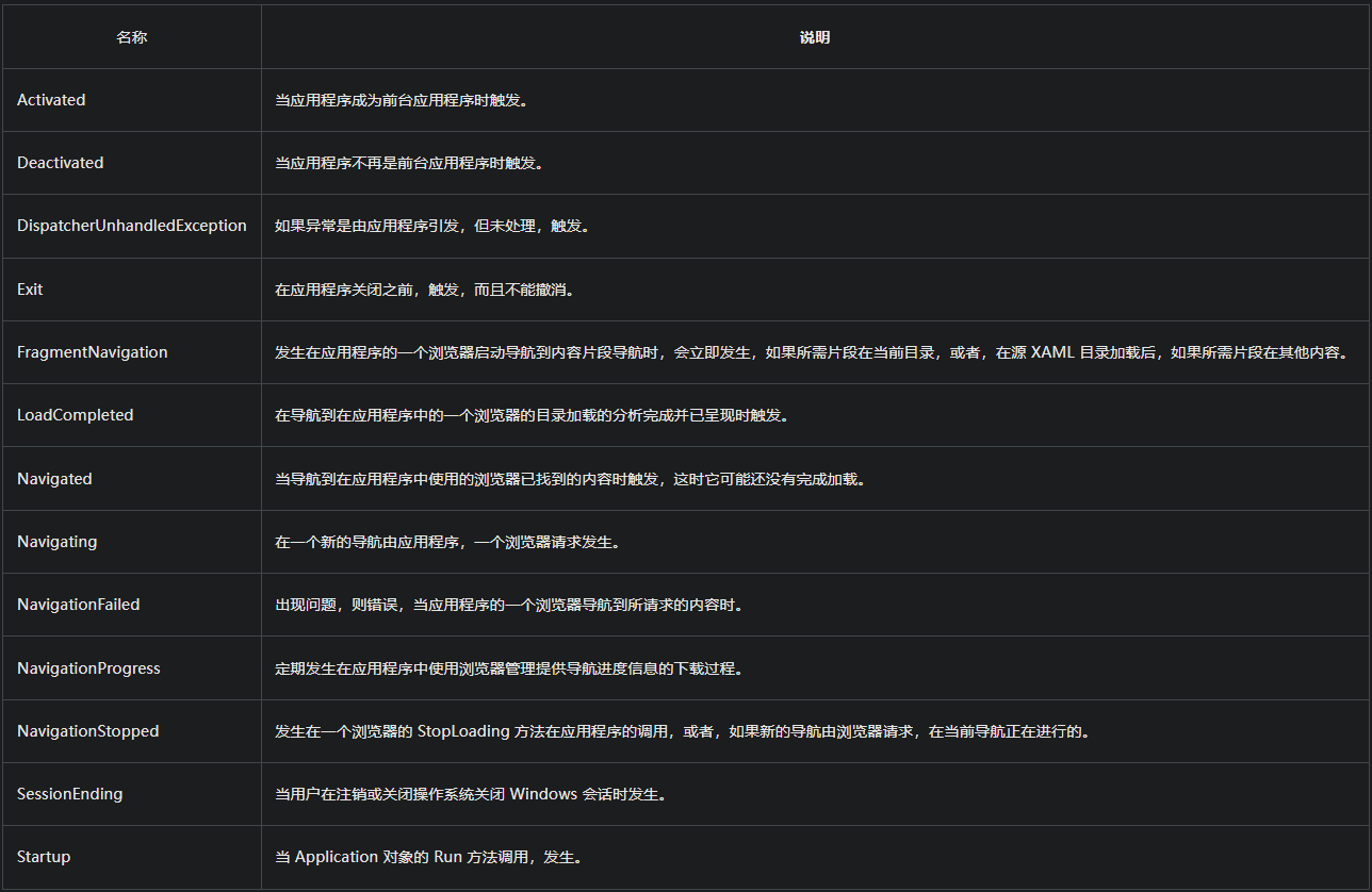
Application对象的其他属性:
| 名称 | 说明 |
|---|---|
| Current | 获取当前 AppDomain 的 Application 对象 |
| Dispatcher | 获取与此 DispatcherObject 关联的 Dispatcher。(继承自 DispatcherObject ) |
| MainWindow | 获取或设置应用程序的主窗口 |
| Properties | 获取应用程序范围的属性集合 |
| ResourceAssembly | 获取或设置对于 WPF 应用程序的资源提供已装箱统一资源标识符(URI)的 Assembly |
| Resources | 获取或设置应用程序范围资源的集合,例如样式和画笔 |
| ShutdownMode | 获取或设置会导致 Shutdown 方法调用的情况 |
| StartupUri | 获取或设置自动显示的 UI,当应用程序启动时 |
| Windows | 获取在应用程序中实例化窗口 |
二、添加Application对象事件
在应用程序中添加事件的方式有如下三种。
第一种方式:
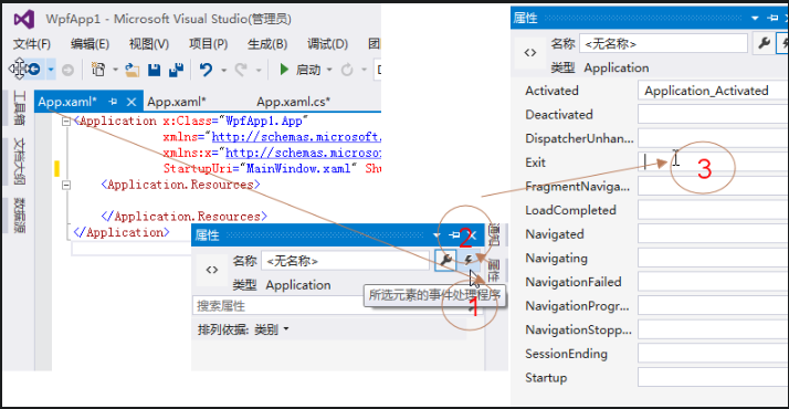
1、在App.xaml中做事件的绑定,在App.xaml.cs文件中添加事件的处理方法。
在App.xaml文件中,具体添加方法见下图:
2、添加完事件后的App.xaml文件代码如下:
<Application x:Class="WpfApp1.App"xmlns="http://schemas.microsoft.com/winfx/2006/xaml/presentation"xmlns:x="http://schemas.microsoft.com/winfx/2006/xaml"StartupUri="MainWindow.xaml" ShutdownMode="OnExplicitShutdown" Activated="Application_Activated" Exit="Application_Exit"><Application.Resources></Application.Resources></Application>
3、在App.xaml.cs文件的代码如下:
using System;using System.Collections.Generic;using System.Configuration;using System.Data;using System.Linq;using System.Threading.Tasks;using System.Windows;namespace WpfApp1{/// <summary>/// App.xaml 的交互逻辑/// </summary>public partial class App : Application{private void Application_Activated(object sender, EventArgs e){}private void Application_Exit(object sender, ExitEventArgs e){}}}
4、在使用以上方式添加事件之后,如果在 Visual Studio 中按 F5 执行应用程序时,报以下错误“不包含适合于入口点的静态‘Main’方法”。这个错误是由于 Visual Studio 把项目文件(*.csproj)中原来自动生成的 app.xaml 相关的定义进行了修改。具体区别如下:
1)直接新建在WPF项目中的有关 App.xaml 的定义如下:
<ApplicationDefinition Include="App.xaml"><Generator>MSBuild:Compile</Generator><SubType>Designer</SubType></ApplicationDefinition>
2)Visual Studio 把修改后的 App.xaml 的配置代码如下:
<Page Include="App.xaml"><SubType>Designer</SubType><Generator>MSBuild:Compile</Generator></Page>
第一段代码中 App.xaml 在项目文件里面用 ApplicationDefinition 标签定义。第二段代码中 App.xaml 在项目文件中用 Page 标签定义,这种定义是指 App.xaml只是一个页面而已。
因此,只需要把项目文件中将 App.xaml 的配置由 Page 修改成 ApplicationDefinition即可。
第二种方式
1、可以像是在WinForm中的Program类中写Main方法一样,在WPF中一样可以自定义一个app类中写main及其他相关事件。
using System;using System.Collections.Generic;using System.Linq;using System.Text;using System.Threading.Tasks;using System.Windows;namespace WpfApp1{class App{[STAThread]static void Main(){// 定义Application对象作为整个应用程序入口Application app = new Application();MainWindow win = new MainWindow();app.ShutdownMode = ShutdownMode.OnMainWindowClose;app.MainWindow = win;//是必须的,否则无法显示窗体win.Show();app.Run();app.Activated += app_Activated;app.Exit += app_Exit;}static void app_Activated(object sender, EventArgs e){throw new NotImplementedException();}static void app_Exit(object sender, ExitEventArgs e){throw new NotImplementedException();}}}
第三种方式
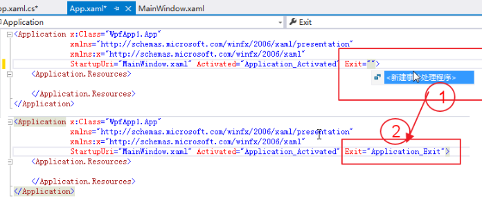
1、在App.xaml界面中,如下图位置1处,输入Exit事件名称,VS会弹出一个菜单“新建事件处理程序”,双击这个菜单,VS会自动创建一个“Application_Exit”事件,如下图位置2处:
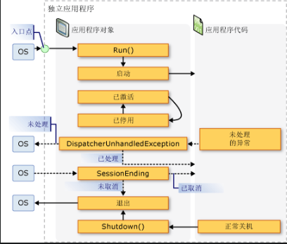
三、WPF应用程序生命周期
WPF应用程序的生命周期与执行顺序,用MSDN上的一张图片进行说明。下图显示了窗口的生存期中的主要事件的顺序:
WPF入门系列四——Dispatcher介绍
一、Dispatcher介绍
不管是WinForm应用程序还是WPF应用程序,实际上都是一个进程,一个进程可以包含多个线程,其中有一个是主线程。在WPF或WinForm应用程序中,主线程负责接收输入、处理事件、绘制屏幕等工作,为了使主线程及时响应,防止假死,在开发过程中对一些耗时的操作、消耗资源比较多的操作,都会去创建一个或多个子线程去完成操作,比如大数据量的循环操作、后台下载。这样一来,由于UI界面是主线程创建的,所以子线程不能直接更新由主线程维护的UI界面。
Dispatcher 的作用是用于管理线程工作项队列,类似于Win32中的消息队列,Dispatcher的内部函数,仍然调用了传统的创建窗口类,创建窗口,建立消息泵等操作。Dispatcher本身是一个单例模式,构造函数私有,暴露了一个静态的CurrentDispatcher方法用于获得当前线程的Dispatcher。对于线程来说,它对Dispatcher是一无所知的,Dispatcher内部维护了一个静态的List
二、Dispatcher的继承关系
在WPF的类层次结构中,大部分都集中派生于DispatcherObject类(通过其他类)。如下图所示,DispatcherObject虚拟类正好位于Object下方和大多数WPF类的层次结构之间。要了解它们之间的关系可以参看下面这张类的继承关系图。
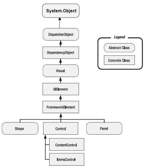
WPF中的绝大部分的控件,还包括窗口本身都是继承自ContentControl的。
ContentControl族包含的控件:
| Button | ButtonBase | CheckBox | ComboBoxItem |
|---|---|---|---|
| ContentControl | Frame | GridViewColumnHeader | GroupItem |
| Label | ListBoxItem | ListViewItem | NavigationWindow |
| RadioButton | RepeatButton | ScrollViewer | StatusBarItem |
| ToggleButton | ToolTip | UserControl | Window |
9)System.Windows.Controls.ItemsControl 类:表示可用于提供项目的集合的控件。
以条目集合内容的控件 ItemControl
特点:①均派生自ItemControl
②内容属性为Items或ItemsSource③每种ItemsControl都对应有自己的条目容器(Item Container)。
ItemsControl族包含的控件:
| Menu | MenuBase | ContextMenu | ComboBox |
|---|---|---|---|
| ItemsControl | ListBox | ListView | TabControl |
| TreeView | Selector | StatusBar |

三、走进Dispatcher
所有的WPF应用程序启动时都会加载两个重要的线程:一个用于呈现用户界面,另一个用于管理用户界面。呈现线程是一个在后台运行的隐藏线程,因此你通常面对的唯一线程就是UI线程。WPF要求将其大多数对象与UI线程相关联。这称之为线程关联,意味着要使用一个WPF对象,只能在创建它的线程上使用。在其他线程上使用它会导致运发运行时异常。UI线程的作用时用于接收输入、处理事件、绘制屏幕以及运行应用程序代码。
在WPF中绝大部分控件都继承自 DispatcherObject,甚至包括Application。这些继承自 DispatcherObject的对象具有线程关联特征,也就意味着只有创建这些对象实例,且包含了Dispatcher的线程(通常默认UI线程)才能直接对其进行更新操作。
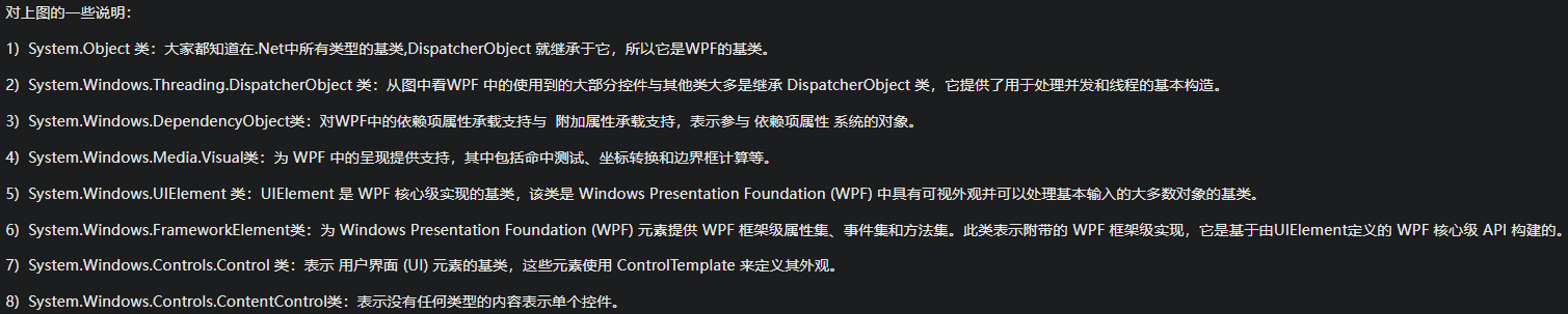
DispatcherObject类有两个主要职责:提供对对象所关联的当前 Dispatcher的访问权限,以及提供方法以检查(CheckAccess)和验证(VerifyAccess)某个线程是否有权访问对象(派生于DispatcherObject)。CheckAccess与VerifyAccess的区别在于 CheckAccess返回一个布尔值,表示当前线程是否可以使用对象,而VerifyAccess则在线程无权访问对象的情况下引发异常。通过提供这些基本的功能,所有WPF对象都支持对是否可在特定线程(特别是UI线程)上使用它们加以确定。
在WPF中,DispatcherObject只能通过与它关联的 Dispatcher进行访问。例如,后台线程不能更新由UI线程创建的 Label的内容。
那么如何更新UI线程创建的对象信息呢?Dispatcher提供了两个方法,Invoke和BeginInvoke,这两个方法还有多个不同参数的重载。其中Invoke内部还是调用了BeginInvoke,一个典型的BeginInvoke参数如下:
public DispatcherOperation BeginInvoke(Delegate method, DispatcherPriority priority, params object[] args);
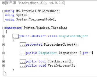
Invoke时同步操作,而BeginInvoke是异步操作。这两个操作将指定的Dispatcher添加到Dispatcher的队列中。DispatcherPriority定义了很多优先级,可以分为前台优先级和后台优先级,其中前台包括Loaded~Send,后台包括Background~Input。剩下的几个优先级除了Invalid和Inactive都属于空闲优先级。这个前台优先级和后台优先级的分界线是以Input来区分的,这里的Input指的是键盘输入和鼠标移动、点击等等。
DispatcherPrioirty优先级:
四、使用Dispatcher
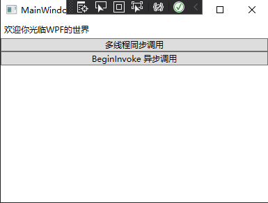
下面来看看如何正确从一个非UI线程中更新一个由UI线程创建的对象。
<Window x:Class="DispatcherTestDemo.MainWindow"xmlns="http://schemas.microsoft.com/winfx/2006/xaml/presentation"xmlns:x="http://schemas.microsoft.com/winfx/2006/xaml"xmlns:d="http://schemas.microsoft.com/expression/blend/2008"xmlns:mc="http://schemas.openxmlformats.org/markup-compatibility/2006"xmlns:local="clr-namespace:DispatcherTestDemo"mc:Ignorable="d"Title="MainWindow" Height="300" Width="400"><Grid><StackPanel><Label x:Name="lblHello">欢迎你光临WPF的世界</Label><Button Name="btnThd" Click="btnThd_Click">多线程同步调用</Button><Button Name="btnAppBeginInvoke" Click="btnAppBeginInvoke_Click">BeginInvoke 异步调用</Button></StackPanel></Grid></Window>
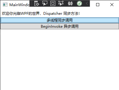
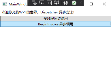
using System;using System.Collections.Generic;using System.Linq;using System.Text;using System.Threading;using System.Threading.Tasks;using System.Windows;using System.Windows.Controls;using System.Windows.Data;using System.Windows.Documents;using System.Windows.Input;using System.Windows.Media;using System.Windows.Media.Imaging;using System.Windows.Navigation;using System.Windows.Shapes;using System.Windows.Threading;namespace DispatcherTestDemo{/// <summary>/// MainWindow.xaml 的交互逻辑/// </summary>public partial class MainWindow : Window{public MainWindow(){InitializeComponent();}public void ModifyUI(){//模拟一些工作正在运行Thread.Sleep(TimeSpan.FromSeconds(2));//如果按下面这行代码来写,是从子线程中直接更新UI线程创建的对象,会报错。//lblHello.Content = "欢迎你光临WPF的世界,Dispatcher";//改为使用Dispatcher的Invoke方法,Invoke方法是同步方法。this.Dispatcher.Invoke(DispatcherPriority.Normal, (ThreadStart)delegate (){lblHello.Content = "欢迎你光临WPF的世界,Dispatcher 同步方法!";});}//点击按钮完成对Label的Content的更新private void btnThd_Click(object sender, RoutedEventArgs e){Thread thread = new Thread(ModifyUI);thread.Start();}//这个按钮就用Dispatcher的BeginInvoke异步方法实现。private void btnAppBeginInvoke_Click(object sender, RoutedEventArgs e){new Thread(() =>{Application.Current.Dispatcher.BeginInvoke(DispatcherPriority.Normal,new Action(() =>{Thread.Sleep(TimeSpan.FromSeconds(2));this.lblHello.Content = "欢迎你光临WPF的世界,Dispatcher 异步方法!";}));}).Start();}}}
执行效果:
五、小结
在WPF中,所有的WPF对象都派生自DispatcherObject,DispatcherObject暴露了Dispatcher属性用来取得创建对象线程对应的Dispatcher。DispatcherObject对象只能被创建它的线程所访问,其他线程修改DispatcherObject需要取得对应的Dispatcher,调用Invoke或者BeginInvoke来投入任务。Dispatcher的一些设计思路包括Invoke和BeginInvoke等从WinForm时代就是一直存在的,只是使用了Dispatcher来封装这些线程级的操作。
WPF入门系列五——Window介绍
一、窗体类基本概念
对于WPF应用程序,在Visual Studio和Expression Blend中,自定义的窗体均继承System.Windows.Window类。用户通过与WPF独立应用程序进行交互。窗口的主要用途是承载可视化数据并使用户可以与数据进行交互的内容。独立WPF应用程序使用Window类来提供它们自己的窗口。在WPF中,可以使用代码或XAML标记来实现窗口的外观和行为。我们这里定义的窗体也由这两部分组成:
1、XAML文件,在这里面通常全部写UI的东西,包括窗口的外观、控件等。
2、窗口界面中的各种行为,则由后台代码文件决定。
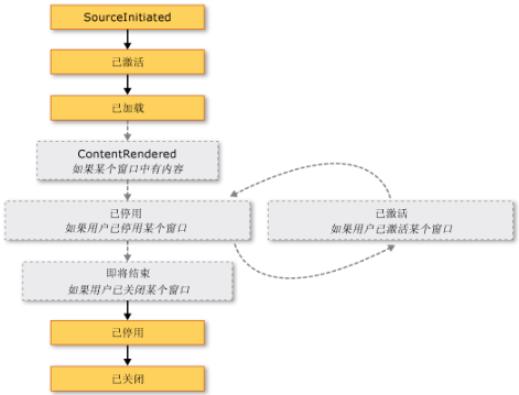
二、窗体的生命周期
和所有类一样,窗口也有生存期,在第一次实例化窗口时生存期开始,然后就可以显示、激活和停用窗口,直到最终关闭窗口。
1、显示窗体
* 构造函数* Show()、ShowDialog()方法:Show()方法显示非模态窗口,这意味着应用程序所运行的模式允许用户在同一个应用程序中激活其他窗口。ShowDislog()方法显示模态窗口,这个基本和WinForm类似* 当初始化窗口时,将引发SourceInitialized事件并显示窗口。
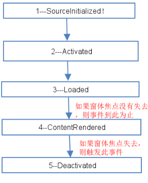
2、窗体的激活
在首次打开一个窗口时,它便成为活动窗口(除非是在ShowActivited设置为false的情况下显示)。活动窗口是当前正在捕获用户输入(例如,键击和鼠标单击)的窗口。当窗口变为活动窗口时,它会引发Activated事件。
当第一次打开窗口时,只有在引发了Activited事件之后,才会引发Loaded和ContentRendered事件。记住这一点,在引发ContentRendered时,便可认为窗口已打开。
窗口变为活动窗口后,用户可以在同一个应用程序中激活其他窗口,还可以激活其他应用程序。当这种情况出现时,当前的活动窗口将停用,并引发Deactivated事件。同样,当用户选择当前停用的窗口时,该窗口会再次变成活动窗口并引发Activated。
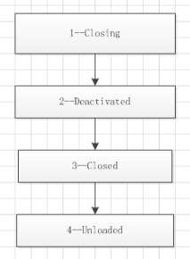
3、关闭窗体
当用户关闭窗口时,窗口的生命便开始走向终结。
* Close()方法:关闭窗体,并释放窗体的资源* Closing事件、Closed事件:关闭时、关闭后引发的事件,通常在Closing事件中提示用户是否退出等信息。
4、窗体的生命周期,如下图:
下面通过代码验证:
using System;using System.Collections.Generic;using System.Linq;using System.Text;using System.Threading;using System.Threading.Tasks;using System.Windows;using System.Windows.Controls;using System.Windows.Data;using System.Windows.Documents;using System.Windows.Input;using System.Windows.Media;using System.Windows.Media.Imaging;using System.Windows.Shapes;using System.Windows.Threading;namespace WpfApp1{/// <summary>/// WindowThd.xaml 的交互逻辑/// </summary>public partial class WindowThd : Window{public WindowThd(){this.Activated += WindowThd_Activated;this.Closing += WindowThd_Closing;this.ContentRendered += WindowThd_ContentRendered;this.Deactivated += WindowThd_Deactivated;this.Loaded += WindowThd_Loaded;this.Closed += WindowThd_Closed;this.Unloaded += WindowThd_Unloaded;this.SourceInitialized += WindowThd_SourceInitialized;InitializeComponent();}void WindowThd_SourceInitialized(object sender, EventArgs e){Console.WriteLine( "1---SourceInitialized!");}void WindowThd_Unloaded(object sender, RoutedEventArgs e){Console.WriteLine("Unloaded!");}void WindowThd_Closed(object sender, EventArgs e){Console.WriteLine("_Closed!");}void WindowThd_Loaded(object sender, RoutedEventArgs e){Console.WriteLine( "3---Loaded!");}void WindowThd_Deactivated(object sender, EventArgs e){Console.WriteLine("Deactivated!");}void WindowThd_ContentRendered(object sender, EventArgs e){Console.WriteLine("ContentRendered!");}void WindowThd_Closing(object sender, System.ComponentModel.CancelEventArgs e){Console.WriteLine("---Closing!");}void WindowThd_Activated(object sender, EventArgs e){Console.WriteLine("2---Activated!");}private void ModifyUI(){// 模拟一些工作正在进行Thread.Sleep(TimeSpan.FromSeconds(2));//lblHello.Content = "欢迎你光临WPF的世界,Dispatcher";this.Dispatcher.Invoke(DispatcherPriority.Normal, (ThreadStart)delegate(){lblHello.Content = "欢迎你光临WPF的世界,Dispatche 同步方法 !!";});}private void btnThd_Click(object sender, RoutedEventArgs e){Thread thread = new Thread(ModifyUI);thread.Start();}private void btnAppBeginInvoke_Click(object sender, RoutedEventArgs e){new Thread(() =>{Application.Current.Dispatcher.BeginInvoke(DispatcherPriority.Normal,new Action(() =>{Thread.Sleep(TimeSpan.FromSeconds(2));this.lblHello.Content = "欢迎你光临WPF的世界,Dispatche 异步方法!!"+ DateTime.Now.ToString();}));}).Start();}}}
打开窗体的事件执行顺序如下:
关闭窗体的事件顺序如下:
WPF入门系列——布局介绍与Canvas
从这篇文章开始是对WPF中的界面如何布局做一个简单的介绍。
一、总体介绍
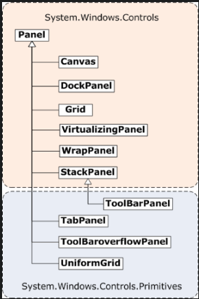
WPF的布局控件都在System.Windows.Controls.Panel这个基类下面,使用WPF提供的各种控件在WPF应用程序中界面进行布局,同时对各种子控件(如按钮、文本框、下拉框等)进行排列组合。
Panel类的公共属性太多了,就简单介绍几个常见的属性如下表:
| 名称 | 说明 |
|---|---|
| Cursor | 获取或设置在鼠标指针位于此元素上时显示的光标。 |
| DataContext | 获取或设置元素参与数据绑定时的数据上下文。 |
| Dispatcher | 获取与此 DispatcherObject 关联的 Dispatcher。 |
| FontFamily | 获取或设置控件的字体系列。 |
| FontSize | 获取或设置字号。 |
| FontWeight | 获取或设置指定的字体的权重或粗细。 |
| Foreground | 获取或设置描述前景色的画笔。 |
| HandlesScrolling | 获取一个值控件是否支持滚动。 |
| Height | 获取或设置元素的建议高度。 |
| HorizontalContentAlignment | 获取或设置控件内容的水平对齐。 |
| IsLoaded | 获取一个值,该值指示是否已加载此元素以供呈现。 |
| IsMouseOver | 获取一个值,该值指示鼠标指针是否位于此元素(包括可视树上的子元素)上。这是一个依赖项属性。 |
| IsTabStop | 获取或设置一个值控制是否在选项卡上导航包含。 |
| IsVisible | 获取一个值,该值指示此元素在用户界面 (UI) 中是否可见。这是一个依赖项属性。 |
| LayoutTransform | 获取或设置在执行布局时应该应用于此元素的图形转换方式。 |
| Margin | 获取或设置元素的外边距。 |
| Name | 获取或设置元素的标识名称。 该名称提供一个引用,以便当 XAML 处理器在处理过程中构造标记元素之后,代码隐藏(如事件处理程序代码)可以对该元素进行引用。 |
| Opacity | 获取或设置当 UIElement 在用户界面 (UI) 中呈现时为其整体应用的不透明度因子。这是一个依赖项属性。 |
| Padding | 获取或设置控件中的空白。 |
| RenderTransform | 获取或设置影响此元素的呈现位置的转换信息。这是一个依赖项属性。 |
| TabIndex | 获取或设置使用 tab 键时,确定顺序接收焦点的元素的值,当用户将控件定位。 |
| Tag | 获取或设置任意对象值,该值可用于存储关于此元素的自定义信息。 |
| ToolTip | 获取或设置在用户界面 (UI) 中为此元素显示的工具提示对象。 |
| TouchesCaptured | 获取在此元素上捕获的所有触摸设备。 |
| TouchesCapturedWithin | 获取在此元素或其可视化树中的任何子元素上捕获的所有触摸设备。 |
| VerticalContentAlignment | 获取或设置控件内容的垂直对齐方式。 |
| Visibility | 获取或设置此元素的用户界面 (UI) 可见性。这是一个依赖项属性。 |
| VisualOpacityMask | 获取或设置 Brush 值,该值表示 Visual 的不透明蒙板。 |
| Width | 获取或设置元素的宽度。 |
二、Canvas
Canvas是最基本的面板,只是一个存储控件的容器,它不会自动调整内部元素的排列及大小,它仅支持用显式坐标定位控件,它也允许指定相对任何角的坐标,而不仅仅是左上角。可以使用Left、Top、Right、Bottom附加属性在Canvas中定位控件。通过设置Left和Right属性的值表示元素最靠近的那条边,应该与Canvas左边缘或右边缘保持一个固定的距离,设置Top和Bottom的值也是类似的意思。实质上,你在选择每个控件停靠的角时,附加属性的值是作为外边距使用的。如果一个控件没有使用任何附加属性,它会被放在Canvas的左上方(等同于设置Left和Top为0)。
Cancas的主要用途是用来画图。Canvas默认不会自动裁剪超过自身范围的内容,即溢出的内容会显示在Canvas外面,这是因为默认ClipToBounds=”False”;我们可以通过设置ClipToBounds=”True”来裁剪多出的内容。
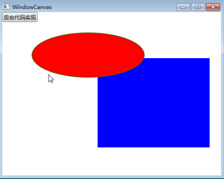
接下来看两个实例,第一个实例用XAML代码实现:
<Window x:Class="WpfApp1.WindowCanvas"xmlns="http://schemas.microsoft.com/winfx/2006/xaml/presentation"xmlns:x="http://schemas.microsoft.com/winfx/2006/xaml"Title="WindowCanvas" Height="400" Width="500"><Grid><Canvas Margin="0,0,0,0" Background="White"><Rectangle Fill="Blue"Stroke="Azure"Width="250"Height="200"Canvas.Left="210" Canvas.Top="101"/><Ellipse Fill="Red"Stroke="Green"Width="250" Height="100"Panel.ZIndex="1"Canvas.Left="65" Canvas.Top="45"/></Canvas><Canvas><Button Name="btnByCode" Click="btnByCode_Click">后台代码实现</Button></Canvas></Grid></Window>
实现效果:
第二个实例,我们使用后台代码来实现。
using System;using System.Collections.Generic;using System.Linq;using System.Text;using System.Threading.Tasks;using System.Windows;using System.Windows.Controls;using System.Windows.Data;using System.Windows.Documents;using System.Windows.Input;using System.Windows.Media;using System.Windows.Media.Imaging;using System.Windows.Shapes;namespace WpfApp1{/// <summary>/// WindowCanvas.xaml 的交互逻辑/// </summary>public partial class WindowCanvas : Window{public WindowCanvas(){InitializeComponent();}public void DisplayCanvas(){Canvas canv = new Canvas();//把canv添加为窗体的子控件this.Content = canv;canv.Margin = new Thickness(0, 0, 0, 0);canv.Background = new SolidColorBrush(Colors.White);//RectangleRectangle r = new Rectangle();r.Fill = new SolidColorBrush(Colors.Red);r.Stroke = new SolidColorBrush(Colors.Red);r.Width = 200;r.Height = 140;r.SetValue(Canvas.LeftProperty, (double)200);r.SetValue(Canvas.TopProperty, (double)120);canv.Children.Add(r);//EllipseEllipse el = new Ellipse();el.Fill = new SolidColorBrush(Colors.Blue);el.Stroke = new SolidColorBrush(Colors.Blue);el.Width = 240;el.Height = 80;el.SetValue(Canvas.ZIndexProperty, 1);el.SetValue(Canvas.LeftProperty, (double)100);el.SetValue(Canvas.TopProperty, (double)80);canv.Children.Add(el);}private void btnByCode_Click(object sender, RoutedEventArgs e){DisplayCanvas();}}}
最后,说明一点**Canvas内的子控件不能使用两个以上的Canvas附加属性**,如果同时设置Canvas.Left和Canvas.Right属性,那么后者将会被忽略。
三、WrapPanel
WrapPanel布局面板将各个控件从左至右按照行或列的顺序罗列,当长度或高度不够时就会自动调整进行换行,后续排序按照从上至下或从右至左的顺序进行。
Orientation——根据内容自动换行。当Horizontal选项看上去类似于Windows资源管理器的缩略图视图:元素是从左向右排列的,然后从上至下自动换行。Vertical选项看上去类似于Windows资源管理器的列表视图:元素是从上向下排列的,然后从左至右自动换行。
ItemHeight——所有子元素都一致的高度。每个子元素填充高度的方式取决于它的VerticalAlignment属性、Height属性等。任何比ItemHeight高的元素都将被截断。
ItemWidth——所有子元素都一致的宽度。每个子元素填充宽度的方式取决于它的VerticalAlignment属性、Width属性等。任何比ItemWidth宽的元素都将被截断。
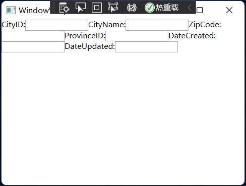
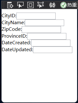
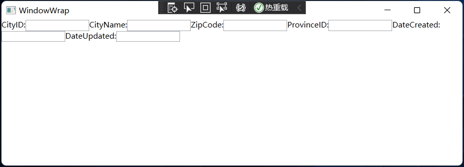
本次的示例,效果如下2图,图1是宽度比较小,图2就是拉长了宽度后的结果。
示例代码:
<Window x:Class="CanvasTestDemo.MainWindow"xmlns="http://schemas.microsoft.com/winfx/2006/xaml/presentation"xmlns:x="http://schemas.microsoft.com/winfx/2006/xaml"xmlns:d="http://schemas.microsoft.com/expression/blend/2008"xmlns:mc="http://schemas.openxmlformats.org/markup-compatibility/2006"xmlns:local="clr-namespace:CanvasTestDemo"mc:Ignorable="d"Title="WindowWrap" Height="300" Width="400"><Grid><WrapPanel Orientation="Horizontal"><TextBlock Name="textBlock_CityID" Text="CityID:" /><TextBox Name="textBox_CityID" MinWidth="100" /><TextBlock Name="textBlock_CityName" Text="CityName:" /><TextBox Name="textBox_CityName" MinWidth="100" /><TextBlock Name="textBlock_ZipCode" Text="ZipCode:" /><TextBox Name="textBox_ZipCode" MinWidth="100" /><TextBlock Name="textBlock_ProvinceID" Text="ProvinceID:" /><TextBox Name="textBox_ProvinceID" MinWidth="100" /><TextBlock Name="textBlock_DateCreated" Text="DateCreated:" /><TextBox Name="textBox_DateCreated" MinWidth="100" /><TextBlock Name="textBlock_DateUpdated" Text="DateUpdated:" /><TextBox Name="textBox_DateUpdated" MinWidth="100" /></WrapPanel></Grid></Window>
使用C#代码实现下面示例:
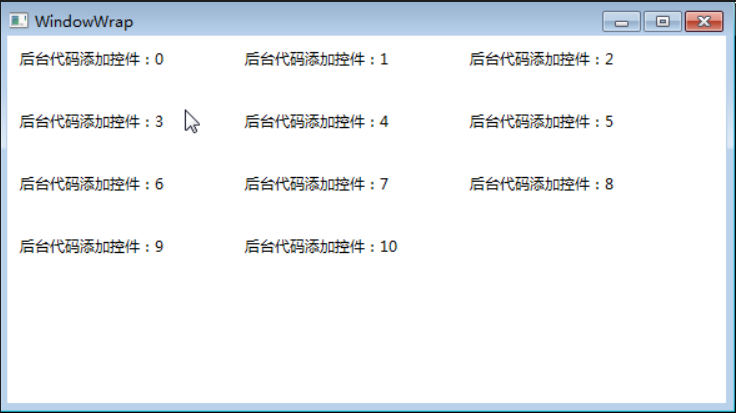
using System;using System.Collections.Generic;using System.Linq;using System.Text;using System.Threading.Tasks;using System.Windows;using System.Windows.Controls;using System.Windows.Data;using System.Windows.Documents;using System.Windows.Input;using System.Windows.Media;using System.Windows.Media.Imaging;using System.Windows.Shapes;namespace WpfApp1{/// <summary>/// WindowWrap.xaml 的交互逻辑/// </summary>public partial class WindowWrap : Window{public WindowWrap(){InitializeComponent();}private void btnAddByCode_Click(object sender, RoutedEventArgs e){WrapPanel wp = new WrapPanel();//把wp添加为窗体的子控件this.Content = wp;wp.Margin = new Thickness(0, 0, 0, 0);wp.Background = new SolidColorBrush(Colors.White);//遍历增加TextBlockTextBlock block;for (int i = 0; i <= 10; i++){block = new TextBlock();block.Text = "后台代码添加控件:" + i.ToString();block.Margin = new Thickness(10, 10, 10, 10);block.Width = 160;block.Height = 30;wp.Children.Add(block);}}}}
四、StackPanel
StackPanel就是将控件按照行或列来顺序排列,但不会换行。通过设置面板的 Orientation 属性设置了两种排列方式:横排(Horizontal默认的)和竖排(Vertical)。纵向的 StackPanel 默认每个元素宽度与面板一样宽,反之横向亦然。如果包含的元素超过了面板空间,它只会截断多出的内容。元素的 Margin 属性用于使元素之间产生一定的间隔,当元素空间大于其内容的空间时,剩余空间将由 HorizontalAlignment 和 VerticalAlignment 属性来决定如何分配。
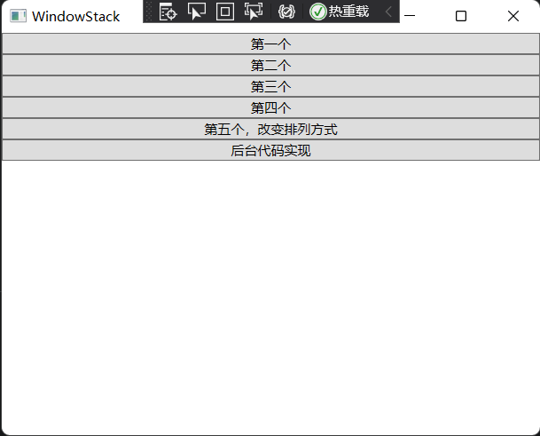
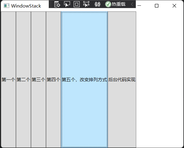
下面这个案例实现效果:点击按钮“第五个,改变排列方式”后(图1),窗口变成竖着排列所有按钮
(图2);点击“后台代码实现”按钮,变成图3。

代码实现:
<Window x:Class="StackPanelTestDemo.MainWindow"xmlns="http://schemas.microsoft.com/winfx/2006/xaml/presentation"xmlns:x="http://schemas.microsoft.com/winfx/2006/xaml"xmlns:d="http://schemas.microsoft.com/expression/blend/2008"xmlns:mc="http://schemas.openxmlformats.org/markup-compatibility/2006"xmlns:local="clr-namespace:StackPanelTestDemo"mc:Ignorable="d"Title="WindowStack" Height="400" Width="500"><Grid><StackPanel Name="stackPanel" Margin="0,0,0,0" Background="White" Orientation="Vertical"><Button Content="第一个"/><Button Content="第二个"/><Button Content="第三个"/><Button Content="第四个"/><Button Content="第五个,改变排列方式" Click="Button_Click"/><Button Content="后台代码实现" Click="Button_Click_1"/></StackPanel></Grid></Window>
using System;using System.Collections.Generic;using System.Linq;using System.Text;using System.Threading.Tasks;using System.Windows;using System.Windows.Controls;using System.Windows.Data;using System.Windows.Documents;using System.Windows.Input;using System.Windows.Media;using System.Windows.Media.Imaging;using System.Windows.Navigation;using System.Windows.Shapes;namespace StackPanelTestDemo{/// <summary>/// MainWindow.xaml 的交互逻辑/// </summary>public partial class MainWindow : Window{public MainWindow(){InitializeComponent();}private void Button_Click(object sender, RoutedEventArgs e){stackPanel.Orientation = Orientation.Horizontal;}private void StackPanels(){StackPanel sp = new StackPanel();//把sp添加为窗体的子控件this.Content = sp;sp.Margin = new Thickness(0, 0, 0, 0);sp.Background = new SolidColorBrush(Colors.White);sp.Orientation = Orientation.Vertical;//Button1Button b1 = new Button();b1.Content = "后台代码,第一个";sp.Children.Add(b1);//Button2Button b2 = new Button();b2.Content = "后台代码,第二个";sp.Children.Add(b2);//Button3Button b3 = new Button();b3.Content = "后台代码,第三个";sp.Children.Add(b3);}private void Button_Click_1(object sender, RoutedEventArgs e){StackPanels();}}}
注:当把StackPanel 的FlowDirection 属性设置为 RightToLeft,Orientation属性设置为 Horizontal,StackPanel 将从右向左排列元素。
五、Grid
Grid顾名思义就是“网格”,它的子控件被放在一个一个实现定义好的小格子里面,整齐排列。Grid和其他各个Panel比较起来,功能最多也最复杂。要使用Grid,首先要向RowDefinitions 和ColumnDefinitions属性中添加一定数量的RowDefinitions和ColumnDefinitions元素,从而定义行数和列数。而放置在Grid面板中的控件元素都必须显示采用附加属性语法定义其放置所在的行和列,它们都是以0为基准的整型值(下标都是从0开始的),如果没有显式设置任何行或列,Grid将会隐式地将控件放入第0行第0列。由于Grid的组成并非简单的添加属性标记来区分行列,这也使得用户在实际应用中可以具体到某一单元格中,所以布局起来就很精细了。
Grid的单元格可以是空的,一个单元格中可以有多个元素,而在单元格中元素是根据它们的顺序一个接着一个呈现的。与Canvas一样,同一个单元格中的子元素不会与其他元素交互布局,信息——它们仅仅是重叠而已。接下来我们来使用一些实际的代码演示一下如何使用Grid。
(1)Grid的列宽与行高可采用固定、自动、按比例三种方式定义:
| 名称 | 说明 |
|---|---|
| 绝对尺寸 | 就是给一个实际的数字,但通常将此值指定为整数。 |
| 自动(Autosizing) | 值为Auto,实际作用就是取实际控件所需的最小值 |
| StarSizing | 值为或N,实际作用就是取尽可能大的值,当某一列或行被定义为则是尽可能大,当出现多列或多行被定义为则是代表几者之间按比例设置尺寸。 |
第一种,固定长度——宽度不够,会裁剪,不好用。单位pixel。
第二种,自动长度——自动匹配列中最长元素的宽度。
第三种,比例长度——表示占用剩余的全部宽度;两行都是,将平分剩余宽度;像上面的一个2,一个,表示前者2/3宽度。
(2)跨越多行和多列
<Rectangle Fill="Silver" Grid.Column="1" Grid.ColumnSpan="3"/>
使用Grid.ColumnSpan和Grid.RowSpan附加属性可以让相互间隔的行列合并,所以元素也可以跨越多个单元格。
(3)使用GridSplit分割
<GridSplitter Height="6" VerticalAlignment="Stretch" HorizontalAlignment="Stretch" Grid.Row="2" Grid.Column="2"/>
使用GridSplit控件结合Grid控件实现类似于WinForm中 SplitContainer 的功能。
(4)XAML代码实现下图效果:

<Window x:Class="WpfApp1.MainWindow"xmlns="http://schemas.microsoft.com/winfx/2006/xaml/presentation"xmlns:x="http://schemas.microsoft.com/winfx/2006/xaml"xmlns:d="http://schemas.microsoft.com/expression/blend/2008"xmlns:mc="http://schemas.openxmlformats.org/markup-compatibility/2006"xmlns:local="clr-namespace:WpfApp1"mc:Ignorable="d"Title="MainWindow" Height="300" Width="450"><Grid><Grid.RowDefinitions><RowDefinition Height="61*"/><RowDefinition Height="101*"/><RowDefinition Height="108*"/></Grid.RowDefinitions><Grid.ColumnDefinitions><ColumnDefinition Width="139"/><ColumnDefinition Width="184*"/><ColumnDefinition Width="45*"/><ColumnDefinition Width="250*"/></Grid.ColumnDefinitions><TextBlock Grid.Row="0" Grid.ColumnSpan="1" Text="第一行,第一列,占一列" Background="Red" HorizontalAlignment="Center"/><Button Grid.Column="1" Grid.Row="0" Grid.ColumnSpan="3" Grid.RowSpan="2" Content="从第1行第2列开始,占两行,三列"/><Button Grid.Row="2" Grid.Column="0" Grid.ColumnSpan="4" Content="第3行,从第1列开始,占4列"/><Button Grid.Row="1" Name="btnAddByCode" Click="btnAddBuCode_Click">后台代码生成(第2行第1列)</Button></Grid></Window>
(5)下图,通过C#代码实现:
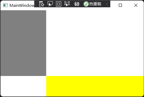
using System;using System.Collections.Generic;using System.Linq;using System.Text;using System.Threading.Tasks;using System.Windows;using System.Windows.Controls;using System.Windows.Data;using System.Windows.Documents;using System.Windows.Input;using System.Windows.Media;using System.Windows.Media.Imaging;using System.Windows.Navigation;using System.Windows.Shapes;namespace WpfApp1{/// <summary>/// MainWindow.xaml 的交互逻辑/// </summary>public partial class MainWindow : Window{public MainWindow(){InitializeComponent();}private void btnAddBuCode_Click(object sender, RoutedEventArgs e){Grid grid = new Grid();grid.Width = Double.NaN;//相当于在XAML中设置Width="Auto"grid.Height = Double.NaN;//相当于在XAML中设置Height="Auto"//把grid添加为窗体的子控件this.Content = grid;//列一ColumnDefinition cd1 = new ColumnDefinition();cd1.Width = new GridLength(139);grid.ColumnDefinitions.Add(cd1);//列二ColumnDefinition cd2 = new ColumnDefinition();cd2.Width = new GridLength(1, GridUnitType.Star);grid.ColumnDefinitions.Add(cd2);//列三ColumnDefinition cd3 = new ColumnDefinition();cd2.Width = new GridLength(2, GridUnitType.Star);grid.ColumnDefinitions.Add(cd3);//行一RowDefinition row1 = new RowDefinition();row1.Height = new GridLength(61);grid.RowDefinitions.Add(row1);//行二RowDefinition row2 = new RowDefinition();row1.Height = new GridLength(1,GridUnitType.Star);grid.RowDefinitions.Add(row2);//行三RowDefinition row3 = new RowDefinition();row1.Height = new GridLength(200);grid.RowDefinitions.Add(row3);//把单元格添加到grid中Rectangle r0c1 = new Rectangle();r0c1.Fill = new SolidColorBrush(Colors.Gray);r0c1.SetValue(Grid.ColumnProperty, 0);r0c1.SetValue(Grid.RowProperty, 0);grid.Children.Add(r0c1);Rectangle r1c23 = new Rectangle();r1c23.Fill = new SolidColorBrush(Colors.Yellow);r1c23.SetValue(Grid.ColumnProperty, 1);r1c23.SetValue(Grid.ColumnSpanProperty, 2);r1c23.SetValue(Grid.RowProperty, 1);r1c23.SetValue(Grid.RowSpanProperty, 2);grid.Children.Add(r1c23);}}}
六、UniformGrid
UniformGrid就是Grid的简化版,每个单元格的大小相同,不需要定义行列集合。每个单元格始终具有相同的大小,每个单元格只能容纳一个控件,将自动按照定义在其内部的元素个数,自动创建行列,并通常保持相同的行列数。UniformGrid中没有Row和Column附加属性,也没有空白单元格。
与Grid布局控件相比,UniformGrid布局控件很少使用。Grid面板是用于创建简单乃至复杂窗口布局的通用工具。UniformGrid面板是一种更特殊的布局容器,主要用于在一个刻板的网格中快速的布局元素。
下面用XAML代码实现一个示例:
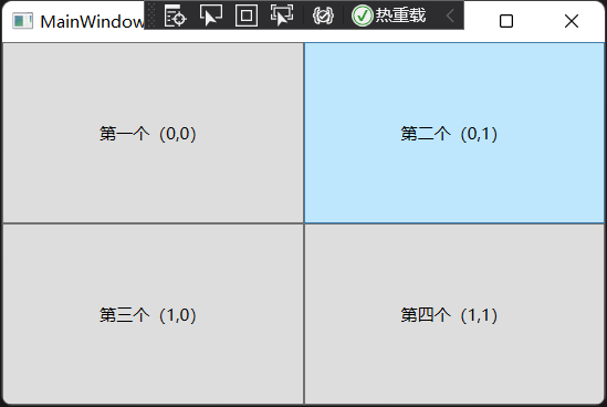
<Window x:Class="WpfApp1.MainWindow"xmlns="http://schemas.microsoft.com/winfx/2006/xaml/presentation"xmlns:x="http://schemas.microsoft.com/winfx/2006/xaml"xmlns:d="http://schemas.microsoft.com/expression/blend/2008"xmlns:mc="http://schemas.openxmlformats.org/markup-compatibility/2006"xmlns:local="clr-namespace:WpfApp1"mc:Ignorable="d"Title="MainWindow" Height="300" Width="450"><Grid><UniformGrid Rows="2" Columns="2"><Button>第一个(0,0)</Button><Button>第二个(0,1)</Button><Button>第三个(1,0)</Button><Button Name="btnAddByCode" Click="btnAddBuCode_Click">第四个(1,1)</Button></UniformGrid></Grid></Window>
下面使用C#代码实现10个TextBlock的控件的布局。
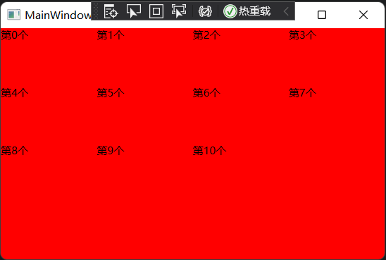
using System;using System.Collections.Generic;using System.Linq;using System.Text;using System.Threading.Tasks;using System.Windows;using System.Windows.Controls;using System.Windows.Controls.Primitives;using System.Windows.Data;using System.Windows.Documents;using System.Windows.Input;using System.Windows.Media;using System.Windows.Media.Imaging;using System.Windows.Navigation;using System.Windows.Shapes;namespace WpfApp1{/// <summary>/// MainWindow.xaml 的交互逻辑/// </summary>public partial class MainWindow : Window{public MainWindow(){InitializeComponent();}private void btnAddBuCode_Click(object sender, RoutedEventArgs e){UniformGrid wp = new UniformGrid();//把wp添加为窗体的子控件this.Content = wp;wp.Margin = new Thickness(0, 0, 0, 0);wp.Background = new SolidColorBrush(Colors.Red);//遍历添加RectanglesTextBlock block;for(int i = 0; i <= 10; i++){block = new TextBlock();block.Text = string.Format("第{0}个",i);wp.Children.Add(block);}}}}
WPF入门系列九——布局之DockPanel与ViewBox(四)
七、DockPanel
DockPanel 定义一个区域,在此区域中,可以使子元素通过描点的形式排列,这些对象位于Children属性中。停靠面板其实就是在 WinForm类似于Dock属性的元素。DockPanel会对每个子元素进行排序,并停靠在面板的一侧,多个停靠在同侧的元素则按顺序排列。
如果将 LastChildFill 属性设置为true(默认属性),那么无论对 DockPanel的最后一个子元素设置的其他任何停靠值如何,该子元素都将始终填满剩余的空间。若要将子元素停靠在另一个方向,必须将 ListChildFill 属性设置为 false,还必须为最后一个子元素指定显式停靠方向。
默认情况下,面板属性并不接收焦点。要强制使面板元素接收焦点,请将 Focusable属性设置为true。
注意:屏幕上 DockPanel 的子元素的位置由相关子元素的 Dock属性以及这些子元素在 DockPanel下的相对顺序确定。因此,具有相同 Dock属性值的一组子元素在屏幕上的位置可能不同,具体取决于这些子元素在 DockPanel下的顺序。子元素的顺序会影响定位,因为DockPanel会按顺序迭代其子元素,并根据剩余空间来设置每个子元素的位置。
使用XAML代码实现如下图所示效果:
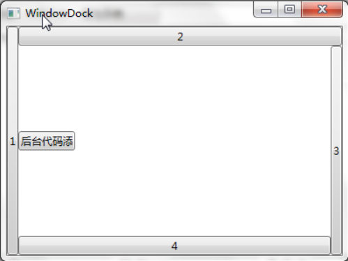
<Window x:Class="WpfApp1.MainWindow"xmlns="http://schemas.microsoft.com/winfx/2006/xaml/presentation"xmlns:x="http://schemas.microsoft.com/winfx/2006/xaml"xmlns:d="http://schemas.microsoft.com/expression/blend/2008"xmlns:mc="http://schemas.openxmlformats.org/markup-compatibility/2006"xmlns:local="clr-namespace:WpfApp1"mc:Ignorable="d"Title="MainWindow" Height="300" Width="450"><Grid><DockPanel Width="Auto" Height="Auto"><Button DockPanel.Dock="Left" Content="1"/><Button DockPanel.Dock="Top" Content="2"/><Button DockPanel.Dock="Right" Content="3"/><Button DockPanel.Dock="Bottom" Content="4"/><Button HorizontalAlignment="Left" Name="btnAddByCode" Height="22" Width="65"DockPanel.Dock="Left" Click="btnAddBuCode_Click">后台代码添加</Button></DockPanel></Grid></Window>
使用C#代码实现如下图效果:
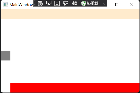
using System;using System.Collections.Generic;using System.Linq;using System.Text;using System.Threading.Tasks;using System.Windows;using System.Windows.Controls;using System.Windows.Controls.Primitives;using System.Windows.Data;using System.Windows.Documents;using System.Windows.Input;using System.Windows.Media;using System.Windows.Media.Imaging;using System.Windows.Navigation;using System.Windows.Shapes;namespace WpfApp1{/// <summary>/// MainWindow.xaml 的交互逻辑/// </summary>public partial class MainWindow : Window{public MainWindow(){InitializeComponent();}private void btnAddBuCode_Click(object sender, RoutedEventArgs e){DockPanel dp = new DockPanel();//dp.LastChildFill = true;dp.Width = Double.NaN;//相当于在XAML中设置Width="Auto"dp.Height = Double.NaN;//相当于在XAML中设置Height="Auto"//把dp添加为窗体的子控件this.Content = dp;//添加RectanglesRectangle rTop = new Rectangle();rTop.Fill = new SolidColorBrush(Colors.BlanchedAlmond);rTop.Stroke = new SolidColorBrush(Colors.BlanchedAlmond);rTop.Height = 30;dp.Children.Add(rTop);rTop.SetValue(DockPanel.DockProperty, Dock.Top);Rectangle rLeft = new Rectangle();rLeft.Fill = new SolidColorBrush(Colors.Gray);rLeft.Stroke = new SolidColorBrush(Colors.Gray);rLeft.HorizontalAlignment = HorizontalAlignment.Left;rLeft.Height = 30;rLeft.Width = 30;dp.Children.Add(rLeft);rLeft.SetValue(DockPanel.DockProperty, Dock.Left);Rectangle rBottom = new Rectangle();rBottom.Fill = new SolidColorBrush(Colors.Red);rBottom.VerticalAlignment = VerticalAlignment.Bottom;rBottom.Height = 30;dp.Children.Add(rBottom);rBottom.SetValue(DockPanel.DockProperty, Dock.Bottom);}}}
八、ViewBox
ViewBox 这个控件通常和其他控件结合起来使用,是WPF中非常有用的控件。定义一个内容容器。ViewBox组件的作用是拉伸或延展位于其中的组件,以填满可用空间,使之有更好的布局及视觉效果。
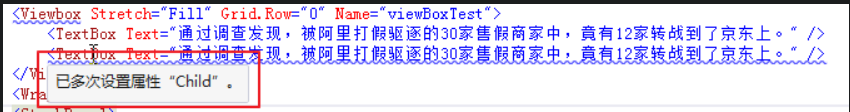
一个ViewBox中只能放一个控件。如果多添加了一个控件就会报错。如下图:
组件常用属性:
Child:获取或设置一个ViewBox元素的单一子元素。
Stretch:获取或设置拉伸模式以决定该组件中的内容以怎样的形式填充该组件的已有空间。具体设置值如下:
| 成员名称 | 说明 |
|---|---|
| None | 内容保持其原始大小。 |
| Fill | 调整内容的大小以填充目标尺寸。不保留纵横比。 |
| Uniform | 在保留内容原有纵横比的同时调整内容的大小,以适合目标尺寸。 |
| UniformToFill | 在保留内容原有纵横比的同时调整内容的大小,以填充目标尺寸。如果目标矩形的纵横比不同于源矩形的纵横比,则对源内容进行剪裁以适合目标尺寸。 |
StretchDirection:获取或设置该组件的拉伸方向以决定该组件中的内容将以何种形式被延展。具体的设置值如下:
| 成员名称 | 说明 |
|---|---|
| UpOnly | 仅当内容小于父项时,它会放大。如果内容大于父项,不会执行任何缩小操作。 |
| DownOnly | 仅当内容大于父项时,它才会缩小。如果内容小于父项,不会执行任何放大操作。 |
| Both | 内容根据 Stretch 属性进行拉伸以适合父项的大小。 |
接下来做个示例,可以通过选择下拉框中的不同设置值,来查看不同的效果。效果如下:
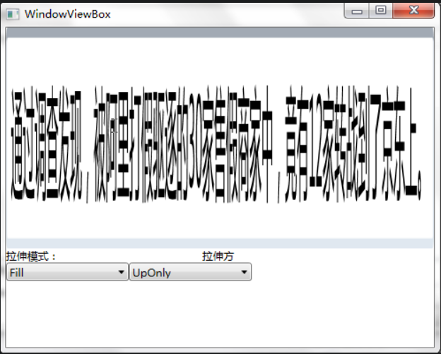
<Window x:Class="WpfApp1.MainWindow"xmlns="http://schemas.microsoft.com/winfx/2006/xaml/presentation"xmlns:x="http://schemas.microsoft.com/winfx/2006/xaml"xmlns:d="http://schemas.microsoft.com/expression/blend/2008"xmlns:mc="http://schemas.openxmlformats.org/markup-compatibility/2006"xmlns:local="clr-namespace:WpfApp1"mc:Ignorable="d"Title="MainWindow" Height="300" Width="450"><Grid><Grid.RowDefinitions><RowDefinition Height="250"/><RowDefinition Height="auto"/><RowDefinition Height="73*"/></Grid.RowDefinitions><Viewbox Stretch="Fill" Grid.Row="0" Name="viewBoxTest"><TextBox Text="通过调查发现,被阿里打假驱逐的30家售假商家中,竟有12家转战到了京东上。" /></Viewbox><WrapPanel Grid.Row="2"><StackPanel><TextBlock Height="16" HorizontalAlignment="Left" VerticalAlignment="Bottom"Width="66" Text="拉伸模式:" TextWrapping="Wrap"/><ComboBox x:Name="cbStretch" Height="21" HorizontalAlignment="Left"VerticalAlignment="Bottom" Width="139" SelectionChanged="cbStretch_SelectionChanged"/></StackPanel><StackPanel><TextBlock Height="16" HorizontalAlignment="Right" VerticalAlignment="Bottom"Width="56" Text="拉伸方向:" TextWrapping="Wrap"/><ComboBox x:Name="cbStretchDirection" Height="21" HorizontalAlignment="Right"VerticalAlignment="Bottom" Width="139"SelectionChanged="cbStretchDirection_SelectionChanged"/></StackPanel></WrapPanel></Grid></Window>
using System;using System.Collections.Generic;using System.Linq;using System.Text;using System.Threading.Tasks;using System.Windows;using System.Windows.Controls;using System.Windows.Data;using System.Windows.Documents;using System.Windows.Input;using System.Windows.Media;using System.Windows.Media.Imaging;using System.Windows.Shapes;namespace WpfApp1{/// <summary>/// WindowViewBox.xaml 的交互逻辑/// </summary>public partial class WindowViewBox : Window{//定义cbStretch与cbStretchDirection的数据源List<StretchHelper> cbStretchList = new List<StretchHelper>();List<StretchDirectionHelper> cbStretchDirectionList = new List<StretchDirectionHelper>();public WindowViewBox(){InitializeComponent();}private void BindDrp(){ //填充各ComboBox内容cbStretchList.Add(new StretchHelper() { StretchModeName = "Fill", theStretchMode = Stretch.Fill });cbStretchList.Add(new StretchHelper() { StretchModeName = "None", theStretchMode = Stretch.None });cbStretchList.Add(new StretchHelper() { StretchModeName = "Uniform", theStretchMode = Stretch.Uniform });cbStretchList.Add(new StretchHelper() { StretchModeName = "UniformToFill", theStretchMode = Stretch.UniformToFill });cbStretch.ItemsSource = cbStretchList;cbStretch.DisplayMemberPath = "StretchModeName";cbStretchDirectionList.Add(new StretchDirectionHelper() { StretchDirectionName = "DownOnly", theStretchDirection = StretchDirection.DownOnly });cbStretchDirectionList.Add(new StretchDirectionHelper() { StretchDirectionName = "UpOnly", theStretchDirection = StretchDirection.UpOnly });cbStretchDirectionList.Add(new StretchDirectionHelper() { StretchDirectionName = "Both", theStretchDirection = StretchDirection.Both });cbStretchDirection.ItemsSource = cbStretchDirectionList;cbStretchDirection.DisplayMemberPath = "StretchDirectionName";}private void cbStretchDirection_SelectionChanged(object sender, SelectionChangedEventArgs e){if (cbStretchDirection.SelectedItem != null){viewBoxTest.StretchDirection = (cbStretchDirection.SelectedItem as StretchDirectionHelper).theStretchDirection;}}private void cbStretch_SelectionChanged(object sender, SelectionChangedEventArgs e){if (cbStretch.SelectedItem != null){viewBoxTest.Stretch = (cbStretch.SelectedItem as StretchHelper).theStretchMode;}}private void Window_Loaded(object sender, RoutedEventArgs e){BindDrp();}}//辅助类StretchHelperpublic class StretchHelper{public string StretchModeName { get; set; }public Stretch theStretchMode { get; set; }}//辅助类StretchDirectionHelperpublic class StretchDirectionHelper{public string StretchDirectionName { get; set; }public StretchDirection theStretchDirection { get; set; }}}
WPF入门系列十——布局之Border与ViewBox(五)
九、Border
Border是一个装饰的控件,此控件绘制边框及背景,在Border中只能有一个子控件,若要显示多个子控件,需要将一个附加的 Panel控件放置在父 Border中。然后可以将子控件放置在该 Panel控件中。
Border几个重要属性:
WPF入门系列——依赖属性
一、依赖属性基本介绍
依赖属性就是可以自己没有值,并能够通过Binding从数据源获取值(依赖在别人身上)的属性。拥有依赖属性的对象被称为“依赖对象”。依赖属性的重点在于“依赖”二字,既然是依赖了,也就是说:依赖项属性的值的改变过程一定与其他对象相关,不是A依赖B就是B依赖A,或者相互依赖。
依赖主要应用在以下地方:
1、双向绑定。有了这个,依赖项属性不用写额外的代码,也不用实现什么接口,它本身就具备双向绑定的特性,比如,我把员工对象的姓名绑定到文本框,一旦绑定,只要文本框中的值发生改变,依赖项属性员工姓名也会跟着变化,反之亦然;
2、触发器。这个东西在WPF中很重要,比如,一个按钮背景是红色,我想让它当鼠标停留在上面时,背景变成绿色,而鼠标一旦移开,按钮恢复红色。
如果在传统的Windows编程中,你一定会想办法弄一些事件、或者委托来处理,还要写一堆代码。但是有了依赖属性,一行代码都不需要写,所有的处理均由WPF属性系统自动处理。而触发器只是临时改变属性的值,当触发完成时,属性值自动被“还原”。
3、附加属性。附加属性也是依赖属性,它可以把A类型的某些属性推迟到运行时根据B类型的具体情况来进行设置,而且可以同时被多个类型同时维护同一个属性值,但每个实例的属性值是独立的。A属性改变时,也同时改变其他属性的值,如TogleButton按下的同时,弹出下拉框。
依赖属性与传统的CLR属性和面向对象相比有很多新颖之处,其中包括:
1、新功能的引入:加入了属性变化通知、限制、验证等功能,这样就可以使我们更方便的实现我们的应用,同时也使代码量大大减少了。
2、节约内存:在WinForm等项目开发中,你会发现UI控件的属性通常都是赋予的初始值,为每一个属性存储一个字段将是对内存的巨大浪费。WPF依赖属性允许对象在被创建的时候并不包含用于存储数据的空间(即字段所占用的空间)、只保留在需要用到数据的时候能够获得默认值。借用其他对象的数据或者实时分配空间的能力——这种对象被称为依赖对象而它这种实时获取数据的能力则是依靠依赖属性来实现。在WPF开发中,必须使用依赖对象作为依赖属性的宿主,使二者结合起来,才能形成完整的Binding目标被数据所驱动。
3、支持多个提供对象:我们可以通过多种方式来设置依赖属性的值。同时其内部可以存储多个值,配合Expression、Style、Animation等可以给我们带来很强的开发体验。
在.NET中,对于属性是大家应该很熟悉,封装类的字段,表示类的状态,编译后被转化为对应的 get 和 set 方法。属性可以被类或结构等使用。
依赖属性的实现:
第一步:让自己的类继承自 DependencyObject 基类。在WPF中,几乎所有的 UI 元素都继承自 DependencyObject,这个类封装了对依赖属性的存储及访问等操作,使用静态类型与依赖类型的内部存储机制相关。WPF处理依赖属性不再像.NET属性那样将属性值存储到一个私有变量中,而是使用一个字典类型的变量来存放用户显式设置的值。
第二步:依赖属性的定义必须使用 public static 声明一个 DependencyProperty 的变量,并且有一个 Peoperty 作为后缀,该变量才是真正的依赖属性。例如下面的代码定义了一个依赖属性 NameProperty:
public static readonly DependencyProperty NameProperty;
第三步:在静态构造函数中向属性系统注册依赖属性,并获取对象引用。依赖属性是通过调用 DependencyProperty.Register 静态方法创建,该方法需要传递一个属性名称,这个名称非常重要,在定义控件 Style 和 Template 的时候,Setter 的 Property 属性填入的值就是注册依赖属性时使用的名称。propertyType 指明了依赖属性实际的类型,ownerType指明了是哪个类注册了此依赖属性,最后 typeMetadata 存放了一些依赖属性的元信息,包括依赖属性使用的默认值,还有属性值发生变更时的通知函数。例如。下面的代码注册了依赖属性:
NameProperty = DependencyProperty.Register("Name", typeof(string), typeof(Student), new PropertyMetadata("名称", OnValueChanged));
第四步:在前面三步中,我们完成了一个依赖属性的注册,那么我们怎样才能对这个依赖属性进行读写呢?答案就是提供一个依赖属性的实例化包装属性,通过这个属性来实现具体的读写操作。和 CLR属性不同,依赖属性不是直接对私有变量的操纵,而是通过 GetValue()和 SetValue()方法来操作属性值的,可以使用标准的.NET属性定义语法进行封装,使依赖属性可以像标准属性那样来使用,代码如下:
public string Name{get{ return (string)GetValue(NameProperty);}set{ SetValue(NameProperty, value);}}
根据前面的四步操作,我们可以写出下面的代码:
public class Student : DependencyObject{//声明一个静态只读的DependencyProperty字段public static readonly DependencyProperty NameProperty;static Student(){//注册我们定义的依赖属性NameNameProperty = DependencyProperty.Register("Name", typeof(string), typeof(Student),new PropertyMetadata("名称", OnValueChanged));}private static void OnValueChanged(DependencyObject o, DependencyPropertyChangedEventArgs e){//当值改变时,我们可以在此做一些逻辑处理}//属性包装器,通过它来读取和设置我们刚才注册的依赖属性public string Name{get{ return (string)GetValue(NameProperty);}set{ SetValue(NameProperty, value);}}}
总结:我们一般.NET属性是直接对类的一个私有属性进行封装,所以读取值得时候,也就是直接读取这个字段;而依赖属性则是通过调用继承自 DependencyObject 的 GetValue()来操作,它实际存储在 DependencyProperty 的一个 IDictionary的键-值配对字典中,所以一套记录中的键(Key)就是该属性的 HashCode值,而值(Value)则是我们注册的 DependencyProperty。
二、依赖属性的优先级
这个内容在“WPF精读”部分有,这里就不展开了,在那里讲的清楚一点。这里只贴一张原博客的图片在这里。虽然看这个图我现在还看不明白:
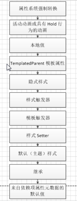
P.S.这个流程图过于理想化,在实际工作中不一定是这样的,需要具体问题具体分析。
三、依赖属性的继承
属性值继承是WPF属性系统的一项功能。属性值继承使得元素树中的子元素可以从父元素那里获得特定的属性的值,并继承该值,就好像它是在最近的父元素中任意位置设置的一样。父元素还可以通过属性值继承来获得其值,因此系统有可能一直递归到页面根元素。属性值继承不是属性系统的默认行为;属性必须用特定的元数据设置来建立,以便使该属性能够对子元素启动属性值继承。
依赖属性继承的最初意愿是父元素的相关设置会自动传递给所有层次的子元素,即元素可以从其在树中的父级继承依赖项属性的值。这个我们在编程当中接触的比较多,比如当我们修改窗体容器控件的字体设置时,所有级别的子控件都将自动使用该字体设置(前提是该子控件未做自定义设置)。接下来,我们来做一个实际的例子,代码如下:
<Window x:Class="WpfApp1.WindowInherited"xmlns="http://schemas.microsoft.com/winfx/2006/xaml/presentation"xmlns:x="http://schemas.microsoft.com/winfx/2006/xaml"Title="WindowInherited" Height="400" Width="500" Loaded="Window_Loaded" ><Grid><Grid.RowDefinitions><RowDefinition Height="101*"/><RowDefinition Height="80"/><RowDefinition Height="80"/></Grid.RowDefinitions><StackPanel Grid.Row="0" ><Label Content="继承自Window的FontSize" /><TextBlock Name="textBlockInherited" Text="重写了继承,没有继承Window的FontSize"FontSize="36" TextWrapping="WrapWithOverflow"/><StatusBar>没有继承自Window的FontSize,Statusbar</StatusBar></StackPanel><WrapPanel Grid.Row="1"><Label Content="窗体字体大小" /><ComboBox Name="drpWinFontSize"></ComboBox><Button Name="btnFontSize" Click="btnFontSize_Click">改变window字体</Button></WrapPanel><WrapPanel Grid.Row="2"><Label Content="文本字体大小" /><ComboBox Name="drpTxtFontSize"></ComboBox><Button Name="btnTextBlock" Click="btnTextBlock_Click">改变TextBlock字体</Button></WrapPanel></Grid></Window>
using System;using System.Collections.Generic;using System.Linq;using System.Text;using System.Threading.Tasks;using System.Windows;using System.Windows.Controls;using System.Windows.Data;using System.Windows.Documents;using System.Windows.Input;using System.Windows.Media;using System.Windows.Media.Imaging;using System.Windows.Shapes;namespace WpfApp1{/// <summary>/// WindowInherited.xaml 的交互逻辑/// </summary>public partial class WindowInherited : Window{public WindowInherited(){InitializeComponent();}private void btnFontSize_Click(object sender, RoutedEventArgs e){this.FontSize =Convert.ToInt32(drpWinFontSize.Text);}private void btnTextBlock_Click(object sender, RoutedEventArgs e){this.textBlockInherited.FontSize = Convert.ToInt32(drpTxtFontSize.Text);}private void Window_Loaded(object sender, RoutedEventArgs e){List<int> listFontSize = new List<int>();for (int i = 0; i <= 60; i++){listFontSize.Add(i + 4);}drpTxtFontSize.ItemsSource = listFontSize;drpWinFontSize.ItemsSource = listFontSize;}}}
效果图如下:
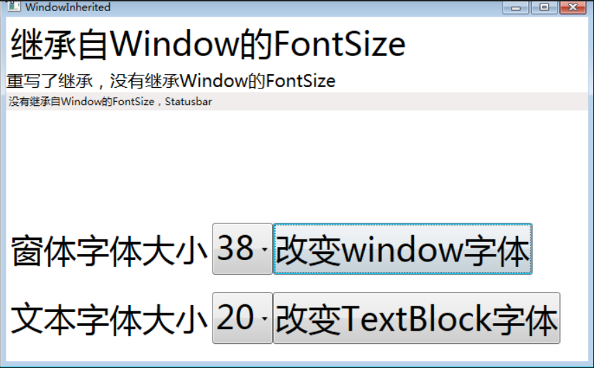
Window.FontSize设置会影响所有的内部元素字体大小,这就是所谓的属性值继承,如上面代码中的第一个 Label 没有定义 FontSize,所以他继承了Window.FontSize 的值。但是一旦子元素提供了显式设置,这种继承就会被打断,比如第二个 TextBlock定义了自己的 FontSize,所以这个时候继承的值就不会再起作用了。
这个时候你会发现一个很奇怪的问题:虽然 StatusBar没有重写 FontSize,同时它也是 Window的子元素,但是它的字体大小却没有变化,保持了系统默认值。那这是什么原因呢?其实不是所有元素都支持属性值继承,还会存在一些意外的的情况,那么总的来说是由于以下两个方面:
1、有些Dependency属性在用注册的时候指定 Inherits 为不可继承,这样继承就会失效了。
2、有其他更优先级的设置设置了该值,在前面讲到的“依赖属性的优先级”可以看到,
属性值继承通过混合树操作。持有原始值的父对象和继承该值的子对象都必须是 FrameworkElement 或 FrameworkContentElement,且都必须属于某个逻辑树。但是,对于支持属性继承的现有 WPF属性,属性值的继承能够通过逻辑树中没有的中介对象永久存在。这主要适用于以下情况:让模板元素使用在应用了模板的实例上设置的所有继承属性值,或者使用在更高级别的页级成分(因此在逻辑树中也位于更高位置)中设置的所有继承属性值。为了使属性值的继承在这两种情况下保持一致,继承属性必须注册为附加属性。
这里的原因是部分控件,如 StatusBar、Tooptip 和 Menu等内部设置它们的字体属性值以匹配当前系统。这样用户通过操作系统的控制面板来修改它们的外观。这种方法存在一个问题:StatusBar等截获了从父元素继承来的属性,并且不影响其子元素。比如,如果我们在 StatusBar中添加了一个Button。那么这个Button的字体属性会因为StatusBar的截断而没有任何改变,将保留其默认值。所以大家在使用的时候要特别注意这些问题。
四、只读依赖属性
对于非WPF得功能来说,对于类的属性的封装中,经常会对那些希望暴露给外界只读操作的字段封装成只读属性,同样在WPF中也提供了只读属性的概念,比如一些WPF控件的依赖属性是只读的,它们经常用于报告控件的状态和信息,像IsMouseOver等属性,那么在这个时候对它赋值就没有任何意义了。
那为什么不使用一般的.NET属性提供出来呢?一般的实行也可以绑定到元素上啊?这个是由于有些地方必须要用到只读依赖属性,比如 Trigger等,同时也因为内部可能有多个提供者修改其值,所以用.NET属性就不行了。
那么一个只读的依赖属性怎么创建呢?其实创建一个只读的依赖属性和创建一个一般的依赖属性大同小异。不同的地方就是 DependencyProperty.Register 变成了 DependencyProperty.RegisterReadOnly。和前面的普通依赖属性一样,它将返回一个 DependencyPropertyKey。而且只提供一个 GetValue 给外部,这样便可以像一般属性一样使用了,只是不能在外部设置它的值罢了。
下面通过一个简单的例子来说明:
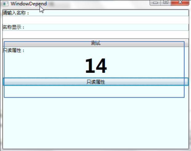
public partial class WindowReadOnly : Window{public WindowReadOnly (){InitializeComponent();//用SetValue的方法来设置值DispatcherTimer timer =new DispatcherTimer(TimeSpan.FromSeconds(1),DispatcherPriority.Normal,(object sender, EventArgs e)=>{int newValue = Counter == int.MaxValue ? 0 : Counter + 1;SetValue(counterKey, newValue);},Dispatcher);}//属性包装器,只提供GetValuepublic int Counter{get { return (int)GetValue(counterKey.DependencyProperty); }}//用RegisterReadOnly来代替Register来注册一个只读的依赖属性private static readonly DependencyPropertyKey counterKey =DependencyProperty.RegisterReadOnly("Counter",typeof(int),typeof(WindowReadOnly),new PropertyMetadata(0));}
<Window x:Name="winReadOnly" x:Class="WpfApp1.WindowReadOnly"xmlns="http://schemas.microsoft.com/winfx/2006/xaml/presentation"xmlns:x="http://schemas.microsoft.com/winfx/2006/xaml"Title="WindowDepend" Height="300" Width="300"><Grid><Viewbox><TextBlock Text="{Binding ElementName=winReadOnly, Path=Counter}" /></Viewbox></Grid></Window>
效果如下图所示:
五、附加属性
现在我们再继续探讨另外一种特殊的依赖属性——附加属性。附加属性是一种特殊的依赖属性。这是WPF的特性之一,通俗的理解起来就是,别人有的属性,由于你跟它产生了关系所以你也有了这个属于它的属性。
附加属性是说一个属性本来不属于某个对象,但由于某种需求而被后来附加上,也就是把对象放入一个特定环境后对象才具有的属性就称为附加属性,附加属性的作用就是将属性与数据类型解耦合,让数据类型的设计更加灵活,举例,一个 TextBox被放在不同的布局容器中时就会有不同的布局属性,这些属性就是由布局容器为 TextBox附加上的,附加属性的本质就是依赖属性,二者仅仅在注册和包装上有一点区别。
附加属性是依赖属性的一种特殊形式,它可以让用户在一个元素中设置其他元素的属性。一般来说,附加属性是用于一个父元素定位其他元素布局的。就像Grid和DockPanel元素就包含附加属性。Grid使用附加属性来指定包含子元素的特定行和列,而DockPanel使用附加属性是来指定子元素应该停靠在面板中的何处位置。
附加属性就是自己没有这个属性,在某些上下文中需要就被附加上去。比如 StackPanel的Grid.Row属性,如果我们定义StackPanel类时定义一个Row属性是没有意义的,因为我们并不知道一定会放在Grid里,这样就造成了浪费。
例如,下面转场控件的定义使用了Grid的Row属性来将自身定位到特定的行中:
<Grid><Grid.RowDefinitions><RowDefinition Height="101*"/><RowDefinition Height="80"/><RowDefinition Height="80"/></Grid.RowDefinitions><StackPanel Grid.Row="0" >
使用附加属性,可以避开可能会防止一个关系中的不同对象在运行时相互传递信息的编码约定。一定可以针对常见的基类设置属性,以便每个对象只需获取和设置该属性即可。但是,基类中最终很可能会充斥着大量的可共享属性。它甚至可能会引入以下情况:在数百个后代中,只有两个后代尝试使用一个属性。这样的类设计很糟糕。为了解决这个问题,我们使用附加属性概念来允许对象为不是由它自己的类结构定义的属性赋值。在创建对象树中的各个相关对象之后,在运行时从子对象读取此值。
最好的例子就是布局面板。每一个布局面板都需要自己特有的方式来组织它的子元素。如 Canvas需要 Top和 Left来布局,DockPanel需要 Dock来布局。
下面代码中的 Button 就是用了 Canvas 的 Canvas.Left=”20”来进行布局定位,那么这两个就是传说中的附加属性。
定义附加属性的方法与定义依赖属性的方法一致,前面我们是使用 DependencyProperty.Register来注册一个依赖属性,只是在注册属性时使用的是RegisterAttach()方法。这个RegisterAttached的参数和 Register是完全一致的,那么Attached(附加)这个概念从何而来?
其实我们使用依赖属性,一直在Attached(附加)。我们注册(构造)一个依赖属性,然后在DependencyObject中通过 GetValue和 SetValue来操作这个依赖属性,也就是把这个依赖属性通过这样的方法关联到了这个DependencyObject上,只不过是通过封装 CLR属性来达到的。那么 RegisterAttached 又是怎样的呢?
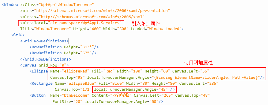
using System;using System.Collections.Generic;using System.Linq;using System.Text;using System.Threading.Tasks;using System.Windows;using System.Windows.Media;namespace WpfApp1.Services{public class TurnoverManager : DependencyObject{//通过静态方法的形式暴露读的操作public static double GetAngle(DependencyObject obj){return (double)obj.GetValue(AngleProperty);}//通过静态方法的形式暴露写的操作public static void SetAngle(DependencyObject obj, double value){obj.SetValue(AngleProperty, value);}//通过使用RegisterAttached来注册一个附加属性public static readonly DependencyProperty AngleProperty = DependencyProperty.RegisterAttached("Angle",typeof(double), typeof(TurnoverManager), new PropertyMetadata(0.0, OnAngleChanged));//根据附加属性中的值,当值改变的时候,旋转相应的角度。private static void OnAngleChanged(DependencyObject obj, DependencyPropertyChangedEventArgs e){var element = obj as UIElement;if (element != null){element.RenderTransformOrigin = new Point(0.5, 0.5);element.RenderTransform = new RotateTransform((double)e.NewValue);}}}}
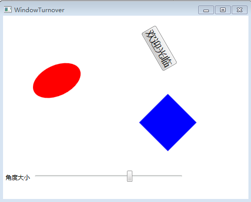
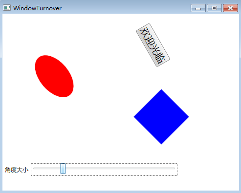
<Window x:Class="WpfApp1.WindowTurnover"xmlns="http://schemas.microsoft.com/winfx/2006/xaml/presentation"xmlns:x="http://schemas.microsoft.com/winfx/2006/xaml"xmlns:local="clr-namespace:WpfApp1.Services"Title="WindowTurnover" Height="400" Width="500" Loaded="Window_Loaded"><Grid><Grid.RowDefinitions><RowDefinition Height="313*"/><RowDefinition Height="57*"/></Grid.RowDefinitions><Canvas Grid.Row="0"><Ellipse Name="ellipseRed" Fill="Red" Width="100" Height="60" Canvas.Left="56"Canvas.Top="98" local:TurnoverManager.Angle="{Binding ElementName=sliderAngle, Path=Value}"/><Rectangle Name="ellipseBlue" Fill="Blue" Width="80" Height="80" Canvas.Left="285"Canvas.Top="171" local:TurnoverManager.Angle="45" /><Button Name="btnWelcome" Content="欢迎光临" Canvas.Left="265" Canvas.Top="48"FontSize="20" local:TurnoverManager.Angle="60"/></Canvas><WrapPanel Grid.Row="1"><Label Content="角度大小" /><Slider x:Name="sliderAngle" Minimum="0" Maximum="240" Width="300" /></WrapPanel></Grid></Window>
在XAML中就可以使用刚才注册的附加属性了,如下图:
这个例子中只有椭圆的角度会发生变化:
六、依赖属性回调、验证及强制值
WPF属性系统对依赖属性操作的基本步骤:
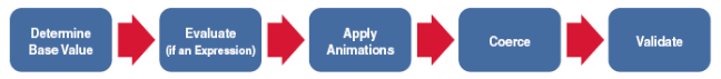
1. 确定Base Value,对同一个属性的赋值可能发生在很多地方。比如控件的背景(Background),可能在 Style 或者控件的构造函数中都对它进行了赋值,这个Base Value就是要确定这些值中优先级最高的值,把它作为Base Value。2. 估值。如果依赖属性值是计算表达式(Expression),比如说一个绑定,WPF属性系统就会计算表达式,把结果转化成一个实际值。3. 动画。动画是一种优先级很高的特殊行为。如果当前属性正在作动画,那么因动画而产生的值会优于前面获得的值,这个也就是WPF中常说的动画优先。4. 强制。如果我们在FrameworkPropertyMetadata中传入了`CoerceValueCallback`委托,WPF属性系统会回调我们传入的delegate,进行属性值的验证,验证属性值是否在我们允许的范围之内。例如强制设置该值必须大于等于0小于10等等。在属性赋值过程中,Coerce拥有最高的优先级,这个优先级要大于动画的优先级别。5. 验证。验证是指我们注册依赖属性如果提供了`ValidateValueCallback`委托,那么最后WPF会调用我们传入的delegate,来验证数据的有效性。当数据无效时会抛出异常来通知。
那么应该如何使用这些功能呢?
前面讲了基本的流程,下面用一个小的例子来进行说明:
<Window x:Class="WpfApp1.WindowValid"xmlns="http://schemas.microsoft.com/winfx/2006/xaml/presentation"xmlns:x="http://schemas.microsoft.com/winfx/2006/xaml"Title=" WindowValid " Height="300" Width="400"><Grid><StackPanel><Button Name="btnDPTest" Click="btnDPTest_Click" >属性值执行顺序测试</Button></StackPanel></Grid></Window>
using System;using System.Collections.Generic;using System.Linq;using System.Text;using System.Threading;using System.Threading.Tasks;using System.Windows;using System.Windows.Controls;using System.Windows.Data;using System.Windows.Documents;using System.Windows.Input;using System.Windows.Media;using System.Windows.Media.Imaging;using System.Windows.Shapes;using System.Windows.Threading;using WpfApp1.Models;namespace WpfApp1{/// <summary>/// WindowThd.xaml 的交互逻辑/// </summary>public partial class WindowValid: Window{public WindowValid (){InitializeComponent();}private void btnDPTest_Click(object sender, RoutedEventArgs e){SimpleDP test = new SimpleDP();test.ValidDP = 1;}}}using System;using System.Collections.Generic;using System.Linq;using System.Text;using System.Threading.Tasks;using System.Windows;namespace WpfApp1.Models{public class SimpleDP : DependencyObject{public static readonly DependencyProperty ValidDPProperty =DependencyProperty.Register("ValidDP", typeof(int), typeof(SimpleDP),new FrameworkPropertyMetadata(0,FrameworkPropertyMetadataOptions.None,new PropertyChangedCallback(OnValueChanged),new CoerceValueCallback(CoerceValue)),new ValidateValueCallback(IsValidValue));public int ValidDP{get { return (int)GetValue(ValidDPProperty); }set { SetValue(ValidDPProperty, value); }}private static void OnValueChanged(DependencyObject d, DependencyPropertyChangedEventArgs e){Console.WriteLine("当属性值的OnValueChanged方法被调用,属性值为: {0}", e.NewValue);}private static object CoerceValue(DependencyObject d, object value){Console.WriteLine("当属性值的CoerceValue方法被调用,属性值强制为: {0}", value);return value;}private static bool IsValidValue(object value){Console.WriteLine("当属性值的IsValidValue方法被调用,对属性值进行验证,返回bool值,如果返回True表示验证通过,否则会以异常的形式抛出: {0}", value);return true;}}}
结果如下:
当ValidDP属性变化之后,PropertyChangeCallback就会被调用。可以看到结果并没有完全按照我们先前的流程先Coerce后Validate的顺序执行,有可能是WPF内部做了什么特殊的处理,当属性被修改时,首先会调用Validate来判断传入的value是否有效,如果无效就不继续后续的操作,这样可以更好的优化性能。从上面的结果可以看出,CoerceValue后面并没有立即ValidateValue,而是直接调用了PropertyChanged。这是因为前面已经验证过了value,如果在Coerce中没有改变value,那么就不用再验证了。如果在Coerce中改变了value,那么这里还会再次调用ValidateValue操作,和前面的流程图执行的顺序一样,在最后我们会调用ValidateValue来进行最后的验证,这就保证最后的结果是我们希望的那样了。
上面简单介绍了处理流程,下面我们就以一个案例来具体看看上面的流程到底有没有写入。
using System;using System.Collections.Generic;using System.Linq;using System.Text;using System.Threading.Tasks;using System.Windows;namespace WpfApp1.Controls{class MyValiDP:System.Windows.Controls.Control{//注册Current依赖属性,并添加PropertyChanged、CoerceValue、ValidateValue的回调委托public static readonly DependencyProperty CurrentValueProperty = DependencyProperty.Register("CurrentValue",typeof(double),typeof(MyValiDP),new FrameworkPropertyMetadata(Double.NaN,FrameworkPropertyMetadataOptions.None,new PropertyChangedCallback(OnCurrentValueChanged),new CoerceValueCallback(CoerceCurrentValue)),new ValidateValueCallback(IsValidValue));//属性包装器,通过它来暴露Current的值public double CurrentValue{get { return (double)GetValue(CurrentValueProperty); }set { SetValue(CurrentValueProperty, value); }}//注册Min依赖属性,并添加PropertyChanged、CoerceValue、ValidateValue的回调委托public static readonly DependencyProperty MinValueProperty = DependencyProperty.Register("MinValue",typeof(double),typeof(MyValiDP),new FrameworkPropertyMetadata(double.NaN,FrameworkPropertyMetadataOptions.None,new PropertyChangedCallback(OnMinValueChanged),new CoerceValueCallback(CoerceMinValue)),new ValidateValueCallback(IsValidValue));//属性包装器,通过它来暴露Min的值public double MinValue{get { return (double)GetValue(MinValueProperty); }set { SetValue(MinValueProperty, value); }}//注册Max依赖属性,并添加PropertyChanged、CoerceValue、ValidateValue的回调委托public static readonly DependencyProperty MaxValueProperty = DependencyProperty.Register("MaxValue",typeof(double),typeof(MyValiDP),new FrameworkPropertyMetadata(double.NaN,FrameworkPropertyMetadataOptions.None,new PropertyChangedCallback(OnMaxValueChanged),new CoerceValueCallback(CoerceMaxValue)),new ValidateValueCallback(IsValidValue));//属性包装器,通过它来暴露Max的值public double MaxValue{get { return (double)GetValue(MaxValueProperty); }set { SetValue(MaxValueProperty, value); }}//在CoerceCurrent加入强制判断赋值private static object CoerceCurrentValue(DependencyObject d, object value){MyValiDP g = (MyValiDP)d;double current = (double)value;if (current < g.MinValue) current = g.MinValue;if (current > g.MaxValue) current = g.MaxValue;return current;}//当Current值改变的时候,调用Min和Max的CoerceValue回调委托private static void OnCurrentValueChanged(DependencyObject d, DependencyPropertyChangedEventArgs e){d.CoerceValue(MinValueProperty);d.CoerceValue(MaxValueProperty);}//当OnMin值改变的时候,调用Current和Max的CoerceValue回调委托private static void OnMinValueChanged(DependencyObject d, DependencyPropertyChangedEventArgs e){d.CoerceValue(MaxValueProperty);d.CoerceValue(CurrentValueProperty);}//在CoerceMin加入强制判断赋值private static object CoerceMinValue(DependencyObject d, object value){MyValiDP g = (MyValiDP)d;double min = (double)value;if (min > g.MaxValue) min = g.MaxValue;return min;}//在CoerceMax加入强制判断赋值private static object CoerceMaxValue(DependencyObject d, object value){MyValiDP g = (MyValiDP)d;double max = (double)value;if (max < g.MinValue) max = g.MinValue;return max;}//当Max值改变的时候,调用Min和Current的CoerceValue回调委托private static void OnMaxValueChanged(DependencyObject d, DependencyPropertyChangedEventArgs e){d.CoerceValue(MinValueProperty);d.CoerceValue(CurrentValueProperty);}//验证value是否有效,如果返回True表示验证通过,否则会提示异常public static bool IsValidValue(object value){Double v = (Double)value;return (!v.Equals(Double.NegativeInfinity) && !v.Equals(Double.PositiveInfinity));}}}
<Window x:Class="WpfApp1.WindowProcess"xmlns="http://schemas.microsoft.com/winfx/2006/xaml/presentation"xmlns:x="http://schemas.microsoft.com/winfx/2006/xaml"xmlns:local="clr-namespace:WpfApp1.Controls"Title="WindowProcess" Height="400" Width="500"><Grid><StackPanel Orientation="Vertical"><local:MyValiDP x:Name="myValiDP1" MaxValue="500" MinValue="0" /><Label Content="可以设置最小值为0和最小大值为500" Height="30"/><StackPanel Orientation="Horizontal" Height="60"><Label Content="当前值为 : "/><Label Background="Yellow" BorderBrush="Black" BorderThickness="1"IsEnabled="False" Content="{Binding ElementName=myValiDP1, Path=CurrentValue}" Height="25" VerticalAlignment="Top" /></StackPanel><WrapPanel ><Label Content="最小值" /><Slider x:Name="sliderMin" Minimum="-200" Maximum="100" Width="300" ValueChanged="sliderMin_ValueChanged" SmallChange="10" /><Label Content="{Binding ElementName=sliderMin, Path=Value}" /></WrapPanel><WrapPanel ><Label Content="最大值" /><Slider x:Name="sliderMax" Minimum="200" Maximum="800" Width="300" ValueChanged="sliderMax_ValueChanged" SmallChange="10" /><Label Content="{Binding ElementName=sliderMax, Path=Value}" /></WrapPanel></StackPanel></Grid></Window>
using System;using System.Collections.Generic;using System.Linq;using System.Text;using System.Threading.Tasks;using System.Windows;using System.Windows.Controls;using System.Windows.Data;using System.Windows.Documents;using System.Windows.Input;using System.Windows.Media;using System.Windows.Media.Imaging;using System.Windows.Shapes;namespace WpfApp1{/// <summary>/// WindowProcess.xaml 的交互逻辑/// </summary>public partial class WindowProcess : Window{public WindowProcess(){InitializeComponent();//设置Current的值myValiDP1.CurrentValue = 100;}private void sliderMin_ValueChanged(object sender, RoutedPropertyChangedEventArgs<double> e){//设置Current的值myValiDP1.CurrentValue = (int)sliderMin.Value;}private void sliderMax_ValueChanged(object sender, RoutedPropertyChangedEventArgs<double> e){//设置Current的值myValiDP1.CurrentValue = (int)sliderMax.Value;}}}
效果图如下:
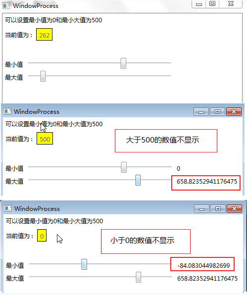
在上面的例子中,一共有三个依赖属性相互作用——CurrentValue``MinValue和MaxValue,这些属性互相作用,但它们的规则是MinValue≤CurrentValue≤MaxValue。根据这个规则,当其中一个依赖属性变化时,另外两个依赖属性必须进行适当的调整,这里我们要用到的就是CoerceValue这个回调委托,那么实现起来也非常简单,注册MaxValue的时候加入CoerceValueCallback进行相应的强制处理。然后在MinValue的ChangedValueCallback被调用的时候,调用CurrentValue和MaxValue的CoerceValue回调委托,这样就可以达到相互作用的依赖属性一变应万变的“千机变”。
换句话说,当相互作用的几个依赖属性其中一个发生变化时,在它的PropertyChangedCallback中调用受它影响的依赖属性的CoerceValue,这样才能保证相互作用关系的正确性。前面也提高ValidateValue主要是验证该数据的有效性,最后设置了值以后都会调用它来进行验证,如果验证不成功,则抛出异常。
WPF入门系列——数据绑定
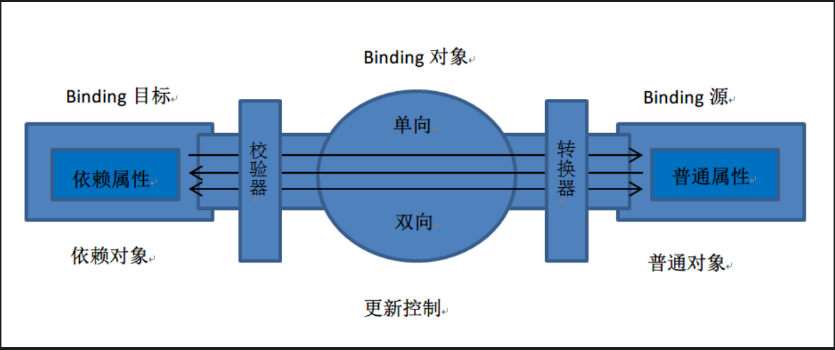
一、什么是数据绑定
WPF中的数据绑定,必须要有绑定目标和绑定源。绑定目标可以是继承自DependencyProperty的任何可访问的属性或控件,例如TextBox控件的Text属性。数据源可以是其他控件的属性,可以是对象实例、XAML元素、ADO.NET DataSet、XML数据。微软针对XML绑定与对象绑定,提供了两个辅助类XmlDataProvider和ObjectDataProvider。
WPF使用{Binding…}这一语句来实现界面控件的属性与后台数据之间的绑定。
WPF绑定引擎从Binding对象获取有关以下内容的信息:
源对象和目标对象。
数据流的方向。你可以通过设置Binding.Mode属性来指定该方向。
值转换器(如果存在)。你可以通过将Converter属性设置为用来实现IValueConverter的类的一个实例,指定值转换器。
WPF与ASP.NET与WinForm中的绑定方式比较,存在着如下几点差异:
(1)Binding可以通过XAML语句实现界面与数据的耦合。如果把Binding比作数据的桥梁,那么它的两端分别是Binding的源和目标。数据从哪里来哪里就是源,Binding是架在中间的桥梁,Binding目标是数据要往哪里去。一般情况下,Binding源是逻辑层对象,Binding目标是UI层的控件对象,这样,数据就会源源不断通过Binding送达UI层,被UI层展现,也就完成了数据驱动UI的过程。如下图:
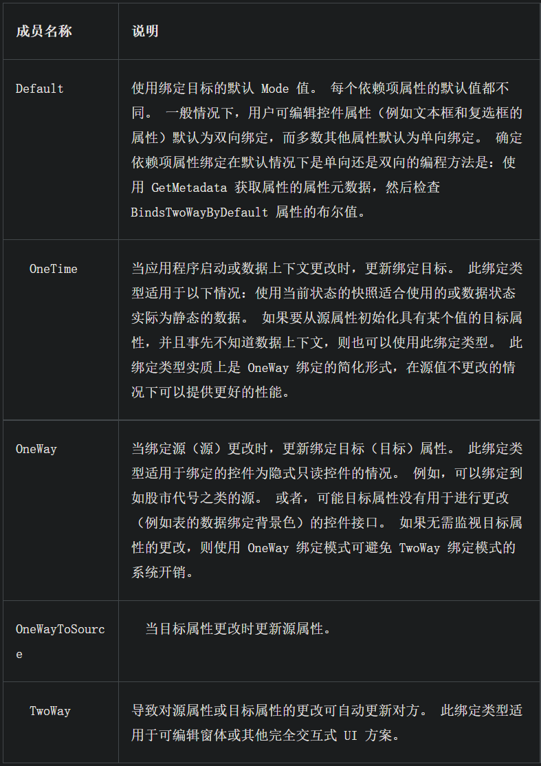
(2)Binding有一个重要的属性Mode,实现绑定中的数据流向。具体有以下几种:
(3)可通过配置触发器,决定用户在界面输入的数据在什么时候去修改数据源中的值。可以通过UpdateSourceTrigger属性实现,具体有如下几种值:
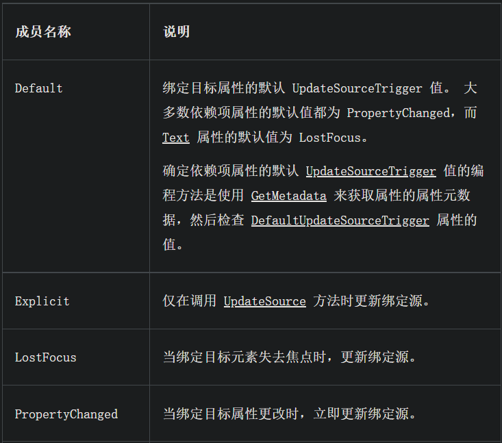
具体用法如下:
<TextBox Name="itemNameTextBox"Text="{Binding Path=ItemName, UpdataSourceTrigger=Explicit}"/>
二、简单的绑定
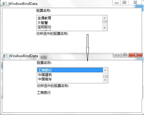
接下来是一个简单的绑定示例,该示例演示如何通过绑定的方式把ListBox中选中的值显示到TextBlock中。
首先,给ListBox添加了七个ListBoxItem,作为ListBox的选项。
其次,把第二个TextBlock的Text通过Binding与ListBox选择项进行绑定。Binding语法中的ElementName属性指示TextBlock的Text属性要与其绑定的控件的名称。Path属性指示我们将绑定到Text属性上ListBox元素的属性。具体代码如下:
<Window x:Class="WpfApp1.WindowBindData"xmlns="http://schemas.microsoft.com/winfx/2006/xaml/presentation"xmlns:x="http://schemas.microsoft.com/winfx/2006/xaml"Title="WindowBindData" Height="400" Width="500"><Grid><Grid.RowDefinitions><RowDefinition Height="150"/><RowDefinition Height="150"/><RowDefinition Height="138*"/></Grid.RowDefinitions><StackPanel Grid.Row="0"><TextBlock Width="248" Height="24" Text="股票名称:"TextWrapping="Wrap"/><ListBox x:Name="listStockName" Width="248" Height="56"><ListBoxItem Content="全通教育"/><ListBoxItem Content="大智慧"/><ListBoxItem Content="宝钢股份"/><ListBoxItem Content="浦发银行"/><ListBoxItem Content="工商银行"/><ListBoxItem Content="中国建筑"/><ListBoxItem Content="中国南车"/></ListBox><TextBlock Width="248" Height="24" Text="你所选中的股票名称:" /><TextBlock Width="248" Height="24" Text="{Binding ElementName=listStockName, Path=SelectedItem.Content}"></TextBlock></StackPanel></Grid></Window>
效果如下:
三、绑定模式
上面一块学习了简单的绑定,在这里的示例,要学习一下绑定的模式和模式的使用效果。
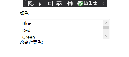
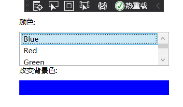
首先,我们来做一个简单的示例,这个示例是根据ListBox中的选中项,去改变TextBlock的背景色。将TextBlock的背景色绑定到在ListBox中选择的颜色。在下面的代码中针对TextBlock的Background属性使用绑定语法绑定从ListBox中选择的值。代码如下:
<StackPanel Grid.Row="1"><TextBlock Width="248" Height="24" Text="颜色:"TextWrapping="Wrap"/><ListBox x:Name="listColor" Width="248" Height="56"><ListBoxItem Content="Blue"/><ListBoxItem Content="Red"/><ListBoxItem Content="Green"/><ListBoxItem Content="Gray"/><ListBoxItem Content="Cyan"/><ListBoxItem Content="GreenYellow"/><ListBoxItem Content="Orange"/></ListBox><TextBlock Width="248" Height="24" Text="改变背景色:" /><TextBlock Width="248" Height="24" Background="{Binding ElementName=listColor,Path=SelectedItem.Content, Mode=OneWay}"></TextBlock></StackPanel>
如果用户在`ListBox`中选择了一种颜色,那么`TextBlock`的背景色会变为选定的颜色(如下图)。

接下来我们对上面的示例进行一些修改:
1)同一个数据源绑定到两个或多个控件上。比如我们的示例中把ListBox的选项绑定到TextBox与TextBlock。
2)在绑定语法中增加一个Mode属性,即绑定模式。对于我们的示例,我们把TextBlock的绑定语法中的Mode属性设置为OneWay。把TextBox的绑定语法中的Mode属性设置为TwoWay。
对于示例中的Mode进行一下简单说明:
1)使用OneWay绑定时,每当数据源(ListBox)发生变化时,数据就会从数据源流向目标(TextBlock)。
2)OneTime绑定也会将数据从源发送到目标;但是,仅当启动了应用程序或DataContext发生改变时才会如此操作,因此,它不会侦听源中的更改通知。
3)OneWayToSource绑定会将数据从目标发送到源。
4)TwoWay绑定会将源数据发送到目标,但如果目标属性的值发生变化,则会将它们发回给源。
下面是修改后的示例代码,功能是将TextBlock(OneWay)和TextBox(TwoWay)绑定到ListBox的代码:
<StackPanel Grid.Row="1"><TextBlock Width="248" Height="24" Text="颜色:" TextWrapping="Wrap"/><ListBox x:Name="listColor" Width="248" Height="56"><ListBoxItem Content="Blue"/><ListBoxItem Content="Red"/><ListBoxItem Content="Green"/><ListBoxItem Content="Gray"/><ListBoxItem Content="Cyan"/><ListBoxItem Content="GreenYellow"/><ListBoxItem Content="Orange"/></ListBox><TextBlock Width="248" Height="24" Text="改变背景色:" /><TextBlock Width="248" Height="24" Text="{Binding ElementName=listColor, Path=SelectedItem.Content, Mode=OneWay}"Background="{Binding ElementName=listColor, Path=SelectedItem.Content, Mode=OneWay}"></TextBlock><TextBox Name="txtTwoWay" Text="{Binding ElementName=listColor,Path=SelectedItem.Content,Mode=TwoWay}"Background="{Binding ElementName=listColor,Path=SelectedItem.Content,Mode=TwoWay}"></TextBox></StackPanel>
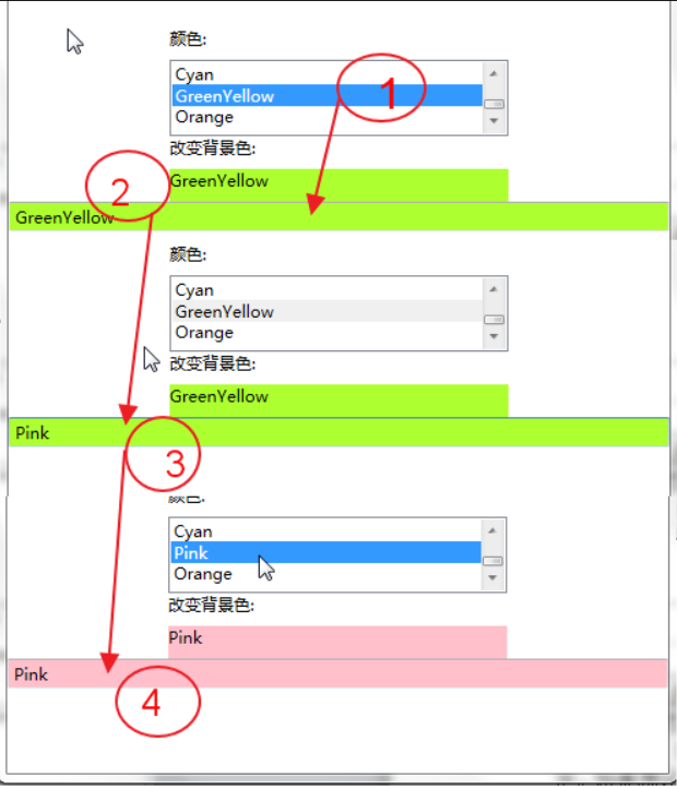
在上述示例中,对TextBlock使用了OneWay绑定模式,因为我希望之后当选择了ListBox中的某一项之后,应用程序将选定的ListBoxItem(数据源)发送到TextBlock。我不希望TextBlock的变更会影响到ListBox中的内容。
我对TextBox使用TwoWay绑定模式,因为我希望用户在ListBox中选择了一种颜色后,该颜色就会显示在TextBox中,并且其背景颜色也会随之相应变化。如果该用户在TextBox中键入了另一种颜色(例如Pink),ListBox中刚才选中的颜色名称就会被更新(即从目标到数据源),当鼠标再次点击这条修改后的数据时,新值就会被再次发送到TextBox上。这意味着TextBlock也会随之改变。
如果我将TwoWay模式改回到OneWay,用户则可以编辑TextBox中的颜色(通过在ListBox中选),但是不会将TextBox中输入的值去替换ListBox中选中项的值。
绑定模式应该如何应用呢?
1)当只想让用户看到数据,而不希望用户去修改数据时,可以采用OneWay模式,类似WinForm中的只读属性。
2)当希望用户可以对控件中的数据进行修改,同时让用户修改的数据更新到数据源(DataSet、对象、XML或其他绑定控件)中时,可以使用TwoWay绑定。
3)如果想让用户修改数据源中的数据,而又不想使用TwoWay模式,就可以使用OneWayToSource绑定。OneWayToSource模式允许通过在原来被看作是绑定源的对象中防止绑定表达式,从而翻转源和目标。
4)当你的界面中的一系列只读控件被绑定了数据,并且当用户刷新了数据源时,希望绑定控件中的值仍保持不变,可以使用OneTime绑定。此外,当源没有实现INotifyPropertyChanged时,OneTime绑定模式也是一个不错的选择。
说明:绑定目标中的修改何时去修改数据源
在上面的例子中,TextBox使用了TwoWay绑定模式,所以当TextBox失去焦点时WPF会使用TextBox中的值改变ListBox中的值。如果你不想在TextBox失去焦点时,就去修改ListBox中的值,可以为UpdateSourceTrigger指定值,它是用于定义何时更新源的绑定属性。可以为UpdateSourceTrigger设置三个值:Explicit、LostFocus和PropertyChanged。
如果将UpdateSourceTrigger设置为Explicit,则不会更新源,除非从代码中调用BindingExpression.UpdateSource方法。设置为LostFocus,(TextBox控件的默认值)指示数据源绑定的控件失去焦点时才会更新。PropertyChanged值绑定控件的绑定属性每次发生更改时就去更新数据源中的值。
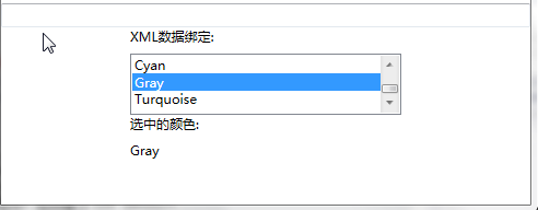
四、XML数据绑定
XmlDataProvider用来绑定XML数据,该XML数据可以是嵌入.Xaml文件的XmlDataProvider标记中,也可以是外部位置引用的文件中。
当然嵌入式XML内容必须置于XmlDataProvider内部的<x:Data>标记中,而且不容易修改,所以建议使用XML数据文件形式。对于XmlDataProvider必须命名一个x:Key值,以便数据绑定目标可以对其进行引用。
XmlDataProvider也可以指向XML内容的外部源。例如,项目中一个colors.xml文件,文件的内容就是一个颜色列表。需要在<StackPanel.Resources>中添加一个XmlDataProvider资源,并将其的Source设置为XML文件名即可。代码与XML文件如下:
<StackPanel><StackPanel.Resources><XmlDataProvider x:Key="MyColors" Source="Colors.xml" XPath="colors"></XmlDataProvider></StackPanel.Resources>
<?xml version="1.0" encoding="utf-8" ?><colors><color name="Pink"/><color name="Red"/><color name="Purple"/><color name="Cyan"/><color name="Gray"/><color name="Turquoise"/></colors>
资源绑定语法与控件绑定语法略有不同。绑定到控件时,可以设置绑定的`ElementName`和`Path`属性。但是绑定到资源时,需要设置`Source`属性,由于我们是绑定到`XmlDataProvider`,所以还要设置绑定的`XPath`属性。例如,下面代码可以将`ListBox`的项绑定`MyColors`资源。将`Source`属性设置为资源,并将其指定为名为`MyColors`的`StaticResource`。`XPath`属性指示项会绑定到XML数据源中`<color>`元素的`name`属性:
<TextBlock Width="248" Height="24" Text="XML数据绑定:" TextWrapping="Wrap"/><ListBox x:Name="listXmlColor" Width="248" Height="56" IsSynchronizedWithCurrentItem="True"ItemsSource="{Binding Source={StaticResource MyColors}, XPath=color/@name}"></ListBox><TextBlock Width="248" Height="24" Text="选中的颜色:" /><TextBlock Width="248" Height="24" Text="{Binding ElementName=listXmlColor, Path=SelectedValue, Mode=OneWay}"></TextBlock>
效果如下:
五、对象绑定和数据模板
虽然XmlDataProvider对XML非常有用,但是当你想绑定到对象或对象列表时,可以创建ObjectDataProvider作为资源。
ObjectDataProvider的ObjectType指定将提供数据绑定源的对象,而MethodName则指示为获得数据而需调用的方法。例如,假设我有一个名为StudentService的类,该类使用一种名为GetStudentList的方法来返回列表<Student>。那么ObjectDataProvider应该如下所示:
<StackPanel.Resources><ObjectDataProvider x:Key="students" ObjectType="{x:Type local:StudentService}" MethodName="GetStudentList"></ObjectDataProvider></StackPanel.Resources>
`ObjectDataProvider`还可以使用许多其他属性。`ConstructionParameters`属性允许您将参数传递给要调用的类的构造函数。此外,可以使用`MethodParameters`属性来指定参数,同时还可以使用`ObjectInstance`属性来指定现有的对象实例作为源。
如果希望异步检索数据,可以将ObjectDataProvider的IsAsynchronous属性设置为true。这样,用户将可以在等待数据填充绑定到ObjectDataProvider的源的目标控件时与屏幕进行交互。
在添加ObjectDataProvider时,必须限定数据源类的命名空间。在本例中,我必须将xmlns属性添加到<Window>标记中,以便local快捷方式符合要求,并指示正确的命名空间:
xmlns:local=”clr-namespace:WpfApp1.Services”
既然数据源已经通过ObjectDataProvider定义,

若有收获,就点个赞吧
0 人点赞
