Matplotlib 可用于创建直方图。直方图在垂直轴上显示频率,水平轴是另一个维度。通常它具有箱,其中每个箱具有最小值和最大值。 每个箱的频率也介于x和无穷大之间。
Matplotlib 直方图示例
下面显示了最小的 Matplotlib 直方图:
import numpy as npimport matplotlib.mlab as mlabimport matplotlib.pyplot as pltx = [21,22,23,4,5,6,77,8,9,10,31,32,33,34,35,36,37,18,49,50,100]num_bins = 5n, bins, patches = plt.hist(x, num_bins, facecolor='blue', alpha=0.5)plt.show()
输出:
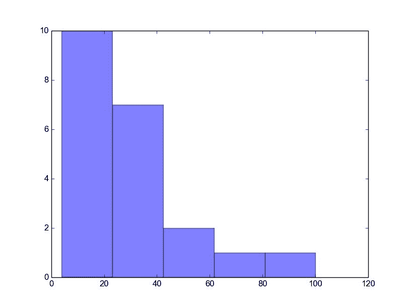
Python 直方图
完整的 matplotlib 直方图
许多东西都可以添加到直方图中,例如拟合线,标签等。 下面的代码创建了更高级的直方图。
#!/usr/bin/env pythonimport numpy as npimport matplotlib.mlab as mlabimport matplotlib.pyplot as plt# example datamu = 100 # mean of distributionsigma = 15 # standard deviation of distributionx = mu + sigma * np.random.randn(10000)num_bins = 20# the histogram of the datan, bins, patches = plt.hist(x, num_bins, normed=1, facecolor='blue', alpha=0.5)# add a 'best fit' liney = mlab.normpdf(bins, mu, sigma)plt.plot(bins, y, 'r--')plt.xlabel('Smarts')plt.ylabel('Probability')plt.title(r'Histogram of IQ: $\mu=100$, $\sigma=15$')# Tweak spacing to prevent clipping of ylabelplt.subplots_adjust(left=0.15)plt.show()
输出:
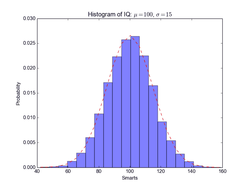
Python 直方图

若有收获,就点个赞吧
0 人点赞
