1.line-height
1.给line-height:200% line-height*font-size
2.line-height:2; //特殊 div的行高 line-height*div(font-size)
<!DOCTYPE html><html lang="en"><head><meta charset="UTF-8"><meta name="viewport" content="width=device-width, initial-scale=1.0"><title>Document</title></head><style>/*1.给line-height:200% line-height*font-size2.line-height:2; //特殊 div的行高 line-height*div(font-size)*/*{margin:0;padding:0;}body{font-size: 20px;line-height: 3;}div{font-size: 18px;}</style><body><div>hello world</div></body></html>
2.em,rem,vw,vh
px 绝对单位
em 相对单位 相对于父元素的font-size(了解)
rem (root em) 相对于根元素(html)的font-size而言
<!DOCTYPE html>
<html lang="en">
<head>
    <meta charset="UTF-8">
    <meta name="viewport" content="width=device-width, initial-scale=1.0">
    <title>Document</title>
</head>
<style>
    /*
    px 绝对单位
    em 相对单位 相对于父元素的font-size(了解)
    rem (root em) 相对于根元素(html)的font-size而言
    */
    *{margin:0;padding:0;}
    html{
        font-size: 10px;
    }
    .parent{
        width:200px;
        height: 200px;
        background-color: red;
        font-size: 20px;
    }
    .child{
        width:2em;
        height:2em;
        background-color: yellow;
    }
    .rem{
        width:10rem;
        height: 10rem;
        background-color: blue;
    }
</style>
<body>
    <div class="parent">
     <div class="child"></div>
    </div>
    <div class="rem"></div>
</body>
</html>
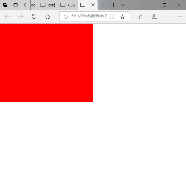
3.vw.vh
<!DOCTYPE html>
<html lang="en">
<head>
    <meta charset="UTF-8">
    <meta name="viewport" content="width=device-width, initial-scale=1.0">
    <title>Document</title>
</head>
<style>
    *{margin:0;padding: 0;}
    .parent{
        width:50vw;
        height:50vh;
        background-color: red;
    }
</style>
<body>
    <div class="parent"></div>
</body>
</html>
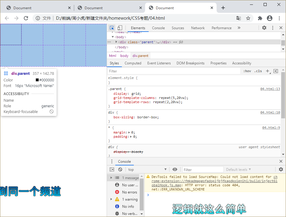
4.vw布局
<!DOCTYPE html>
<html lang="en">
<head>
    <meta charset="UTF-8">
    <meta name="viewport" content="width=device-width, initial-scale=1.0">
    <title>Document</title>
</head>
<style>
    *{margin:0;padding: 0;}
    div{
        box-sizing: border-box;
    }
    .parent{
        display: grid;
        grid-template-columns: repeat(5,20vw);
        grid-template-rows: repeat(2,20vw);
    }
    .parent div{
        border: 1px solid #333;
    }
</style>
<body>
    <div class="parent">
        <div></div>
    </div>
</body>
</html>

若有收获,就点个赞吧
0 人点赞
