flex布局链接:http://www.ruanyifeng.com/blog/2015/07/flex-grammar.html
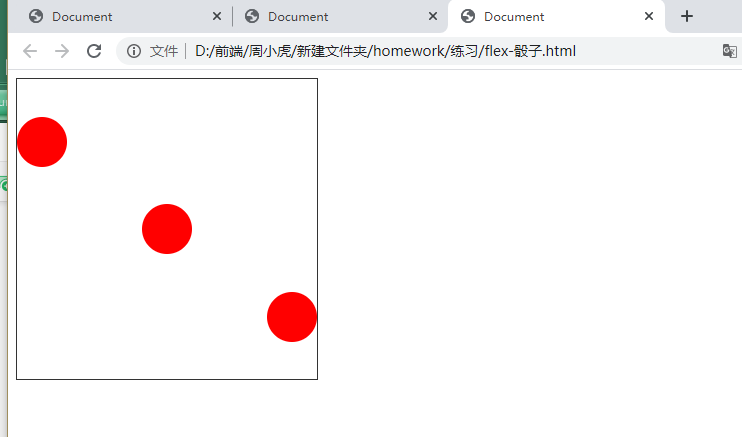
<!DOCTYPE html><html lang="en"><head><meta charset="UTF-8"><meta name="viewport" content="width=device-width, initial-scale=1.0"><title>Document</title></head><style>.parent{width: 300px;height: 300px;border:1px solid #333;display: flex;flex-direction: column;justify-content: space-evenly;}.parent div{width: 50px;height: 50px;background-color: red;border-radius: 50%;}.parent div:nth-child(2){align-self: center;}.parent div:nth-child(3){align-self:flex-end;}</style><body><div class="parent"><div></div><div></div><div></div></div></body></html>

若有收获,就点个赞吧
0 人点赞
