JSX 简介:https://zh-hans.reactjs.org/docs/introducing-jsx.html
比较
template
学习成本低 大量内置指令简化开发 组件作用域
CSS
- 模版语法(
HTML的扩展) 数据绑定使用
Mustache语法(双大括号)<span>{{ msg }}</span>
jsx|tsx
灵活
JavaScript的语法扩展- 数据绑定使用单引号
扩展
引入
Vue官方文档(https://cn.vuejs.org/v2/guide/comparison.html#JSX-vs-Templates)更抽象一点来看,我们可以把组件区分为两类:一类是偏视图表现的
**(presentational)**,一类则是偏逻辑的**(logical)**。我们推荐在前者中使用模板,在后者中使用**JSX**或渲染函数。这两类组件的比例会根据应用类型的不同有所变化,但整体来说我们发现表现类的组件远远多于逻辑类组件。
常用
v-for 与 v-if
jsx|tsx没有v-for与v-if,分别条件运算符(?:)替代v-if、array.map替代v-for
render() {return (// v-if{this.type && <div>true</div>}// v-if / v-else{this.type ? <div>true</div> : <div>false</div>}// v-for{this.options.map(item => {<div>{item.title}</div>})})}
指令
v-modelv-model_trimdomPropsInnerHTML等价于v-htmldomPropsTextContent等价于v-text
render() {return (<div><input v-model={this.keyValue} /></div><div><input v-model_trim={this.keyValue} /></div><div><p domPropsInnerHTML={this.html} /></div><div><p domPropsTextContent={this.text} /></div>)}
事件
遵循一个规则或者如下:事件绑定需要在事件名称前端加上
on前缀,原生事件添加nativeOn
@click等价于on-click等价于onClick等价于vOn:clickvOn:keyup_enter_native@click.native等价于nativeOnClick注意: 传递参数不能直接使用
**onClick={this.search('params')}**,这会导致**jsx|tsx**每次都会**render**会自执行一次方法(重则会死循环) 处理: 应该使用**bind**,或箭头函数来处理传参**onClick={()=> this.search('params')}**
render() {return (<div><input v-model={this.keyValue} on-input={this.inputText} /></div><div><input v-model={this.keyValue} vOn:click_stop_prevent={this.inputText} /></div><div><input v-model={this.keyValue} vOn:keyup_enter_native={() => this.search()} /></div><div><el-button nativeOnClick={this.handleClick}>Native click</el-button></div>)}
监听.sync修饰符的事件
https://github.com/vuejs/babel-plugin-transform-vue-jsx/blob/master/example/example.js
// jsx | tsx<el-dialogvisible={this.dialogVisible}{...{ on: { 'update:visible': console.log } }}before-close={() => (this.dialogVisible = false)}/>// jsx 发现这样写也ok// 在 vue2.x 版本使用 tsx 这种方式打包会报错<el-dialogvisible:sync={this.dialogVisible}before-close={() => (this.dialogVisible = false)}/>// template// 在 vue2.x 版本使用 tsx 这种方式打包会报错<el-dialog:visible.sync="dialogVisible":before-close="handleClose"/>
class绑定
注:与
react的jsx绑定的有区别,react中使用className,vue中使用class
<buttononClick={handleClick}disabled={disabled}type={'button'}v-loading={loading}class={['ws-btn','ws-button',type ? `ws-button--${type}` : '',{'is-disabled': disabled,'is-circle': circle,'is-block': block}]}>{defaultSlots}</button>
自定义组件
导入直接使用,不需要在
components属性声明
import HelloWolrd from './HelloWorld';export default {name: 'App',render() {return <HelloWorld msg='Welcome to Your Vue.js App' />;}};
新版本
所有形如 on-update:* 的 prop 都有一个对应的 onUpdate* 属性可供使用。
由于
JSX自身的规定,on-update:*和onUpdate:*不是合法的prop名称(如果你发现我的代码没有这样写,那一定是幻觉,请偷偷给我提醒下),如下所示
<d-select @update:value="..." />// 在 JSX 中可以写为<DSelect onUpdateValue={...} />
样式模块化
样式文件必须已
.module文件名结尾才能使用模块的方式vue单文件使用scoped可以实现模块化:<style scoped>
Button.tsx
import Vue, { VNode } from 'vue';// @ts-ignoreimport ButtonModule from './Button.module.less';export default Vue.extend({name: 'Button',props: {type: String,loading: Boolean,disabled: Boolean,circle: Boolean,block: Boolean},methods: {handleClick(event: MouseEvent) {if (this.loading) {event.preventDefault();} else if (!this.disabled) {this.$emit('click', event);}}},render(): VNode {const { type, loading, disabled, circle, block, $slots, handleClick } = this;const loadingNode = () => {return loading && <van-loading color='inherit' size='15px' />;};const defaultSlots = () => {return ($slots?.default && (<span class={loading ? ButtonModule['button--loading-text'] : null}>{$slots.default}</span>));};return (<buttononClick={handleClick}disabled={disabled}type={'button'}class={[ButtonModule['btn'],ButtonModule['button'],type ? ButtonModule[`button--${type}`] : '',disabled ? ButtonModule['is-disabled'] : '',loading ? ButtonModule['is-loading'] : '',circle ? ButtonModule['is-circle'] : '',block ? ButtonModule['is-block'] : '',]}>{loadingNode()}{defaultSlots()}</button>);}});
Button.module.less
@theme-color: #294ba3;@theme-color-active: #26479a;@white: #fff;@secondary-font-color: #545454;.button {display: inline-block;height: 0.88rem;line-height: 0.88rem;white-space: nowrap;cursor: pointer;background: @white;border: 1px solid #ddd;color: @secondary-font-color;-webkit-appearance: none;text-align: center;box-sizing: border-box;outline: none;margin: 0;transition: 0.1s;font-weight: 500;user-select: none;padding: 0 0.24rem;font-size: 15px;border-radius: 0.12rem;&.is-circle {height: 28px;line-height: 28px;border-radius: 0.28rem;}&.is-loading {display: flex;justify-content: center;align-items: center;.van-loading {display: flex;color: inherit;font-size: inherit;margin-right: 0.5em;}}&.is-active,&:active {background: #fafafa;}&.is-disabled,&.is-disabled:active,&.is-disabled:focus,&.is-disabled:hover {cursor: not-allowed;color: #ccc;background-color: @white;}&--primary {border-color: @theme-color;background: @theme-color;color: @white;&.is-disabled,&.is-disabled:active,&.is-disabled:focus,&.is-disabled:hover {cursor: not-allowed;color: @white;background-color: #ddd;border-color: #ddd;}&.is-active,&:active {background: @theme-color-active;}}&--border {color: #294ba3;background: @white;border-color: #3975c6;&.is-disabled,&.is-disabled:active,&.is-disabled:focus,&.is-disabled:hover {cursor: not-allowed;color: #ccc;background-color: @white;border-color: @white;}&.is-disabled,&.is-disabled:active,&.is-disabled:focus,&.is-disabled:hover {cursor: not-allowed;color: #ccc;background-color: @white;border-color: @white;}}&--text {height: 0.88rem;background: transparent;border: none;}& + .button {margin-left: 0.08rem;}&--loading-text {opacity: 0.2;}}.is-block {width: 100%;display: block;}
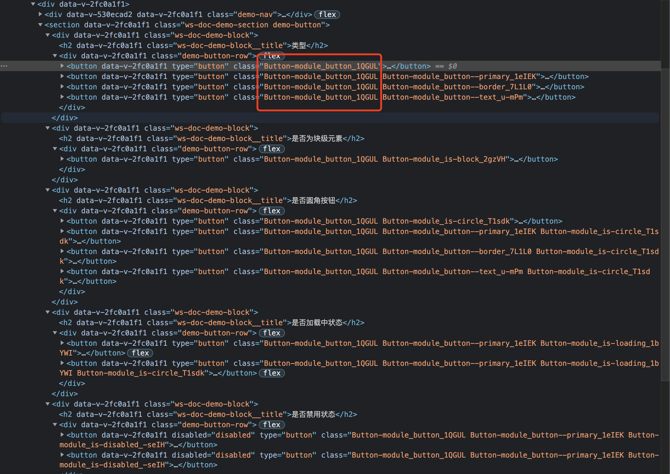
效果如下
命名规则以
XXX.module名称为主
coding
vue2:https://github.com/WuChenDi/Front-End/tree/master/05-Vue/vue2-jsx
参考:
vue2
https://github.com/vuejs/jsx#readme
Babel Plugin JSX for Vue 3.0
https://github.com/vuejs/jsx-next#readme
vite
https://github.com/vitejs/vite/tree/main/packages/plugin-vue-jsx#readme
注:
vue jsx 2X 版本不支持空标签 <></> 的写法,3X 支持
React 中可以使用空标签 <></> 和 <react.Fragment></react.Fragment> 来实现包裹元素,其实空标签本质就只是 react.Fragment 的一个语法糖

若有收获,就点个赞吧
0 人点赞
