- UpCode">1. UpCode
- NextStrain">2. NextStrain
- Johns Hopkins Center for Systems Science and Engineering">3. Johns Hopkins Center for Systems Science and Engineering
- The Wuhan Virus">4. The Wuhan Virus
- BBC">5. BBC
- New York Times">6. New York Times
- HealthMap">7. HealthMap
- Singapore Ministry of Health">8. Singapore Ministry of Health
- US Centers for Disease Control and Prevention">9. US Centers for Disease Control and Prevention
- Hong Kong government">10. Hong Kong government
搬运自https://www.technologyreview.com/s/615330/best-worst-coronavirus-dashboards/
原文 by Neel V. Patel
有很多网站展示了新型冠状病毒是如何在全世界传播的,Neel的团队选取了10个仪表板作出了评价。
1. UpCode
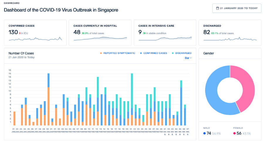
Pros: Clean and easy to navigate; provides insights from the data; represents locations of infection; provides known details for each case
Cons: Represents only Singapore; privacy concerns
2. NextStrain
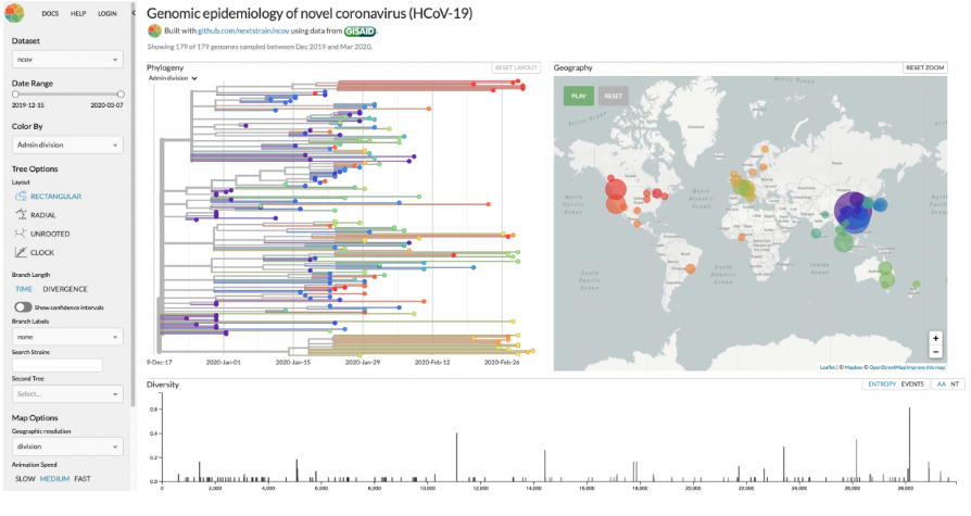
Pros: Gorgeous visuals and animations; unique data for a dashboard
Cons: Very niche information
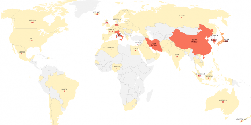
3. Johns Hopkins Center for Systems Science and Engineering
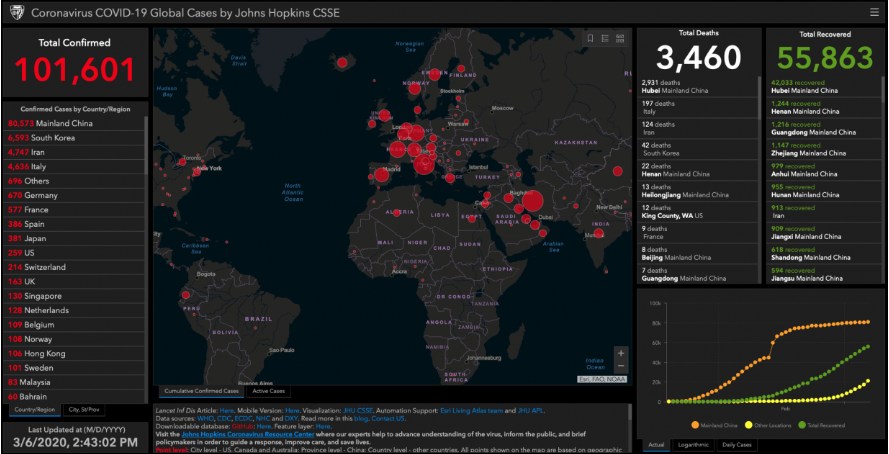
Pros: Offers global look at the disease, near real-time updates, mobile version
Cons: Gloom-and-doom colors; a bit clunky to navigate; no info on history of cases for any location
4. The Wuhan Virus
Pros: Clean; good color scheme; loads fast
Cons: Top-down layout is long; presence of extra stories is distracting and weird
5. BBC
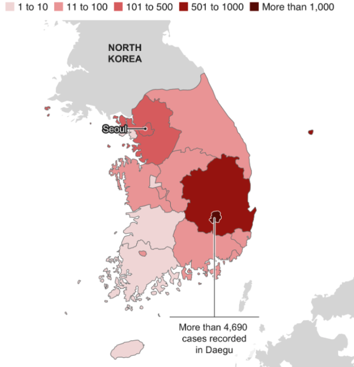
Pros: Easy to understand and navigate; explains major outbreak areas in detail
Cons: Bland; no interactive features; reads like an article
6. New York Times
Pros: Clean, easy to understand, neat color scheme; a good introduction to the crisis; provides tips to readers,
Cons: Basic; not updated in real time; no interactive features
7. HealthMap
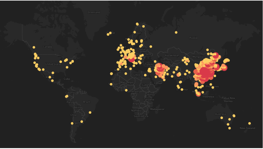
Pros: Easy to play the animation
Cons: Basic, dark-gray map is gloomy
8. Singapore Ministry of Health
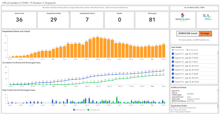
Pros: Provides known details for each individual case; easy to understand the present situation in Singapore
Cons: No map; limited data presentation; looks ugly; privacy concerns
9. US Centers for Disease Control and Prevention
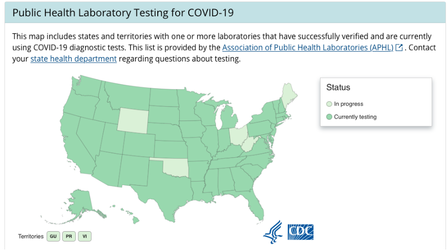
Pros: Simple “at a glance” summary of coronavirus in the US; provides information on state testing
Cons: Extremely dull; lacks any unique or interesting insights; limited information
10. Hong Kong government
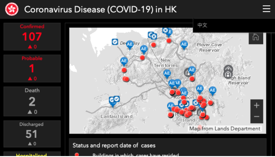
Pros: Good for Hong Kong–specific information
Cons: Hard to use; looks terrible

若有收获,就点个赞吧
0 人点赞
