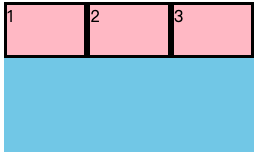
一、flex(子项占剩余空间份数)
| 三个子盒子平均分配宽度 | span1(flex:1) span2(flex:1) span3(flex:1) |
 |
|---|---|---|
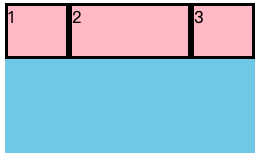
| 1号和3号盒子占一份,2号盒子占两份 | span1(flex:1) span2(flex:2) span3(flex:1) |
 |
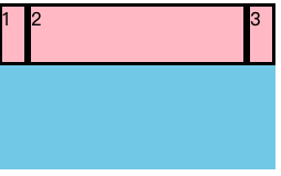
| 1号和3号盒子宽20px,2号盒子占剩余空间 | span1(width:20px) span2(flex:1) span3(width:20px) |
 |
<!DOCTYPE html><html lang="en"><head><meta charset="UTF-8"><title>flex布局</title><style>div {display: flex;width: 250px;height: 150px;background-color: skyblue;}div span {/*width: 50px;*/height: 50px;background-color: pink;border: 3px black solid;}span:nth-child(1) {width: 20px;}span:nth-child(2) {flex: 1;}span:nth-child(3) {width: 20px;}</style></head><body><div><span>1</span><span>2</span><span>3</span></div></body></html>
二、align-self(子项在侧轴的排列方式)
- 设置子盒子对齐方式,可覆盖align-items熟悉,默认继承父元素的align-items
| 2号盒子底部排列 | span2(align-self: flex-end) |
 |
| —- | —- | —- |
| 2号盒子单独居中 | span2(align-self: center) |
|
| —- | —- | —- |
| 2号盒子单独居中 | span2(align-self: center) | 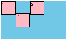 |
| 2号盒子拉伸 | span2(align-self: stretch) |
|
| 2号盒子拉伸 | span2(align-self: stretch) | 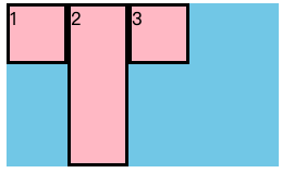 |
|
<!DOCTYPE html><html lang="en"><head><meta charset="UTF-8"><title>flex布局</title><style>div {display: flex;width: 250px;height: 150px;background-color: skyblue;}div span {width: 50px;background-color: pink;border: 3px black solid;}span:nth-child(1),span:nth-child(3){height: 50px;}span:nth-child(2) {/*单独底部排列*//*align-self: flex-end;*//*单独居中排列*//*align-self: center;*//*单独居中拉伸*/align-self: stretch;}</style></head><body><div><span>1</span><span>2</span><span>3</span></div></body></html>
三、order(子项排列先后顺序)
- 设置排列顺序,数值越小,越靠前
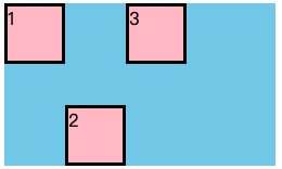
| 排列顺序改为213 | span2(order:-1) |
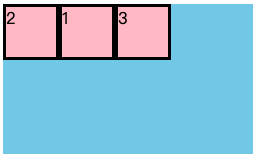 |
| —- | —- | —- |
| 排列顺序改为321 | span1(order:-1)
|
| —- | —- | —- |
| 排列顺序改为321 | span1(order:-1)
span2(order:-2)
span3(order:-3) |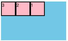 |
|
<!DOCTYPE html><html lang="en"><head><meta charset="UTF-8"><title>flex布局</title><style>div {display: flex;width: 250px;height: 150px;background-color: skyblue;}div span {width: 50px;height: 50px;background-color: pink;border: 3px black solid;}span:nth-child(1) {order: -1;}span:nth-child(2){order: -2;}span:nth-child(3) {order: -3;}</style></head><body><div><span>1</span><span>2</span><span>3</span></div></body></html>

若有收获,就点个赞吧
0 人点赞
