简介
Ant Design of Vue
这里是 Ant Design 的 Vue 实现,开发和服务于企业级后台产品。 +
+ 
特性
- 提炼自企业级中后台产品的交互语言和视觉风格。
- 开箱即用的高质量 Vue 组件。
- 共享Ant Design of React设计工具体系。
支持环境
表单校验
只允许输入数字
需求:若用户输入非数字,则直接替换为空
<a-form-item label="手机号"><a-inputv-show="tag !== 2"v-decorator="['driver_tel',{rules: [{ required: true, message: '请输入手机号!' }]}]"placeholder="请输入"oninput="value=value.replace(/[^\d]/g,'')"/></a-form-item>
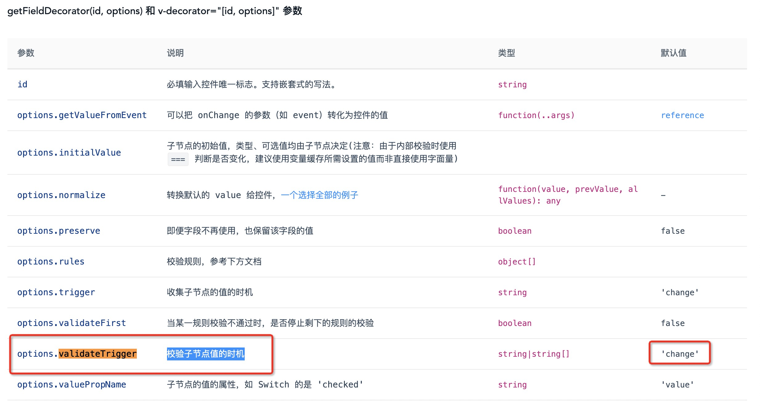
改变校验子节点的时机
| options.validateTrigger | 校验子节点值的时机 | string|string[] | ‘change’、’onBlur’ |
|---|---|---|---|
样式覆盖
checkBox🇭🇰相关
.ant-checkbox-wrapper:hover .ant-checkbox-inner,.ant-checkbox:hover .ant-checkbox-inner,.ant-checkbox-input:focus + .ant-checkbox-inner{border: 1px solid #1BBA79 !important;}
修改选中时多选框样式:
.ant-checkbox-checked .ant-checkbox-inner,.ant-checkbox-indeterminate .ant-checkbox-inner {background-color: transparent;border: 1px solid #1BBA79;}
修改多选框默认样式:
.ant-checkbox{.ant-checkbox-inner{border: 1px solid #1BBA79;background-color: transparent;}}
修改多选框中全选按钮的样式,或去除样式
/deep/.ant-checkbox-indeterminate {// background-color: red !important;// color: red !important;}// 用来改变未能全选时,而附加在全选按钮的色块/deep/.ant-checkbox-indeterminate .ant-checkbox-inner::after {background-color #ffffff !important;}
如图: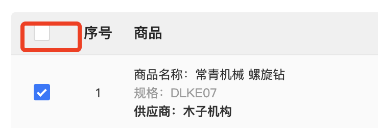
table🇭🇰相关
修改表格鼠标悬浮样式hover
/deep/.ant-checkbox-checked .ant-checkbox-inner,.ant-checkbox-indeterminate .ant-checkbox-inner {background-color: #2176FF !important;border: 1px solid #2176FF !important;}/deep/.ant-table-tbody > tr:hover:not(.ant-table-expanded-row) > td {background-color: #e8f1ff!important;}/deep/.ant-table-body .ant-table-row-hover{background: #e8f1ff!important;}/deep/.ant-table-body .ant-table-row-hover > td {background: #e8f1ff!important;}/deep/.ant-divider-vertical {margin 0 20pxheight 1.3em}
自定义标题及内容插槽slot
{// title: '标准编号' + '' + '厂商编号',key: 'code',width: 100,// scopedSlots: { customRender: 'code' },scopedSlots: { title: 'code_title', customRender: 'code' },align: 'center'}
<!-- 标准编号|厂商编号 --><span slot="code" slot-scope="record" style="display:flex; flex-direction: column;"><span class="item-code">{{ record.code | filterShow }}</span><span class="item-code">{{ record.sn | filterShow }}</span></span><span slot="code_title" style="display: flex; flex-direction: column"><span>标准编号</span><span>厂商编号</span></span>
根据条件使勾选框禁用
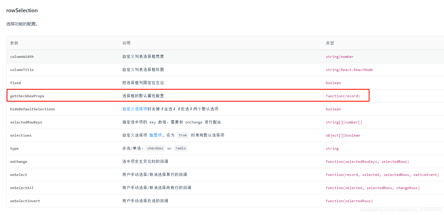
/*** 判断商品已添加,不可添加*/getCheckboxProps (record) {return {props: {disabled: record.is_exist === 1}}},
组件使用
Select🇨🇳选择器
搜索值默认为value的问题解决方法
a-select、a-tree-select 默认使用了value进行搜索
我们会发现,a-tree-select搜索时候搜的是value,由于传入值一般都是id类型,用户不可能去搜索id,导致发生此问题
在a-select中可以通过设置: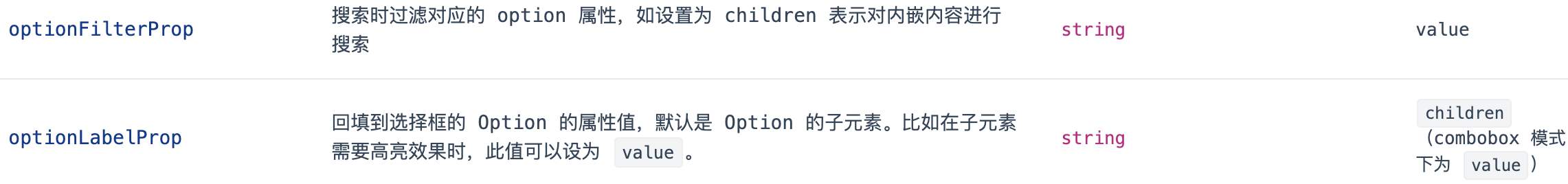
option-label-prop="label"option-filter-prop="label"
<a-form-item label="商品类型:"><a-selectv-decorator="['type']"mode="default"style="width: 200px":allow-clear="true"placeholder="请选择商品类型"show-searchoption-label-prop="label"option-filter-prop="label"@change="handleChangeGoodsBrand"><a-select-optionv-for="(goodsType,goodsTypeIndex) in goods_type_list":key="goodsTypeIndex":value="goodsType.key":label="goodsType.value">{{ goodsType.value }}</a-select-option></a-select></a-form-item>
TreeSelect选择器
搜索值默认为value的问题解决方法
a-tree-select默认使用了value进行搜索
我们会发现,a-tree-select搜索时候搜的是value,由于传入值一般都是id类型,用户不可能去搜索id,导致发生此问题。
默认:
title:显示值value:搜索值(不能重复)、提交时候的传输值。key:区分值(不能重复)
示例:【传入的json串示例】
const treeData = [{title: '满意度',value: '0-0',key: '0-0',disabled: true,children: [{title: "工作满意度",value: '0-0-1',key: '0-0-1',},{title: '生活满意度',value: '0-0-1',key: '0-0-2',// disabled: true,},],}]
解决方法:
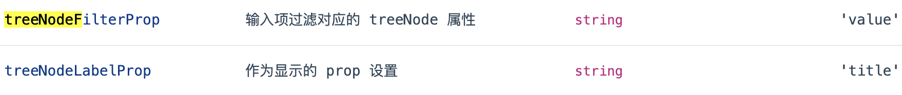
在标签中加入:tree-node-filter-prop="title"
示例:
<a-tree-selectv-model="form.tags"style="width: 100%":dropdown-style="{ maxHeight: '400px', overflow: 'auto' }"allow-clearmultiple:tree-data="tagsData"placeholder="请选择"tree-default-expand-alltree-node-filter-prop="title"><span slot="checkboxTitle" slot-scope="record">{{ record.permission_name }}</span><span slot="checkbox" slot-scope="record">{{ record.permission_name }}</span></a-tree-select>
Table表格
自定义头部标题栏
{width: 90,key: 'action',scopedSlots: { title: 'checkboxTitle', customRender: 'checkbox' }// align: 'left'},
Table组件的column添加鼠标悬浮提示
columns:[{title: 'name',dataIndex: 'name',key: 'name',ellipsis:true},{title: 'Age',dataIndex: 'age',key: 'age',ellipsis:true},{title: 'Address',dataIndex: 'address',key: 'address',ellipsis:true // 用于省略...},]
this.$nextTick(()=>{let rowsDom = document.getElementsByClassName("ant-table-row-cell-break-word");rowsDom = Array.from(rowsDom)rowsDom.forEach(item1=>{if(item1.nodeName === "TD"){item1.setAttribute("title",item1.textContent)}})var tableHeadDom = document.getElementsByClassName("ant-table-thead");var colsDom = tableHeadDom[0].getElementsByClassName("ant-table-row-cell-ellipsis");colsDom.forEach(item=>{item.setAttribute("title",item.textContent)})})
表格行排序拖动
<a-table id="mytb"></a-table>
initSortable () {const mytb = document.querySelector('#mytb tbody')const that = this// eslint-disable-next-line no-newnew Sortable(mytb, {handle: '.ant-table-row',animation: 150,ghostClass: 'blue-background-class',sort: true,onEnd ({ newIndex, oldIndex }) {const source = that.data[oldIndex] // 谁const destination = that.data[newIndex] // 移动到哪儿console.log(source, destination)console.log(newIndex, oldIndex)// 删除原来的,新增新位置that.data.splice(oldIndex, 1)that.data.splice(newIndex, 0, source)if (newIndex > oldIndex) {// console.log(destination.template_id, source.template_id)that.updateSortable(source.template_id, destination.template_id, 2)} else if (newIndex < oldIndex) {// console.log(source.template_id, destination.template_id)// that.updateSortable(source.template_id, destination.template_id)that.updateSortable(source.template_id, destination.template_id, 1)}}})}
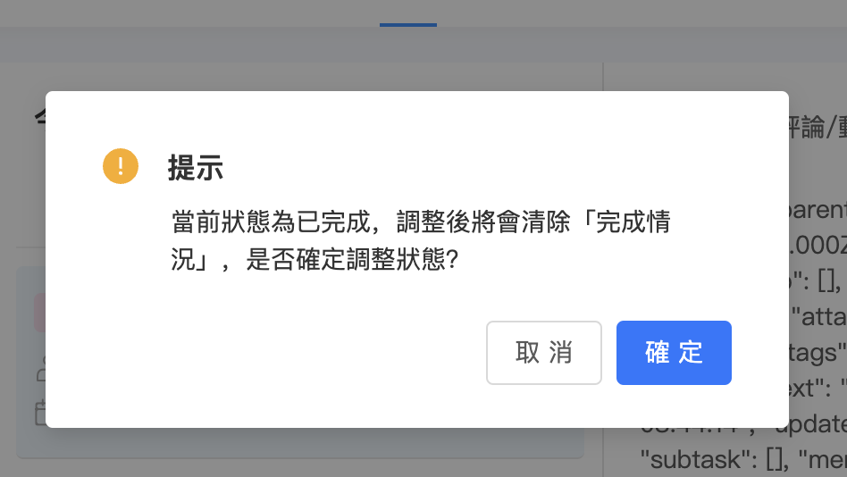
Modal对话框
自定义$confirm、$info…
如下
this.$confirm({title: '提示',okText: "確定",cancelText: "取消",icon: (h) => (<a-icontype="exclamation-circle"style="color:#FAAD14"theme="filled"/>),content: (h) => (<div style="font-size:14px;color:#333333">當前狀態為已完成,調整後將會清除「完成情況」,是否確定調整狀態?</div>),onOk() {},});this.$info({title: "提示",content: "你沒有以企業發起該業務的權限,請選擇項目",okText: "確定",icon: (h) => (<a-icontype="exclamation-circle"style="color:#FAAD14"theme="filled"/>),onOk: () => {this.form.setFieldsValue({project: undefined,});return;},});

若有收获,就点个赞吧
0 人点赞
