介绍
https://matplotlib.org/stable/api/index.html
Matplotlib是python中的一个包,主要用于绘制2D图形(当然也可以绘制3D,但是需要额外安装支持的工具包)。在数据分析领域它有很大的地位,而且具有丰富的扩展,能实现更强大的功能。
Matplotlib将数据绘制在 Figure s(即windows、Jupyter窗口小部件等),每个小部件都可以包含一个或多个 Axes (即,可以用x-y坐标(或极坐标图中的θ-r或3D图中的x-y-z等)来指定点的区域。创建带有轴的图形的最简单方法是使用 pyplot.subplots , 然后可以使用 Axes.plot 要在轴上绘制一些数据。
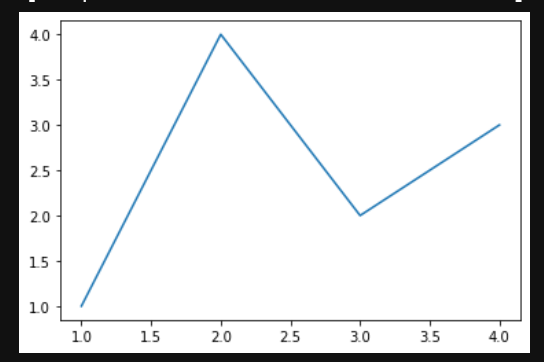
eg:
import numpy as npimport matplotlib.pyplot as pltfig, ax = plt.subplots() # 创建一个图ax.plot([1, 2, 3, 4], [1, 4, 2, 3]) # 在轴上绘制一些数据

对于每个 Axes 作图方法中,有一个对应的函数 matplotlib.pyplot 在“当前”轴上执行绘图的模块,如果轴(及其父图形)尚不存在,则创建这些轴。所以前面的例子可以写成
import numpy as npimport matplotlib.pyplot as pltplt.plot([1, 2, 3, 4], [1, 4, 2, 3])
Matplotlib架构
https://zhuanlan.zhihu.com/p/155927024
Matplotlib框架分为三层,这三层构成了一个栈,上层可以调用下层。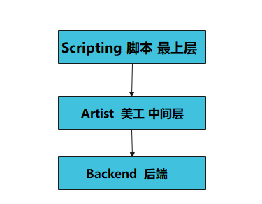
后端层
matplotlib的底层,实现了大量的抽象接口类,这些API用来在底层实现图形元素的一个个类
FigureCanvas对象实现了绘图区域这一概念
Renderer对象在FigureCanvas上绘图
美工层
图像中所有能看得到的元素都属于Artist对象,即标题、轴标签、刻度等组成图像的所有元素都是Artist对象的实例。
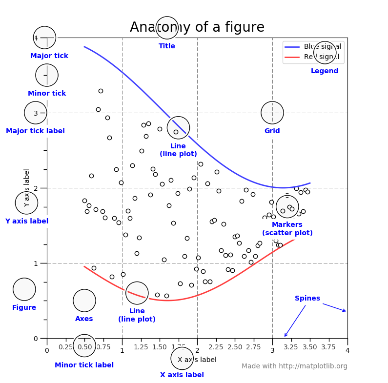
Figure:指整个图形(包括所有的元素,比如标题、线等)
Axes(坐标系):数据的绘图区域
Axis(坐标轴):坐标系中的一条轴,包含大小限制、刻度和刻度标签
特点为:
一个figure(图)可以包含多个axes(坐标系),但是一个axes只能属于一个figure。
一个axes(坐标系)可以包含多个axis(坐标轴),包含两个即为2d坐标系,3个即为3d坐标系
脚本层
主要用于可视化编程,pylot、python语法和api层,pytplot模块可以提供给我们一个与matplotlib打交道的接口。可以只通过调用pyplot模块的函数从而操作整个程序包,来绘制图形。
操作或者改动Figure对象,例如创建Figure对象
大部分工作是处理样本文件的图形与坐标的生成
Matplotlib图形的组件
matplotlib画图步骤

导入模块:import matplotlib.pyplot as plt
定义图像窗口:plt.figure()
画图:plt.plot(x, y)
定义坐标轴范围:plt.xlim()/plt.ylim()
定义坐标轴名称:plt.xlabel()/plt.ylabel()
定义坐标轴刻度及名称:plt.xticks()/plt.yticks()
设置图像边框颜色:ax = plt.gca() ax.spines[].set_color()
调整刻度位置:ax.xaxis.set_ticks_position()/ax.yaxis.set_ticks_position()
调整边框(坐标轴)位置:ax.spines[].set_position()
分类
https://matplotlib.org/stable/tutorials/introductory/pyplot.html#formatting-the-style-of-your-plot
格式化绘图样式
对于每对x,y参数,都有一个可选的第三个参数,它是表示图的颜色和线条类型的格式字符串。
matplotlib.pyplot.plot函数
https://matplotlib.org/stable/api/_as_gen/matplotlib.pyplot.plot.html#matplotlib.pyplot.plotmatplotlib.pyplot.plot(*args, scalex=True, scaley=True, data=None, **kwargs)[source]plot([x], y, [fmt], *, data=None, **kwargs)plot([x], y, [fmt], [x2], y2, [fmt2], ..., **kwargs)
参数详解
| 参数 | 类型 | 说明 |
|---|---|---|
| x | 类或标量数组 |
位置参数,数据点的水平坐标 |
| y | 类或标量数组 | 位置参数,数据点的垂直坐标 |
| fmt | str | 位置参数,定义基本格式(如颜色,标记和线型) |
| data | 可索引对象 | label 关键字参数,定义基本格式(如颜色,标记和线型) |
| scalex,scaley | bool,默认值:True | 这些参数确定视图限制是否适合数据限制。 这些值将传递到 autoscale_view |
| **kwargs | Line2D属性 |
kwarg用于指定属性,例如线标签(用于自动图例),线宽, 抗锯齿,标记面颜色。 |
格式化字符串
格式字符串由颜色,标记和线条的一部分组成。它们中的每一个都是可选的。如果未提供,则使用样式周期中的值。fmt = '[marker][line][color]'
marker
| 特点 | 描述 |
|---|---|
'.' |
点标记 |
',' |
像素标记 |
'o' |
圆圈标记 |
'v' |
triangle_down标记 |
'^' |
三角形标记 |
'<' |
triangle_left标记 |
'>' |
triangle_right标记 |
'1' |
tri_down标记 |
'2' |
tri_up标记 |
'3' |
tri_left标记 |
'4' |
tri_right标记 |
'8' |
八边形标记 |
's' |
方形标记 |
'p' |
五边形标记 |
'P' |
加号(填充)标记 |
'*' |
星形标记 |
'h' |
六角形标记 |
'H' |
hexagon2标记 |
'+' |
加号 |
'x' |
X标记 |
'X' |
x(填充)标记 |
'D' |
钻石笔 |
'd' |
thin_diamond标记 |
'|' |
垂直线标记 |
'_' |
标记线 |
line**
| 特点 | 描述 |
|---|---|
'-' |
实线样式 |
'--' |
虚线样式 |
'-.' |
点划线样式 |
':' |
虚线样式 |
color
如果颜色是格式字符串的唯一部分,则可以另外使用任何matplotlib.colors规格,例如全名(’green’)或十六进制字符串(’#008000’)
| 特点 | 颜色 |
|---|---|
'b' |
蓝色 |
'g' |
绿色 |
'r' |
红色的 |
'c' |
青色 |
'm' |
品红 |
'y' |
黄色的 |
'k' |
黑色的 |
'w' |
白色的 |
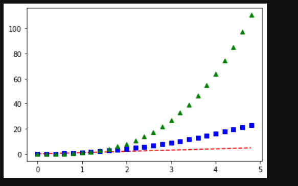
import numpy as npimport matplotlib.pyplot as plt# evenly sampled time at 200ms intervalst = np.arange(0., 5., 0.2)# red dashes, blue squares and green triangles## 显示三条线,第一条红色--型,第二条蓝色方形标记,第三条,绿色三角形标记plt.plot(t, t, 'r--', t, t**2, 'bs', t, t**3, 'g^')plt.show()
matplotlib.pyplot.axis 函数
获取或设置某些轴属性的便捷方法
https://matplotlib.org/stable/api/_as_gen/matplotlib.pyplot.axis.html#matplotlib-pyplot-axismatplotlib.pyplot.axis(*args, emit=True, **kwargs)[source]
xmin, xmax, ymin, ymax = axis()xmin, xmax, ymin, ymax = axis([xmin, xmax, ymin, ymax])xmin, xmax, ymin, ymax = axis(option)xmin, xmax, ymin, ymax = axis(**kwargs)
| 参数 | 参数类型 | 说明 |
|---|---|---|
| xmin, xmax, ymin, ymax | float | 设置的轴限制 |
| option | bool or str | 如果是布尔型,请打开或关闭轴线和标签。如果是字符串,则可能的值为下面的 |
| emit | bool, 默认是:True | 是否通知观察者有关轴极限的变化 |
option
| Value | Description |
|---|---|
'on' |
打开轴线和标签。与相同True。 |
'off' |
关闭轴线和标签。与相同False。 |
'equal' |
通过更改轴限制设置相等的缩放比例(即使圆成为圆形)。 这与 ax.set_aspect('equal'``adjustable='datalim')相同在这种情况下,可能不遵守明确的数据限制 |
'scaled' |
通过更改绘图框的尺寸设置相等的缩放比例(即使圆成为圆形)。 这与 ax.set_aspect('equal', adjustable='box', anchor='C')相同进一步的自动缩放功能将被禁用 |
'tight' |
将限制设置为刚好足以显示所有数据,然后禁用进一步的自动缩放。 |
'auto' |
自动缩放(用数据填充绘图框)。 |
'image' |
“定标”且轴限制等于数据限制。 |
'square' |
方形图;类似于“缩放”,但最初是强制的 。xmax-xmin == ymax-ymin |
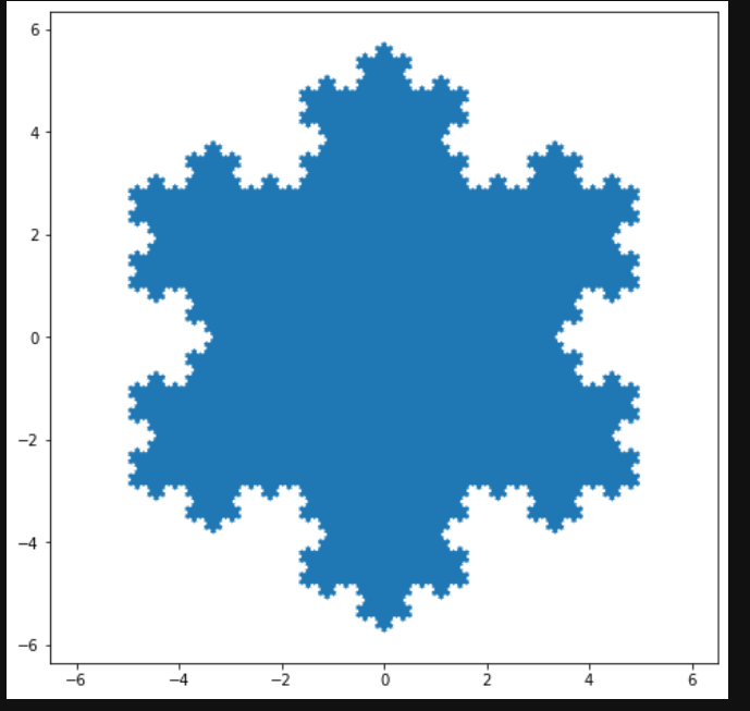
import numpy as npimport matplotlib.pyplot as pltdef koch_snowflake(order, scale=10):"""Return two lists x, y of point coordinates of the Koch snowflake.Parameters----------order : intThe recursion depth.scale : floatThe extent of the snowflake (edge length of the base triangle)."""def _koch_snowflake_complex(order):if order == 0:# initial triangleangles = np.array([0, 120, 240]) + 90return scale / np.sqrt(3) * np.exp(np.deg2rad(angles) * 1j)else:ZR = 0.5 - 0.5j * np.sqrt(3) / 3p1 = _koch_snowflake_complex(order - 1) # start pointsp2 = np.roll(p1, shift=-1) # end pointsdp = p2 - p1 # connection vectorsnew_points = np.empty(len(p1) * 4, dtype=np.complex128)new_points[::4] = p1new_points[1::4] = p1 + dp / 3new_points[2::4] = p1 + dp * ZRnew_points[3::4] = p1 + dp / 3 * 2return new_pointspoints = _koch_snowflake_complex(order)x, y = points.real, points.imagreturn x, yx, y = koch_snowflake(order=5)plt.figure(figsize=(8, 8))plt.axis('equal') # 通过更改轴限制设置相等的缩放比例(即使圆成为圆形)。plt.fill(x, y)plt.show()
用关键字字符串绘图
在某些情况下,有某种格式的数据,该格式允许您使用字符串访问特定变量。
matplotlib.pyplot.scatter 函数
matplotlib.pyplot.scatter(x, y, s=None, c=None, marker=None, cmap=None, norm=None, vmin=None, vmax=None, alpha=None, linewidths=None, *, edgecolors=None, plotnonfinite=False, data=None, **kwargs)[source]
参数说明
| 参数 | 数据类型 | 说明 |
|---|---|---|
| x, y | float 或者数组 | 输入数据 |
| s | 浮点型或数组形 | 是一个标量或者是一个shape大小为(n,)的数组,可选,默认20 |
| c | 数组或颜色或颜色列表 | 可选,默认蓝色’b’ c不应为单个数字RGB或RGBA序列 如果未指定或 None,则标记颜色由Axes当前“形状和填充”颜色循环的下一个颜色确定。此循环默认为[rcParams["axes.prop_cycle"]](https://matplotlib.org/stable/tutorials/introductory/customizing.html?highlight=axes.prop_cycle#a-sample-matplotlibrc-file)(默认值:)。cycler('color', ['#1f77b4', '#ff7f0e', '#2ca02c', '#d62728', '#9467bd', '#8c564b', '#e377c2', '#7f7f7f', '#bcbd22', '#17becf']) |
| marker | MarkerStyle | 标记样式,默认’o’可以是类的实例,也可以是特定标记的文本简写, |
| cmap | STR或Colormap |
默认值:’viridis’ 一个Colormap实例或注册的颜色表名。仅当c是浮点数数组时才使用cmap |
| norm | Normalize | 数据亮度在0-1之间,也是只有c是一个浮点数的数组的时候才使用。如果没有申明,就是默认None |
| vmin, vmax | float | 标量,当norm存在的时候忽略。用来进行亮度数据的归一化,可选,默认None。 |
| alpha | float | 标量,介于0(透明)和1(不透明)之间 |
| linewidths | float或数组类 | 标记点的长度,默认值:1.5 |
Matplotlib允许为此类对象提供data关键字参数
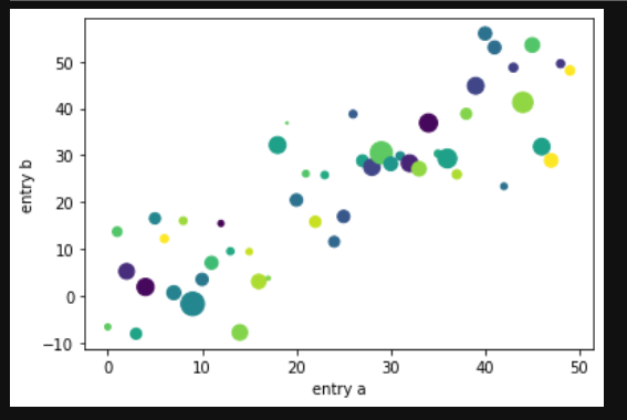
import numpy as npimport matplotlib.pyplot as pltdata = {'a': np.arange(50),'c': np.random.randint(0, 50, 50),'d': np.random.randn(50)}data['b'] = data['a'] + 10 * np.random.randn(50)data['d'] = np.abs(data['d']) * 100plt.scatter('a', 'b', c='c', s='d', data=data)plt.xlabel('entry a')plt.ylabel('entry b')plt.show()
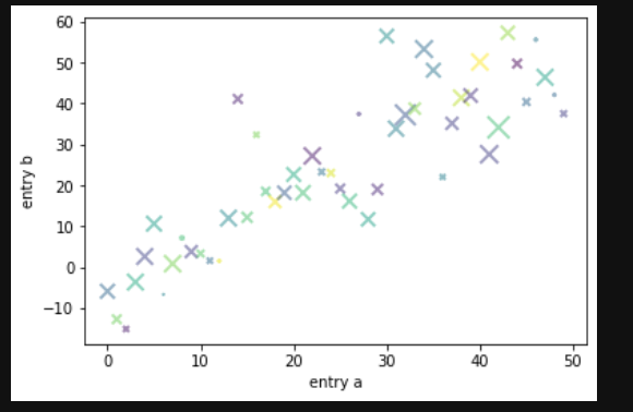
import numpy as npimport matplotlib.pyplot as pltdata = {'a': np.arange(50),'c': np.random.randint(0, 50, 50),'d': np.random.randn(50)}data['b'] = data['a'] + 10 * np.random.randn(50)data['d'] = np.abs(data['d']) * 100# plt.scatter('a', 'b', c='c', s='d', data=data)plt.scatter('a', 'b', c='c', s='d', data=data, alpha=0.5, marker='x', linewidths=2)plt.xlabel('entry a')plt.ylabel('entry b')plt.show()
用分类变量绘图
matplotlib.pyplot.subplot 函数
https://matplotlib.org/stable/api/_as_gen/matplotlib.pyplot.subplot.html#matplotlib.pyplot.subplot
将轴添加到当前图形或检索现有轴
matplotlib.pyplot.bar 函数
绘制条形图
https://matplotlib.org/stable/api/_as_gen/matplotlib.pyplot.bar.html#matplotlib.pyplot.bar
matplotlib.pyplot.suptitle 函数
https://matplotlib.org/stable/api/_as_gen/matplotlib.pyplot.suptitle.html#matplotlib.pyplot.suptitle
在图上添加居中的字幕
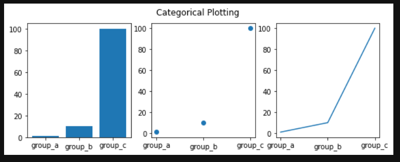
import numpy as npimport matplotlib.pyplot as pltnames = ['group_a', 'group_b', 'group_c']values = [1, 10, 100]plt.figure(figsize=(9, 3))plt.subplot(131)plt.bar(names, values)plt.subplot(132)plt.scatter(names, values)plt.subplot(133)plt.plot(names, values)plt.suptitle('Categorical Plotting')plt.show()
控制线的属性
线条具有许多可以设置的属性:线宽,破折号样式,抗锯齿等
https://matplotlib.org/stable/api/_as_gen/matplotlib.lines.Line2D.html#matplotlib.lines.Line2D
- 使用关键字args:
plt.plot(x, y, linewidth=2.0)
- 使用Line2D实例的setter方法。plot返回Line2D对象列表;例如。在下面的代码中,我们假设只有一行,因此返回的列表的长度为1。我们使用tuple unpacking 获取该列表的第一个元素:line1, line2 = plot(x1, y1, x2, y2)line,
line, = plt.plot(x, y, '-')line.set_antialiased(False) # turn off antialiasing
- 使用setp。下面的示例使用MATLAB样式的函数在行列表上设置多个属性。setp与对象列表或单个对象透明地工作。您可以使用python关键字参数或MATLAB样式的字符串/值对:
/
lines = plt.plot(x1, y1, x2, y2)# use keyword argsplt.setp(lines, color='r', linewidth=2.0)# or MATLAB style string value pairsplt.setp(lines, 'color', 'r', 'linewidth', 2.0)
与多种图形和轴工作
MATLAB和和pyplot具有当前图形和当前轴的概念。所有绘图功能均适用于当前轴。该函数gca返回当前轴(一个 matplotlib.axes.Axes实例),并gcf返回当前图形(一个matplotlib.figure.Figure实例)
figure此处的调用是可选的,因为如果不存在图形,则将创建图形,就像如果不存在,则将创建轴(相当于显式 subplot()调用)一样。
import numpy as npimport matplotlib.pyplot as pltdef f(t):return np.exp(-t) * np.cos(2*np.pi*t)t1 = np.arange(0.0, 5.0, 0.1)t2 = np.arange(0.0, 5.0, 0.02)plt.figure()plt.subplot(211)plt.plot(t1, f(t1), 'bo', t2, f(t2), 'k')plt.subplot(212)plt.plot(t2, np.cos(2*np.pi*t2), 'r--')plt.show()

可以通过使用多个figure具有递增数字的呼叫来创建多个数字 。当然,每个图形都可以包含您内心所希望的多个轴和子图
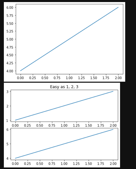
import matplotlib.pyplot as pltplt.figure(1) # the first figureplt.subplot(211) # the first subplot in the first figureplt.plot([1, 2, 3])plt.subplot(212) # the second subplot in the first figureplt.plot([4, 5, 6])plt.figure(2) # a second figureplt.plot([4, 5, 6]) # creates a subplot() by defaultplt.figure(1) # figure 1 current; subplot(212) still currentplt.subplot(211) # make subplot(211) in figure1 currentplt.title('Easy as 1, 2, 3') # subplot 211 title
您可以使用清除当前图形,使用清除clf 当前轴cla。
如果要制作大量图形,则还需要注意一件事:在使用图形明确关闭图形之前,图形所需的内存不会完全释放 close。删除对图形的所有引用,和/或使用窗口管理器杀死图形在屏幕上出现的窗口是不够的,因为pyplot会一直保持内部引用直到close 被调用。
使用文本
text可以用于在任意位置添加文本 xlabel,ylabel和title可以用于在指示的位置添加文本
import matplotlib.pyplot as pltimport numpy as npmu, sigma = 100, 15x = mu + sigma * np.random.randn(10000)# the histogram of the datan, bins, patches = plt.hist(x, 50, density=1, facecolor='g', alpha=0.75)plt.xlabel('Smarts')plt.ylabel('Probability')plt.title('Histogram of IQ')plt.text(60, .025, r'$\mu=100,\ \sigma=15$')plt.axis([40, 160, 0, 0.03])plt.grid(False)plt.show()

在文本中使用数学表达式plt.title(r'$\sigma_i=15$')
注释文字
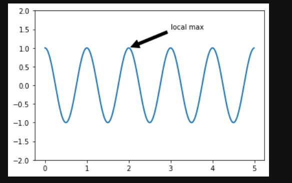
文本的常见用法是注释绘图的某些功能, annotate方法(https://matplotlib.org/stable/api/_as_gen/matplotlib.pyplot.annotate.html#matplotlib.pyplot.annotate)。在注释中,有两点要考虑:由参数表示的要注释xy的位置和text的位置xytext,这两个参数都是元组(x, y)。
ax = plt.subplot()t = np.arange(0.0, 5.0, 0.01)s = np.cos(2*np.pi*t)line, = plt.plot(t, s, lw=2)plt.annotate('local max', xy=(2, 1), xytext=(3, 1.5),arrowprops=dict(facecolor='black', shrink=0.05),)plt.ylim(-2, 2)plt.show()
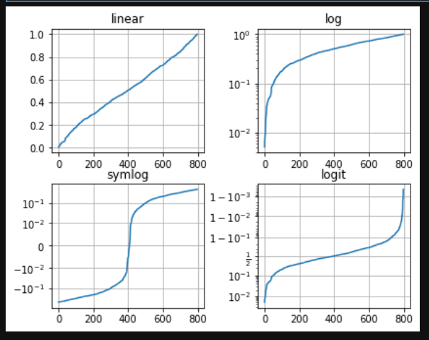
对数轴和其他非线性轴
matplotlib.pyplot不仅支持线性轴刻度,还支持对数和对数刻度。如果数据跨多个数量级,则通常使用此方法。更改轴的比例很容易:plt.xscale('log')
# Fixing random state for reproducibilitynp.random.seed(19680801)# make up some data in the open interval (0, 1)y = np.random.normal(loc=0.5, scale=0.4, size=1000)y = y[(y > 0) & (y < 1)]y.sort()x = np.arange(len(y))# plot with various axes scalesplt.figure()# linearplt.subplot(221)plt.plot(x, y)plt.yscale('linear')plt.title('linear')plt.grid(True)# logplt.subplot(222)plt.plot(x, y)plt.yscale('log')plt.title('log')plt.grid(True)# symmetric logplt.subplot(223)plt.plot(x, y - y.mean())plt.yscale('symlog', linthresh=0.01)plt.title('symlog')plt.grid(True)# logitplt.subplot(224)plt.plot(x, y)plt.yscale('logit')plt.title('logit')plt.grid(True)# Adjust the subplot layout, because the logit one may take more space# than usual, due to y-tick labels like "1 - 10^{-3}"plt.subplots_adjust(top=1, bottom=0.01, left=0.10, right=0.95, hspace=0.25,wspace=0.35)plt.show()
图例中文显示问题
如果使用的是中文标签,将在图像中无法显示,因为matplotlib默认为英文,可以在做图前进行下面的设置来显示中文:plt.rcParams['font.sans-serif'] = ['SimHei']
负号显示问题
保存图像时,负号可能不正常显示,可以通过如下代码解决:plt.rcParams['axes.unicode_minus'] = False

若有收获,就点个赞吧
0 人点赞
