整体导图
布局的基本原则
- 一个窗口只能含有一个元素
- 不应显式设置元素的尺寸和坐标位置
- 支持多元素时,可使用嵌套容器:典型的用户界面使用Gird面板作为开始,Gird面板是WPF中功能最强大的容器。
核心布局面板
System.Windows.Controls
| 名称 | 说明 |
|---|---|
| Grid | 功能最强大,布局最灵活的。 |
| StackPanel | 在水平或垂直的堆栈中放置元素。常用于更大、更复杂窗口中的一些小区域 |
| WrapPanel | 在一系列可换的行中放置元素。 |
| DockPanel | 根据容器的整个边界调整元素 |
| Grid | 最灵活最常用 |
| UniformGrid | 在不可见但是强制所有单元格具有相同尺寸的表中放置元素,这个布局控件不常用。 |
| Canvas | 和传统Windows窗体应用程序最相似。 |
| InkCanvas | |
| Border |
Grid
适用场景:
- UI布局的大框架设计
- 大量UI元素需要成行或者成列对其的情况
- UI整体尺寸改变时,元素需要保持固有的高度和宽度比例
- UI后期可能有较大变更或拓展。
Grid.RowDefinitions:可以创建任意多行
Grid.ColumnDefinitions:可以创建任意多列
ShowGridLine:可以设置边距线的显示
<Grid ShowGridLines="True"><Grid.RowDefinitions><RowDefinition></RowDefinition><RowDefinition></RowDefinition></Grid.RowDefinitions><Grid.ColumnDefinitions><ColumnDefinition></ColumnDefinition><ColumnDefinition></ColumnDefinition></Grid.ColumnDefinitions></Grid>
StackPanel
适用场景:
- 同类元素需要紧凑排列(如制作菜单或者列表)
- 移除其中的元素后能够自动补缺的布局和动画
Orientation:用于设置StackPanel的元素排列方式,默认以垂直的方式布局。
Horizontal为水平,Vertical为垂直布局
<Grid ShowGridLines="True">
        <StackPanel Orientation="Vertical">
            <Button Background="BurlyWood" Height="40"/>
            <Button Background="Gray" Height="40"/>
        </StackPanel>
    </Grid>
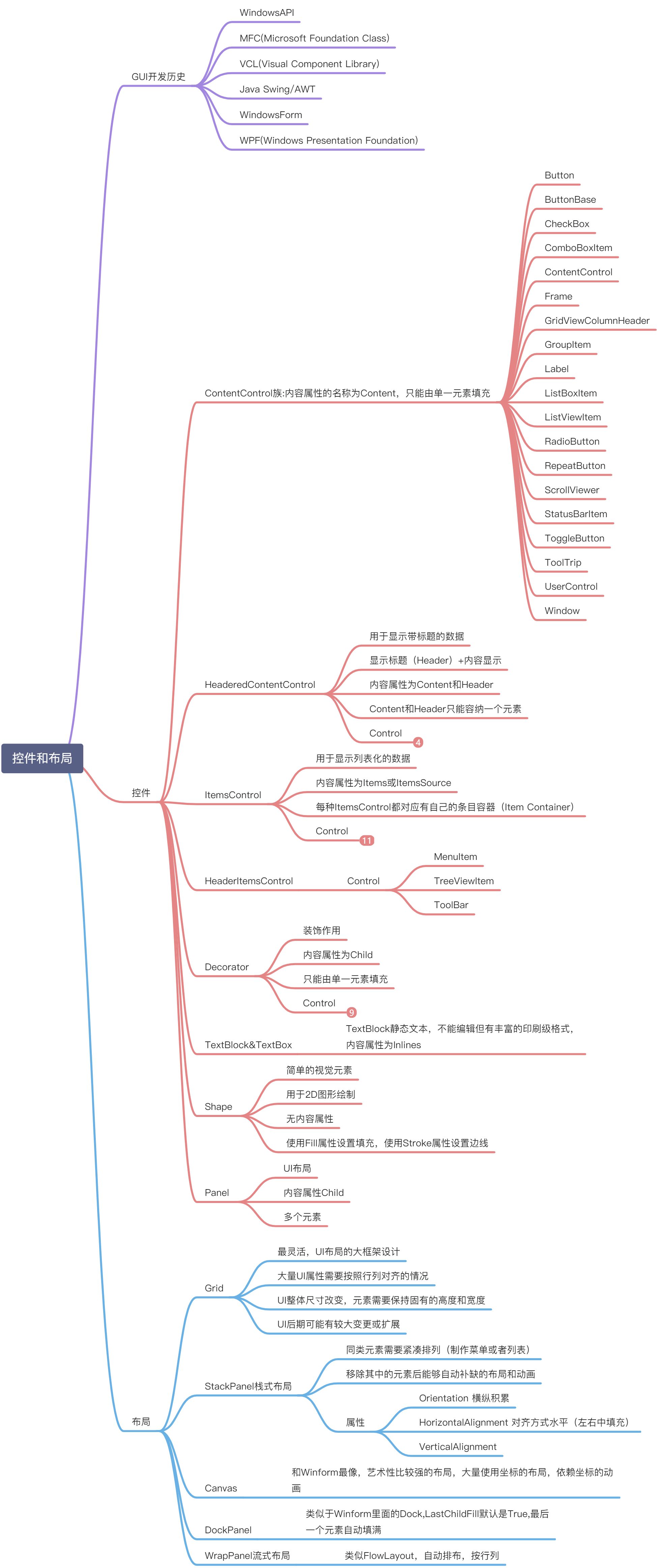
WrapPanel
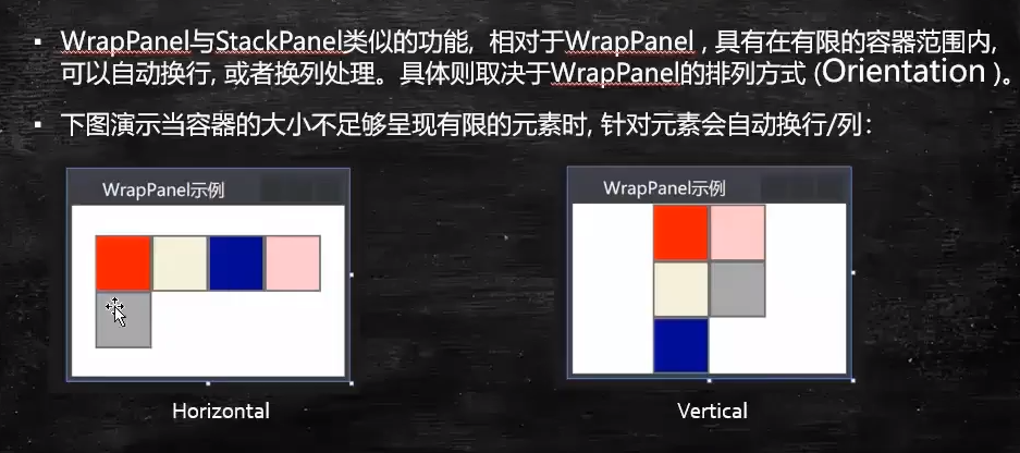
DockPanel
<Grid ShowGridLines="True">
        <DockPanel LastChildFill="False">
            <Button Width="20" Height="20" Background="Red"/>
            <Button Width="20" Height="20" Background="Green"/>
            <Button Width="20" Height="20" Background="Gray"/>
            <Button Width="20" Height="20" Background="Red"/>
        </DockPanel>
    </Grid>
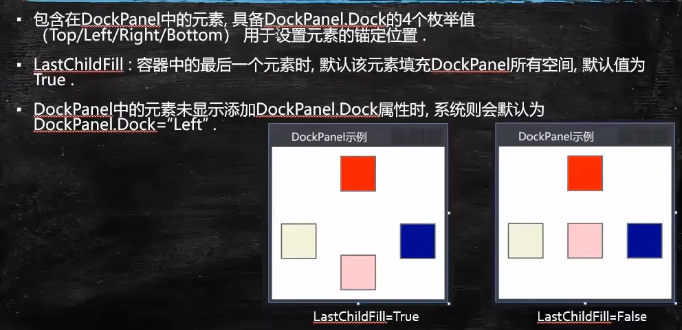
UniformGrid
<Grid ShowGridLines="True">
        <Grid.RowDefinitions>
            <RowDefinition Height="40"/>
        </Grid.RowDefinitions>
        <UniformGrid Rows="2" Background="AliceBlue"></UniformGrid>
    </Grid>
Border
Backgroud
BorderBrush和BorderThickness
CornerRadius
Padding
Botton控件使用ButtonChrome装饰元素,ListBox控件使用ListBoxChrome装饰元素,
Border和Viewbox元素用于构造用户界面。
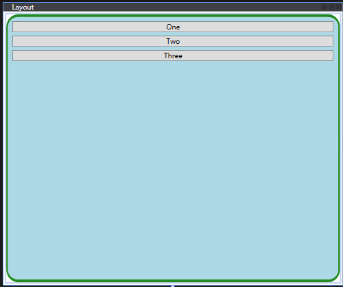
 <Grid>
        <Border Margin="5" Padding="5" Background="LightBlue"
                BorderBrush="ForestGreen" BorderThickness="3,5,3,5"
                CornerRadius="20">
            <StackPanel>
                <Button Margin="3" Content="One"/>
                <Button Margin="3" Content="Two"/>
                <Button Margin="3" Content="Three"/>
            </StackPanel>
        </Border>
    </Grid>
布局属性

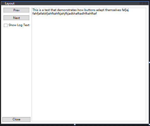
示例代码1
 <Grid>
        <Grid.RowDefinitions>
            <RowDefinition Height="*"/>
            <RowDefinition Height="Auto"/>
        </Grid.RowDefinitions>
        <Grid.ColumnDefinitions>
            <ColumnDefinition Width="Auto"/>
            <ColumnDefinition Width="*"/>
        </Grid.ColumnDefinitions>

        <StackPanel Grid.Row="0" Grid.Column="0">
            <Button Content="Prev" Margin="10,10,10,3"/>
            <Button Content="Next" Margin="10,10,10,3"/>
            <CheckBox Margin="10,10,10,10" Content="Show Log Text"/>
        </StackPanel>
        <TextBox Grid.Row="0" Grid.Column="1" Margin="0,10,10,10"
                 TextWrapping="WrapWithOverflow" Grid.RowSpan="2">
            This is a test that demonstrates how buttons adapt themselves
            fafjaj fahfjafakkfjahfkahfkjahjfkjadkhafkadhfkahfkaf
        </TextBox>
        <Button Grid.Row="1" Grid.Column="0" Margin="5,3,5,8">Close</Button>
    </Grid>
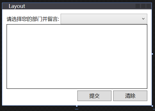
示例代码2
<Grid Margin="10" ShowGridLines="False">
        <Grid.RowDefinitions>
            <RowDefinition Height="25"/>
            <RowDefinition Height="4"/>
            <RowDefinition Height="*"/>
            <RowDefinition Height="4"/>
            <RowDefinition Height="25"/>
        </Grid.RowDefinitions>
        <Grid.ColumnDefinitions>
            <ColumnDefinition Width="Auto"/>
            <ColumnDefinition Width="*"/>
            <ColumnDefinition Width="80"/>
            <ColumnDefinition Width="4"/>
            <ColumnDefinition Width="80"/>
        </Grid.ColumnDefinitions>

        <TextBlock Text="请选择您的部门并留言: " Grid.Column="0" Grid.Row="0" VerticalAlignment="Center"/>
        <ComboBox Grid.Column="1" Grid.Row="0" Grid.ColumnSpan="4"/>
        <TextBox Grid.Column="0" Grid.Row="1" Grid.ColumnSpan="5" Grid.RowSpan="2" BorderBrush="Black"/>
        <Button Content="提交" Grid.Column="2" Grid.Row="4"/>
        <Button Content="清除" Grid.Column="4" Grid.Row="4"/>
    </Grid>
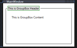
示例代码3
HeaderedContentControl
 <Grid>
        <GroupBox Margin="10" BorderBrush="Black">
            <GroupBox.Header>
                <Button Content="This is GroupBox Header" BorderBrush="Green"/>
            </GroupBox.Header>
            <TextBlock Text="This is GroupBox Content" Margin="20"/>
        </GroupBox>
    </Grid>
ItemsControl
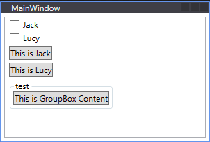
 <Grid>
        <ListBox Margin="5">
            <CheckBox Content="Jack"/>
            <CheckBox Content="Lucy"/>
            <Button Content="This is Jack"/>
            <Button Content="This is Lucy"/>
            <GroupBox Header="test">
                <Button Content="This is GroupBox Content"/>
            </GroupBox>
        </ListBox>
    </Grid>
PersonalSummary
控件和布局,在WPF中更加灵活方便,有Grid,StackPanel,Canvas,DockPanel,WrapPanel。WPF中控件可以进行嵌套,这样就有很多丰富的组合,之前在Winform中看到同名,因为WPF的控件名称空间为System.Windows.Controls,这就是为什么总能在System.Windows.Forms找到同名控件的原因了。内容决定形式,GUI从最开始的WindowsAPI时代到MFC到组件VCL再到事件驱动的Winform,最近十年发展到了WPF(数据驱动)。
常用的控件属性需要熟记,其余的可在实际需要中选择性记忆,更重要的不是外在的,而是理解事件驱动和数据驱动的区别,最后能够利用MVVM重构一些老项目和开发新项目。

若有收获,就点个赞吧
0 人点赞
