一、线性布局LinearLayout
线性布局LinearLayout
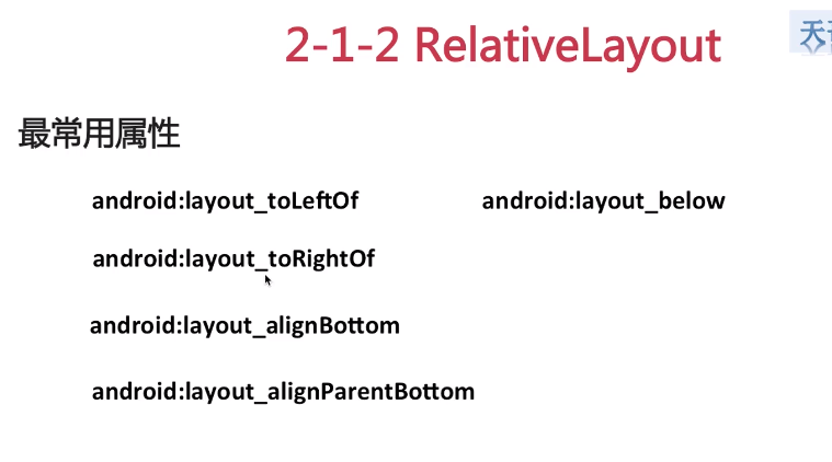
相对布局RelativeLayout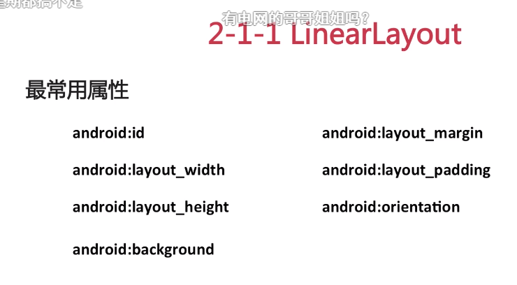
layout_width : match_parent匹配父控件 wrap_content根据文字内容匹配
二、TextView
常用属性设置
<TextViewandroid:id="@+id/textViewOne"android:layout_width="100dp"android:layout_height="wrap_content"android:text="Hello Albert"android:maxLines="1" 最大行数android:ellipsize="end" 最后显示为...android:textSize="20sp" 字体大小android:drawableRight="@drawable/awg_pic_tx_run_playing" 在文字右侧插入图片android:layout_marginLeft="@dimen/dp_20"android:textColor="@color/red"/>
package com.rigol.station.generator.awg;import android.app.AlertDialog;import android.content.DialogInterface;import android.content.Intent;import android.graphics.Paint;import android.os.Bundle;import android.view.WindowManager;import androidx.annotation.Nullable;import com.rigol.station.generator.SplashActivity;import com.rigol.station.generator.common.base.BaseActivity;import com.rigol.station.generator.databinding.ActivityAlbertTestBinding;public class AwgTestActivity extends BaseActivity{private ActivityAlbertTestBinding mBinding;@Override protected void onCreate(@Nullable Bundle savedInstanceState){super.onCreate(savedInstanceState);//这句代码是固定的getWindow().addFlags(WindowManager.LayoutParams.FLAG_FULLSCREEN);//创建Binding实例mBinding = ActivityAlbertTestBinding.inflate(getLayoutInflater());//设置上下文内容(Binding的View)setContentView(mBinding.getRoot());//设置TextView文本有下划线mBinding.textViewOne.getPaint().setFlags(Paint.STRIKE_THRU_TEXT_FLAG);//去除锯齿mBinding.textViewOne.getPaint().setAntiAlias(true);//Button的点击事件mBinding.TestButton.setOnClickListener(v->{//弹框AlertDialog.Builder builder = new AlertDialog.Builder(this);builder.setTitle("AWG");builder.setMessage("AWG交互体验测试");builder.setPositiveButton("Good", new DialogInterface.OnClickListener(){@Override public void onClick(DialogInterface dialog, int which){}});AlertDialog dialog = builder.create();dialog.show();//界面跳转Intent intent = new Intent(this, SplashActivity.class);startActivity(intent);});}}
跑马灯效果
<TextViewandroid:id="@+id/textViewTwo"android:layout_width="@dimen/dp_80"android:layout_height="wrap_content"android:text="Hello Albert Hello Albert Hello Albert Hello Albert Hello Albert"android:singleLine="true"android:ellipsize="marquee"android:marqueeRepeatLimit="marquee_forever"android:focusable="true"android:focusableInTouchMode="true"android:textSize="20sp"android:layout_marginLeft="@dimen/dp_20"android:textColor="@color/red"/>
三、Button
常用属性
layout_below = “@id/btn_1 在btn_1的下方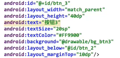
自定义Button样式
在res-drawable下面添加Drawable Resource File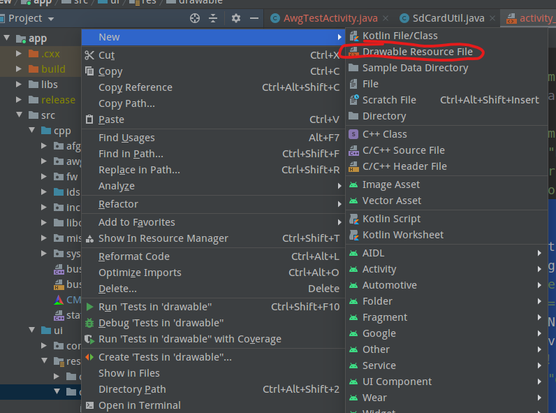
增加代码:
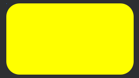
最外面的形状为方形,solid实心颜色为yellow,corners圆角为100dp<?xml version="1.0" encoding="utf-8"?><shape xmlns:android="http://schemas.android.com/apk/res/android"><solid android:color="@color/yellow"/><corners android:radius="@dimen/dp_100"/></shape>
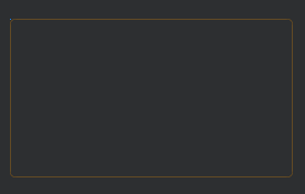
虚线框stroke
<?xml version="1.0" encoding="utf-8"?>
<shape xmlns:android="http://schemas.android.com/apk/res/android">
    <stroke
        android:width="1dp"
        android:color="#FF9900"/>
    <corners android:radius="@dimen/dp_20"/>
</shape>
四、EditText、RadioButton、CheckBox
五、ImageView
src:图片源
scaleType:拉伸方式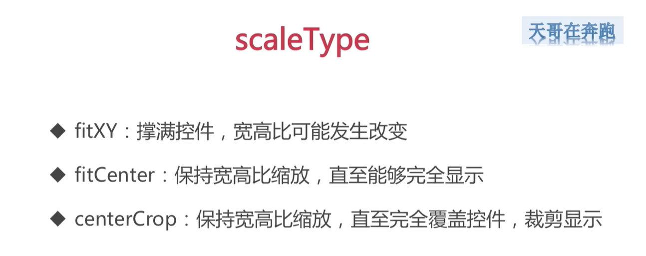
网络图片显示到本地:
https://github.com/bumptech/glide
在build.gradle中链接上库
详细用法参考github上面的使用说明
在AndriodManifest.xml中:

若有收获,就点个赞吧
0 人点赞
