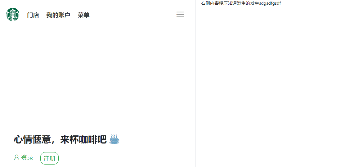
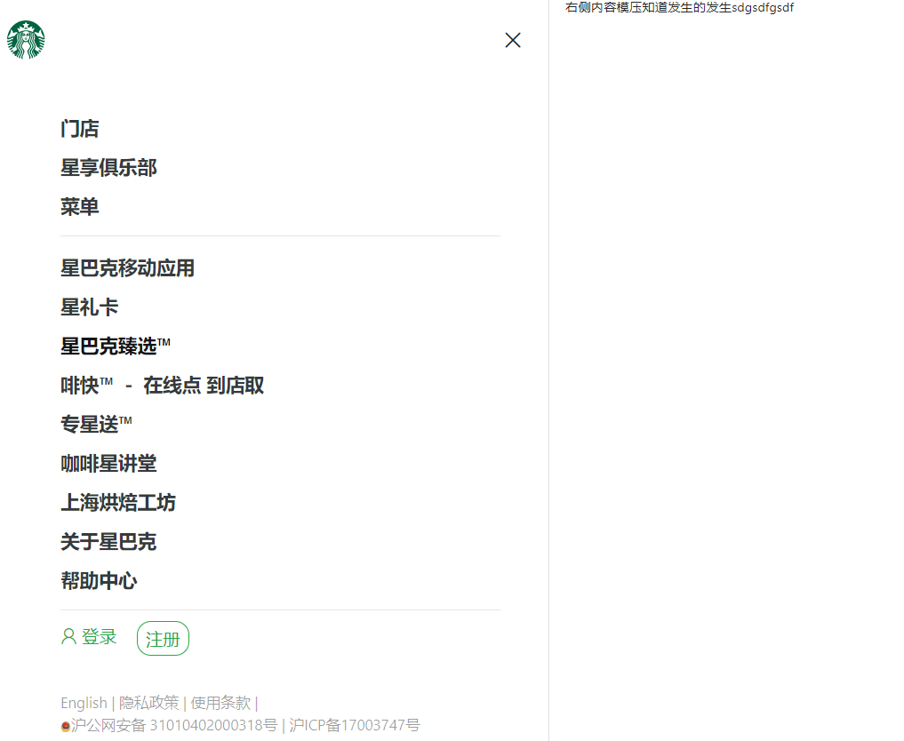
<!DOCTYPE html><html><head><meta charset="UTF-8"><title></title><meta name="viewport" content="width=device-width, initial-scale=1, shrink-to-fit=no"><link rel="stylesheet" href="https://stackpath.bootstrapcdn.com/bootstrap/4.3.1/css/bootstrap.min.css"integrity="sha384-ggOyR0iXCbMQv3Xipma34MD+dH/1fQ784/j6cY/iJTQUOhcWr7x9JvoRxT2MZw1T" crossorigin="anonymous"><link rel="stylesheet" href="css/iconfont.css"><link rel="stylesheet" href="css/index.css"></head><body><div class="container-fluid"><!-- 栅格系统:不管屏幕大小都是100% --><div class="row justify-content-end"><!-- 左边内容 --><div class="col-lg-4 position-fixed border-right leftCon"><!-- 1、解决左边内容在右边的问题 --><!-- 导航栏 --><header class="navbar d-none d-sm-flex px-0 px-lg-3 py-3 py-lg-4"><a href="#" class="navbar-brand"><img src="images/logo.svg" alt="" width="36"></a><ul class="nav mr-auto"> <!--mr-auto: 图标和文字挨着 --><li class="nav-item"><a href="#" class="nav-link text-dark font-weight-bold">门店</a></li><li class="nav-item"><a href="#" class="nav-link text-dark font-weight-bold">我的账户</a></li><li class="nav-item"><a href="#" class="nav-link text-dark font-weight-bold">菜单</a></li></ul><span class="iconfont icon-menu" id="showBtn"></span><!-- 三条杠iconfont --></header><!-- 标题与登录注册 --><div class="d-flex align-items-center login"><div class="px-0 px-lg-5"><h1 class="font-weight-bold py-3">心情惬意,来杯咖啡吧 <span class="iconfont icon-kafei"></span></h1><div class="d-none d-sm-block my-3"><a href="#" class="text-success"><span class="iconfont icon-denglu"></span><span>登录</span></a><a href="#" class="btn btn-outline-success ml-4 register">注册</a></div></div></div><!-- 点击菜单后要展示的内容 --><div class="d-flex bg-white flex-column justify-content-between position-absolute menu hide"><!-- 注意:flex-column:旋转后是垂直,但是其实本质上还是要横着,所以要justify-content-between--><header class="navbar d-flex px-0 px-lg-3 py-3 py-lg-4"><a href="#" class="navbar-brand"><img src="images/logo.svg" alt="" width="36"></a><span class="iconfont icon-guanbi" id="closeBtn"></span></header><div class="list"><ul class="list-unstyled mx-sm-5 pl-sm-5"><li><a href="#" class="font-weight-bold text-dark py-2 d-block">门店</a></li><li><a href="#" class="font-weight-bold text-dark py-2 d-block">星享俱乐部</a></li><li><a href="#" class="font-weight-bold text-dark py-2 d-block">菜单</a></li><hr><li><a href="#" class="font-weight-bold text-dark py-2 d-block">星巴克移动应用</a></li><li><a href="#" class="font-weight-bold text-dark py-2 d-block">星礼卡</a></li><li><a href="#" class="font-weight-bold text-dark py-2 d-block">星巴克臻选™</a></li><li><a href="#" class="font-weight-bold text-dark py-2 d-block">啡快™ - 在线点 到店取</a></li><li><a href="#" class="font-weight-bold text-dark py-2 d-block">专星送™</a></li><li><a href="#" class="font-weight-bold text-dark py-2 d-block">咖啡星讲堂</a></li><li><a href="#" class="font-weight-bold text-dark py-2 d-block">上海烘焙工坊</a></li><li><a href="#" class="font-weight-bold text-dark py-2 d-block">关于星巴克</a></li><li><a href="#" class="font-weight-bold text-dark py-2 d-block">帮助中心</a></li><hr></ul><div class="my-3 mx-sm-5 pl-sm-5 font"><a href="#" class="text-success"><span class="iconfont icon-denglu"></span><span>登录</span></a><a href="#" class="btn btn-outline-success ml-4 register">注册</a></div></div><footer class="mx-sm-5 pl-sm-5 pb-5"><div><a href="#">English</a> | <a href="#">隐私政策</a> | <a href="#">使用条款</a> |</div><div><a href="#"><img src="images/icpicon.png" width="10" height="10" alt="">沪公网安备 31010402000318号</a> | <a href="#">沪ICP备17003747号</a></div></footer></div></div><!-- 右边内容 --><div class="col-lg-8">右侧内容模压知道发生的发生sdgsdfgsdf</div></div></div><script src="https://code.jquery.com/jquery-3.3.1.slim.min.js"integrity="sha384-q8i/X+965DzO0rT7abK41JStQIAqVgRVzpbzo5smXKp4YfRvH+8abtTE1Pi6jizo"crossorigin="anonymous"></script><script src="https://stackpath.bootstrapcdn.com/bootstrap/4.3.1/js/bootstrap.min.js"integrity="sha384-JjSmVgyd0p3pXB1rRibZUAYoIIy6OrQ6VrjIEaFf/nJGzIxFDsf4x0xIM+B07jRM"crossorigin="anonymous"></script><script>$('#showBtn').on('click',function(){$('.menu').removeClass('hide').addClass('show');});$('#closeBtn').on('click',function(){$('.menu').removeClass('show').addClass('hide');});</script></body></html>
html {
font-size: 62.5% !important; /* 取默认字体的百分比 */
}
@media (min-width: 992px){
html {
font-size: 62.5%;
}
}
@media (min-width: 768px){
html {
font-size: 59%;
}
}
@media (min-width: 576px){
html {
font-size: 56%
}
}
body{
overflow-x: hidden;
}
a:hover{
text-decoration: none;
}
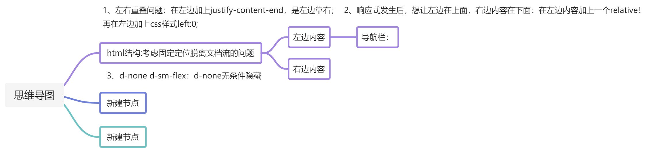
/* 左侧内容 */
.leftCon{
left: 0; /* 解决了左边内容靠右的问题 */
}
.leftCon header{
height: 80px;
}
.leftCon header ul a{
font-size: 1.6rem;
}
.leftCon .icon-menu{
font-size: 3rem;
cursor: pointer;
color: #858585;
}
.login{
height: calc(100vh - 80px);/* 减去的时导航栏的高度 */
}
.login .icon-kafei{
font-size: 24px;
color: #67a4c7;
}
.login a{
font-size: 1.6rem;
}
.register{
border-radius: 13px;
}
@media (max-width:991.98px){/* 媒体查询:解决左边在上,右边内容在下的问题 */
.leftCon{
position: relative!important;
}
.login{
height: auto;
/* 可以让login部分在小屏幕上调 */
}
}
.menu{
left: 0;
top: 0;
width:100%;
height: 100vh;
padding-left: 15px;
padding-right: 15px;
z-index: 2000;
transition: 0.3s;
}
/* 切换隐藏显示状态 */
.menu.hide{
opacity: 0;
transform: scale(2);/* 放大特效 */
z-index: -1;
}
.menu.show{
opacity: 1;
transform: scale(1);
}
.menu .list ul a{
font-size: 1.8rem;
}
.menu .font,.menu .font .btn{
font-size: 1.6rem;
}
.menu footer{
font-size: 1.4rem;
}
.menu footer,.menu footer a{
color: rgba(0,0,0,0.38);
}
#closeBtn{
cursor: pointer;
}

若有收获,就点个赞吧
0 人点赞
