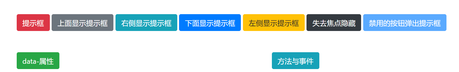
1、提示框
<div class="container"><div class="row mt-5"><div class="col"><button class="btn btn-danger" data-toggle="popover" title="这里放的是提示框的标题" data-content="这里放的是提示框的内容">提示框</button></div></div></div><script src="https://code.jquery.com/jquery-3.3.1.slim.min.js"integrity="sha384-q8i/X+965DzO0rT7abK41JStQIAqVgRVzpbzo5smXKp4YfRvH+8abtTE1Pi6jizo"crossorigin="anonymous"></script><script src="https://cdnjs.cloudflare.com/ajax/libs/popper.js/1.14.7/umd/popper.min.js"integrity="sha384-UO2eT0CpHqdSJQ6hJty5KVphtPhzWj9WO1clHTMGa3JDZwrnQq4sF86dIHNDz0W1"crossorigin="anonymous"></script><script src="https://stackpath.bootstrapcdn.com/bootstrap/4.3.1/js/bootstrap.min.js"integrity="sha384-JjSmVgyd0p3pXB1rRibZUAYoIIy6OrQ6VrjIEaFf/nJGzIxFDsf4x0xIM+B07jRM"crossorigin="anonymous"></script><script>//初始化提示框,必需要写这一步$(function(){$('[data-toggle="popover"]').popover();//并不仅仅初始化的是button,而是所有data-toggle=popover。});</script>
2、4个弹出方向:data-placement
<div class="container"><div class="row mt-5"><div class="col"><!-- 4个弹出方向:data-placement --><button class="btn btn-secondary" data-toggle="popover" title="这个提示框没有标题,并且是在上面显示" data-placement="top">上面显示提示框</button><button class="btn btn-info" data-toggle="popover" title="这个提示框没有标题,并且是在右侧显示" data-placement="right">右侧显示提示框</button><button class="btn btn-primary" data-toggle="popover" title="这个提示框没有标题,并且是在下面显示" data-placement="bottom">下面显示提示框</button><button class="btn btn-warning" data-toggle="popover" title="这个提示框没有标题,并且是在左侧显示" data-placement="left">左侧显示提示框</button></div></div></div>
3、失去焦点隐藏
<div class="container"><div class="row mt-5"><div class="col"><button class="btn btn-dark" data-toggle="popover" title="这个提示框当焦点失去的时候就会隐藏" data-trigger="focus">失去焦点隐藏</button></div></div></div>
4、禁用元素弹出提示框
<div class="container">
    <div class="row mt-5">
        <div class="col">
            <!-- 禁用元素弹出提示框 -->
            <span class="d-inline-block" data-toggle="popover" data-trigger="hover" data-content="禁用的元素想要弹出提示框,需要在外面添加一层,把交互的功能都加到这个层上">
                <button class="btn btn-primary" style="pointer-events: none;" disabled>禁用的按钮弹出提示框</button><!-- style="pointer-events: none;:不能作为事件触发的源头,而让span做 -->
            </span> <!-- span的作用:data-content的文字内容 -->
            <!-- data-trigger="hover":一般是提升用户体验 -->
        </div>
    </div>
</div>
5、data-属性
<div class="row mt-5">
    <div class="col">
        <button class="btn btn-success" data-toggle="popover" title="这是<b>标题<b>" data-content="这是内容"
            data-animation="true"
            data-container='body'
            data-delay='{ "show": 1000, "hide": 2000 }'
            data-html='true'
            data-placement='top'
            data-template='<div class="popover" role="tooltip"><div class="arrow"></div><h3 class="popover-header"></h3><div class="popover-body"></div></div>'
            data-trigger='hover'
            data-offset='120'
        >data-属性</button>
        <!--
            data-animation="true":过渡效果
            data-container='body':提示框添加到body里的结构,一般不要改
            data-delay='{ "show": 1000, "hide": 2000 }':延迟1秒,2秒
            data-html='true':让html的结构起作用,例如<b>加粗
            data-placement='top':位置方向
            data-template='<div class="popover" role="tooltip"><div class="arrow"></div><h3 class="popover-header"></h3><div class="popover-body"></div></div>':了解,不要修改
            data-trigger='hover':触发方式
            data-offset='120':提示框偏移120像素
         -->
    </div>
    </div>
6、方法与事件
<div class="row mt-5">
    <div class="col">
    <!-- 方法与事件 -->
    <div class="col">
        <button class="btn btn-info" title="方法与事件" id="myPopover">方法与事件</button>
    </div>
</div>
</div>
<script>
    //初始化提示框,必需要写这一步
    $(function(){
        $('[data-toggle="popover"]').popover();
    });
    //方法
    //$('#myPopover').popover('show');  //显示提示框
    /* setTimeout(function(){
        $('#myPopover').popover('hide');    //隐藏提示框
    },1000); */
    /* $('#myPopover').popover('hide');
    $('#myPopover').popover('toggle');  //切换提示框 */
    //$('#myPopover').popover('enable');    //添加提示框功能
    $('#myPopover').popover('disable'); //取消提示框功能
    $('#myPopover').popover('toggleEnabled')    //切换(enable与disable的功能)
    //事件
    $('#myPopover').on('show.bs.popover',function(){
        console.log('提示框要显示了');
    });
    $('#myPopover').on('shown.bs.popover',function(){
        console.log('提示框已经完全显示了');
    });
    $('#myPopover').on('hide.bs.popover',function(){
        console.log('提示框要隐藏了');
    });
    $('#myPopover').on('hidden.bs.popover',function(){
        console.log('提示框已经完全隐藏了');
    });
    $('#myPopover').on('inserted.bs.popover',function(){
        console.log('提示框DOM已经插入到页面里了');
    });
</script>

若有收获,就点个赞吧
0 人点赞
