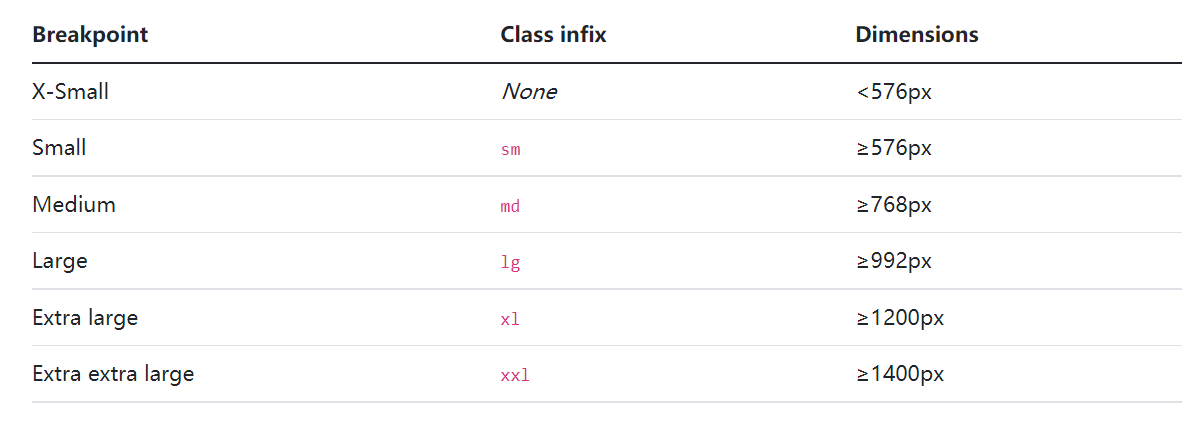
屏幕尺寸:
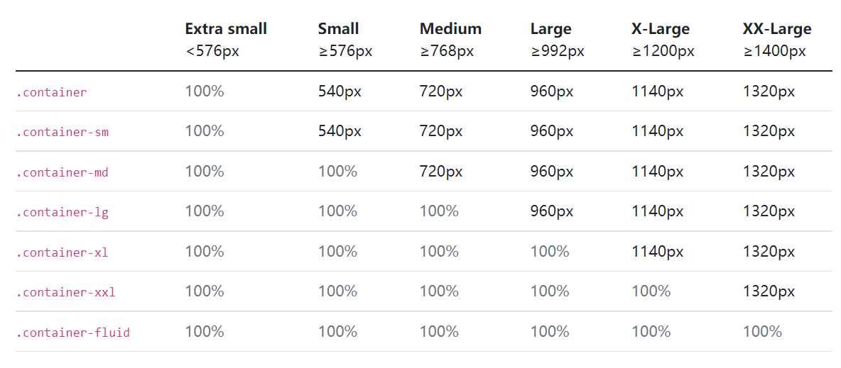
在各种屏幕下,容器尺寸:
应用:
<!--在超大屏幕下一行显示6个 一个div占2列在大屏幕下一行显示4个 一个div占3列在中等屏幕下一行显示3个 一个div占4列在小屏幕下一行显示2个 一个div占6列在超小屏幕下一行显示1个 一个div占12列--><div class="container"><div class="row mt-5"><div class="col-xl-2 col-lg-3 col-md-4 col-sm-6 col-12">超大屏6个,大屏4个,中等屏3个,小屏2个,超小屏1个</div><div class="col-xl-2 col-lg-3 col-md-4 col-sm-6 col-12">超大屏6个,大屏4个,中等屏3个,小屏2个,超小屏1个</div><div class="col-xl-2 col-lg-3 col-md-4 col-sm-6 col-12">超大屏6个,大屏4个,中等屏3个,小屏2个,超小屏1个</div><div class="col-xl-2 col-lg-3 col-md-4 col-sm-6 col-12">超大屏6个,大屏4个,中等屏3个,小屏2个,超小屏1个</div><div class="col-xl-2 col-lg-3 col-md-4 col-sm-6 col-12">超大屏6个,大屏4个,中等屏3个,小屏2个,超小屏1个</div><div class="col-xl-2 col-lg-3 col-md-4 col-sm-6 col-12">超大屏6个,大屏4个,中等屏3个,小屏2个,超小屏1个</div></div></div>
bootstrap5.x版本只需要引入一个连接了。

若有收获,就点个赞吧
0 人点赞
