- 单选框 Radio RadioListTile
- 复选框 Checkbox
- 开关 Switch
- 滑块 Slider
跟Vue不同,跟React类似,单选框与复选框需要一个状态维护,改变时使用 setState 更新状态以重新渲染UI。
一、复选框与开关
class SwitchAndCheckBoxTestRoute extends StatefulWidget {@override_SwitchAndCheckBoxTestRouteState createState() => new _SwitchAndCheckBoxTestRouteState();}class _SwitchAndCheckBoxTestRouteState extends State<SwitchAndCheckBoxTestRoute> {bool _switchSelected=true; // 维护单选开关状态bool _checkboxSelected=true; // 维护复选框状态@overrideWidget build(BuildContext context) {return Column(children: <Widget>[Switch(value: _switchSelected, //当前状态onChanged:(value){// 重新构建页面setState(() {_switchSelected=value;});},),Checkbox(value: _checkboxSelected,activeColor: Colors.red, // 选中时的颜色onChanged: (value) {setState(() {_checkboxSelected=value;});},)],);}}
二、滑块
class HomePage extends StatefulWidget {@overridecreateState() => new _HomePageState();}class _HomePageState extends State<HomePage> {double _sliderValue = 1;@overrideWidget build(BuildContext context) {return Scaffold(appBar: new AppBar(title: Text('首页'),),body: Column(children: [Slider(value: _sliderValue,max: 10,min: 0,onChanged: (value) {setState(() {_sliderValue = value;});},)]));}}
三、单选框
Radio 的话, 只有点击 Radio 本身才能改变其 value, 点击 ListTile 的 title 无效
class HomePage extends StatefulWidget {@overridecreateState() => new _HomePageState();}enum SingingCharacter { lafayette, jefferson }class _HomePageState extends State<HomePage> {SingingCharacter _character = SingingCharacter.lafayette;@overrideWidget build(BuildContext context) {return Scaffold(appBar: new AppBar(title: Text('首页'),),body: Column(children: [ListTile(title: const Text('Lafayette'),leading: Radio(value: SingingCharacter.lafayette,groupValue: _character,onChanged: (SingingCharacter value) {setState(() { _character = value; });},),),ListTile(title: const Text('Thomas Jefferson'),leading: Radio(value: SingingCharacter.jefferson,groupValue: _character,onChanged: (SingingCharacter value) {setState(() { _character = value; });},),),]));}}
RadioListTile
与 Radio 不同的是,RadioListTile 独占一行,点击时有水波效果
class HomePage extends StatefulWidget {@overridecreateState() => new _HomePageState();}enum SingingCharacter { lafayette, jefferson }class _HomePageState extends State<HomePage> {SingingCharacter _character = SingingCharacter.lafayette;@overrideWidget build(BuildContext context) {return Scaffold(appBar: new AppBar(title: Text('首页'),),body: Column(children: <Widget>[RadioListTile<SingingCharacter>(title: const Text('Lafayette'),value: SingingCharacter.lafayette,groupValue: _character,onChanged: (SingingCharacter value) { setState(() { _character = value; }); },),RadioListTile<SingingCharacter>(title: const Text('Thomas Jefferson'),value: SingingCharacter.jefferson,groupValue: _character,onChanged: (SingingCharacter value) { setState(() { _character = value; }); },),],));}}
四、进度指示器
LinearProgressIndicator
LinearProgressIndicator 是一个线性、条状的进度条,定义如下:
LinearProgressIndicator({double value,Color backgroundColor,Animation<Color> valueColor,...})
- value: value表示当前的进度,取值范围为
[0,1];如果value为null时则指示器会执行一个循环动画(模糊进度);当value不为null时,指示器为一个具体进度的进度条。 - backgroundColor: 指示器的背景色。
- valueColor: 指示器的进度条颜色;值得注意的是,该值类型是
Animation<Color>,这允许我们对进度条的颜色也可以指定动画。如果我们不需要对进度条颜色执行动画,换言之,我们想对进度条应用一种固定的颜色,此时我们可以通过AlwaysStoppedAnimation来指定。
模糊进度条(会执行一个动画)
LinearProgressIndicator(backgroundColor: Colors.grey[200],valueColor: AlwaysStoppedAnimation(Colors.blue),);
进度条显示50%, 常用于监控上传等情景 (动态传入value)
LinearProgressIndicator(backgroundColor: Colors.grey[200],valueColor: AlwaysStoppedAnimation(Colors.blue),value: .5,);
示例:以按钮点击模拟上传:
class Progress extends StatefulWidget {@overridecreateState() => new _ProgressState();}class _ProgressState extends State<Progress> {var v = 0.0;@overrideWidget build(BuildContext context) {return Column(children: <Widget>[RaisedButton(child: Text("normal"),onPressed: () {setState(() {if (v < 1.0) {v += 0.1;}});},),LinearProgressIndicator(backgroundColor: Colors.grey[200],valueColor: AlwaysStoppedAnimation(Colors.blue),value: v,)],);}}
示例:进度条变色加载
class ProgressRoute extends StatefulWidget {@override_ProgressRouteState createState() => _ProgressRouteState();}class _ProgressRouteState extends State<ProgressRoute>with SingleTickerProviderStateMixin {AnimationController _animationController;@overridevoid initState() {// 动画执行时间3秒_animationController =new AnimationController(vsync: this, duration: Duration(seconds: 3));_animationController.forward();_animationController.addListener(() => setState(() => {}));super.initState();}@overridevoid dispose() {_animationController.dispose();super.dispose();}@overrideWidget build(BuildContext context) {return SingleChildScrollView(child: Column(children: <Widget>[Padding(padding: EdgeInsets.all(16),child: LinearProgressIndicator(backgroundColor: Colors.grey[200],valueColor: ColorTween(begin: Colors.grey, end: Colors.blue).animate(_animationController), // 从灰色变成蓝色value: _animationController.value,),)],),);}}
CircularProgressIndicator
CircularProgressIndicator 是一个圆形进度条,定义如下:
CircularProgressIndicator({double value,Color backgroundColor,Animation<Color> valueColor,this.strokeWidth = 4.0, // 圆形进度条的粗细...})
自定义尺寸
我们可以发现LinearProgressIndicator和CircularProgressIndicator,并没有提供设置圆形进度条尺寸的参数;如果我们希望LinearProgressIndicator的现细一些,或者希望CircularProgressIndicator的圆大一些该怎么做?
其实LinearProgressIndicator和CircularProgressIndicator都是取父容器的尺寸作为绘制的边界的。知道了这点,我们便可以通过尺寸限制类Widget,如ConstrainedBox、SizedBox (我们将在后面容器类组件一章中介绍)来指定尺寸,如:
// 线性进度条高度指定为3SizedBox(height: 3,child: LinearProgressIndicator(backgroundColor: Colors.grey[200],valueColor: AlwaysStoppedAnimation(Colors.blue),value: .5,),),// 圆形进度条直径指定为100SizedBox(height: 100,width: 100,child: CircularProgressIndicator(backgroundColor: Colors.grey[200],valueColor: AlwaysStoppedAnimation(Colors.blue),value: .7,),),
其他内置的进度指示器
- CupertinoActivityIndicator 一个iOS风格的loading指示器。显示一个圆形的转圈菊花
第三方进度指示器
五、时间日期选择器
六、输入框
TextField
TextField 是一个可以输入值的组件
定义:
TextField({Key key,this.decoration = const InputDecoration(), // 文本框样式, InputDecorationthis.controller, // 控制器, TextEditingControllerthis.focusNode, // 焦点控制, FocusNodethis.textAlign = TextAlign.start, // 对齐TextInputType keyboardType, // 键盘类型, TextInputTypethis.textCapitalization = TextCapitalization.none, // 首字母大写this.textInputAction, // 更改键盘本身的操作按钮, TextInputActionthis.autofocus = false, // 是否自动获取焦点this.enabled, // 是否可用this.readOnly = false,this.obscureText = false,this.autocorrect = true,this.expands = false,this.minLines, // 文本最小行数this.maxLines = 1, // 文本最大行数this.maxLength, // 最大长度this.maxLengthEnforced = true,this.showCursor,this.cursorWidth = 2.0, // 光标宽度this.cursorRadius, // 光标圆角, Radius, 比如 Radius.circular(10.0)this.cursorColor, // 光标颜色, Colorthis.onChanged, // 文本改变事件, 接收一个参数为当前输入值 void Function(String)this.onTap,this.onEditingComplete,this.onSubmitted,this.textAlignVertical,this.textDirection,this.style,this.strutStyle,this.inputFormatters,this.keyboardAppearance,this.scrollPadding = const EdgeInsets.all(20.0),this.dragStartBehavior = DragStartBehavior.start,this.enableInteractiveSelection,this.buildCounter,this.scrollController,this.scrollPhysics,})
示例:
TextField(decoration: InputDecoration(border: OutlineInputBorder(borderSide: BorderSide.none),labelText: "验证码",hintText: "请输入验证码",icon: Icon(Icons.lock),filled: true,fillColor: Color.fromRGBO(255,0,0,.1),),)
TextFormField
为了方便使用,Flutter提供了一个 TextFormField 组件,它继承自FormField类,也是TextField的一个包装类,所以除了FormField定义的属性之外,它还包括TextField的属性。
创建一个输入框和 TextField 的使用没有任何区别,唯一多出来的属性时 validator,接收一个方法,并且方法的参数中会传入 value 当前表单的值。
示例:
TextFormField(controller: _priceController,keyboardType: TextInputType.number,decoration: InputDecoration(labelText: "套餐价格",hintText: "请输入套餐价格"),),
键盘类型
TextInputType 可以指定键盘类型, 常见的有:
- TextInputType.text 普通文本
- TextInputType.number 数字
- TextInputType.phone 电话号码
- TextInputType.emailAddress 电子邮件
- TextInputType.datetime 日期时间
- TextInputType.url URL
确定键
TextInputAction 可以更改键盘本身的操作按钮
常用的:
- TextInputAction.search
- TextInputAction.go
- TextInputAction.next
- TextInputAction.done
文本框样式
InputDecoration 用于指定文本框样式, InputDecoration 包括如下常用参数:
—- 图标 —-
- icon 输入框图标
- prefixIcon 输入框内侧左面的控件
- suffixIcon 输入框内侧右面的图标
—- 文本 —-
- labelText 输入框标题文本
- hintText 相当于html的placeholder
- helperText 帮助文字
—- 填充 —-
- filled 是否启用填充色
- fillColor 填充色
—- 前缀后缀 —-
- prefix 前缀组件, Widget, 不能跟 prefixText 共存
- prefixText 前缀文字, String, 不能跟 prefix 共存
- suffix 后缀组件, Widget, 不能跟 suffixText 共存
- suffixText 后缀文字, String, 不能跟 suffix 共存
—- 文字样式 —-
- helperStyle 帮助文字样式
- hintStyle 提示文字样式
- labelStyle 标签文字样式
- counterStyle 计数器文字样式
- prefixStyle 前缀文字样式
- suffixStyle 后缀文字样式
—- 边框 —-
- border 普通边线
InputBorder.none无边框 (或OutlineInputBorder(borderSide: BorderSide.none))UnderlineInputBorder()下划线边框OutlineInputBorder()四周带边框
- focusedBorder 聚焦时的外边线
- focusedErrorBorder 聚焦时的错误边线
focusedBorder 和 focusedErrorBorder 的属性值同 border
下划线边框
UnderlineInputBorder(borderSide: BorderSide(color: Colors.green, //边框颜色为绿色width: 5, //宽度为5)),
四周带边框
OutlineInputBorder(borderRadius: BorderRadius.all(Radius.circular(10)), // 设置边框圆角borderSide: BorderSide(color: Colors.green, // 边框颜色为绿色width: 10, // 宽度为10))
InputDecoration示例
TextField(maxLength: 10,decoration: InputDecoration(prefixIcon: Icon(Icons.accessible),suffixIcon: Icon(Icons.ac_unit),icon: Icon(Icons.access_time),hintText: 'hintText',labelText: 'labelText',helperText: 'helperText',border: UnderlineInputBorder(),filled: true,fillColor: Colors.green.withAlpha(100),prefix: Text('prefix '),suffixText: 'suffixText',helperStyle: TextStyle(color: Colors.purple),hintStyle: TextStyle(color: Colors.white),labelStyle: TextStyle(color: Colors.indigo),counterStyle: TextStyle(color: Colors.cyan),prefixStyle: TextStyle(color: Colors.teal),suffixStyle: TextStyle(color: Colors.deepOrange),),)
效果: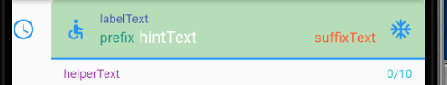
自定义样式
我们可以不通过 decoration 属性实现样式, 可以使用类似于Web中的技巧, 在TextField外部包一层, 本身不实现任何样式, 而是控制外层容器的样式:
Container(padding: const EdgeInsets.all(8.0),alignment: Alignment.center,height: 60.0,decoration: new BoxDecoration(color: Colors.green.withAlpha(100),border: new Border.all(color: Colors.grey, width: 4.0), // 这里控制边框粗细borderRadius: new BorderRadius.circular(12.0)),child: new TextFormField(decoration: InputDecoration.collapsed(hintText: 'hello'),),)
效果: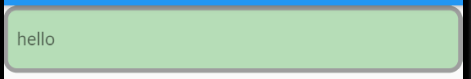
FocusNode
FocusNode这个类用来通知控件获取/失去焦点, 可以对它实行焦点获取/失去的监听:
class TestPage extends StatefulWidget {@override_TestPageState createState() => new _TestPageState();}class _TestPageState extends State<TestPage> {FocusNode _focusNode = new FocusNode(); // 初始化一个FocusNode控件@overridevoid initState(){super.initState();_focusNode.addListener(_focusNodeListener); // 初始化一个listener}@overridevoid dispose(){_focusNode.removeListener(_focusNodeListener); // 页面消失时必须取消这个listener!!super.dispose();}Future<Null> _focusNodeListener() async { // 用async的方式实现这个listenerif (_focusNode.hasFocus){print('TextField got the focus');} else {print('TextField lost the focus');}}@overrideWidget build(BuildContext context) {return new Scaffold(appBar: new AppBar(title: new Text('Test'),),body: new SafeArea(top: false,bottom: false,child: new Form(child: new Column(children: <Widget> [new TextFormField(focusNode: _focusNode, // 将listener和TextFormField绑定decoration: InputDecoration(labelText: "第一个输入框",hintText: "第一个输入框"),),TextFormField(keyboardType: TextInputType.number,decoration: InputDecoration(labelText: "第二个输入框",hintText: "第二个输入框"),),],),),),);}}
焦点控制
有的时候我们需要执行某些操作时自动获取文本框焦点或使其失去焦点, 只需要使用 TextField 的 focusNode 参数即可:
FocusNode _codeFocus = FocusNode();...TextFormField(focusNode: _codeFocus,decoration: InputDecoration(border: OutlineInputBorder(borderSide: BorderSide.none),labelText: "验证码",hintText: "请输入验证码",icon: Icon(Icons.lock)),),
获取焦点:
FocusScope.of(context).requestFocus(_codeFocus);
失去焦点:
_codeFocus.unfocus();
在多个输入框内切换焦点
下面介绍一下onEditingComplete这个事件。
当用户提交可编辑内容时调用(例如,用户按下键盘上的“done”按钮)。
onEditingComplete的默认实现根据情况执行2种不同的行为:
- 当完成操作被按下时,例如“done”、“go”、“send”或“search”,用户的内容被提交给[controller],然后焦点被放弃。
- 当按下一个未完成操作(如“next”或“previous”)时,用户的内容被提交给[controller],但不会放弃焦点,因为开发人员可能希望立即将焦点转移到[onsubmit]中的另一个输入小部件。
示例:
FocusNode secondTextFieldNode = FocusNode();Column(children: <Widget>[TextFormField(onEditingComplete: () {FocusScope.of(context).requestFocus(secondTextFieldNode);}),TextField(focusNode: secondTextFieldNode,),],)
输入控制器
TextEditingController 用于控制文本输入, 通常用于获取文本框的输入值
class TestPage extends StatefulWidget {@overrideState<StatefulWidget> createState() {return _TestPageState();}}class _TestPageState extends State<TestPage> {final _controller = TextEditingController(); // 定义控制器void initState() {_controller.addListener(() {final text = _controller.text.toLowerCase();_controller.value = _controller.value.copyWith(text: text,selection: TextSelection(baseOffset: text.length, extentOffset: text.length),composing: TextRange.empty,);});super.initState();}void dispose() {_controller.dispose();super.dispose();}Widget build(BuildContext context) {return Scaffold(appBar: new AppBar(title: new Text('test'),leading: IconButton(icon: Icon(Icons.dashboard), onPressed: () {}),actions: <Widget>[ //导航栏右侧菜单IconButton(icon: Icon(Icons.share), onPressed: () {}),],),body: Column(children: <Widget>[Container(alignment: Alignment.center,padding: const EdgeInsets.all(6),child: TextFormField(controller: _controller, // 绑定控制器decoration: InputDecoration(border: OutlineInputBorder()),),),RaisedButton(onPressed: () {var text = _controller.text; // 获取输入的值print(text);},child: Text('获取数据'),)],));}}
解决输入框被键盘遮挡的问题
原理不说了, 看封装好的组件:
/*** 作者:Created by H on 2019/1/23 11:08.* 介绍: 解决输入框被遮挡问题*/import 'package:flutter/material.dart';import 'package:flutter/rendering.dart';////// Helper class that ensures a Widget is visible when it has the focus/// For example, for a TextFormField when the keyboard is displayed////// How to use it:////// In the class that implements the Form,/// Instantiate a FocusNode/// FocusNode _focusNode = new FocusNode();////// In the build(BuildContext context), wrap the TextFormField as follows:////// new EnsureVisibleWhenFocused(/// focusNode: _focusNode,/// child: new TextFormField(/// .../// focusNode: _focusNode,/// ),/// ),////// Initial source code written by Collin Jackson./// Extended (see highlighting) to cover the case when the keyboard is dismissed and the/// user clicks the TextFormField/TextField which still has the focus.///class EnsureVisibleWhenFocused extends StatefulWidget {const EnsureVisibleWhenFocused({Key key,@required this.child,@required this.focusNode,this.curve: Curves.ease,this.duration: const Duration(milliseconds: 100),}) : super(key: key);/// The node we will monitor to determine if the child is focusedfinal FocusNode focusNode;/// The child widget that we are wrappingfinal Widget child;/// The curve we will use to scroll ourselves into view.////// Defaults to Curves.ease.final Curve curve;/// The duration we will use to scroll ourselves into view////// Defaults to 100 milliseconds.final Duration duration;@override_EnsureVisibleWhenFocusedState createState() => new _EnsureVisibleWhenFocusedState();}////// We implement the WidgetsBindingObserver to be notified of any change to the window metrics///class _EnsureVisibleWhenFocusedState extends State<EnsureVisibleWhenFocused> with WidgetsBindingObserver {@overridevoid initState(){super.initState();widget.focusNode.addListener(_ensureVisible);WidgetsBinding.instance.addObserver(this);}@overridevoid dispose(){WidgetsBinding.instance.removeObserver(this);widget.focusNode.removeListener(_ensureVisible);super.dispose();}////// This routine is invoked when the window metrics have changed./// This happens when the keyboard is open or dismissed, among others./// It is the opportunity to check if the field has the focus/// and to ensure it is fully visible in the viewport when/// the keyboard is displayed///@overridevoid didChangeMetrics(){if (widget.focusNode.hasFocus){_ensureVisible();}}////// This routine waits for the keyboard to come into view./// In order to prevent some issues if the Widget is dismissed in the/// middle of the loop, we need to check the "mounted" property////// This method was suggested by Peter Yuen (see discussion).///Future<Null> _keyboardToggled() async {if (mounted){EdgeInsets edgeInsets = MediaQuery.of(context).viewInsets;while (mounted && MediaQuery.of(context).viewInsets == edgeInsets) {await new Future.delayed(const Duration(milliseconds: 10));}}return;}Future<Null> _ensureVisible() async {// Wait for the keyboard to come into viewawait Future.any([new Future.delayed(const Duration(milliseconds: 300)), _keyboardToggled()]);// No need to go any further if the node has not the focusif (!widget.focusNode.hasFocus){return;}// Find the object which has the focusfinal RenderObject object = context.findRenderObject();final RenderAbstractViewport viewport = RenderAbstractViewport.of(object);assert(viewport != null);// Get the Scrollable state (in order to retrieve its offset)ScrollableState scrollableState = Scrollable.of(context);assert(scrollableState != null);// Get its offsetScrollPosition position = scrollableState.position;double alignment;if (position.pixels > viewport.getOffsetToReveal(object, 0.0).offset) {// Move down to the top of the viewportalignment = 0.0;} else if (position.pixels < viewport.getOffsetToReveal(object, 1.0).offset){// Move up to the bottom of the viewportalignment = 1.0;} else {// No scrolling is necessary to reveal the childreturn;}position.ensureVisible(object,alignment: alignment,duration: widget.duration,curve: widget.curve,);}@overrideWidget build(BuildContext context) {return widget.child;}}
使用方式:
import 'package:flutter/material.dart';import './widgets/EnsureVisibleWhenFocused.dart';void main() {runApp(new StartApp());}class StartApp extends StatefulWidget {@overrideState<StatefulWidget> createState() {return new _StartAppState();}}class _StartAppState extends State<StartApp> {@overrideWidget build(BuildContext context) {return MaterialApp(title: '首页',theme: new ThemeData(primarySwatch: Colors.blue,),home: TestPage(),);}}class TestPage extends StatefulWidget {@overrideState<StatefulWidget> createState() {return _TestPageState();}}class _TestPageState extends State<TestPage> {FocusNode _focusNode = new FocusNode();Widget build(BuildContext context) {return Scaffold(appBar: new AppBar(title: new Text('test'),leading: IconButton(icon: Icon(Icons.dashboard), onPressed: () {}),actions: <Widget>[IconButton(icon: Icon(Icons.share), onPressed: () {}),],),body: SingleChildScrollView( // 注意外层一定得有一个可滑动的组件child: Padding(padding: EdgeInsets.only(top: 300.0, left: 50.0, right: 50.0),child: new EnsureVisibleWhenFocused( // 这里focusNode: _focusNode,child: new TextFormField(),),),));}}
效果: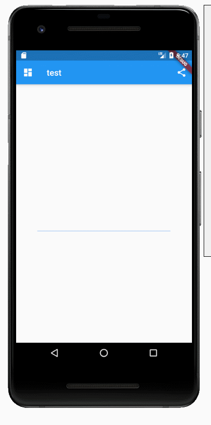
七、表单
Form
Form 继承自StatefulWidget对象,它对应的状态类为FormState。Form类的定义如下:
Form({@required Widget child,bool autovalidate = false,WillPopCallback onWillPop,VoidCallback onChanged,})
- autovalidate:是否自动校验输入内容;当为true时,每一个子FormField内容发生变化时都会自动校验合法性,并直接显示错误信息。否则,需要通过调用FormState.validate()来手动校验。
- onWillPop:决定Form所在的路由是否可以直接返回(如点击返回按钮),该回调返回一个Future对象,如果Future的最终结果是false,则当前路由不会返回;如果为true,则会返回到上一个路由。此属性通常用于拦截返回按钮。
- onChanged:Form的任意一个子FormField内容发生变化时会触发此回调。
FormField
Form的子孙元素必须是FormField类型,FormField 是一个抽象类,定义几个属性,FormState内部通过它们来完成操作,FormField部分定义如下:
const FormField({...FormFieldSetter<T> onSaved, //保存回调FormFieldValidator<T> validator, //验证回调T initialValue, //初始值bool autovalidate = false, //是否自动校验。})
validator
validator 校验逻辑
如果不通过,直接可以返回提示的文案,如果通过,则返回 null 即可
调用数据校验
调用数据校验的时机一般放在按钮提交点击的时候,这个时候 _formKey 就派上用处了
if ((_formKey.currentState as FormState).validate()) {Scaffold.of(context).showSnackBar(SnackBar(content: Text('提交成功...'),));}
FormState
FormState 为Form的State类,可以通过Form.of()或GlobalKey获得。我们可以通过它来对Form的子孙FormField进行统一操作。我们看看其常用的三个方法:
- FormState.validate():调用此方法后,会调用Form子孙FormField的validate回调,如果有一个校验失败,则返回false,所有校验失败项都会返回用户返回的错误提示。
- FormState.save():调用此方法后,会调用Form子孙FormField的save回调,用于保存表单内容
- FormState.reset():调用此方法后,会将子孙FormField的内容清空。
示例: 登录页面
class FormTestRoute extends StatefulWidget {@override_FormTestRouteState createState() => new _FormTestRouteState();}class _FormTestRouteState extends State<FormTestRoute> {TextEditingController _unameController = new TextEditingController();TextEditingController _pwdController = new TextEditingController();GlobalKey _formKey= new GlobalKey<FormState>();@overrideWidget build(BuildContext context) {return Scaffold(appBar: AppBar(title:Text("Form Test"),),body: Padding(padding: const EdgeInsets.symmetric(vertical: 16.0, horizontal: 24.0),child: Form(key: _formKey, // 设置globalKey,用于后面获取FormStateautovalidate: true, // 开启自动校验child: Column(children: <Widget>[TextFormField(autofocus: true,controller: _unameController,decoration: InputDecoration(labelText: "用户名",hintText: "用户名或邮箱",icon: Icon(Icons.person)),// 校验用户名validator: (v) {return v.trim().length > 0 ? null : "用户名不能为空";}),TextFormField(controller: _pwdController,decoration: InputDecoration(labelText: "密码",hintText: "您的登录密码",icon: Icon(Icons.lock)),obscureText: true,// 校验密码validator: (v) {return v.trim().length > 5 ? null : "密码不能少于6位";}),// 登录按钮Padding(padding: const EdgeInsets.only(top: 28.0),child: Row(children: <Widget>[Expanded(child: RaisedButton(padding: EdgeInsets.all(15.0),child: Text("登录"),color: Theme.of(context).primaryColor,textColor: Colors.white,onPressed: () {// 在这里不能通过此方式获取FormState,context不对// print(Form.of(context));// 通过_formKey.currentState 获取FormState后,调用validate()方法校验用户名密码是否合法,校验通过后再提交数据。if((_formKey.currentState as FormState).validate()){// 验证通过提交数据print(_unameController.text);print(_pwdController.text);}},),),],),)],),),),);}}
登录按钮的onPressed方法中不能通过 Form.of(context) 来获取,原因是,此处的 context 为 FormTestRoute 的 context,而 Form.of(context) 是根据所指定 context 向根去查找,而 FormState 是在 FormTestRoute 的子树中,所以不行。正确的做法是通过 Builder 来构建登录按钮,Builder会将widget节点的context作为回调参数:
Expanded(// 通过Builder来获取RaisedButton所在widget树的真正context(Element)child:Builder(builder: (context){return RaisedButton(...onPressed: () {// 由于本widget也是Form的子代widget,所以可以通过下面方式获取FormStateif(Form.of(context).validate()){// 验证通过提交数据print(_unameController.text);print(_pwdController.text);}},);}))
参考资料

若有收获,就点个赞吧
0 人点赞
