一、文本
Text
Text 用于显示简单样式文本,它包含一些控制文本显示样式的一些属性
Text("Hello world ! " * 4,textAlign: TextAlign.center,textScaleFactor: 1.5, // 文本相对于当前字体大小的缩放因子maxLines: 1,overflow: TextOverflow.ellipsis,);
文本样式:
Text("Hello world",style: TextStyle(color: Colors.blue,fontSize: 18.0,height: 1.2, // 行高fontFamily: "Courier",background: new Paint()..color=Colors.yellow,decoration: TextDecoration.underline,decorationStyle: TextDecorationStyle.dashed),);
TextStyle
文字样式可以使用 TextStyle 定义
TextDecoration
TextDecoration: 文字装饰
- TextDecoration.none 默认
- TextDecoration.overline
- TextDecoration.lineThrough
- TextDecoration.underline
TextDecoration.combine(List<TextDecoration>)组合多个装饰
TextDecoration.combine 可以组合多种文字装饰, 比如:
TextDecoration.combine([TextDecoration.overline, TextDecoration.underline])
TextDecorationStyle
TextDecorationStyle: 文字装饰样式
- TextDecorationStyle.solid
- TextDecorationStyle.dashed
- TextDecorationStyle.dotted
- TextDecorationStyle.double
- TextDecorationStyle.wavy
TextSpan
TextSpan 文字片段
定义:
const TextSpan({TextStyle style,Sting text,List<TextSpan> children,GestureRecognizer recognizer,});
示例:
Text.rich(TextSpan(children: [TextSpan(text: "Home: "),TextSpan(text: "flutterchina.club",style: TextStyle(color: Colors.blue),recognizer: _tapRecognizer),]))
默认样式的继承
使用 DefaultTextStyle 设置默认样式, 子Widget可以继承默认样式, 除非设置 inherit: false
DefaultTextStyle(// 1.设置文本默认样式style: TextStyle(color:Colors.red,fontSize: 20.0,),textAlign: TextAlign.start,child: Column(crossAxisAlignment: CrossAxisAlignment.start,children: <Widget>[Text("hello world"), // 继承默认样式Text("I am Jack"), // 继承默认样式Text("I am Jack",style: TextStyle(inherit: false, // 2.不继承默认样式color: Colors.grey),),],),);
自定义字体
要使用自定义字体, 需要在pubspec.yaml中先进行声明:
flutter:fonts:- family: Ralewayfonts:- asset: assets/fonts/Raleway-Regular.ttf- asset: assets/fonts/Raleway-Medium.ttfweight: 500- asset: assets/fonts/Raleway-SemiBold.ttfweight: 600- family: AbrilFatfacefonts:- asset: assets/fonts/abrilfatface/AbrilFatface-Regular.ttf
在Widget中使用:
Text("Use the font for this text",style: TextStyle(fontFamily: 'Raleway',),);
富文本
RichText 可以容纳富文本内容:
RichText(text: TextSpan(text: 'Hello ',style: DefaultTextStyle.of(context).style,children: <TextSpan>[TextSpan(text: 'bold', style: TextStyle(fontWeight: FontWeight.bold)),TextSpan(text: ' world!'),],),)
使用 Text.rich 可以实现相同的功能
二、按钮
漂浮形态的按钮
RaisedButton 创建一个凸起的材质矩形按钮 (Material Design风格)
RaisedButton(child: Text("normal"),onPressed: () {},);
自定义按钮样式:
RaisedButton(color: Colors.blue,highlightColor: Colors.blue[700], // 按钮按下时的背景颜色colorBrightness: Brightness.dark, // 按钮主题splashColor: Colors.grey, // 点击时,水波动画中水波的颜色child: Text("Submit"),shape:RoundedRectangleBorder(borderRadius: BorderRadius.circular(20.0)),onPressed: () {},);
扁平形态的按钮
FlatButton 创建一个扁平化的按钮
FlatButton(child: Text("normal"),onPressed: () {},);
FlatButton的定义
const FlatButton({...@required this.onPressed, // 按钮点击回调@required this.child, // 按钮的内容this.textColor, // 按钮文字颜色this.highlightColor, // 按钮按下时的背景颜色this.splashColor, // 点击时,水波动画中水波的颜色this.colorBrightness, // 按钮主题,默认是浅色主题this.enabled, // 是否可用this.disabledTextColor, // 按钮禁用时的文字颜色this.disabledColor, // 按钮禁用时的背景颜色this.color, // 按钮背景颜色this.padding, // 按钮的填充this.shape, // 外形})
自定义按钮样式:
FlatButton(color: Colors.blue,highlightColor: Colors.blue[700],colorBrightness: Brightness.dark,splashColor: Colors.grey,child: Text("Submit"),shape:RoundedRectangleBorder(borderRadius: BorderRadius.circular(20.0)),onPressed: () {},);
带边框的按钮
OutlineButton 创建一个带边框的按钮
OutlineButton(child: Text("normal"),onPressed: () {},)
带图标的按钮
IconButton(icon: Icon(Icons.thumb_up),onPressed: () {},)RaisedButton.icon(icon: Icon(Icons.send),label: Text("发送"),onPressed: () {},);FlatButton.icon(icon: Icon(Icons.info),label: Text("详情"),onPressed: () {},);OutlineButton.icon(icon: Icon(Icons.add),label: Text("添加"),onPressed: () {},);
下拉选择按钮
DropdownButton: 下拉选择按钮,示例: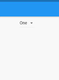
String dropdownValue = 'One';@overrideWidget build(BuildContext context) {return Scaffold(body: Center(child: DropdownButton<String>(value: dropdownValue,onChanged: (String newValue) {setState(() {dropdownValue = newValue;});},items: <String>['One', 'Two', 'Free', 'Four'].map<DropdownMenuItem<String>>((String value) {return DropdownMenuItem<String>(value: value,child: Text(value),);}).toList(),),),);}
弹出选择按钮
PopupMenuButton: 弹出选择按钮,示例: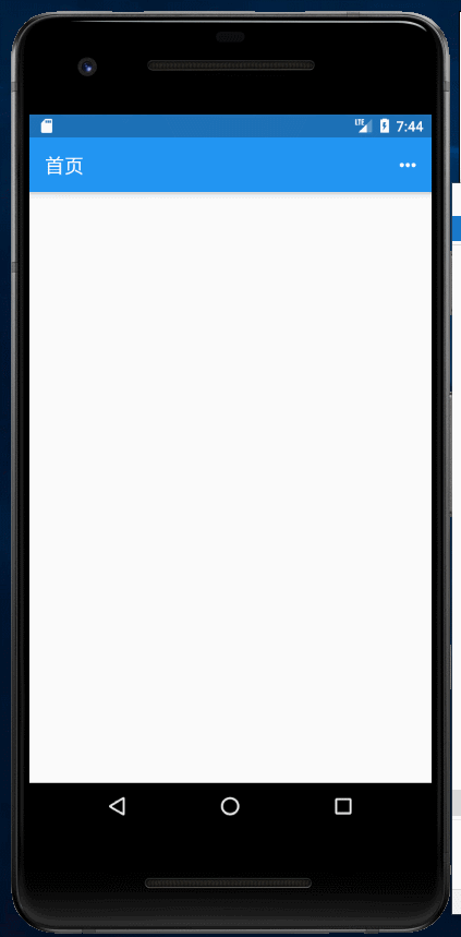
class HomePage extends StatefulWidget {@overridecreateState() => new _HomePageState();}class _HomePageState extends State<HomePage> {@overrideWidget build(BuildContext context) {return Scaffold(appBar: new AppBar(title: Text('首页'),actions: [PopupMenuButton<String>(icon: Icon(Icons.more_horiz),offset: Offset(100, 100),itemBuilder: (BuildContext context) => <PopupMenuEntry<String>>[const PopupMenuItem<String>(value: "1",child: ListTile(leading: Icon(Icons.share),title: Text('分享'),),),PopupMenuDivider(),//分割线const PopupMenuItem<String>(value: "2",child: ListTile(leading: Icon(Icons.settings),title: Text('设置'),),),],tooltip: "点击弹出菜单",onSelected: (String result) {switch (result) {case "1":print('分享');break;case "2":print('设置');break;}},onCanceled: () {print("取消");},),]),body: Container());}}
PopupMenuDivider 为菜单项之间的分隔符
水平排列的按钮组
ButtonBar: 水平排列的按钮组,示例: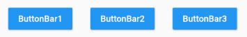
ButtonBar(alignment: MainAxisAlignment.spaceAround, // 布局方向,默认MainAxisAlignment.endmainAxisSize: MainAxisSize.max, // 主轴大小,默认MainAxisSize.maxchildren: <Widget>[ // Button集合RaisedButton(child: Text('ButtonBar1', style: TextStyle(color: Colors.white),),color: Colors.blue,onPressed: ()=>{},),RaisedButton(child: Text('ButtonBar2', style: TextStyle(color: Colors.white),),color: Colors.blue,onPressed: ()=>{},),RaisedButton(child: Text('ButtonBar3', style: TextStyle(color: Colors.white),),color: Colors.blue,onPressed: ()=>{},),],),
InkWell
InkWell 可以创建一个包含水波效果的按钮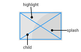
InkWell 可以捕获更多事件:
- onTap
- onDoubleTap
- onLongPress
- onTapCancel
- onTapDown
- onHighlightChanged
- onHover
InkWell无水波纹效果的解决方案
在 InkWell 的外层再套上 Matetial 以及 Ink组件:
Material(child: Ink(child:InkWell(onTap: () {// ...},child: ListTile(// ...),),),)
自定义按钮组件的封装
其实写按钮组件也挺费劲的,我们可以封装一个公共按钮组件:
enum ButtonType { RaisedButton, FlatButton }Widget CommonButton (title, {VoidCallback onPressed,Color bgColor: BaseStyle.mainColor, // 按钮背景色Color textColor, // 文字颜色Color splashColor: Colors.grey, // 水波颜色Color highlightColor: Colors.transparent, // 高亮颜色ButtonType type: ButtonType.RaisedButton, // 按钮类型}) {textColor = type == ButtonType.RaisedButton ? Colors.white : BaseStyle.mainColor;if (type == ButtonType.RaisedButton) {return RaisedButton(color: bgColor,splashColor: splashColor,highlightColor: highlightColor,colorBrightness: Brightness.dark,child: Text(title, style: TextStyle(color: textColor)),onPressed: () {if (onPressed != null) {onPressed();}},);} else if (type == ButtonType.FlatButton) {return FlatButton(child: new Text(title, style: TextStyle(color: textColor)),onPressed: () {if (onPressed != null) {onPressed();}},);}}
使用方式:
// RaisedButtonCommonButton('取消', onPressed: () {Navigator.of(context).pop('1');}),// FlatButtonCommonButton('取消', type: ButtonType.FlatButton, onPressed: () {Navigator.of(context).pop('1');}),
其他按钮
- CupertinoButton iOS风格的button
三、图片
从项目中加载图片
如果图片是存放于项目之中, 需要先在 pubspec.yaml 中的flutter部分添加如下内容:
flutter:assets:- assets/imgs/avatar.png
其中 assets 是位于项目根目录而不是 lib 文件夹
使用的时候:
Image(image: AssetImage("assets/imgs/avatar.png"),width: 60,height: 60,);// 或:Image.asset("assets/imgs/avatar.png", width: 60, height: 60,)
加载网络图片
Image(image: NetworkImage("https://avatars1.githubusercontent.com/u/13745132?s=460&v=4"),width: 100.0,)// 或:Image.network("https://avatars1.githubusercontent.com/u/13745132?s=460&v=4",width: 100.0,)
如果只设置width、height的其中一个,那么另一个属性默认会按比例缩放
加载图片文件
可以从相册或相机中获取图片, 然后用 Image 加载:
File _image;// 拍照Future getImage() async {try {var image = await ImagePicker.pickImage(source: ImageSource.gallery);if (image != null) {setState(() {_image = image;});}} catch (e) {}}GestureDetector(onTap: getImage,child: Image.file(_image, width: 100, height: 100,),)
这里用到了 image_picker 进行图片获取
Image
Image 的定义:
const Image({...this.width, //图片的宽this.height, //图片高度this.color, //图片的混合色值this.colorBlendMode, //混合模式this.fit,//缩放模式this.alignment = Alignment.center, //对齐方式this.repeat = ImageRepeat.noRepeat, //重复方式...})
fit
该属性用于在图片的显示空间和图片本身大小不同时指定图片的适应模式。适应模式是在BoxFit中定义,它是一个枚举类型,有如下值可选:
- fill:会拉伸填充满显示空间,图片本身长宽比会发生变化,图片会变形。
- cover:会按图片的长宽比放大后居中填满显示空间,图片不会变形,超出显示空间部分会被剪裁。
- contain:这是图片的默认适应规则,图片会在保证图片本身长宽比不变的情况下缩放以适应当前显示空间,图片不会变形。
- fitWidth:图片的宽度会缩放到显示空间的宽度,高度会按比例缩放,然后居中显示,图片不会变形,超出显示空间部分会被剪裁。
- fitHeight:图片的高度会缩放到显示空间的高度,宽度会按比例缩放,然后居中显示,图片不会变形,超出显示空间部分会被剪裁。
- none:图片没有适应策略,会在显示空间内显示图片,如果图片比显示空间大,则显示空间只会显示图片中间部分。
color 和 colorBlendMode
在图片绘制时可以对每一个像素进行颜色混合处理,color指定混合色,而colorBlendMode指定混合模式, 示例:
Image(image: AssetImage("images/avatar.png"),width: 100.0,color: Colors.blue,colorBlendMode: BlendMode.difference,);
repeat
当图片本身大小小于显示空间时,指定图片的重复规则。
- ImageRepeat.noRepeat 默认
- ImageRepeat.repeat
- ImageRepeat.repeatX
- ImageRepeat.repeatY
相关的第三方图片库
四、图标
Flutter中,可以像Web开发一样使用iconfont,iconfont即“字体图标”,它是将图标做成字体文件,然后通过指定不同的字符而显示不同的图片。
在字体文件中,每一个字符都对应一个位码,而每一个位码对应一个显示字形,不同的字体就是指字形不同,即字符对应的字形是不同的。而在iconfont中,只是将位码对应的字形做成了图标,所以不同的字符最终就会渲染成不同的图标。
在Flutter开发中,iconfont和图片相比有如下优势:
- 体积小:可以减小安装包大小。
- 矢量的:iconfont都是矢量图标,放大不会影响其清晰度。
- 可以应用文本样式:可以像文本一样改变字体图标的颜色、大小对齐等。
- 可以通过TextSpan和文本混用。
使用Material Design字体图标
Flutter默认包含了一套Material Design的字体图标,在pubspec.yaml文件中的配置如下
flutter:uses-material-design: true
Material Design所有图标可以在其官网查看:https://material.io/tools/icons/
使用方式
通过Text组件直接指定fontFamily渲染:
Text('\uE914 \uE000 \uE90D',style: TextStyle(fontFamily: "MaterialIcons",fontSize: 24.0,color: Colors.green),)
通过Icon组件渲染:
Row(mainAxisAlignment: MainAxisAlignment.center,children: <Widget>[Icon(Icons.accessible, color: Colors.green,),Icon(Icons.error, color: Colors.green,),Icon(Icons.fingerprint, color: Colors.green, size: 20),],)
图标按钮
使用 IconButton 可以创建一个带图标的按钮, 长按可以出现提示文本 (tooltip)
IconButton(icon: Icon(Icons.volume_up),tooltip: 'mute',onPressed: () {},)
使用自定义字体图标
导入字体图标文件;这一步和导入字体文件相同,假设我们的字体图标文件保存在项目根目录下,路径为”fonts/iconfont.ttf”:
fonts:- family: myIcon #指定一个字体名fonts:- asset: fonts/iconfont.ttf
为了使用方便,我们定义一个
MyIcons类,功能和Icons类一样:将字体文件中的所有图标都定义成静态变量:
myIcons.dart
class MyIcons{// book 图标static const IconData book = const IconData(0xe614,fontFamily: 'myIcon',matchTextDirection: true);// 微信图标static const IconData wechat = const IconData(0xec7d,fontFamily: 'myIcon',matchTextDirection: true);}
:::warning 配置完之后,一定要执行flutter packages get命令以及重新编译项目,否则字体文件无法使用。 :::
- 使用 ```dart import ‘./myIcons.dart’;
…
Row(
mainAxisAlignment: MainAxisAlignment.center,
children:
参考资料

若有收获,就点个赞吧
0 人点赞
