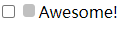
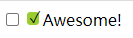
input[type="checkbox"]+label::before {content: '\a0';background: silver;/* content: '\2713';background: yellowgreen; *//* 不换行空格 */display: inline-block;vertical-align: .2em;width: .8em;height: .8em;margin-right: .2em;border-radius: .2em;text-indent: .15em;line-height: .65;}
隐藏原来的复选框input[type="checkbox"] {position: absolute;clip: rect(0, 0, 0, 0);}
在它聚焦或禁用时改变它的样式
input[type="checkbox"]:focus + label::before {box-shadow: 0 0 .1em .1em #58a;}input[type="checkbox"]:disabled + label::before {background: gray; box-shadow: none; color: #555;}
开关式按钮
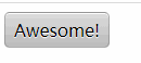
input[type="checkbox"] {position: absolute;clip: rect(0, 0, 0, 0);}input[type="checkbox"]+label {display: inline-block;padding: .3em .5em;background: #ccc;background-image: linear-gradient(#ddd, #bbb);border: 1px solid rgba(0, 0, 0, .2);border-radius: .3em;box-shadow: 0 1px white inset;text-align: center;text-shadow: 0 1px 1px white;}input[type="checkbox"]:checked+label,input[type="checkbox"]:active+label {box-shadow: .05em .1em .2em rgba(0, 0, 0, .6) inset;border-color: rgba(0, 0, 0, .3);background: #bbb;}<input type="checkbox" id="awesome" /><label for="awesome">Awesome!</label>

若有收获,就点个赞吧
0 人点赞
