text-shadow: h-shadow v-shadow blur color;
7-1 凸版印刷效果
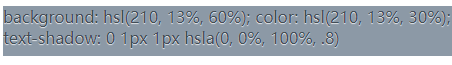
background: hsl(210, 13%, 40%);color: hsl(210, 13%, 75%);text-shadow: 0 -1px 1px black;
7-2 空心字

background: deeppink;color: white;text-shadow: 1px 1px black, -1px -1px black,1px -1px black, -1px 1px black
7-3 文字外发光效果
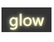
background-color: #333;color: #ffc;text-shadow: 0 0 .1em,0 0 .3em;
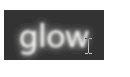
.glow{width: 100px;text-align: center;line-height: 50px;font-size: 30px;background-color: #333;color: #ffc;transition: 1s;text-shadow: 0 0 .1em,0 0 .3em;}.glow:hover{color: transparent;text-shadow: 0 0 .1em white,0 0 .3em white;/* filter: blur(.1em); */}
7-4 文字凸起效果

background: #58a;color: white;text-shadow: 0 1px hsl(0,0%,85%),0 2px hsl(0,0%,80%),0 3px hsl(0,0%,75%),0 4px hsl(0,0%,70%),0 5px hsl(0,0%,65%),0 5px 10px black;

color: white;background: hsl(0,50%,45%);text-shadow: 1px 1px black, 2px 2px black,3px 3px black, 4px 4px black,5px 5px black, 6px 6px black,7px 7px black, 8px 8px black

若有收获,就点个赞吧
0 人点赞
