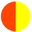
.pie{width: 100px;height: 100px;border-radius: 50%;background: orangered;margin: 100px;background-image: linear-gradient(to right,transparent 50%, yellow 0);}覆盖
1 transform 的解决方案
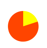
.pie{width: 100px;height: 100px;border-radius: 50%;background: orangered;margin: 100px;background-image: linear-gradient(to right,transparent 50%, yellow 0);}.pie::before{content: "";display: block;margin-left: 50%;height: 100%;background-color: inherit;transform-origin: left;/*绕着圆形的圆心来旋转 */border-radius: 0 100% 100% 0/50%;transform: rotate(72deg);}
2 动画解决
动画必须处于暂停状态。跟常规情形下我们让动画动起来的做法不一样,这里我们要用负的动画延时来直接跳至动画中的任意时间点
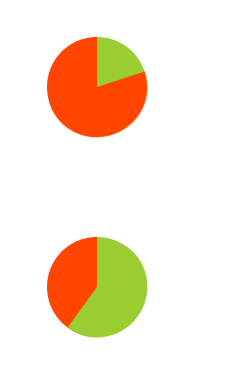
动画实现饼图(含百分比)<style>.pie{width: 100px;height: 100px;line-height: 100px;border-radius: 50%;background: orangered;margin: 100px;position: relative;text-align: center;color: transparent;background-image: linear-gradient(to right,transparent 50%, yellowgreen 0);}.pie::before{content: "";display: block;position: absolute;top: 0;left: 50%;/* margin-left: 50%; */height: 100%;width: 50%;background-color: inherit;transform-origin: left;/*绕着圆形的圆心来旋转 */border-radius: 0 100% 100% 0/50%;animation: spin 50s linear infinite,bg 100s step-end infinite;animation-play-state: paused;animation-delay: inherit;}@keyframes spin{to{transform: rotate(180deg);}}@keyframes bg{50%{background: yellowgreen;}}</style></head><body><div class="pie" style="animation-delay:-20s;">20%</div><div class="pie" style="animation-delay:-60s;">60%</div></body>
3 SVG 解决方案
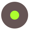
  <style>
        circle{
            fill: greenyellow;
            stroke: #655;
            stroke-width: 30;
        }
    </style>

<body>
   <svg width="100" height="100">
       <circle r="30" cx="50" cy="50" />
   </svg>
</body>


fill:填充色
stroke:描边色
stroke-width:边框宽度

 stroke-dasharray: 20 10;

 stroke-dasharray 虚线描边

 虚线的线段长度为 20 且间隙长度为 10,
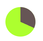
    <style>
        circle{
            fill: greenyellow;
            stroke: #655;
            stroke-width: 50;
            stroke-dasharray: 60 158;
        }
        svg{
            transform: rotate(-90deg);
            background: greenyellow;
            border-radius: 50%;
            margin: 100px;
        }
    </style>
<body>
    <svg width="100" height="100">
        <circle r="25" cx="50" cy="50" />
    </svg>
</body
4 角向渐变实现
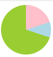
background: conic-gradient(pink 20%,lightblue 0,lightblue 30%,yellowgreen 0);

若有收获,就点个赞吧
0 人点赞
