- ">

- 一、描述,是什么
- 二、目标,为什么使用
- 三、痛点,常遇见什么问题
- 四、时机,什么时候使用
- 五、方案,如何使用
- 1、类型
- 2、设计思考
- (1)Determine what information users need or want to see,Dont splatter the screen with confusing or unimportant data,Remove,or at least deemphasize(弱化),information that doesnt help the user
- (2)选择合适的图表,下面是几种图表的区别
- (3)遵循明确和一致的命名惯例和一致的日期格式,并截断大的数值。
- (4)优先定义布局和路径,选择一个良好的视觉层次结构来安排这些列表、表格、信息图形
- (5)每个区别保持一致结构
- (6)尽量在一个屏幕内,最好不要滚动
- (7)支持移动面板,尽量提供定制功能
- 3、图表交互
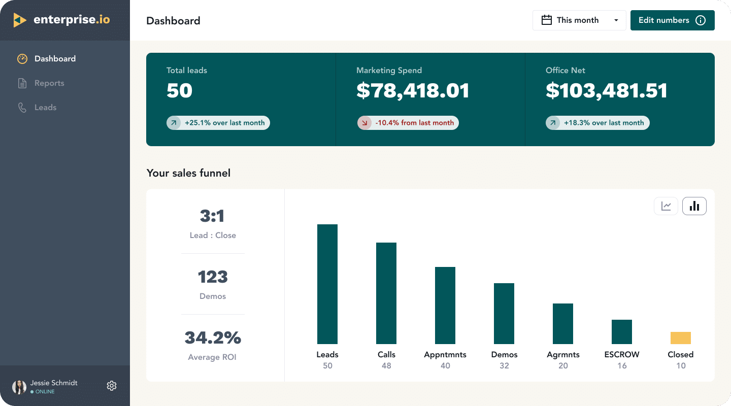
- 六、案例
- In other libraries
一、描述,是什么

二、目标,为什么使用
他是一个比较常见且很好识别的页面类型,常常用来显示有用的信息,使用图形显示数据
A dashboard is also a guild of interlocking patterns and comppnents.Such as these in predictable ways::
- Titled Sections
- Tabs and collapsible Panels
- Moveable Panels
- One-window Drilldown
- Lists and Tables of various kinds
- Row Striping(斑马行)
- Information Graphics
- Tatatips
三、痛点,常遇见什么问题
四、时机,什么时候使用
应用在处理一些信息流,这些信息流有对应的来源。用户有场景需要监测这些数据的时候
五、方案,如何使用
1、类型
Operational dashboard
操作仪表盘的目的是在用户从事对时间敏感的任务时,迅速向他们传递关键信息。
操作仪表盘的主要目的是快速清晰的给用户展示数据偏差,展示当前资源以及其状态。这就是一个数字控制室,旨在帮助用户快速、主动和高效获取信息。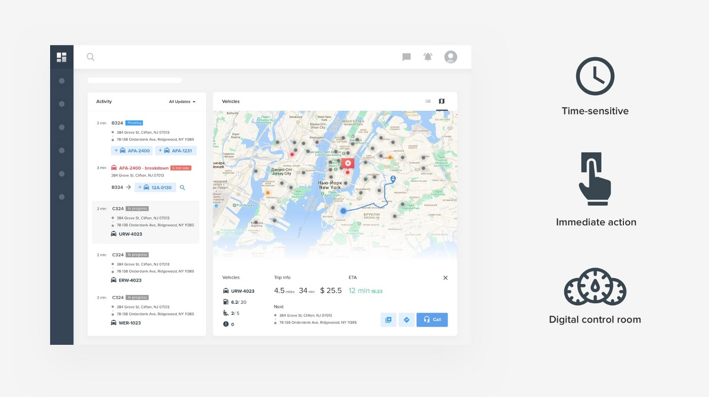
Analytical dashboard
分析型仪表板提供可供分析和做决策的一目了然的信息。
它们对时间的敏感度较低,不注重立即行动
这种仪表盘的一个主要目标是帮助用户对数据进行最佳的理解,分析趋势并推动决策。
2、设计思考
(1)Determine what information users need or want to see,Dont splatter the screen with confusing or unimportant data,Remove,or at least deemphasize(弱化),information that doesnt help the user
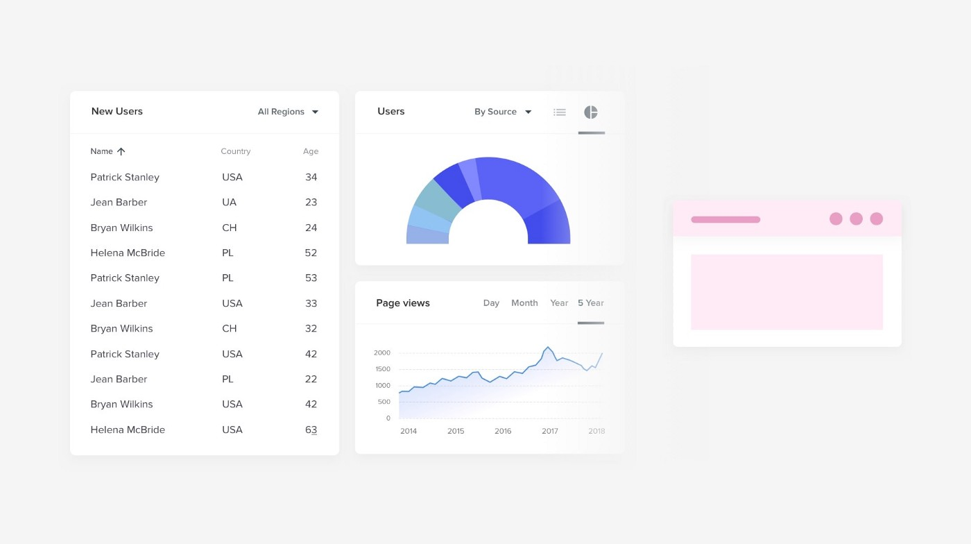
(2)选择合适的图表,下面是几种图表的区别
下面这种主要表示数据之间的关系
下面这些主要表示对比关系,突出对比价值
下面这些重要看全局的每个部分的情况,缺点是They are quite difficult to read when there are too many components or include very similar values
这种主要帮助用户查看分布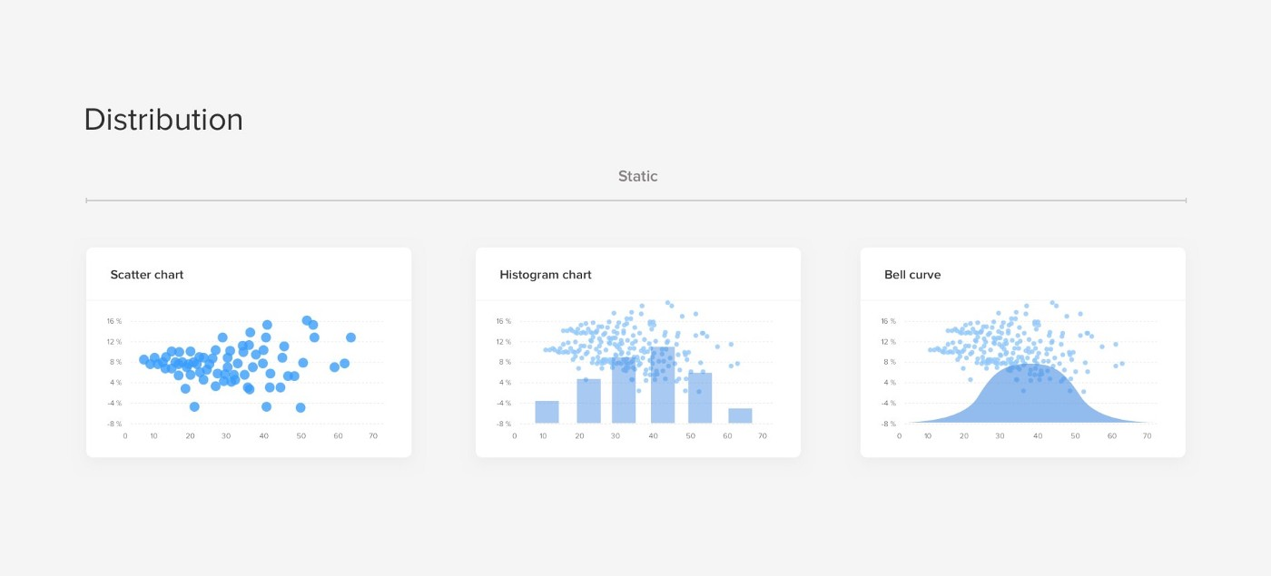
需要避免使用的图表,3D charts and overstyled charts have lower readability, distract the viewer from data, and even more difficult to develop
总的来看
(3)遵循明确和一致的命名惯例和一致的日期格式,并截断大的数值。
(4)优先定义布局和路径,选择一个良好的视觉层次结构来安排这些列表、表格、信息图形
The top left corner of the screen will naturally get more attention so try to position key info from left to right.

(5)每个区别保持一致结构

(6)尽量在一个屏幕内,最好不要滚动


(7)支持移动面板,尽量提供定制功能


Example of Jira’s Create Dashboard flow. You get to pick Gadgets and organize them inside a module layout
3、图表交互
Tooltips & hover states
Hover states are the perfect way to hide that secondary layer of detail while avoiding visual noise. Since the goal of the dashboard is to provide an at-a-glance snapshot, the visual of bars or lines should be enough for users to sense the trends. But revealing additional detail upon hover is a great use of progressive disclosure. That way your users can leverage it when needed, and it doesn’t clutter the page by default.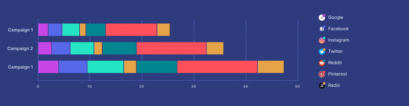
Toggling variables
Another interaction that could be relevant for some of your charts is the turning on and off of certain variables. Let’s say the default view of a line chart presents 7 different lines. It might be useful for the user to hide some of those endpoints so they can focus on comparing a smaller selection.
This can be implemented by making your legend items into a checkbox list.
六、案例
-雅虎的信息面板——支持移动调整

-谷歌分析网站-It uses information graphics to show a visual snapshot of a system

In other libraries
http://quince.infragistics.com/Patterns/Dashboard.aspx
http://patternry.com/p=information-dashboard/
Dashboard is one of the canonical RIA screen layouts described by Bill Scott and Theresa Neil. An article in UX Magazine _explains these layouts:
_http://www.uxmag.com/design/rich-internet-application-screen-design
Finally, you may be interested in Stephen Few’s book, Information Dashboard Design: The Effective Visual Communication of Data (O’Reilly, http://oreilly.com/ catalog/9780596100162/).
学习文章:https://uxplanet.org/10-rules-for-better-dashboard-design-ef68189d734c

若有收获,就点个赞吧
0 人点赞
