2020-03-20 Data from CareerFoundry
什么是UX?—What is UX
UX stands for user experience. This refers to the overall experience a user has when interacting with a product or service in a given environment. Depending on how the product or service is designed, the experience can range from delightful to downright frustrating. UX design isn’t limited to the digital space, either. Anything that can be experienced can be designed, from the packaging of a toothbrush to the wheels of an orthopedic chair!
_
UX代表的是用户体验。这是指用户在给定的产品环境中与产品或服务进行交互时的总体验。根据产品或者服务被设计的方式,这段体验可以令人倍感欣喜也可以使人感到沮丧。ux设计不仅仅局限于数字空间,任何可以被体验的东西都可以被设计,从简单到牙刷的包装,到复杂到矫正形体的轮椅!
UX的历史 —The History Of UX
The term UX was first coined in the 1990s by Dr. Donald Norman, an electrical engineer and cognitive scientist at Apple. A user-focused pioneer, he emphasized the importance of user-centered design—a design process based on the needs and goals of the user. In doing so, he introduced the term “user experience,” which is meant to encompass all aspects of a person’s experience with a system, from the materials used to the interaction itself (physical or digital), along with the interface, graphics, and orientation.
UX这一术语最早于120世纪90年代由Apple的电子工程师兼认知科学家Donald Norman博士命名提出。作为以用户为中心的先驱,他强调了以用户为中心的设计的重要性__一种基于用户需求和用户目地的设计过程。因此,他引入了“用户体验”一词,旨在涵盖用户对整个系统体验的各个方面,从使用的材料到交互本身(无论是物理或数字的),以及界面,图形和设计导向。
什么是UXD?User Experience Design (UXD)
So, where does design fit in with all that? UXD (user experience design) is about designing specifically for the needs of the user or customer, looking at things like ease of use, quality, and efficiency.
那么,设计在哪里发挥它的作用呢? UXD(用户体验设计)是专门针对用户或客户的需求进行设计,着眼于易用性,质量和效率。
in order for humans to make the most out of complex systems like websites and computer programs (or any product, really), designers had to start thinking about how people interact with those same products. They looked for ways to make those interactions as intuitive and straightforward as possible. Remember, though—UX design isn’t limited to digital products!
为了使人们能够充分利用复杂的系统(例如网站和程序,或者任何产品),设计师必须开始考虑人们如何与类似的产品进行交互,寻找使这些交互尽可能接近潜意识或更直接的方法。请记住,UX设计不仅限于数字产品!
You Already Know More About UX Design Than You Realize
UX designers have to wear many hats, finding just the right balance between scientist, psychologist, sociologist, and artist (among others). To produce viable, creative design solutions requires that you analyze past experiences, research new practices, interview potential users, and test, test, test your designs. While you’re not to that level yet, knowing exactly what makes a user experience good or bad is a great place to start! Now’s your chance to test your analytical skills with a short “good vs. bad UX” exercise. Let’s dive right in!
你已经比你所知的更了解UX设计
用户体验设计师必须戴上许多帽子,才能在科学家,心理学家,社会学家和艺术家之间找到适当的平衡。要产生可行的创意设计解决方案,需要分析过去的用户使用经验,探索并研究新的实验,采访潜在用户以及测试,测试和测试您的设计。现在,通过简短的“好与坏的UX”练习来测试你的分析能力。让我们深入下去!
好设计 vs 坏设计—Good vs. Bad UX
Here we have two cases of good vs. bad UX. We’ll start with familiar physical objects before moving onto digital examples.
Take a look at the image below. Notice any good or bad UX design? Upon first glance, the product is recognizable as a faucet, and the design looks functional, having all the necessary components of a tap. It’s aesthetically pleasing, and it might even add an elegant flair to a user’s kitchen or bathroom. Consider the following questions:
在这里,我们有两种情况下,用户体验好坏。在介绍电子类的示例之前,我们将从熟悉的物理对象开始。
- 水龙头的设计
看一下下面的图片。注意UX设计的好坏了吗?乍一看,该产品可识别为水龙头,并且设计具有实用性,具有水龙头的所有必要组件。它在美学上令人愉悦,甚至可以为用户的厨房或浴室增添优雅的气息。请考虑以下问题:
01:如果你需要的是冷水或者热水,你会如何旋转把手?
02:如果你想要增大水的容量,那么应该如何做?
If the tap suddenly dispensed very hot water very quickly, you could have a serious safety concern on your hands. A user shouldn’t have to think about how to make the tap function how they want it to—they should be able to use it without error right from the start. What could you do to make the design safer and more intuitive? Are there any easy yet effective fixes?
如果水龙头突然出了热水,那么用户的手很有可能受到安全性的威胁。用户不必考虑如何使水龙头的功能达到他们想要的样子,他们应该能够从一开始就正确使用它。所以作为用户体验设计师,如何做才能使设计更安全,更直观?让用户一下子就明白改如何正确使用产品,有没有相对简单而有效的修复方法?
线框图—Wireframes
UX professionals often work with wireframes of digital products, so we’ll be looking at a few below. A wireframe is, to put it simply, a drawing (freehand or digital) of a design. Just as architects use blueprints, UX designers use wireframes to communicate their design ideas and demonstrate how a design will function. Wireframes allow designers to focus on the experience of the design without getting distracted by all those fancy visual details, making them a crucial component in every design process!
对于ux来说,经常打交道的就是线框图。简而言之,线框是设计初期的手绘图/低保真原型。就像建筑师会使用蓝图一样,UX设计师也使用线框来传达他们的设计思想并演示设计如何发挥作用。线框使设计师可以专注于设计体验,而不会被所有花哨的视觉细节所分散,使它们成为每个设计过程中的关键组成部分!
- Tips!
When analyzing a user experience, you can start by comparing the experience to industry standards for “good UX.”
A product with good UX will be:
Useful, usable, desirable, findable, accessible, and credible.
Keeping these in mind as you conduct your analysis will hold you in good stead as you continue your UX journey. Take a look at the images below. Notice any examples of good or bad UX design?
- 小贴士!
在分析用户体验时,您可以从将体验与 “好 UX” 的行业标准进行比较开始。
具有好 UX 的产品有以下这些特征:
有用的**、常用的、满足用户需求、可找到的、可访问的且可靠的**。
在你进行分析的时候,记住这些,在你继续你的 UX 之旅的时候,会对你有帮助。看看下面的图片。关注 UX 设计的好与坏的区别。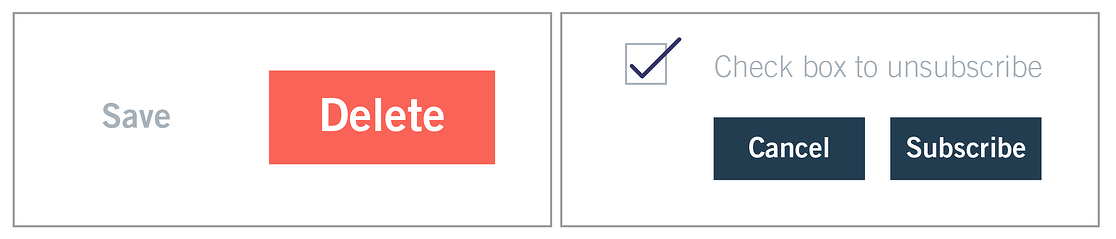
save&delete:重要的是用户希望有什么样的体验?是更希望快速的删除还是避免错误的删除?
cancel&subscribe:对于提供商来说,希望用户订阅,对于用户来说需要取消checkbox的勾选才能取消订阅,这对用户体验来说是糟糕的。
In the wireframe on the left, you can see that the button given most importance is the delete button. The text is larger, it is highlighted in a bright red color, and it is on the right hand side which is commonly reserved for confirmations. This unintuitive design could very quickly lead to a user accidentally deleting something they had meant to save.
On the right, whilst the unsubscribe checkbox is selected, there is no option to actually unsubscribe. The buttons only allow you to Subscribe or Cancel. Being unable to have the choice of unsubscribing from something that you no longer want to receive can be frustrating for users, and is an example of bad design.
在左侧的线框中,您可以看到最重要的按钮是删除按钮。文本较大,以鲜红色突出显示,并且在右侧,通常保留用于确认。这种不直观的设计可能会很快导致用户意外删除他们想要保存的东西。
在右侧,当取消订阅复选框被选中时,没有实际取消订阅的选项。按钮仅允许您订阅或取消。无法选择取消订阅你不再想收到的东西,这对用户来说是令人沮丧的,在用户体验的角度上来说是一个糟糕设计的例子。
The examples provided above have been corrected to demonstrate good design. In the example on the left, emphasis has been placed on the Save option, and it is in a familiar position, reducing the chances of users accidentally deleting something they want to keep. On the right, users can now confirm their decision to unsubscribe from something they no longer want to receive. The copy is straightforward and the consequences of confirming the action are clear.
Referring back to the industry standards for good UX, try identifying additional ways in which the images can be further improved.**
更多阅读…
Enjoyed this lesson? Check out our recommendations for further reading:
What Is User Experience Design? Everything You Need to Know To Get Started
The Fascinating History Of UX Design: A Definitive Timeline
How To Create Your First Wireframe: A Step-By-Step Guide
**
感谢您的阅读
翻译和整理 by 嘉艺
2020.03.20
如有任何疑问或机会请发送邮件至email:
[_lucida997@outlook.com]()
_

若有收获,就点个赞吧
0 人点赞
