backface-visibility: hidden; 3D 翻转时,看不到背面
CSS3 中的transform-origin属性用于设置旋转元素的基点位置
transform-origin: x-axis y-axis z-axis;/*默认值*/transform-origin: 50% 50% 0;
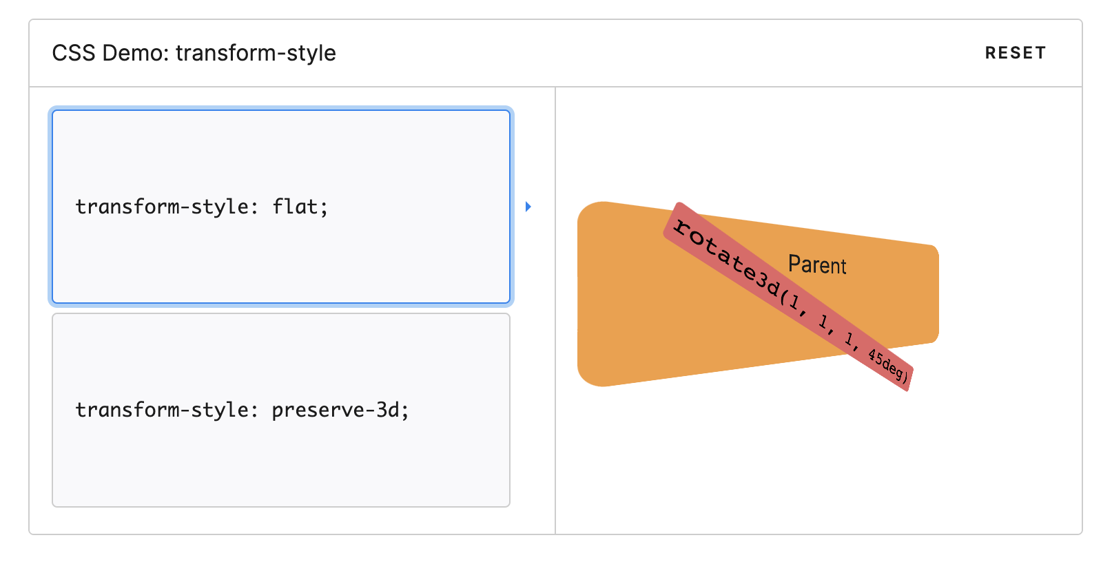
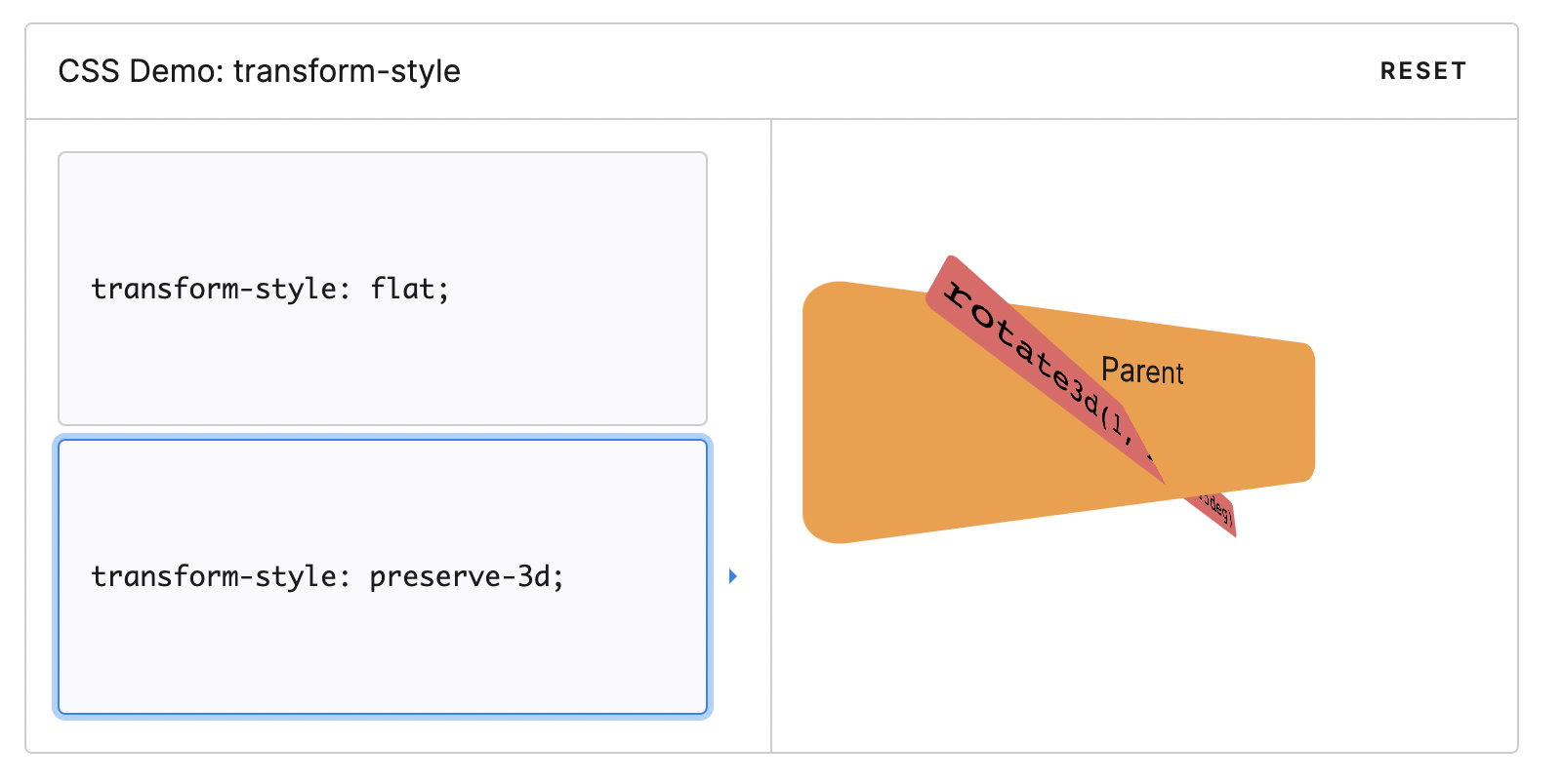
transform-style
CSS 属性 transform-style 设置元素的子元素是位于 3D 空间中还是平面中。
如果选择平面,元素的子元素将不会有 3D 的遮挡关系。
由于这个属性不会被继承,因此必须为元素的所有非叶子子元素设置它。
/* Keyword values */transform-style: flat;transform-style: preserve-3d;/* Global values */transform-style: inherit;transform-style: initial;transform-style: unset;
元素按中心旋转
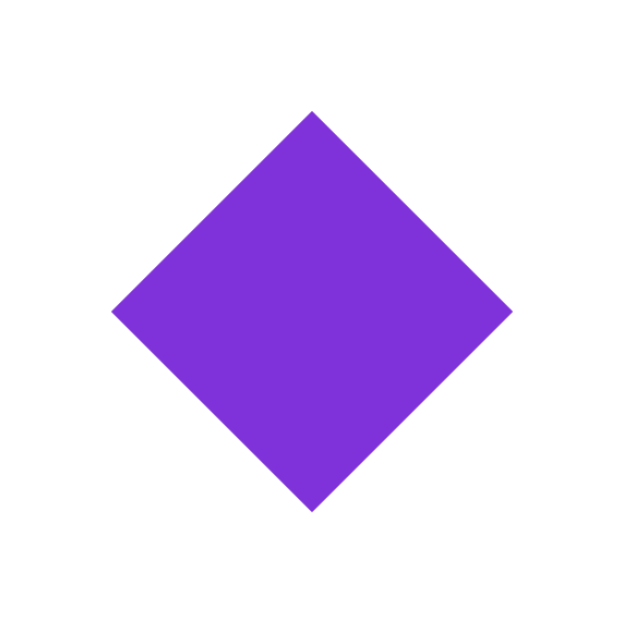
<div class="avatar"></div>
.avatar {position: fixed;left: 200px;top: 200px;width: 200px;height: 200px;background-color: blueviolet;}.avatar {transform: rotate(45deg); // 按中心旋转45度}
元素按圆轨迹运动
<!DOCTYPE html><html><head lang="en"><meta charset="UTF-8"><title>css3</title></head><body><style>.avatar {position: fixed;left: 200px;top: 200px;width: 400px;height: 400px;background-color: blueviolet;border-radius: 100%;}@keyframes spin {/* CSS3 角度单位 turn(圈) */to{transform: rotate(1turn);}}.ani {animation: spin 3s infinite linear;transform-origin: 50% 195px;}.img {position: absolute;left: 180px;top: 5px;border-radius: 100%;width: 40px;height: 40px;background-color: blue;}</style><div class="avatar"><div class="img ani"></div></div></body></html>
跟着椭圆移动 position: absolute;
<!DOCTYPE html><html><head lang="en"><meta charset="UTF-8"><title>css3</title></head><body><style>.avatar {position: fixed;left: 200px;top: 200px;width: 300px;height: 200px;}.img {position: absolute;border-radius: 100%;width: 40px;height: 40px;background-color: blue;}.item {position: relative;width: 100%;height: 100%;background-color: rgba(138, 43, 226, 1);border-radius: 100%;}</style><div class="avatar"><div class="item"></div><div class="img" id="img"></div></div><script>// a 长半径, b 短半径,angle 角度,cx cy 圆心function getCPoint(a, b, angle, cx = 0, cy = 0) {index = anglelet x = a * Math.cos(Math.PI * 2 * index / 360)let y = b * Math.sin(Math.PI * 2 * index / 360)x = (x + cx);y = (y + cy);return {x, y}}const avatar = document.querySelector('.avatar')const div = document.getElementById('img')let step = 360;const loop = function (time, bool) {if (step > 0 || bool) {step--;const posi = getCPoint(150, 100, step, 150 - 20, 100 - 20)div.style.left = posi.x + 'px';div.style.top = posi.y + 'px';setTimeout(() => {loop(time, bool);}, time || 100);}}loop(10, true);</script></body></html>
跟着椭圆排列,使用 transform: translate(x, y)
<!DOCTYPE html><html><head lang="en"><meta charset="UTF-8"><title>css3</title></head><body><style>.avatar {display: flex;position: fixed;left: 200px;top: 200px;width: 300px;height: 200px;}.img {flex: none;z-index: 2;border-radius: 100%;width: 40px;height: 40px;background-color: blue;display: flex;justify-content: center;align-items: center;color: #fff;}.item {position: absolute;width: 100%;height: 100%;background-color: rgba(138, 43, 226, 1);border-radius: 100%;}</style><div class="avatar"><div class="item"></div><div class="img">1</div><div class="img">2</div><div class="img">3</div><div class="img">4</div><div class="img">5</div><div class="img">6</div><div class="img">7</div><div class="img">8</div><div class="img">9</div><div class="img">10</div><div class="img">11</div><div class="img">12</div></div><script>// a 长半径, b 短半径,angle 角度,cx cy 圆心function getCPoint(a, b, angle, cx = 0, cy = 0) {index = anglelet x = a * Math.cos(Math.PI * 2 * index / 360)let y = b * Math.sin(Math.PI * 2 * index / 360)x = (x + cx);y = (y + cy);return {x, y}}const avatar = document.querySelector('.avatar')let divs = document.querySelectorAll('.img')divs = Array.prototype.slice.call(divs)console.log(divs.forEach, divs.length)for (let i = 0; i < divs.length; i+=1) {const item = divs[i];console.log(item.offsetLeft, item.offsetTop)const {x, y} = getCPoint(150, 100, (360 / divs.length) * i, 130, 80);console.log(x, y)// item.style.left = x + 'px';// item.style.top = y + 'px';item.style.transform = `translate(${x - item.offsetLeft}px, ${y - item.offsetTop}px)`}</script></body></html>

若有收获,就点个赞吧
0 人点赞
