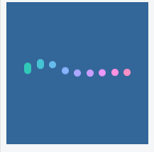
效果如下
View部分
<div id="app"><div class="heart-loading"><div class="ul" style= "--line-count: 9"><div class="li" v-for="v in 9" :key="v" :class="`line-${v}`" :style="`--line-index: ${v}`"></div></div></div></div>
JS部分
var app = new Vue({el: '#app',data() {return {}},methods: {}});
css 部分
.heart-loading {width: 200px;height: 200px;background-color: #369;display: flex;justify-content: center;align-items: center;}.ul {display: flex;justify-content: space-between;width: 150px;height: 10px;}.li {--v: calc(var(--line-index) / var(--line-count) * .5turn);--time: calc((var(--line-index) - 1) * 40ms);border-radius: 5px;width: 10px;height: 10px;background-color: #3c9;filter: hue-rotate(var(--v));animation-duration: 1s;animation-delay: var(--time);animation-iteration-count: infinite;}.line-1, .line-9 {animation-name: line-move-1;}.line-2, .line-8 {animation-name: line-move-2;}.line-3, .line-7 {animation-name: line-move-3;}.line-4, .line-6 {animation-name: line-move-4;}.line-5 {animation-name: line-move-5;}@keyframes line-move-1 {0%,10%,90%,100% {height: 10px;}45%,55% {height: 30px;transform: translate3d(0, -15px, 0);}}@keyframes line-move-2 {0%,10%,90%,100% {height: 10px;}45%,55% {height: 60px;transform: translate3d(0, -30px, 0);}}@keyframes line-move-3 {0%,10%,90%,100% {height: 10px;}45%,55% {height: 80px;transform: translate3d(0, -40px, 0);}}@keyframes line-move-4 {0%,10%,90%,100% {height: 10px;}45%,55% {height: 90px;transform: translate3d(0, -30px, 0);}}@keyframes line-move-5 {0%,10%,90%,100% {height: 10px;}45%,55% {height: 90px;transform: translate3d(0, -20px, 0);}}

若有收获,就点个赞吧
0 人点赞
