设计稿一般以750px作为整屏宽度,而网站最小字体大小为12px,所以这里以750/12 = 62.5作为屏幕水平栏栅数量,同时12px也是蓝湖默认的rem方案根字体大小。
我们在入口文件中添加以下逻辑即可。
(() => {const setFontSize = () => {let clientWidth = document.documentElement.clientWidth;if (clientWidth > 750) {clientWidth = 750;} else if (clientWidth < 320) {clientWidth = 320;}global.rootFontSize = clientWidth / 62.5; // 这里用了一个全局的rootFontSize保存根字体大小,以便在其他地方用到,全局变量可自行定义document.getElementsByTagName('html')[0].style.fontSize = `${global.rootFontSize}px`;}window.onresize = setFontSize;setFontSize();})();
配合最大宽度为750px的公共版心可以友好支持PC端
.box {max-width: 750px;min-height: 100vh;background-color: white;margin: 0 auto;}
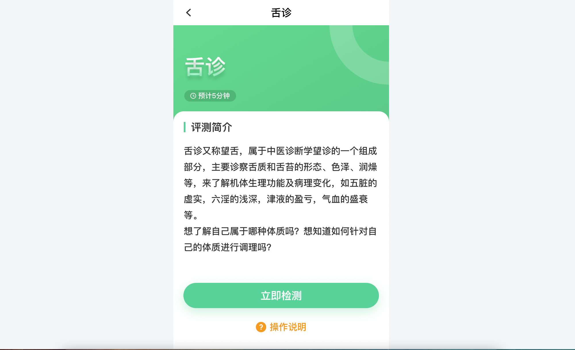
示例:
.header {position: relative;height: 33.33rem;background: linear-gradient(-30deg, #33CA88, #37DD8F);padding: 7.83rem 3.17rem;overflow: hidden;.circle {position: absolute;width: 34.5rem;height: 34.5rem;top: -17.25rem;right: -17.25rem;z-index: 2;}.title {font-size: 6rem;font-family: PingFang SC;font-weight: 800;color: #FFFFFF;text-shadow: 0rem 1rem 1rem rgba(0, 113, 67, 0.3);background: linear-gradient(180deg, #FFFFFF 46.240234375%, #44FFB3 100%);-webkit-background-clip: text;-webkit-text-fill-color: transparent;}.time {margin-top: 2.67rem;width: 15rem;height: 3.33rem;background: rgba(0, 113, 67, 0.3);border-radius: 2rem;display: flex;flex-direction: row;justify-content: center;align-items: center;overflow: hidden;.timeIcon {width: 1.67rem;height: 1.67rem;margin-right: 0.58rem;}.timeText {font-size: 2rem;font-family: PingFang SC;font-weight: 500;color: #FFFFFF;}}}
<div className="box"><div className={styles.header}><img className={styles.circle} src="/assets/images/circle.png" alt="" /><div className={styles.title}>舌诊</div><div className={styles.time}><img className={styles.timeIcon} src="/assets/images/clock.png" alt="" /><div className={styles.timeText}>预计5分钟</div></div></div></div>

若有收获,就点个赞吧
0 人点赞
