背景background
1.背景颜色 background-color
2.背景图片background-image
background-image:url(图片路径)
3.背景重复 background-repeat
repeat
重复平铺满
repeat-x
向X轴重复
repeat-y
向Y轴重复
no-repeat
不重复
4.背景位置 background-position
横向(left,center,right)
纵向(top,center,bottom)
5.简写方式
background:背景颜色 url(图像) 重复 位置
background:#f60 url(images/bg,jpg) no-repeat top center
/*body{background-color:rgb(255,255,255);}body{background-image:url(image/bg.gif);background-repeat:no-repeat;background-position: (x) (y);}*/div{width:200px;height:200px;background:#f2f2f2 url(image/bg.gif) no-repeat 20px 20px;}
5.background-attachment
定义滚动页面时背景图像的行为
background-attachment: scroll;
背景图像将随页面滚动。它还将根据其所应用的元素定位并调整其大小。background-attachment: fixed;
背景图像将不会随页面滚动,而是保持根据视口的位置。它还将根据视口定位并调整其大小。结果,背景图像可能仅是部分可见的。
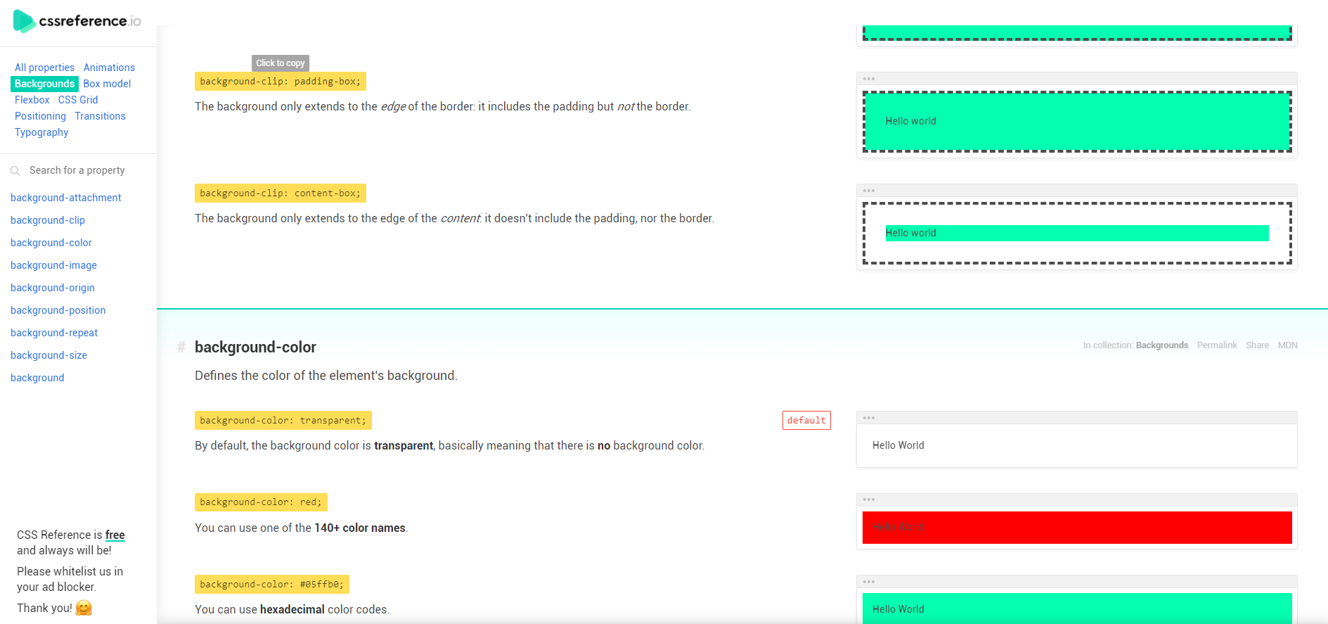
6.background-clip
定义背景在元素内应延伸的距离。background-clip: border-box;
背景完全延伸到整个元素,甚至在边框之下。
background-clip: padding-box;
背景仅延伸到边框的边缘:它包括填充,但不包括边框。
background-clip: content-box;
背景仅扩展到内容的边缘:不包括填充或边框。
7.background-origin
定义背景图像的原点。
background-origin: padding-box;
背景图片从边框的边缘开始:在填充内,但不在边框内。
background-origin: border-box;
背景图像在边框内。
background-origin: content-box;
背景图片仅从内容的边缘开始:不包含填充,也不包含边框。
8.background-size背景图像大小
background-size: auto auto;
背景图像将保留其原始大小。
background-size: 120px 80px;
您可以指定大小(以像素为单位):
- 第一个值是水平尺寸
- 第二个是垂直尺寸
background-size: 100% 50%;
您也可以使用百分比值。请注意,这会改变背景图像的纵横比,并导致意外结果。
background-size: contain;
关键字contain将调整背景图像的大小,以确保其完全可见。
background-size: cover;
关键字cover将调整背景图片的大小,以确保元素被完全覆盖。
background-blend-mode 背景混合
background-blend-mode 属性定义了背景层的混合模式,用于混合元素背景图案、渐变和颜色(图片与颜色)。
.material {background: #2376b7;background-image: url(https://s2.ax1x.com/2019/04/16/AvLUhj.jpg) !important;background-blend-mode: multiply;}
background-blend-mode的具体属性见:CSS混合模式mix-blend-mode/background-blend-mode
CSS混合模式mix-blend-mode/background-blend-mode
深入理解CSS background-blend-mode的作用机制
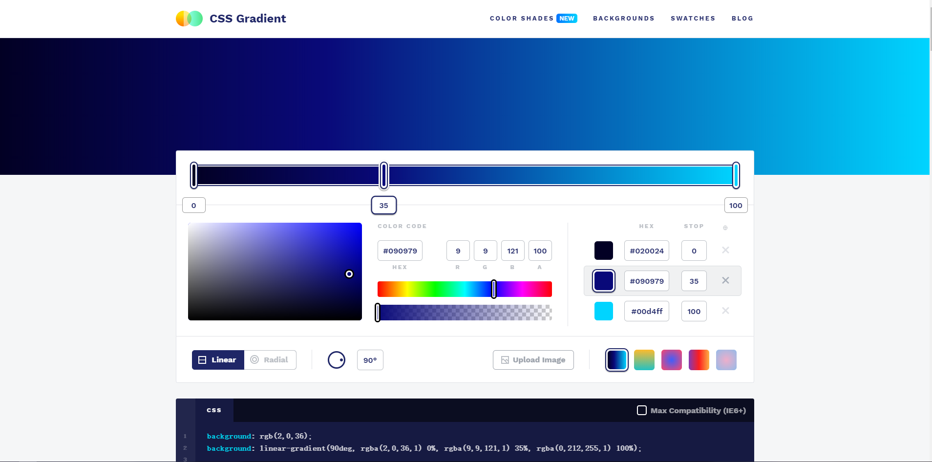
渐变
渐变即多个颜色过渡。CSS3 渐变(gradients)可以让你在两个或多个指定的颜色之间显示平稳的过渡。
Muiticolor
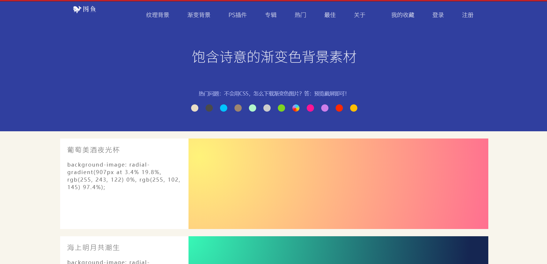
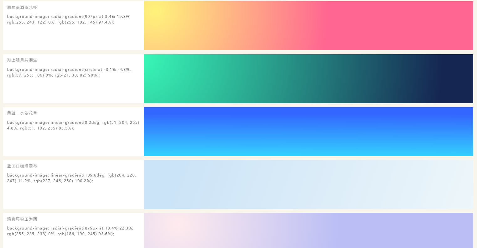
图鱼渐变背景素材
线性渐变linear-gradient
典型的线性渐变是由角度,颜色和位置组成,例如:
.gradient {background-image: linear-gradient(45deg, red 50%, blue 50%);}
1.角度
可以通过度数或者英文方向表示,从下到上 to top,0deg;然后顺时针为: 从左到右 to right 90deg ;从上到下 to bottom 180deg ;从右到左 to left 270deg。
还有45deg 135deg等常用的度数也可用字母表示。
| 角度 | 用英文 | 作用 |
|---|---|---|
| 0deg | to top | 从下到上 |
| 90deg | to right | 从左到右 |
| 180deg | to bottom | 从上到下 |
| 270deg | to left | 从右到左 |
| 45deg | to top right | 从左下到右上 |
| 135deg | to bottom right | 从左上到右下 |
| 对角方向上的渐变通常是使用45deg 和135deg,从左下到右上 变为 从右上到左下 将渐变颜色的顺序反转即可,当然不改变颜色顺序分别用225deg和315deg也行 | ||
.bg-aqua-gradient {background: rgba(127,219,255,1);background: -webkit-linear-gradient(top, rgba(127,219,255,1) 0%, rgba(82,140,163,1) 100%);background: linear-gradient(to bottom, rgba(127,219,255,1) 0%, rgba(82,140,163,1) 100%);}.bg-blue-gradient {background: rgba(0,116,217,1);background: -webkit-linear-gradient(top, rgba(0,116,217,1) 0%, rgba(0,65,122,1) 100%);background: linear-gradient(to bottom, rgba(0,116,217,1) 0%, rgba(0,65,122,1) 100%);}.bg-navy-gradient {background: rgba(0,32,63,1);background: -webkit-linear-gradient(top, rgba(0,32,63,1) 0%, rgba(0,10,20,1) 100%);background: linear-gradient(to bottom, rgba(0,32,63,1) 0%, rgba(0,10,20,1) 100%);}.bg-teal-gradient {background: rgba(57,204,204,1);background: -webkit-linear-gradient(top, rgba(57,204,204,1) 0%, rgba(34,122,122,1) 100%);background: linear-gradient(to bottom, rgba(57,204,204,1) 0%, rgba(34,122,122,1) 100%);}.bg-green-gradient {background: rgba(46,204,64,1);background: -webkit-linear-gradient(top, rgba(46,204,64,1) 0%, rgba(28,122,39,1) 100%);background: linear-gradient(to bottom, rgba(46,204,64,1) 0%, rgba(28,122,39,1) 100%);}.bg-lime-gradient {background: rgba(1,255,111,1);background: -webkit-linear-gradient(top, rgba(1,255,111,1) 0%, rgba(2,163,72,1) 100%);background: linear-gradient(to bottom, rgba(1,255,111,1) 0%, rgba(2,163,72,1) 100%);}.bg-yellow-gradient {background: rgba(255,221,0,1);background: -webkit-linear-gradient(top, rgba(255,221,0,1) 0%, rgba(184,147,0,1) 100%);background: linear-gradient(to bottom, rgba(255,221,0,1) 0%, rgba(184,147,0,1) 100%);}.bg-orange-gradient {background: rgba(255,133,27,1);background: -webkit-linear-gradient(top, rgba(255,133,27,1) 0%, rgba(255,80,27,1) 100%);background: linear-gradient(to bottom, rgba(255,133,27,1) 0%, rgba(255,80,27,1) 100%);}.bg-red-gradient {background: rgba(246,46,36,1);background: -webkit-linear-gradient(top, rgba(246,46,36,1) 0%, rgba(255,54,121,1) 100%);background: linear-gradient(to bottom, rgba(246,46,36,1) 0%, rgba(255,54,121,1) 100%);}.bg-fuchsia-gradient {background: rgba(240,18,188,1);background: -webkit-linear-gradient(top, rgba(240,18,188,1) 0%, rgba(163,11,128,1) 100%);background: linear-gradient(to bottom, rgba(240,18,188,1) 0%, rgba(163,11,128,1) 100%);}.bg-purple-gradient {background: rgba(176,13,201,1);background: -webkit-linear-gradient(top, rgba(176,13,201,1) 0%, rgba(107,7,122,1) 100%);background: linear-gradient(to bottom, rgba(176,13,201,1) 0%, rgba(107,7,122,1) 100%);}.bg-maroon-gradient {background: rgba(204,31,115,1);background: -webkit-linear-gradient(top, rgba(204,31,115,1) 0%, rgba(133,20,75,1) 100%);background: linear-gradient(to bottom, rgba(204,31,115,1) 0%, rgba(133,20,75,1) 100%);}
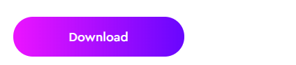
.detail__download {font-size: 1.8rem;font-family: CeraProMedium,sans-serif;border: none;border-radius: 50rem;outline: none;padding: 1.5rem 8rem;margin: 2rem 0 4rem;cursor: pointer;background: linear-gradient(270deg,#ec14ff,#6806fe,#ec14ff);background-size: 200%;color: #fff;transition: .3s ease-in-out;transition: var(--transition);}
径向渐变
圆锥渐变
https://www.zhangxinxu.com/wordpress/2020/04/css-conic-gradient/
文本渐变
参考
https://www.w3cplus.com/css3/do-you-really-understand-css-linear-gradients.html
常用渐变效果
#nocalhost .tx-hero_content_3 {background-image: linear-gradient(-180deg, #2d0777 0%, #200847 57%, #160823 100%);border-radius: 0 200px 0 0;}


若有收获,就点个赞吧
0 人点赞
