通常而言,我们生成阴影的方式大多是 box-shadow 、filter: drop-shadow() 、text-shadow 。
box-shadow
CSS3 box-shadow 属性用来描述一个元素的一个或多个阴影效果,该属性几乎可以让你完成你想要的任何阴影效果。然而 box-shadow 属性语法和取值非常灵活,对于新手有点不容易理解。今天总结一下语法和 box-shadow 属性各种阴影效果。
语法
/* offset-x | offset-y | color */box-shadow: 60px -16px teal;阴影的水平位置 垂直位置 颜色上面表示为 阴影位置相对元素位置水平(向右)偏移60px,垂直(向上)偏移-16px/* offset-x | offset-y | blur-radius 模糊| color */box-shadow: 10px 5px 5px black;模糊值越大,阴影就越大越淡/* offset-x | offset-y | blur-radius | spread-radius 扩大 | color */box-shadow: 2px 2px 2px 1px rgba(0, 0, 0, 0.2);扩大的默认值为0,不扩大,与元素大小相同,取正值时,阴影扩大;取负值时,阴影收缩。/* inset | offset-x | offset-y | color */box-shadow: inset 5em 1em gold;inset设置内阴影,原本默认为外阴影/* Any number of shadows, separated by commas */box-shadow: 3px 3px red, -1em 0 0.4em olive;/* Global keywords */box-shadow: inherit;box-shadow: initial;box-shadow: unset;
示例
shadow-blur 动态阴影
利用 filter: blur 模糊滤镜,我们可以生成与背景图片颜色相仿的阴影效果;
其简单的原理就是,利用伪元素,生成一个与原图一样大小的新图叠加在原图之下,然后利用滤镜模糊 filter: blur() 配合其他的亮度/对比度,透明度等滤镜,制作出一个虚幻的影子,伪装成原图的阴影效果。重要的就是filter: blur(10px) brightness(80%) opacity(.8); 。
.shadow-blur {position: relative;background: url($img) no-repeat center center;}.shadow-blur::before {content: "";display: block;background: inherit;filter: blur(10rpx);opacity: 0.4;position: absolute;width: 100%;height: 100%;top: 10rpx;left: 10rpx;z-index: -1;transform-origin: 0 0;border-radius: inherit;transform: scale(1, 1);}/* 或者 */.shadow-blur::after {content: "";position: absolute;top: 10%;width: 100%;height: 100%;background: inherit;background-size: 100% 100%;filter: blur(10px) brightness(80%) opacity(.8);z-index: -1;}
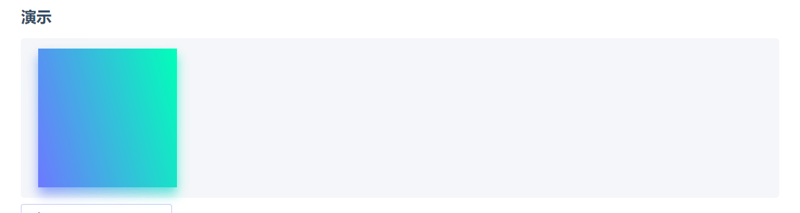
<div class="dynamic-shadow-parent"><div class="dynamic-shadow"></div></div>.dynamic-shadow-parent {position: relative;z-index: 1;}.dynamic-shadow {position: relative;width: 10rem;height: 10rem;background: linear-gradient(75deg, #6d78ff, #00ffb8);}.dynamic-shadow::after {content: '';width: 100%;height: 100%;position: absolute;background: inherit;top: 0.5rem;filter: blur(0.4rem);opacity: 0.7;z-index: -1;}
box-shadow盒阴影图形生成技术

若有收获,就点个赞吧
0 人点赞
