一、文本
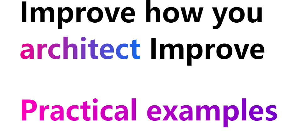
background-clip:text 实现渐变文字
div {color: transparent;background-clip: text;}
通过将文字设置为透明,原本 div 的背景就显现出来了,而文字以外的区域全部被裁剪了,这就是 background-clip:text 的作用。
https://code.juejin.cn/pen/7112616977457217544
<h1>Improve how you<span class="bg-clip-text bg-gradient-to-r text-transparent pink200-to-blue500">architect</span>Improve</h1><h1 class="bg-clip-text bg-gradient-to-r text-transparent pink-to-purple">Practical examples on CodeSandbox</h1><h1 class="bg-clip-text bg-gradient-to-r text-transparent pink-to-orange">Practical examples on CodeSandbox</h1>
h1{margin: 5rem 15rem;font-size: 5.5rem;font-weight: 800;}.text-transparent {color: transparent;}.bg-clip-text {-webkit-background-clip: text;background-clip: text;}.bg-gradient-to-r {background-image: linear-gradient(90deg,var(--tw-gradient-stops));}.pink200-to-blue500{--tw-gradient-from: #ec008c;--tw-gradient-to: #0070f3;--tw-gradient-stops: var(--tw-gradient-from),var(--tw-gradient-to,rgba(236,0,140,0));}.pink-to-purple {--tw-gradient-from: #FF00BB;--tw-gradient-to: #5C00CB;--tw-gradient-stops: var(--tw-gradient-from),var(--tw-gradient-to,rgba(51,140,245,0));}.pink-to-orange {--tw-gradient-from: #EC008C;--tw-gradient-to: #FFF200;--tw-gradient-stops: var(--tw-gradient-from),var(--tw-gradient-to,rgba(51,140,245,0));animation: huerotate 5s infinite;}@keyframes huerotate {100% {filter: hue-rotate(360deg);}}
首字母大写
text-transform: Capitalize;
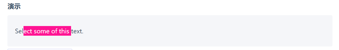
<p class="custom-text-selection">Select some of this text.</p>::selection {background: aquamarine;color: black;}.custom-text-selection::selection {background: deeppink;color: white;}
自定义文本选择
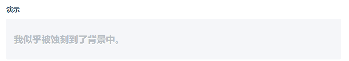
蚀刻文本
<p class="etched-text">I appear etched into the background.</p>
.etched-text {text-shadow: 0 2px white;font-size: 1.5rem;font-weight: bold;color: #b8bec5;}
溢出滚动渐变
向溢出元素添加渐变以更好地指示有更多内容需要滚动。
<div class="overflow-scroll-gradient"><div class="overflow-scroll-gradient__scroller">Content to be scrolled</div></div>
.overflow-scroll-gradient {position: relative;}.overflow-scroll-gradient::after {content: '';position: absolute;bottom: 0;width: 240px;height: 25px;background: linear-gradient(rgba(255, 255, 255, 0.001),white); /* transparent keyword is broken in Safari */pointer-events: none;}.overflow-scroll-gradient__scroller {overflow-y: scroll;background: white;width: 240px;height: 200px;padding: 15px 0;line-height: 1.2;text-align: center;}
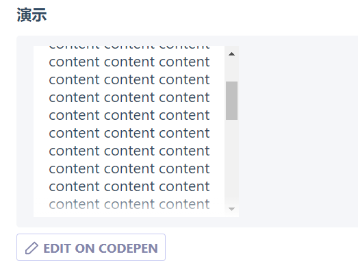
说明
position: relative在父级上为伪元素建立笛卡尔定位上下文。::after定义伪元素。background-image: linear-gradient(...)添加从透明渐变为白色(从上到下)的线性渐变。position: absolute从文档流中取出伪元素,并将其相对于父元素定位。width: 240px匹配滚动元素的大小(它是具有伪元素的父元素的子元素)。height: 25px是衰落梯度伪元素的高度,应当保持相对较小。bottom: 0将伪元素定位在父元素的底部。pointer-events: none指定伪元素不能是鼠标事件的目标,允许其后面的文本仍然是可选/交互式的。
文本高光
利用 background-clip, 我们还可以轻松的给文字增加高光动画。
点击查看【codepen】
<p data-text="Lorem ipsum dolor"> Lorem ipsum dolor </p>
p {position: relative;color: transparent;background-color: #E8A95B;background-clip: text;}p::after {content: attr(data-text);position: absolute;left: 0;top: 0;width: 100%;height: 100%;background-image: linear-gradient(120deg, transparent 0%, transparent 6rem, white 11rem, transparent 11.15rem, transparent 15rem, rgba(255, 255, 255, 0.3) 20rem, transparent 25rem, transparent 27rem, rgba(255, 255, 255, 0.6) 32rem, white 33rem, rgba(255, 255, 255, 0.3) 33.15rem, transparent 38rem, transparent 40rem, rgba(255, 255, 255, 0.3) 45rem, transparent 50rem, transparent 100%);//去掉伪元素的 background-clip: text,就能看懂原理:background-clip: text;background-size: 150% 100%;background-repeat: no-repeat;animation: shine 5s infinite linear;}@keyframes shine {0% {background-position: 50% 0;}100% {background-position: -190% 0;}}
添加了 mask 属性的元素,其内容会与 mask 表示的渐变的 transparent 的重叠部分,并且重叠部分将会变得透明
点击查看【codepen】
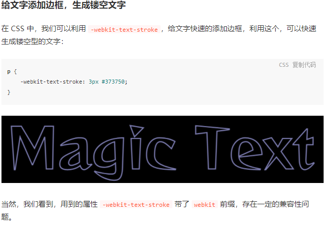
镂空文字
拿到了镂空文字后,我们还可以利用混合模式 mix-blend-mode: multiply 生成渐变色的文字。
p {position: relative;-webkit-text-stroke: 3px #9a9acc;&::before{content: ' ';width: 100%;height: 100%;position: absolute;left: 0;top: 0;background-image: linear-gradient(45deg, #ff269b, #2ab5f5, #ffbf00);mix-blend-mode: multiply;}}

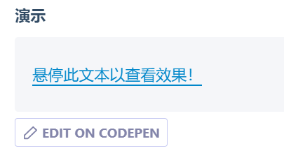
hover 悬停下划线动画
<p class="hover-underline-animation">Hover this text to see the effect!</p>\.hover-underline-animation {display: inline-block;position: relative;color: #0087ca;}.hover-underline-animation::after {content: '';position: absolute;width: 100%;transform: scaleX(0);height: 2px;bottom: 0;left: 0;background-color: #0087ca;transform-origin: bottom right;transition: transform 0.25s ease-out;}.hover-underline-animation:hover::after {transform: scaleX(1);transform-origin: bottom left;}
禁用文本选择
<p>你可以选择我。</p><p class="unselectable">你不能选择我!</p>.unselectable {user-select: none;}
说明
user-select: none 指定无法选取文字。
文本溢出
文本超出不定行
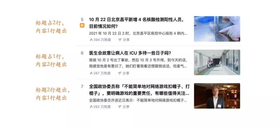
<div class="con"><div class="section"><h3 class="title">LGD 在 TI10 放猛犸,RNG 在 S7 放加里奥最后都输了,哪个更让你愤怒失望?</h3><p class="excerpt">猛犸是对面的绝中绝,大家都知道,并且之前扳回两局已经证明了,当lgd选择ban掉猛犸,或者自己抢掉猛犸时,对面完全不是对手。</p></div><div class="section"><h3 class="title">《饥荒》为什么这么难玩?</h3><p class="excerpt">玩的是联机版,30个小时了还没过第一个冬天。</p></div><div class="section"><h3 class="title">你觉得国漫的巅峰之作是哪个?</h3><p class="excerpt">一直觉得国漫做的一般,之前看了灵笼这部国漫,做的不错,还有什么YYDS的国漫推荐吗!</p></div></div>html,body{margin: 0;height: 100%;display: flex;justify-content: center;align-items: center;}h3,p{margin: 0;}.con{width: 500px;overflow: hidden;resize: horizontal;}.section{display: flex;position: relative;border: 10px solid transparent;outline: 1px solid;overflow: hidden;height: 72px;margin: 10px;line-height: 1.5;text-align: justify;flex-direction: column;}.title{overflow: hidden;display: -webkit-box;-webkit-line-clamp: 2;-webkit-box-orient: vertical;font-size: 16px;margin-bottom: 3px;}.excerpt{font-size: 14px;margin-top: auto;flex: 1;overflow: hidden;max-height: 3em;}.excerpt::before{content: '...';float: right;height: 100%;shape-outside: inset(calc(100% - 1.5em) 0 0 0);display: flex;align-items: flex-end;margin-left: 2px;}.excerpt::after{content: '';position: absolute;width: 999vh;height: 999vh;background: #fff;box-shadow: -2em 2em #fff;}
文字排版布局
文字沿着不规则路径排版布局的实现
https://www.zhangxinxu.com/wordpress/2020/09/svg-text-around-path/
直线等图形3D穿过文字的CSS实现
https://www.zhangxinxu.com/wordpress/2021/02/css-3d-through/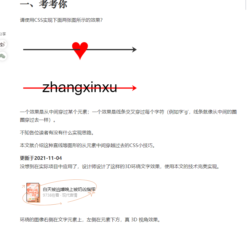
文本特效-掘金
https://css-tricks.com/creating-playful-effects-with-css-text-shadows/
https://juejin.cn/post/6937102296442470413#heading-17

若有收获,就点个赞吧
0 人点赞
