
缺角矩形
PPT中的形状缺角矩形
PPT中效果:
代码实现效果:
<div class="zhui-alert-wrapper"><div class="zhui-alert-inner">天青色等烟雨</div></div>.zhui-alert-wrapper {position: relative;display: inline-block;width: 30px;min-height: 100px;font-size: 12px;border-radius: 3px;background: radial-gradient(circle at bottom left, transparent 7.5px, #fff 8px) 0 100%, radial-gradient(circle at top left, transparent 7.5px, #fff 8px) 0 0, radial-gradient(circle at top right, transparent 7.5px, #fff 8px) 100% 0, radial-gradient(circle at bottom right, transparent 7.5px, #fff 8px) 100% 100%;background-size: 51% 51%;background-repeat: no-repeat;-webkit-filter: drop-shadow(0 0 1px #ff6347);filter: drop-shadow(0 0 1px #ff6347);padding: 3px;}.zhui-alert-inner {font-family: STKaiti;display: -webkit-box;display: -ms-flexbox;display: flex;-webkit-box-pack: center;-ms-flex-pack: center;justify-content: center;-webkit-box-align: center;-ms-flex-align: center;align-items: center;width: 30px;min-height: inherit;margin: 0 auto;padding: 12px 8px;word-wrap: break-word;text-align: center;-webkit-box-sizing: border-box;box-sizing: border-box;background: radial-gradient(circle at bottom left, transparent 7.5px, #fff 8px) 0 100%, radial-gradient(circle at top left, transparent 7.5px, #fff 8px) 0 0, radial-gradient(circle at top right, transparent 7.5px, #fff 8px) 100% 0, radial-gradient(circle at bottom right, transparent 7.5px, #fff 8px) 100% 100%;background-size: 51% 51%;background-repeat: no-repeat;-webkit-filter: drop-shadow(0 0 0.8px #ff6347);filter: drop-shadow(0 0 0.8px #ff6347);color: #ff6347;}
对联
<!DOCTYPE html><html lang="en"><head><meta charset="utf-8"><meta http-equiv="X-UA-Compatible" content="IE=edge"><meta name="viewport" content="width=device-width, initial-scale=1"><title>zhui ui notice</title><style>.zhui-notify-inner {position: relative;float: left;width: 30px;padding: 10px 8px;text-align: center;-webkit-animation: unfold .3s linear;animation: unfold .3s linear;overflow: hidden;outline: 1px solid #f7c985;outline-offset: -4px;background-image: radial-gradient(tan .4px, transparent 1px), radial-gradient(tan .4px, transparent 1px);background-size: 30px 30px;background-position: 20px 15px, -4px 0;}.zhui-notify-light {background-color: #d41d25;}</style></head><body><div class="zhui-notify-inner zhui-notify-light"><span>南风知我意吹梦到西洲</span></div></body></html>
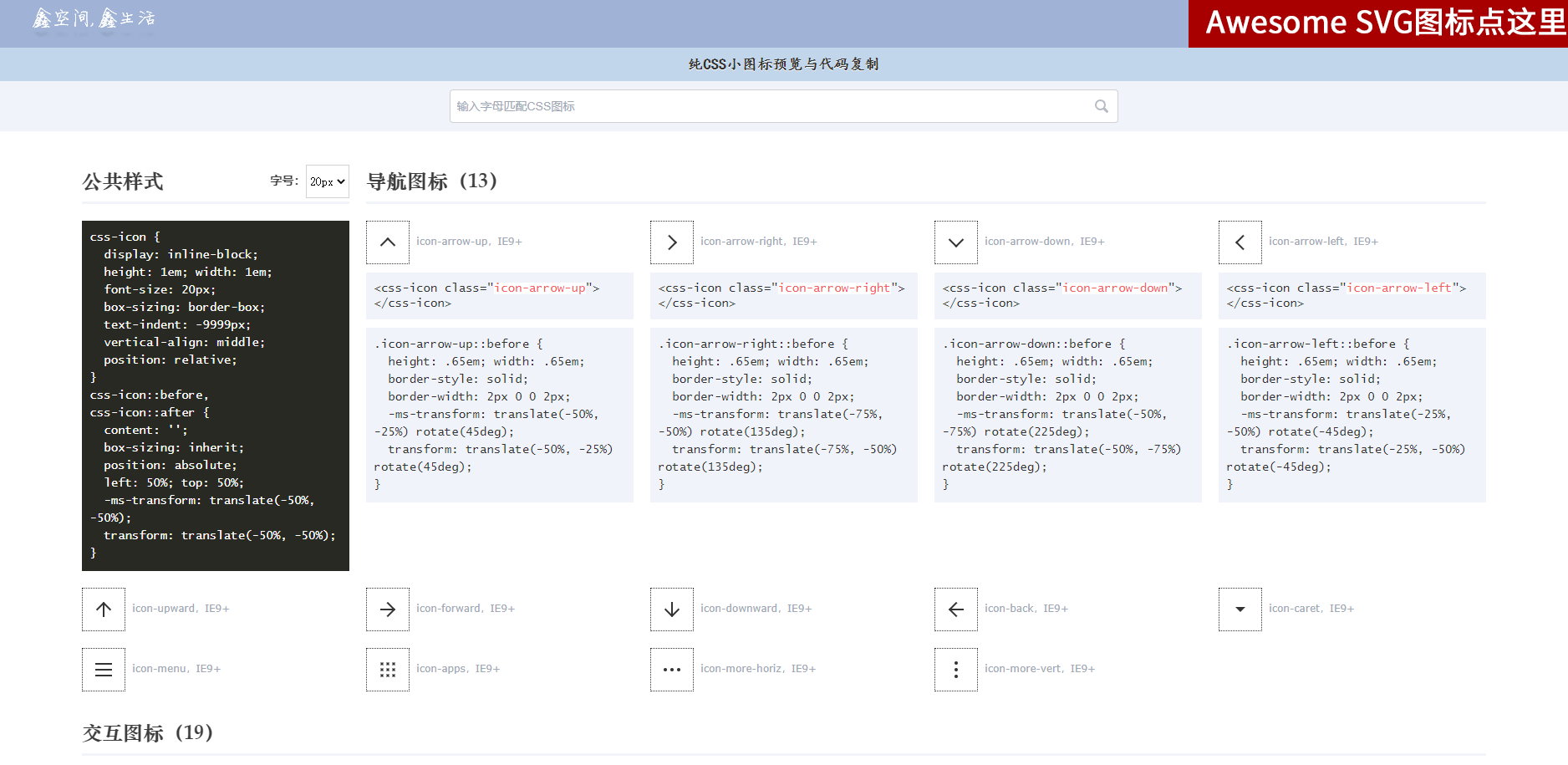
纯CSS小图标预览与代码复制
https://www.zhangxinxu.com/sp/icon/css.php
参考

若有收获,就点个赞吧
0 人点赞
