简介
CoCo 编辑器已开放了自定义控件功能,开发者可以使用 JS 编写属于自己的控件,实现特定的功能。比如实现密码输入框、多行文本输入框、查询天气功能等。
当然,也可以把控件提交给官方,官方通过审核后,上架到控件商城。
自定义控件有两种类型:
可见控件(VisibleWidget)
也就是界面控件,比如按钮、输入框、文本等。 文件格式为
.jsx,比如text.jsx。不可见控件(InvisibleWidget)
这类控件在舞台不可见,一般用于提供系统(原生)能力,所以也称为功能型控件,比如照相机控件、音频控件等。 文件格式为
.js,比如camera.js。
控件文件
控件文件一般由两部分组成,控件类型定义 + 控件实体定义
以 闪烁按钮 控件(可见控件)的文件为例。
附件:blink-button.jsx.txt
下载控件后,将
.txt后缀去掉,语雀不支持.jsx文件上传,所以临时加的.txt后缀。
控件类型定义
// 控件类型定义const types = {type: 'SAMPLE_BLINK_BUTTON_WIDGET',icon: 'https://static.codemao.cn/appcraft/extension-widgets/production/blink-button.svg',title: '闪烁按钮',isInvisibleWidget: false,isGlobalWidget: false,properties: [// ...],methods: [// ...],events: [// ...],};
字段解释:
| 字段 | 解释 | 举例 |
|---|---|---|
| type | 控件类型,全局唯一 命名规范:大写字母加下划线组成 |
SAMPLE_BLINK_BUTTON_WIDGET |
| icon | 控件图标的链接,一般使用 SVG。 注:可以去 https://www.iconfont.cn/ 下载 SVG,然后上传到 CoCo 的素材库,然后复制 URL。 |
https://static.codemao.cn/appcraft/extension-widgets/production/blink-button.svg |
| title | 控件的显示名称 | 闪烁按钮 |
| isInvisibleWidget | 是否不可见控件 不可见控件 true 可见控件 false |
false |
| properties | 控件的属性列表 | 按钮的宽度 输入框的文本 请求的超时事件 |
| methods | 控件的方法列表 | 发送 Get 请求 计数器开始计数 轮播切换到下一张 |
| events | 控件的事件列表 | 当按钮被点击 当输入框获得焦点时 当请求成功时 |
控件属性(properties)
代码如下:
const types = {properties: [{key: '__width', // 内置属性label: '宽度',valueType: 'number', // 数字类型defaultValue: 68,},{key: '__height', // 内置属性label: '高度',valueType: 'number', // 数字类型defaultValue: 36,},{key: 'content',label: '按钮文案',valueType: 'string', // 字符串类型defaultValue: '按钮',},{key: 'disabled',label: '是否禁用',valueType: 'boolean', // 布尔类型defaultValue: false,},{key: 'mode',label: '模式',valueType: 'string',defaultValue: 'mode1',dropdown: [ // 下拉属性{ label: '模式一', value: 'mode1' },{ label: '模式二', value: 'mode2' }],},{key: 'backgroundColor',label: '按钮颜色',valueType: 'color', // 颜色类型defaultValue: '#1495ef',},],};
生成的积木如下: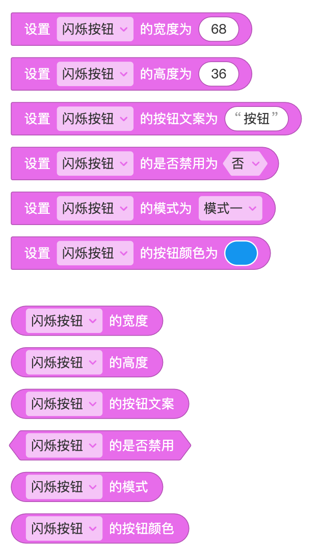
字段解释:
| 属性 | 解释 |
|---|---|
| key | 控件的属性 命名规范:英文 + 数字组成,不能以数字开头 |
| label | 属性的显示名称,一般是中文 |
| valueType | 属性的类型,当前支持'number'、'string'、'boolean'、color三种类型。 |
| defaultValue | 属性的默认值,默认值要与 valueType 相对应,比如 valueType 为 boolean 时,defaultValue 应该为 false 或者 true。 |
| dropdown | 选填,如果属性的值为特定的几个值时,可以使用 dropdown,避免手动输入。 |
注:
__width、__height为可见控件内置属性,当控件拖到舞台时,控件默认的宽高为__widget、__height属性对应的defaultValue值。
控件方法(methods)
代码如下,有删减:
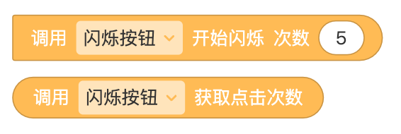
const types = {methods: [{key: 'blink',label: '开始闪烁',params: [{key: 'times',label: '次数',valueType: 'number',defaultValue: 5,},],},{key: 'getClickCount',label: '获取点击次数',params: [],valueType: 'number', // 方法有返回值},],};
生成的积木如下: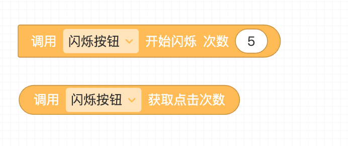
字段解释:
| 属性 | 解释 |
|---|---|
| key | 方法名 命名规范:英文 + 数字组成,不能以数字开头 |
| label | 方法的显示名称,一般为中文 |
| params | 方法的参数列表 |
| params.key | 参数名,命名规则:英文 + 数字组成,不能以数字开头 |
| params.label | 参数的显示名称,一般为中文 |
| params.valueType | 参数的类型,当前支持'number'、'string'、'boolean'三种类型 |
| params.dropdown | 选填,如果参数的值为特定的几个值时,可以使用 dropdown,避免手动输入。 |
| valueType | 选填,当方法有返回值时设置 valueType |
控件事件(events)
代码如下,有删减:
const types = {events: [{key: 'onClick',label: '被点击',params: [{key: 'content',label: '按钮文案',valueType: 'string',},]}]};
生成的积木如下: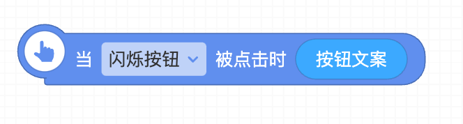
字段解释:
| 属性 | 解释 |
|---|---|
| key | 事件名 命名规范:英文 + 数字组成,不能以数字开头 |
| label | 事件显示名称,一般为中文 |
| params | 事件的参数列表 |
| params.key | 参数名,命名规则:英文 + 数字组成,不能以数字开头 |
| params.label | 参数的显示名称,一般为中文 |
| params.valueType | 参数的类型,当前支持'number'、'string'、'boolean'三种类型 |
控件实体定义
控件实体是一个继承 isInvisibleWidget 或者 VisibleWidget 的类,其中包含初始化、方法定义、事件触发、渲染(仅可见控件)等。
在运行时,会根据控件的属性值初始化一个实例对象。
class BlinkButtonWidget extends VisibleWidget {// 初始化constructor(props) {super(props);this.content = props.content;this.disabled = props.disabled;this.mode = props.mode;this.backgroundColor = props.backgroundColor;this.clickCount = 0;}// 方法定义,用于事件处理onClick = () => {this.emit('onClick', this.content);this.clickCount++;};// 方法定义blink = (times) => {// 开始闪烁for (let i = 0; i < times; i++) {setTimeout(() => {this.setProps({backgroundColor: getRandomColor(),});}, i * 100);}};getClickCount = () => {return this.clickCount;};// 渲染函数render() {return (<buttononClick={this.onClick}disabled={this.disabled}style={{background: this.disabled ? '#ccc' : this.backgroundColor,borderRadius: this.mode === 'mode1' ? 5 : 0,fontWeight: this.mode === 'mode1' ? 'bold' : 'normal',width: '100%',height: '100%',border: 'none',color: '#fff',}}>{this.content}</button>);}}
初始化
将控件的属性通过 props 传入,这里的 props 其实就是控件类型定义中的 properties 中的属性,包含 __width(内置)、__height(内置)、content、disabled、mode等属性。
注:
__width、__height为内置属性,非必要情况下,在自定义控件中不建议使用内置属性。
class BlinkButtonWidget extends VisibleWidget {constructor(props) {super(props);this.content = props.content;this.disabled = props.disabled;this.mode = props.mode;this.backgroundColor = props.backgroundColor;this.clickCount = 0;}}
方法定义
在控件类型定义中,定义了两个方法,blink 和 getClickCount,对应的我们需要在控件实体中定义同名的两个方法,方法的参数类型和数量也需要一致,如下:
class BlinkButtonWidget extends VisibleWidget {// 方法定义blink = (times) => {// 开始闪烁for (let i = 0; i < times; i++) {setTimeout(() => {this.setProps({backgroundColor: getRandomColor(),});}, i * 100);}};// 获取按钮点击次数getClickCount = () => {return this.clickCount;};}
当执行以下两个积木时,会调用上边定义的 blink 和 getClickCount 方法。
事件触发
事件触发有很多场景,比如按钮被点击时、发送请求获取天气成功时、输入框失去焦点等等
在控件实体中,可以通过父级类提供的 emit方法触发指定的事件,格式为 this.emit('eventName', param1, param2, ...),可以不传入参数,也可以传入一个或多个参数。比如:
this.emit('onClick', content);this.emit('onGetApiSuccess', code, data);this.emit('onInputBlur');
如果通过积木注册监听了闪烁按钮的点击事件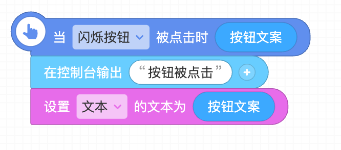
当在控件实体中调用 this.emit('onClick', '提交')时,以上积木将会执行,并且参数积木按钮文案的值为 提交。
渲染方法(render)
class BlinkButtonWidget extends VisibleWidget {// 渲染方法render() {return (<buttononClick={this.onClick}disabled={this.disabled}style={{background: this.disabled ? '#ccc' : this.backgroundColor,borderRadius: this.mode === 'mode1' ? 5 : 0,fontWeight: this.mode === 'mode1' ? 'bold' : 'normal',width: '100%',height: '100%',border: 'none',color: '#fff',}}>{this.content}</button>);}}
可见控件需要定义 render 函数,用于在屏幕(舞台)上生成 UI 界面,这里使用了 JSX 语法。
有的 UI 元素需要响应用户的操作,比如鼠标点击、键盘输入等,通过在元素指定 onClick、onKeyDown 等的处理函数,在函数中触发事件,即可执行响应的逻辑。
注:不可见控件不需要定义
render函数
两种控件区别
1、基础字段isInvisibleWidget 的值不同
可见控件 isInvisibleWidget: false
不可见控件isInvisibleWidget: true
2、文件格式
可见控件.jsx
不可见控件.js
3、继承的类不同
可见控件继承 VisibleWidget
不可见控件继承 InvisibleWidget
4、定义 render 方法
可见控件必须定义 render 方法,通过该方法渲染指定的内容到屏幕上;
不可见控件因为不需要渲染,不需要提供 render 方法。
5、设置属性的方式
不可见控件不需要渲染,设置属性的方式比较简单,直接 this.value = newValue 即可;
可见控件设置属性,需要显式地调用 setProps 方法,比如 this.setProps({ 'value': newVale }),该方法调用完成后,会自动渲染一次。

若有收获,就点个赞吧
0 人点赞
