https://www.bilibili.com/video/BV14J4114768?p=499
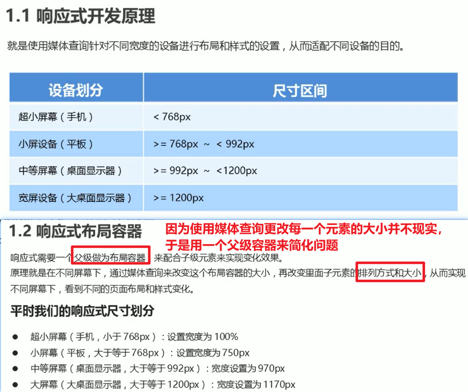
响应式开发
<!DOCTYPE html><html lang="en"><head><title>响应式导航</title><style>* {margin: 0;padding: 0;}ul {list-style: none;}.container {width: 750px;margin: 0 auto;}.container ul li {float: left;width: 93.75px;height: 30px;background-color: green;}@media screen and (max-width: 767px) {.container {width: 100%;}.container ul li {width: 33.33%;}}</style></head><body><div class="container"><ul><li>导航栏</li><li>导航栏</li><li>导航栏</li><li>导航栏</li><li>导航栏</li><li>导航栏</li><li>导航栏</li><li>导航栏</li></ul></div></body></html>
Bootstrap框架
中文官网:https://www.bootcss.com/
官网:https://getbootstrap.com/
Bootstrap栅格系统
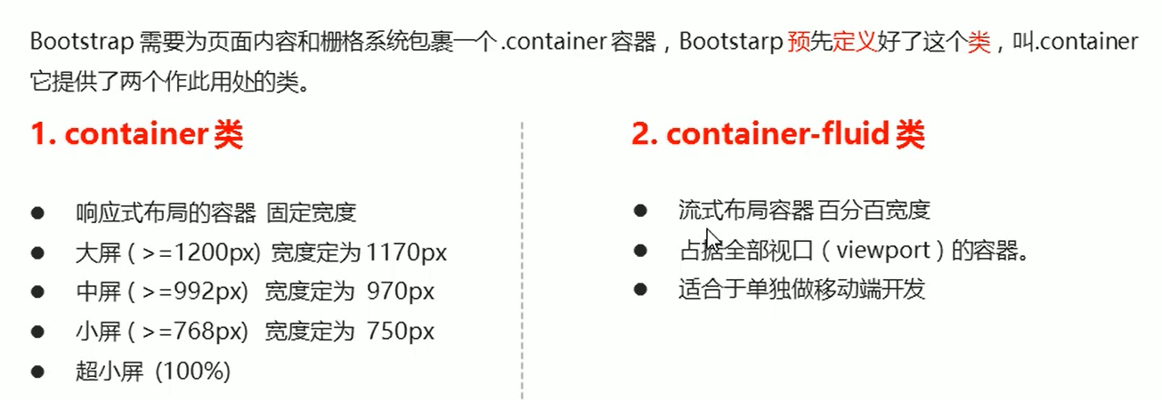
布局容器
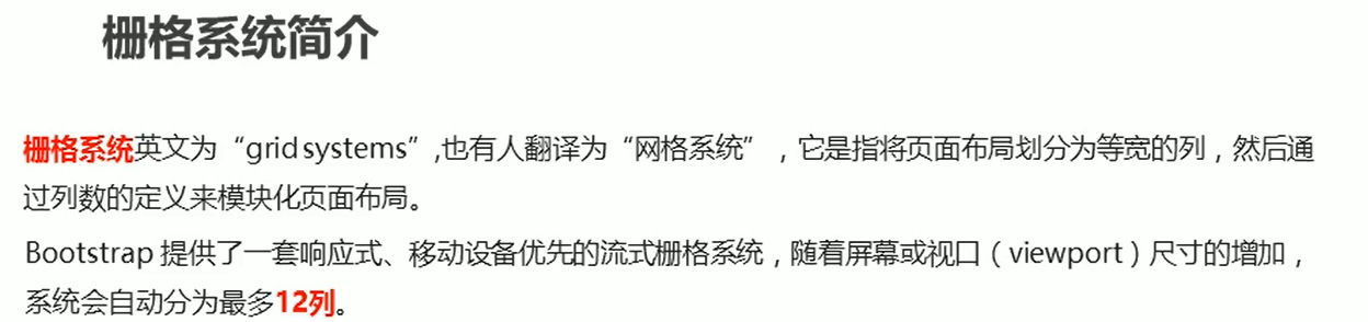
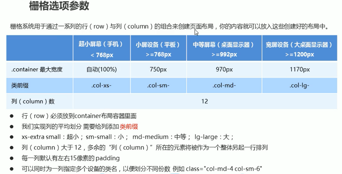
栅格系统

若有收获,就点个赞吧
0 人点赞
