导入函数库
import numpy as npimport pandas as pdimport matplotlib.pyplot as plt%matplotlib inlineimport warningswarnings.filterwarnings('ignore')#不发出警告from bokeh.io import output_notebookoutput_notebook()#导入output_notebook绘图模块from bokeh.plotting import figure, showfrom bokeh.models import ColumnDataSource#导入图表绘制、图表展示模块#导入ColumnDataSource模块
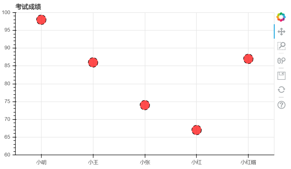
轴线标签设置
设置子字符串
# 1、轴线标签设置# 设置字符串df = pd.DataFrame({'score' : [98, 86, 74, 67, 87]}, index = ['小明', '小王', '小张', '小红', '小红帽'])df.index.name = 'name'#创建数据source = ColumnDataSource(df)#将数据转换为ColumnDataSource对象name = df.index.tolist()p = figure(x_range = name, y_range = (60, 100), plot_height = 350, title = '考试成绩')#通过x_range设置横轴标签为名字,这里提取成listp.circle(x = 'name', y = 'score', source = source,size = 20, #设置点大小line_color = 'black', #设置点外边圈的颜色line_dash = [6, 4], #设置点外边圈的为虚线显示fill_color = 'red', #设置点填充颜色为红色fill_alpha = 0.7 #设置点填充颜色的透明度)show(p)
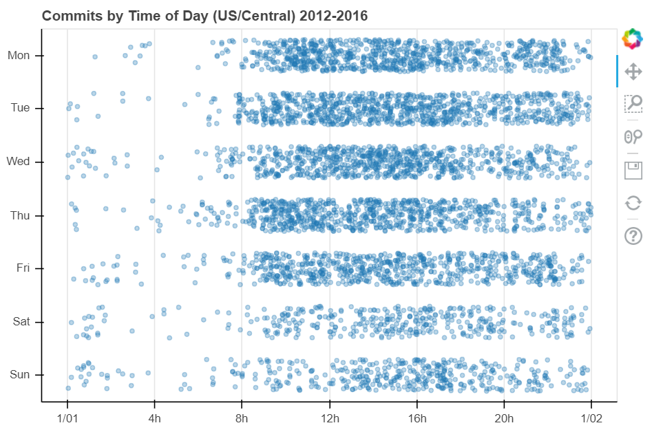
时间序列设置
# 1、轴线标签设置# 时间序列设置# Dataframe DatetimeIndex + x_axis_typefrom bokeh.sampledata.commits import dataprint(data.head())print(type(data.head()))DAYS = ['Sun', 'Sat', 'Fri', 'Thu', 'Wed', 'Tue', 'Mon']source = ColumnDataSource(data)#转化为ColumnDataSource对象p = figure(plot_width = 800, plot_height = 500,y_range = DAYS,x_axis_type = 'datetime',title = 'Commits by Time of Day (US/Central) 2012-2016')p.circle(x = 'time', y = 'day', source = source, alpha = 0.3)#生成散点图p.ygrid.grid_line_color = None#设置其他参数show(p)

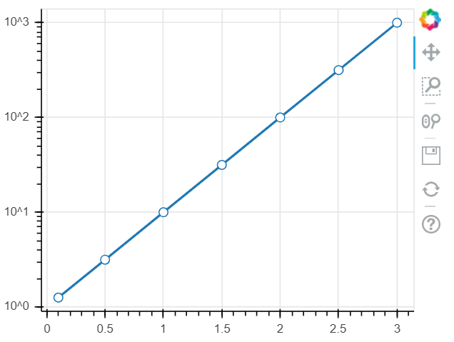
设置对数坐标轴
# 1、轴线标签设置# 设置对数坐标轴x = [0.1, 0.5, 1.0, 1.5, 2.0, 2.5, 3.0]y = [10**xx for xx in x ]#创建数据p = figure(plot_width = 400, plot_height = 300, y_axis_type = 'log')# y_axis_type="log" → 对数坐标轴p.line(x, y, line_width = 2)p.circle(x, y, size = 8, fill_color = 'white')show(p)
浮动数据设置
设置浮动数据,需要用到Bokeh中一个Jitter的参数,其目的是为了将数据不重叠,将图中的点在一定范围内进行浮动显示,具体参数可以参考如下链接Bokeh浮动数据文档
# 2、浮动设置# Jitter# 参考文档:https://bokeh.pydata.org/en/latest/docs/reference/transform.htmlfrom bokeh.sampledata.commits import datafrom bokeh.transform import jitterDAYS = ['Sun', 'Sat', 'Fri', 'Thu', 'Wed', 'Tue', 'Mon']source = ColumnDataSource(data)#转化为ColumnDataSource对象p = figure(plot_width = 600, plot_height = 400,y_range = DAYS, #设置图表的y轴刻度分类x_axis_type = 'datetime', #设置x轴类型--时间序列title = 'Commits by Time of Day (US/Central) 2012-2016',tools = 'hover' #为每一个散点做一个表示,鼠标放在散点上可查看信息)p.circle(x = 'time',y = jitter('day', width = 0.6, range = p.y_range),source = source, alpha = 0.3)# jitter参数 → 'day':第一参数,这里指y的值,width:间隔宽度比例,range:分类范围对象,这里和y轴的分类一致p.ygrid.grid_line_color = None#设置其他参数show(p)
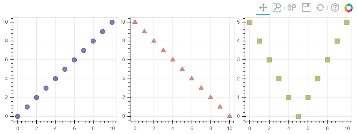
多图表设置
# 3、多图表设置# gridplotfrom bokeh.layouts import gridplot# 导入gridplot模块x = list(range(11))y0 = xy1 = [10-xx for xx in x]y2 = [abs(xx-5) for xx in x]# 创建数据s1 = figure(plot_width=250, plot_height=250, title=None)s1.circle(x, y0, size=10, color="navy", alpha=0.5)# 散点图1s2 = figure(plot_width=250, plot_height=250, x_range=s1.x_range, y_range=s1.y_range, title=None)s2.triangle(x, y1, size=10, color="firebrick", alpha=0.5)# 散点图2,设置和散点图1一样的x_range/y_range → 图表联动s3 = figure(plot_width=250, plot_height=250, x_range=s1.x_range, title=None)s3.square(x, y2, size=10, color="olive", alpha=0.5)# 散点图3,设置和散点图1一样的x_range/y_range → 图表联动p = gridplot([[s1, s2, s3]])#p = gridplot([[s1, s2], [None, s3]])# 组合图表show(p)#图表联动,放大缩小一个表,其他表也会发生相应的变化
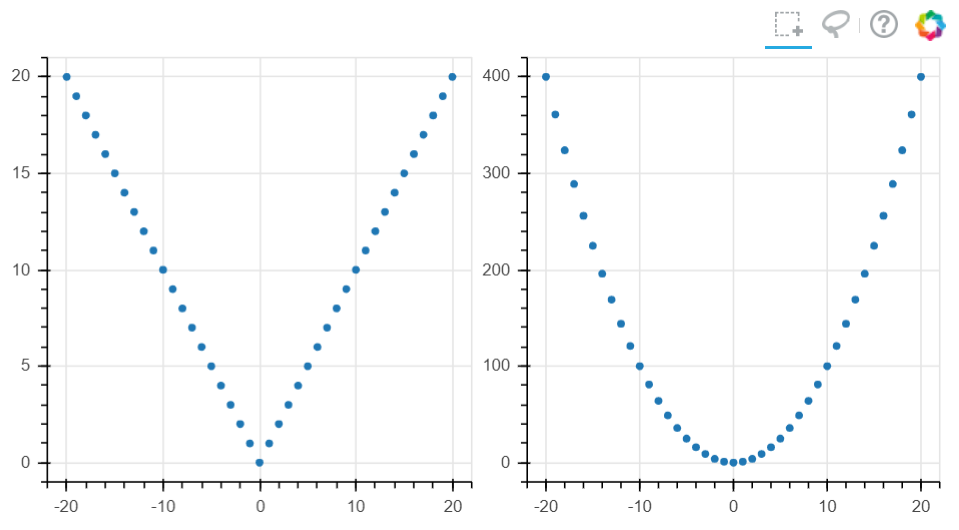
# 3、多图表设置# gridplotx = list(range(-20, 21))y0 = [abs(xx) for xx in x]y1 = [xx**2 for xx in x]source = ColumnDataSource(data=dict(x=x, y0=y0, y1=y1))# 创建数据TOOLS = "box_select,lasso_select,help"left = figure(tools=TOOLS, plot_width=300, plot_height=300, title=None)left.circle('x', 'y0', source=source) # 散点图1right = figure(tools=TOOLS, plot_width=300, plot_height=300, title=None)right.circle('x', 'y1', source=source) # 散点图2# 共用一个ColumnDataSourcep = gridplot([[left, right]])# 组合图表show(p)#可以通过使用同一组数据,实现图表的联动

若有收获,就点个赞吧
0 人点赞
