本章节学习Bokeh的基本操作,Bokeh是一款基于Web的绘图工具库,其会出的图像保存方式以html文件为主,其是一款交互式的可视化Python库,其特点如下:
- 专门针对Web浏览器的交互式、可视化Python绘图库;
- 可以做出D3.js简洁漂亮的交互可视化效果,但其难度低于D3.js;
- 独立的HTML文档或服务端程序;
- 可以处理大量、动态或数据流;
- 支持Python、R、Scala等语言;
- 无需使用JavaScript
概念性的东西无需多讲,直接看代码:
import pandas as pdimport numpy as npimport matplotlib.pyplot as plt%matplotlib inline#不发出警告import warningswarnings.filterwarnings('ignore')from bokeh.plotting import figure, show#导入图表绘制、图表展示模块from bokeh.io import output_notebook#导入notebook绘图模块output_notebook() #选择以notebook的形式输出p = figure(plot_width = 400, plot_height = 400)#创建图表,设置宽度和高度p.circle([1, 2, 3, 4, 5], [3, 5, 4, 2, 6], color = 'gray', size = 20)#创建一个圆形散点图show(p)#绘图
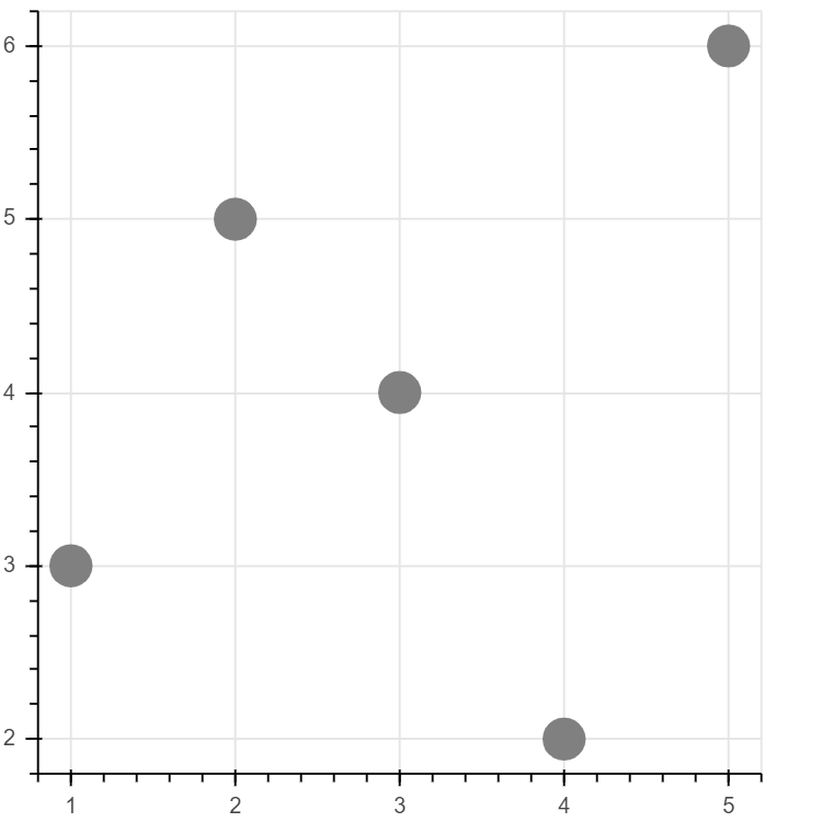
运行结果图
图标的输出形式
事实上Bokeh主流输出方式并不是notebook中,其更多的是生成一个HTML网页,代码如下:
from bokeh.plotting import figure, show, output_file#导入图表绘制、图表展示模块import osos.chdir('C:/Users/RaingEye/Desktop/Python数据分析师微专业/数据表达逻辑:结果输出及内容美化/Python交互图标可视化:Bokeh/')#创建工作目录output_file('line.html')#notebook绘图命令,创建html文件#运行后会弹出html窗口p = figure(plot_width = 400, plot_height = 400) #创建图表,设置宽度、高度p.circle([1, 2, 3, 4, 5], [4, 5, 3, 2, 1], size = 20, color = 'b')show(p)
结果:line.html
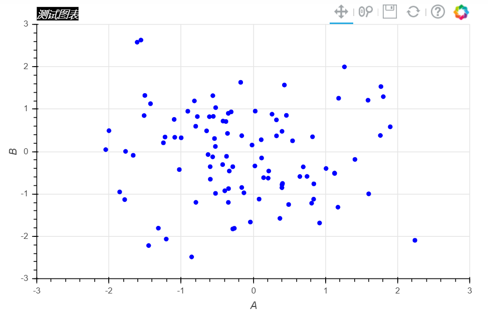
标题的详细设置
df = pd.DataFrame(np.random.randn(100, 2), columns=['A', 'B'])dfp = figure(plot_width = 600,plot_height = 400, #plot_widht和plot_height分别设置图标的宽度和高度tools = 'pan, wheel_zoom,save, reset, help', #设置工具栏,默认全部显示toolbar_location = 'above', #工具栏位置:“above”,“below”,“left”, 'right'x_axis_label = 'A', y_axis_label = 'B', #设置x,y轴的标签,可支持中文x_range = [-3, 3], y_range = [-3, 3], #x轴、y轴的范围title = '测试图表' #设置图表title)p.title.text_color = 'white'p.title.text_font = 'times'p.title.text_font_style = 'italic'p.title.background_fill_color = 'black'#设置标题的颜色,字体,风格,背景颜色p.circle(df['A'], df['B'], size = 5, color = 'blue')show(p)#创建散点图#这里.circle是figure的一个绘图方法
Bokeh也有很多自己的参数,例如:
plot_widht、plot_height:分别设置图表的宽度和高度
tools:设置工具栏,如上图右上角的五个工具栏,其默认全部显示
toolbar_location:设置工具栏的位置,“above”,“below”,“left”, ‘right’分别代表上下左右
x_axis_label,y_axis_label:设置x,y轴的标签,可支持中文
x_range,y_range:设置x,y轴的数据范围
title.text_color、title.text_font、title.text_font_style、title.background_fill_color:分别设置标题的颜色、字体、风格和背景颜色等
tool参考文档:https://bokeh.pydata.org/en/latest/docs/user_guide/tools.html
图表颜色设置
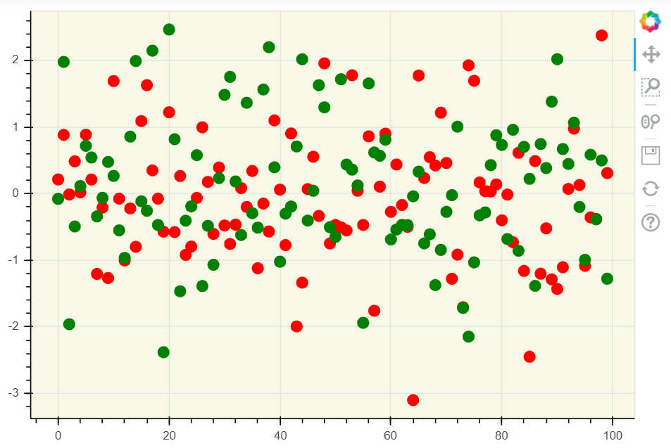
#颜色设置p = figure(plot_width = 600, plot_height = 400)p.circle(df.index, df['A'], color = 'red', size = 10)p.circle(df.index, df['B'], color = 'blue', size = 10)show(p)# 颜色设置# ① 147个CSS颜色,参考网址:http://www.colors.commutercreative.com/grid/# ② RGB颜色值,参考网址:https://coolors.co/87f1ff-c0f5fa-bd8b9c-af125a-582b11
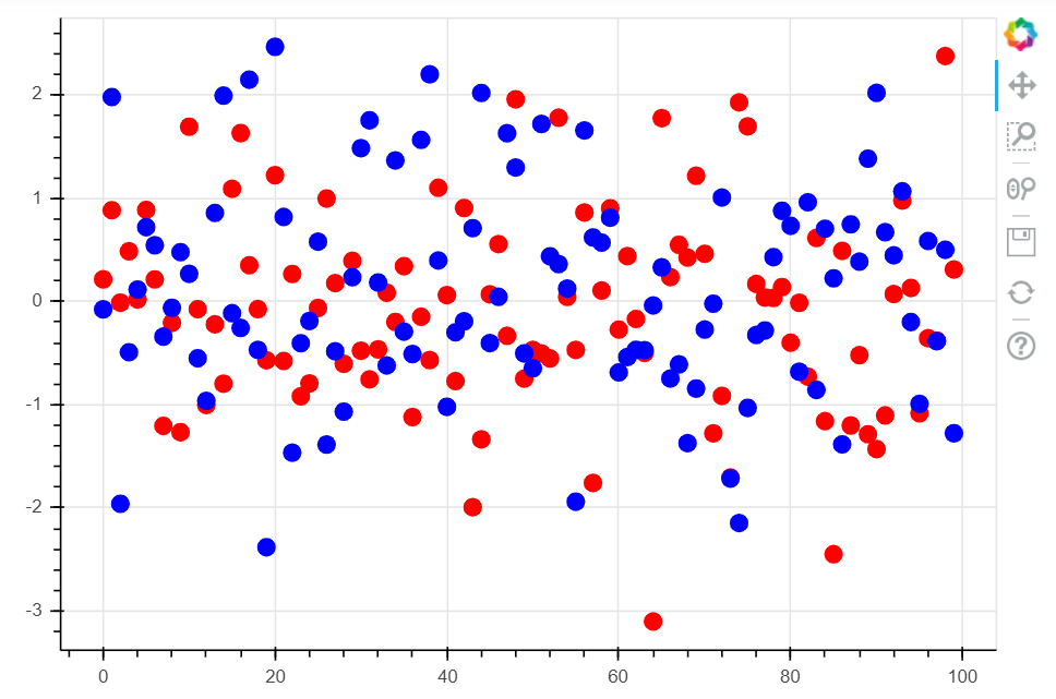
在Bokeh中,颜色设置可以有两种,分别是147个CSS颜色和RGB颜色,如上代码所示,具体颜色可以参考下面两个网站:
147个CSS颜色,参考网址:http://www.colors.commutercreative.com/grid/
RGB颜色值,参考网址:https://coolors.co/87f1ff-c0f5fa-bd8b9c-af125a-582b11
图表边框设置
#图表边框线颜色设置p = figure(plot_width = 600, plot_height = 400)p.circle(df.index, df['A'], color = 'red', size = 10)p.circle(df.index, df['B'], color = 'blue', size = 10)#绘制散点图p.outline_line_width = 7 #边框线宽p.outline_line_alpha = 0.5 #边框线透明度p.outline_line_color = 'navy' #边线框的颜色#设置图表眼边框show(p)
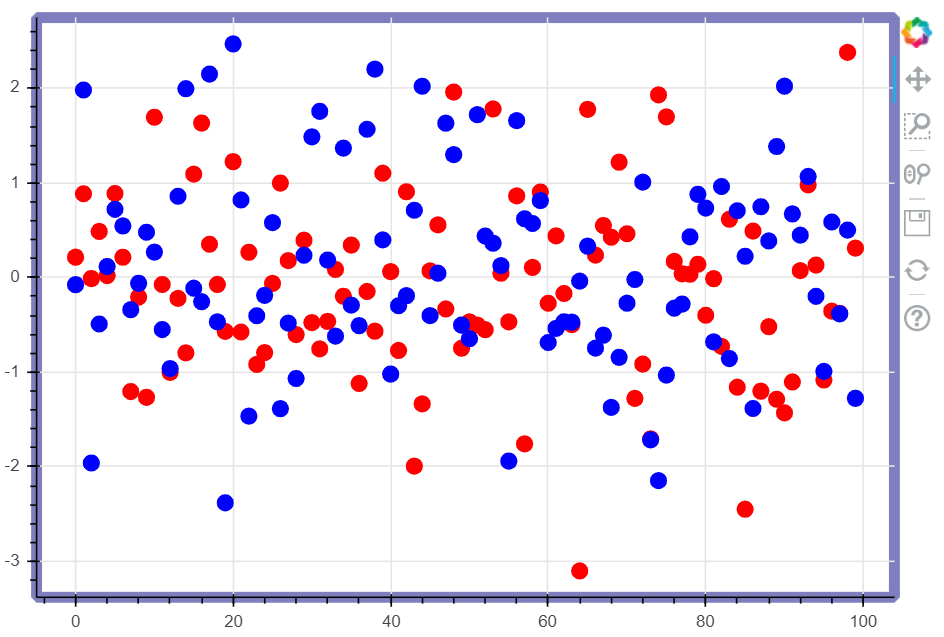
Bokeh对于图表边框的样式也可以进行细化的设置,参数如下:
outline_line_width :边框线宽
outline_line_alpha:边框线透明度
outline_line_color :边线框的颜色,可以设置147个CSS颜色
图表绘图空间背景设置
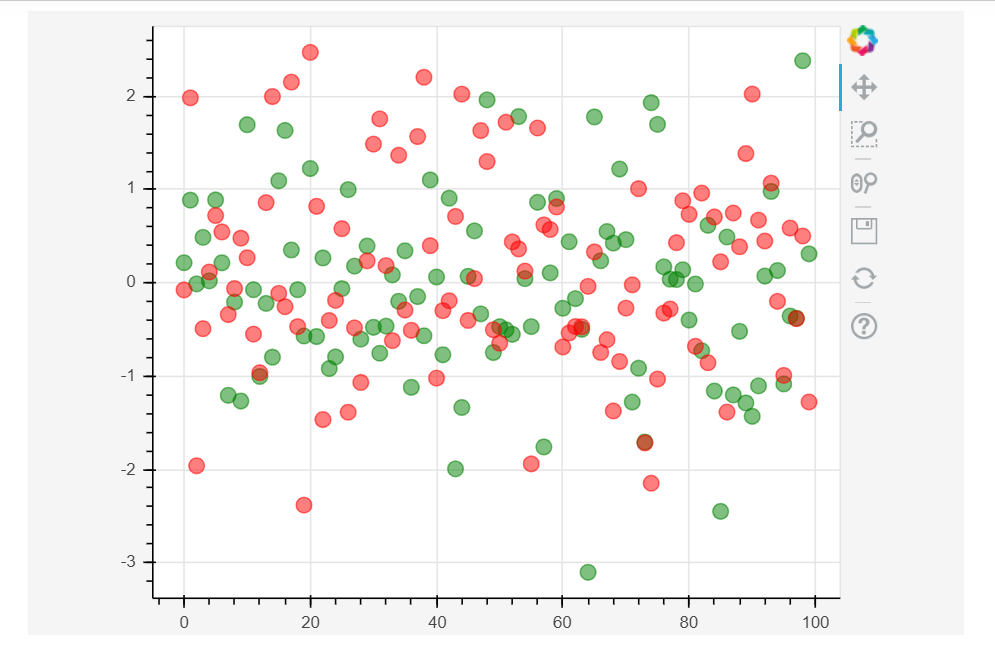
p = figure(plot_width = 600, plot_height = 400)p.circle(df.index, df['A'], size = 10, color = 'red')p.circle(df.index, df['B'], size = 10, color = 'green')#绘制散点图p.background_fill_color = 'beige' #图表的背景颜色p.background_fill_alpha = 0.7 #图表背景颜色的透明度#背景设置参数show(p)
外边界背景设置
# 设置外边界背景p = figure(plot_width=600, plot_height=400)p.circle(df.index, df['A'], color = 'green', size=10, alpha=0.5)p.circle(df.index, df['B'], color = '#FF0000', size=10, alpha=0.5)# 绘制散点图p.border_fill_color = 'whitesmoke' #外边界背景颜色p.border_fill_alpha = 0.5 #外边界背景透明度p.min_border_left = 80 #外边界背景 - 左边宽度p.min_border_right = 80 #外边界背景 - 右边宽度p.min_border_bottom = 10 #外边界背景 - 下宽度p.min_border_top = 10 #外边界背景 - 上宽度show(p)
轴线设置
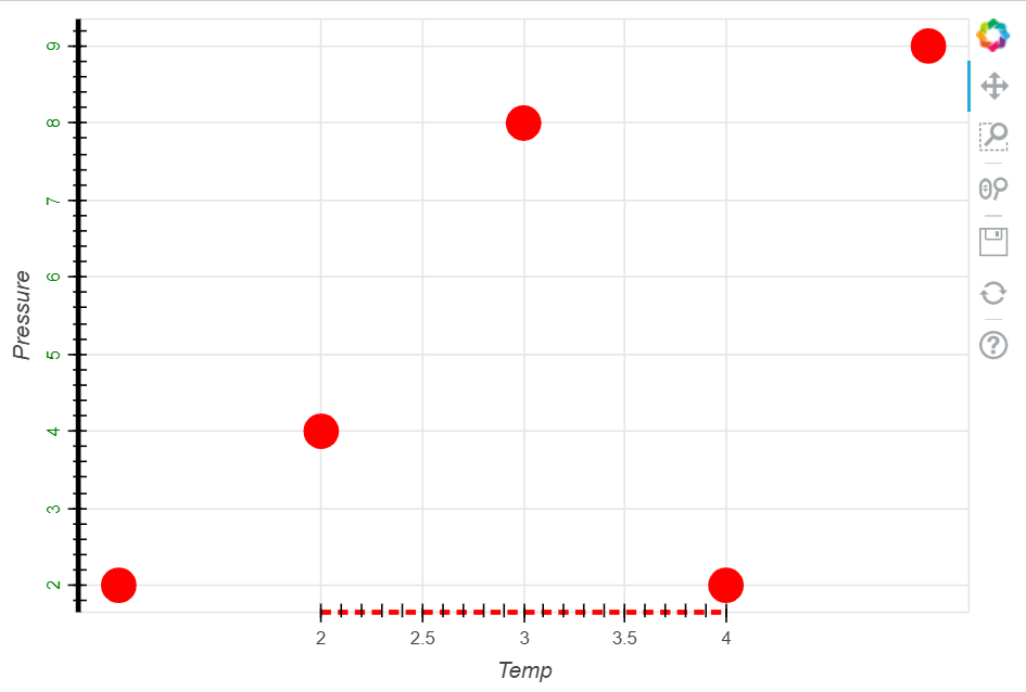
#Axes - 轴线设置#轴线标签、轴线线宽、轴线颜色#字体颜色、字体角度p = figure(plot_width = 600, plot_height = 400)p.circle([1,2,3,4,5], [2,4,8,2,9], size = 20, color= 'red')#绘制散点图p.xaxis.axis_label = 'Temp'p.xaxis.axis_line_width = 3p.xaxis.axis_line_color = 'red'p.xaxis.axis_line_dash = [6, 4] #虚线比例#设置x轴线:标签、线宽、轴线颜色、虚线p.yaxis.axis_label = 'Pressure'p.yaxis.axis_line_width = 3p.yaxis.major_label_text_color = 'green'p.yaxis.major_label_orientation = 'vertical'#设置y轴:标签、字体颜色、字体角度p.axis.minor_tick_in = 5 #刻度往绘图区域内延伸长度p.axis.minor_tick_out = 3 #刻度往绘图区域外延伸长度#设置刻度p.xaxis.bounds = (2, 4)#设置轴线范围show(p)
轴线标签设置
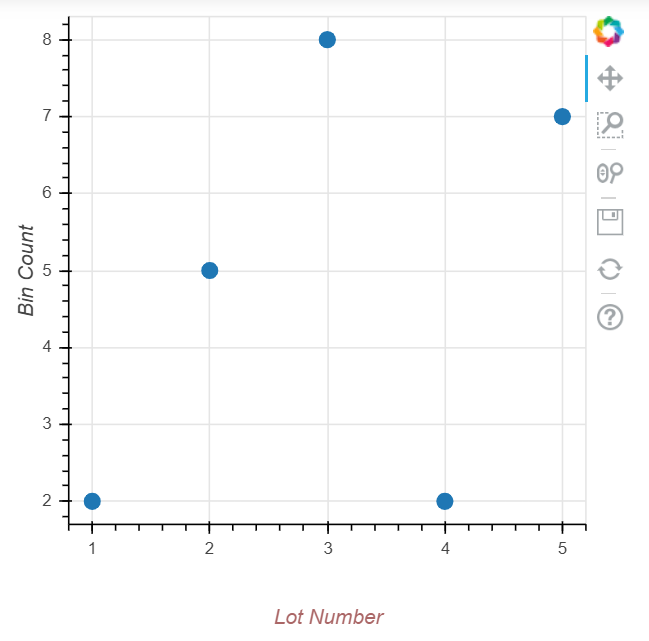
# Axes - 轴线设置# 标签设置p = figure(plot_width=400, plot_height=400)p.circle([1,2,3,4,5], [2,5,8,2,7], size=10)p.xaxis.axis_label = 'Lot Number'p.xaxis.axis_label_text_color = '#aa6666'p.xaxis.axis_label_standoff = 30#设置标签名称、字体颜色、偏移距离p.yaxis.axis_label = 'Bin Count'p.yaxis.axis_label_text_font_style = 'italic'#设置标签名称、字体show(p)
格网设置Grid
线型类型
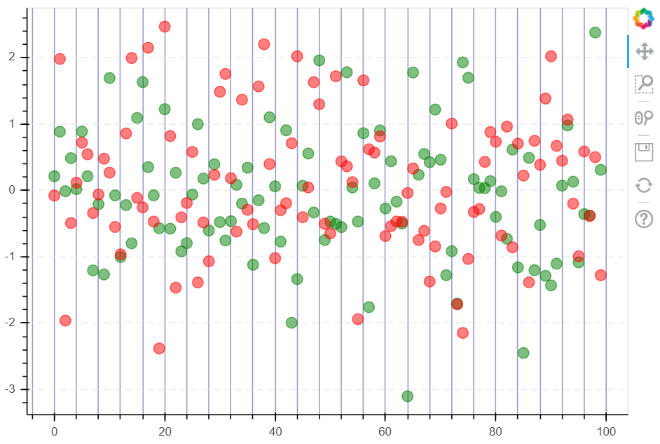
# Grid - 格网设置# 线型设置p = figure(plot_width=600, plot_height=400)p.circle(df.index, df['A'], color = 'green', size=10, alpha=0.5)p.circle(df.index, df['B'], color = '#FF0000', size=10, alpha=0.5)# 绘制散点图#设置x轴线的颜色p.xgrid.grid_line_color = None #为None时,颜色不显示#设置y轴线的颜色p.ygrid.grid_line_alpha = 0.7p.ygrid.grid_line_dash = [6, 4]#设置透明度,须先设置#dash → 通过设置间隔来做虚线p.xgrid.minor_grid_line_color = 'navy'p.xgrid.minor_grid_line_alpha = 0.4#minor_line设置次轴线,即下方紫灰色的竖线show(p)
颜色填充
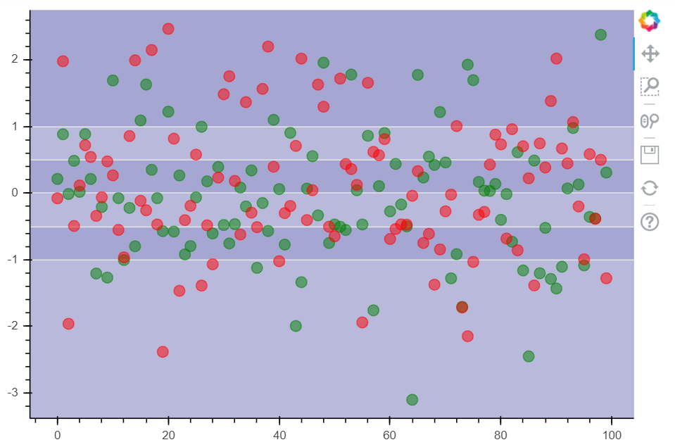
# Grid - 格网设置# 颜色填充p = figure(plot_width=600, plot_height=400)p.circle(df.index, df['A'], color = 'green', size=10, alpha=0.5)p.circle(df.index, df['B'], color = '#FF0000', size=10, alpha=0.5)# 绘制散点图p.xgrid.grid_line_color = None#设置x轴线不显示p.ygrid.band_fill_color = 'navy'p.ygrid.band_fill_alpha = 0.1#设置颜色填充,及透明度p.grid.bounds = (-1, 1)#设置填充边界show(p)
图例设置
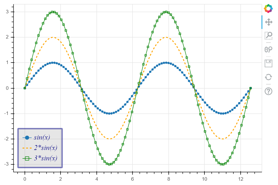
# Legend - 图例设置# 设置方法 → 在绘图时设置图例名称 + 设置图例位置p = figure(plot_width = 600, plot_height = 400)#创建图表x = np.linspace(0, 4*np.pi, 100)y = np.sin(x)#设置x, yp.circle(x, y, legend = "sin(x)")#绘制散点图p.line(x, y, legend = 'sin(x)')#绘制曲线图(连线图,将点连成线)#绘制line1,设置图例名称p.line(x, 2*y, legend = '2*sin(x)', line_dash = [4, 4], line_color = "orange", line_width = 2)#绘制line2,设置图例名称p.square(x, 3*y, legend = "3*sin(x)", fill_color = None, line_color= "green")#square为方形散点图p.line(x, 3*y, legend = "3*sin(x)", line_color = 'green')#绘制line3,设置图例名称p.legend.location = 'bottom_left'# 设置图例位置:"top_left"、"top_center"、"top_right" (the default)、"center_right"、"bottom_right"、"bottom_center"# "bottom_left"、"center_left"、"center"p.legend.orientation = 'vertical'# 设置图例排列方向:"vertical" (默认)or "horizontal"p.legend.label_text_font = "times"p.legend.label_text_font_style = 'italic' #斜体p.legend.label_text_color = 'navy'p.legend.label_text_font_size = "12pt"#设置图例字体、风格、颜色、大小p.legend.border_line_width = 3p.legend.border_line_color = "navy"p.legend.border_line_alpha = 0.5#设置图例边框:跨度、颜色、透明度p.legend.background_fill_color = 'gray'p.legend.background_fill_alpha = 0.2#设置图例背景颜色和透明度show(p)
本章节总结
Line Properties → 线设置
Fill Properties → 填充设置
Text Properties → 字体设置
1、Line Properties → 线设置
(1)line_color,设置颜色
(2)line_width,设置宽度
(3)line_alpha,设置透明度
(4)line_join,设置连接点样式:’miter’ miter_join,’round’ round_join,’bevel’ bevel_join
(5)line_cap,设置线端口样式,’butt’ butt_cap,’round’ round_cap,’square’ square_cap
(6)line_dash,设置线条样式,’solid’,’dashed’,’dotted’,’dotdash’,’dashdot’,或者整型数组方式(例如[6,4])
2、Fill Properties → 填充设置
(1)fill_color,设置填充颜色
(2)fill_alpha,设置填充透明度
3、Text Properties → 字体设置
(1)text_font,字体
(2)text_font_size,字体大小,单位为pt或者em( ‘12pt’, ‘1.5em’)
(3)text_font_style,字体风格,’normal’ normal text,’italic’ italic text,’bold’ bold text
(4)text_color,字体颜色
(5)text_alpha,字体透明度
(6)text_align,字体水平方向位置,’left’, ‘right’, ‘center’
(7)text_baseline,字体垂直方向位置,’top’,’middle’,’bottom’,’alphabetic’,’hanging’
4、可见性
p.xaxis.visible = False
p.xgrid.visible = False
基本参数中都含有.visible参数,设置是否可见

若有收获,就点个赞吧
0 人点赞
