导入模块
import numpy as npimport pandas as pdimport matplotlib.pyplot as plt%matplotlib inlineimport warningswarnings.filterwarnings('ignore')#不发出警告from bokeh.io import output_notebookoutput_notebook()#导入绘图模块output_notebookfrom bokeh.plotting import figure, show#导入图表绘制模块、显示模块
折线图
单线图
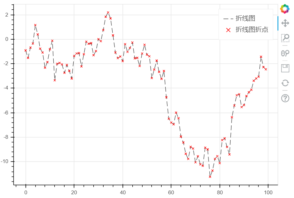
# 1、折线图 - 单线图

df = pd.DataFrame({'value' : np.random.randn(100).cumsum()})
# 创建数据

p = figure(plot_width = 600, plot_height = 400)
p.line(df.index, df['value'],
       line_color = 'black',   #设置线的颜色
       line_width = 1,      #设置线宽
       line_alpha = 0.7,       #设置线的透明度
       line_dash = [10, 5],    #设置线虚线显示
       legend = '折线图'
      )   #线型基本设置


p.x(df.index, df['value'], color = 'red', legend = '折线图折点')
#绘制折点

show(p)
ColumnDataSource绘制单线图
from bokeh.models import ColumnDataSource
#导入ColumnDataSource模块
#将数据存储在ColumnDataSource对象
# 参考文档:http://bokeh.pydata.org/en/latest/docs/user_guide/data.html
# 可以将dict、Dataframe、group对象转化为ColumnDataSource对象

df = pd.DataFrame({'value':np.random.randn(100).cumsum()})
#创建数据

df.index.name = 'index'
source = ColumnDataSource(data = df)
# 转化为ColumnDataSource对象
# 这里注意了,index和columns都必须有名称字段

p = figure(plot_width = 600, plot_height = 400)
p.line(x = 'index', y = 'value', source = source,   #设置x、y值和数据源source
       line_width = 1, line_alpha = 0.7, line_color = 'green', legend = '折线'
      )
p.x(x = 'index', y = 'value', source = source,
   size = 5, color = 'red', alpha = 0.8, legend = '折点')
#绘制折点

p.legend.location = 'bottom_right'  #设置标签位置
show(p)

多线图—multi_line
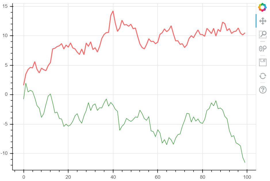
# 1、折线图 - 多线图
# ① multi_line

df = pd.DataFrame({'A':np.random.randn(100).cumsum(), 'B' :np.random.randn(100).cumsum()})
#创建数据

p = figure(plot_width = 600, plot_height = 400)
p.multi_line([df.index, df.index], [df['A'], df['B']],   #设置x,y的值
             color = ['red', 'green'],   #设置两条折线的颜色
             alpha = [0.6, 0.8],   #设置两条折线的透明度, 可同时设施alpha =  0.6
             line_width = [2, 1],   #设置两条折线的粗细     可同时这是line_width = 1
            )

# 绘制多段线
# 这里由于需要输入具体值,故直接用dataframe,或者dict即可

show(p)
多线图—使用多个line绘制
# 1、折线图 - 多线图
# ② 多个line

x = np.linspace(0.1, 5, 100)
#创建x值

p = figure(title = 'log axis example',
           y_axis_type = 'log',    #设置y轴的数据类型,通用也有x_axis_type,默认值为‘auto’,此外还可以为:‘linear’,‘datetime’,‘log’,‘mercatro’
          y_range = (0.001, 10**22)   #设置y轴的数据范围,同样还有 x_range
          )
#这里设置对数坐标轴

p.line(x, np.sqrt(x), legend = 'y = sqrt(x)', line_color = 'tomato', line_dash = 'dotdash')
#line1

p.line(x, x, legend = 'y = x')
p.circle(x, x, legend = 'y = x')
#line2 折线图+散点图

p.line(x, x**2, legend = 'y = x**2')
p.circle(x, x**2, legend = 'y = x**2', fill_color = None, line_color = 'olivedrab')
#line3

p.line(x, 10**x, legend = 'y = 10^x')
p.circle(x, 10**x, legend = 'y = 10^x', line_color = 'gold', line_width = 2)
#line4

p.line(x, x**x, legend = 'y = x^x', line_dash = 'dotted', line_color = 'indigo', line_width = 2)
#line5

p.line(x, 10**(x**2), legend = 'y = 10^(x^2)', line_color = 'coral', line_dash = 'dashed', line_width = 2)
#line6

p.legend.location = 'top_left'
p.xaxis.axis_label = 'Domain'
p.yaxis.axis_label = 'Values (log scale)'
#设置图例及label

show(p)

面积图
单维度面积图
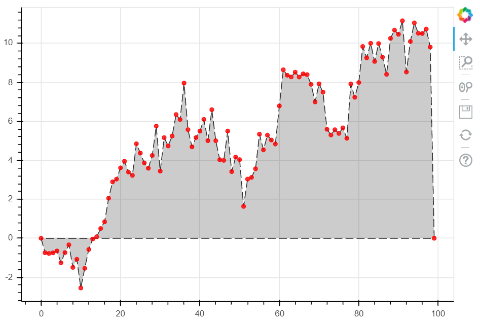
# 2、面积图 - 单维度面积图
s = pd.Series(np.random.randn(100).cumsum())
s.iloc[0] = 0
s.iloc[-1] = 0
# 创建数据
# 注意设定起始值和终点值为最低点

p = figure(plot_width = 600, plot_height = 400)
p.patch(s.index, s.values,   #设置x,y的值
        line_width = 1,
        line_alpha = 0.8,
        line_color = 'black',
        line_dash = [10, 4],
        fill_color = 'black',
        fill_alpha = 0.2
       )
#绘制面积图
#.patch将会把所有的点连接成一个闭合的面

p.circle(s.index, s.values, size = 5, color = 'red', alpha = 0.8 )
#绘制折点

show(p)
堆叠面积图
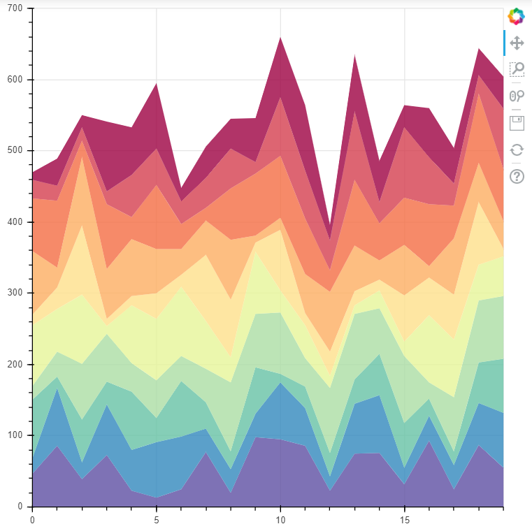
# 2、面积图 - 面积堆叠图

from bokeh.palettes import brewer
# 导入brewer模块

N = 20
cats = 10
rng = np.random.RandomState(1)
df = pd.DataFrame(rng.randint(10, 100, size=(N, cats))).add_prefix('y')
# 创建数据,shape为(20,10)

df_top = df.cumsum(axis=1)   # 每一个堆叠面积图的最高点
df_bottom = df_top.shift(axis=1).fillna({'y0': 0})[::-1]    # 每一个堆叠面积图的最低点,并反向
df_stack = pd.concat([df_bottom, df_top], ignore_index=True)   # 数据合并,每一组数据都是一个可以围合成一个面的散点集合
# 得到堆叠面积数据

colors = brewer['Spectral'][df_stack.shape[1]]    # 根据变量数拆分颜色
x = np.hstack((df.index[::-1], df.index))         # 得到围合顺序的index,这里由于一列是20个元素,所以连接成面需要40个点

p = figure(x_range=(0, N-1), y_range=(0, 700))
p.patches([x] * df_stack.shape[1],                       # 得到10组index
          [df_stack[c].values for c in df_stack],     # c为df_stack的列名,这里得到10组对应的valyes
          color=colors, alpha=0.8, line_color=None)   # 设置其他参数

show(p)

若有收获,就点个赞吧
0 人点赞
