导入数据包
import numpy as npimport pandas as pdimport matplotlib.pyplot as plt%matplotlib inlineimport warningswarnings.filterwarnings('ignore')#不发出警告from bokeh.io import output_notebookoutput_notebook()#导入绘图模块from bokeh.plotting import figure, showfrom bokeh.models import ColumnDataSource#导入绘图模块、展示模块#导入ColumsDataSource模块
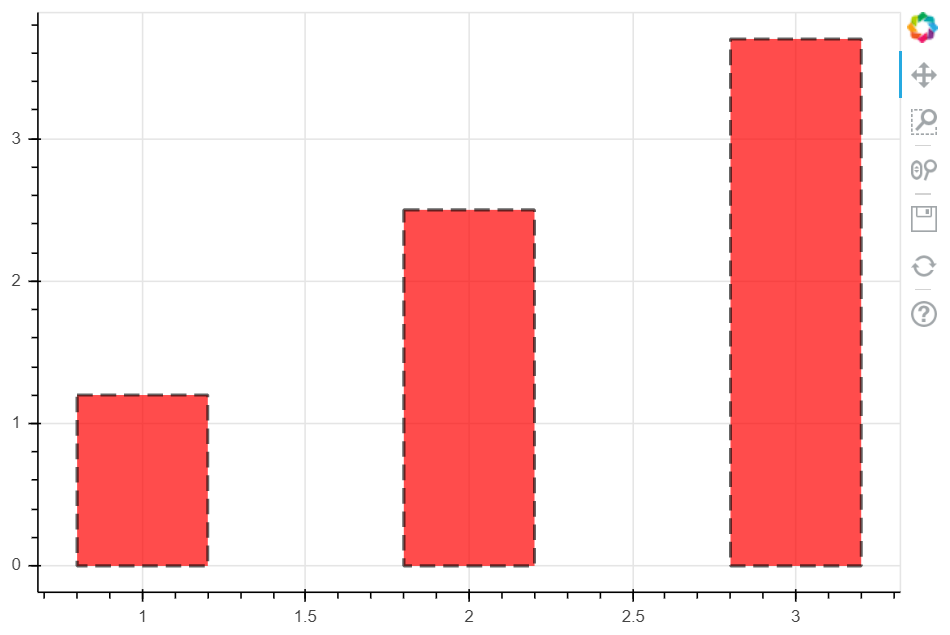
单系列柱状图—vbar
# 1、单系列柱状图# vbar 竖向柱状图p = figure(plot_width = 600, plot_height = 400)p.vbar(x = [1, 2, 3], #设置柱状图的位置,这里数据可以是一个Serice的indexwidth = 0.4, #设置柱状图的宽度bottom = [0, 0, 0], #设置柱状图底部的位置top = [1.2, 2.5, 3.7], #设置柱状图顶部的位置,这里数据可以是一个Serice的valuesline_width = 2, #设置柱状图边框的粗细line_color = 'black', #设置柱状图边框的颜色line_alpha = 0.6, #设置柱状图边框线的透明度line_dash = [10, 5], #设置柱状图边框为虚线显示fill_color = 'red', #设置柱状图内部填充颜色fill_alpha = 0.7, #设置柱状图内部颜色的透明度)show(p)
单系列柱状图—hbar
# 1、单系列柱状图# hbardf = pd.DataFrame({'value' : np.random.randn(100)*10,'color' : np.random.choice(['red', 'yellow', 'blue'], 100)})p = figure(plot_width = 600, plot_height = 400)p.hbar(y = df.index, #设置柱状图的位置height = 0.5, #设置柱状图的宽度left = 0, #设置柱状图左边最小值right = df['value'], #设置柱状图右边的最大值color = df.color #社渚柱状图的颜色)show(p)
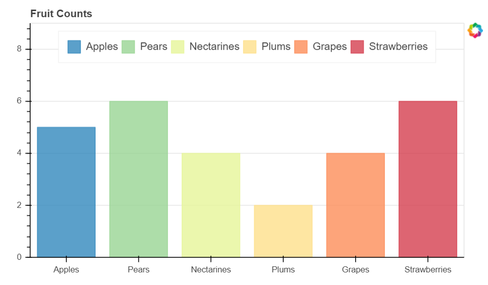
单系列柱状图—分类设置标签(ColumnDataSource)
from bokeh.palettes import Spectral6from bokeh.transform import factor_cmap#导入相关模块fruits = ['Apples', 'Pears', 'Nectarines', 'Plums', 'Grapes', 'Strawberries']counts = [5, 6, 4, 2, 4, 6 ]source = ColumnDataSource(data = dict(fruits = fruits, counts = counts))colors = ['salmon', 'olive', 'darkred', 'goldenrod', 'skyblue', 'orange']#创建一个包含标签的data,对象类型为ColumnDatasourcep = figure(x_range = fruits, y_range = (0, 9), plot_height = 350, title = 'Fruit Counts', tools = '')p.vbar(x = 'fruits', top = 'counts', source = source, #加载数据width = 0.8, alpha = 0.8,color = factor_cmap('fruits', palette=Spectral6, factors=fruits), #设置颜色legend = 'fruits')# 绘制柱状图,横轴直接显示标签# factor_cmap(field_name, palette, factors, start=0, end=None, nan_color='gray'):颜色转换模块,生成一个颜色转换对象# field_name:分类名称# palette:调色盘# factors:用于在调色盘中分颜色的参数# 参考文档:http://bokeh.pydata.org/en/latest/docs/reference/transform.htmlp.xgrid.grid_line_color = Nonep.legend.orientation = 'horizontal'p.legend.location = 'top_center'# 其他参数设置show(p)
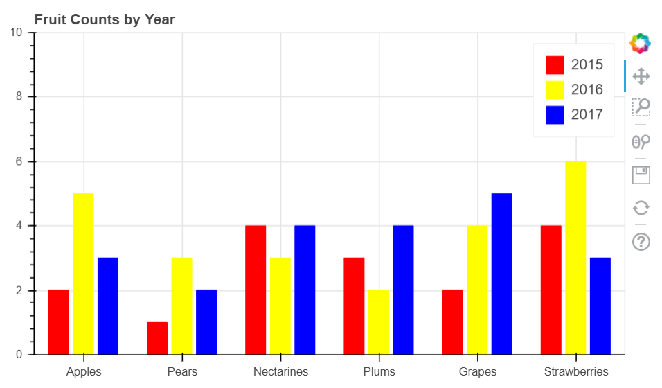
多系列柱状图
# 多系列柱状图# vbarfrom bokeh.transform import dodgefrom bokeh.core.properties import value#导入dodge、value模块df = pd.DataFrame({'2015':[2, 1, 4, 3, 2, 4], '2016':[5, 3, 3, 2, 4, 6], '2017' : [3, 2, 4, 4, 5, 3]},index = ['Apples', 'Pears', 'Nectarines', 'Plums', 'Grapes', 'Strawberries'])#创建数据fruits = df.index.tolist() #横坐标名years = df.columns.tolist() #纵坐标名data = {'index' : fruits}for year in years:data[year] = df[year].tolist()#生成数据,数据格式为dictsource = ColumnDataSource(data = data)#将数据转化为ColumnDataSource对象p = figure(x_range = fruits, y_range = (0, 10), plot_height = 350, title = 'Fruit Counts by Year')p.vbar(x = dodge('index', -0.25, range = p.x_range), top = '2015', width = 0.2, source = source, color = 'red', legend = value('2015'))p.vbar(x = dodge('index', 0, range = p.x_range), top = '2016', width = 0.2, source = source, color = 'yellow', legend = value('2016'))p.vbar(x = dodge('index', 0.25, range = p.x_range), top = '2017', width = 0.2, source = source, color = 'blue', legend = value('2017'))show(p)
Bokeh所能识别的数据结构,是Python自身的数据结构,例如list和dict等数据结构,不过新版本得也开始兼容DataFarme和Serice数据类型
堆叠图—竖图
from bokeh.core.properties import value#导入value模块fruits = ['Apples', 'Pears', 'Nectarines', 'Plums', 'Grapes', 'Strawberries']years = ['2015', '2016', '2017']colors = ["#c9d9d3", "#718dbf", "#e84d60"]data = {'fruits' : fruits,'2015' : [2, 1, 4, 3, 2, 4],'2016' : [5, 3, 4, 2, 4, 6],'2017' : [3, 2, 4, 4, 5, 3]}source = ColumnDataSource(data)#创建数据p = figure(x_range = fruits, plot_height = 350, title = 'Fruit Counts by Year', tools = '')renderers = p.vbar_stack(years, #设置堆叠值,这里source包含了不同年份的值,years变量用于识别不同的对叠层x = 'fruits', #设置x轴坐标source = source,width = 0.9,color = colors,legend = [value(x) for x in years],name = years)# 绘制堆叠图# 注意第一个参数需要放yearsp.xgrid.grid_line_color = Nonep.axis.minor_tick_line_color = Nonep.outline_line_color = Nonep.legend.location = 'top_left'p.legend.orientation = 'horizontal'设置其他参数show(p)

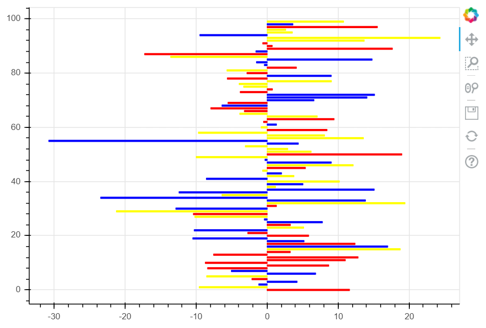
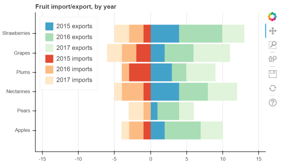
堆叠图—横图
堆叠图from bokeh.palettes import GnBu3, OrRd3# 导入颜色模块fruits = ['Apples', 'Pears', 'Nectarines', 'Plums', 'Grapes', 'Strawberries']years = ["2015", "2016", "2017"]exports = {'fruits' : fruits,'2015' : [2, 1, 4, 3, 2, 4],'2016' : [5, 3, 4, 2, 4, 6],'2017' : [3, 2, 4, 4, 5, 3]}imports = {'fruits' : fruits,'2015' : [-1, 0, -1, -3, -2, -1],'2016' : [-2, -1, -3, -1, -2, -2],'2017' : [-1, -2, -1, 0, -2, -2]}p = figure(y_range=fruits, plot_height=350, x_range=(-16, 16), title="Fruit import/export, by year")p.hbar_stack(years, y='fruits', height=0.9, color=GnBu3, source=ColumnDataSource(exports),legend=["%s exports" % x for x in years]) # 绘制出口数据堆叠图p.hbar_stack(years, y='fruits', height=0.9, color=OrRd3, source=ColumnDataSource(imports),legend=["%s imports" % x for x in years]) # 绘制进口数据堆叠图,这里值为负值p.y_range.range_padding = 0.2 # 调整边界间隔p.ygrid.grid_line_color = Nonep.legend.location = "top_left"p.axis.minor_tick_line_color = Nonep.outline_line_color = None# 设置其他参数show(p)
直方图
# 4、直方图# np.histogram + figure.quad()# 不需要构建ColumnDataSource对象df = pd.DataFrame({'value': np.random.randn(1000)*100})df.index.name = 'index'print(df.head())# 创建数据hist, edges = np.histogram(df['value'],bins=20)print(hist[:5])print(edges)#hist代表不同箱子中,数的个数#edges代表将数据分成不同的箱子以后,每一个箱子的位置坐标# 将数据解析成直方图统计格式# 高阶函数np.histogram(a, bins=10, range=None, weights=None, density=None)# a:数据# bins:箱数# range:最大最小值的范围,如果不设定则为(a.min(), a.max())# weights:权重# density:为True则返回“频率”,为False则返回“计数”# 返回值1 - hist:每个箱子的统计值(top)# 返回值2 - edges:每个箱子的位置坐标,这里n个bins将会有n+1个edgesp = figure(title="HIST", tools="save",background_fill_color="#E8DDCB")p.quad(top=hist, bottom=0, left=edges[:-1], right=edges[1:], # 分别代表每个柱子的四边值fill_color="#036564", line_color="#033649")# figure.quad绘制直方图show(p)


若有收获,就点个赞吧
0 人点赞
